Sunday Funday

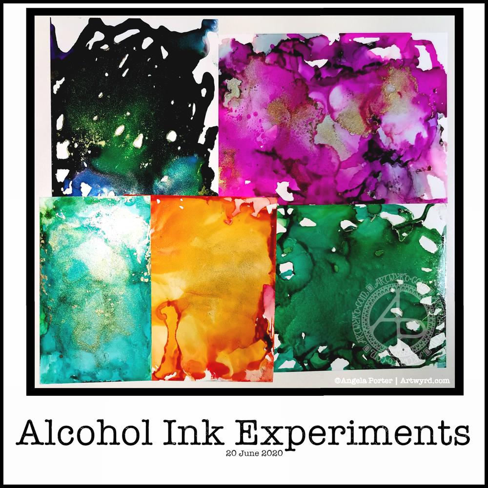
I’ve been enjoying watching the daily YouTube tutorial from Lavinia Stamps, particularly the ones using alcohol inks. So, I thought I’d dig out my small stash of alcohol inks, blending solution and Yupo paper to give it a go.

I can tell you, Lavinia stamps makes it look a helluva lot easier than it really is, as you can tell from my attempts above. The photograph makes them look worse than they are, but they’re still not what I was hoping for – fairly pale coloured, smoky, swirly, interesting backgrounds full of abstract texture and pattern, with seams of gold.

I have now bought a book about using Alcohol Inks and really hope that helps me. Apparently, you need to create a wash of alcohol inks or blending solution on the Yupo first to help the colours flow more easily. That may be why I have so many open patches in the colours.

I also used fairly small pieces of Yupo paper, which may not be the best size to work with.

For the record, I used a mixture of Piñata inks from Jacquard, Ranger Alcohol Inks. I had a gold mixative in the Piñata inks and that was most fascinating to watch work.

I tried a hair drier to move the ink around, but all I ended up with was a blend of the inks with a few ripples of tones of colour in them. I also tried blowing with a straw.

I was surprised how sticky the inks were when they seemed dry. However, after being left overnight, that stickyness is now gone, though I’ll leave them a while longer before doing anything with them.

I have ordered some alcohol lift reinker to try taking a print of the alcohol ink onto paper. That should lighten the colours somewhat. I then hope that I’ll have backgrounds to use for digital art, once I’ve scanned them.

As well as alcohol lift ink, I’ve ordered some Yupo card stock, which is thicker, less floppy and could work better for this. The book I bought suggests using a heat tool, carefully, for spreading the alcohol ink. It also has a recipe for making your own blending fluid for a fraction of the cost of the branded ones. So, I’ve ordered some isopropyl alcohol to go with the glycerine I already have in my stash.

It’s always fun to try out new techniques with media new to me. It can be incredibly frustrating until I work out how it can work for me!

As a side note, I really do need to order some gloves to use; I have really badly stained nails at the moment. A VOC respirator may also be a good idea; I don’t want the fumes to irritate my asthma or cause more respiratory problems. If I decide to draw on the alcohol ink backgrounds, then I will need to order some kind of varnish/sealant that I can draw on top of so my pens don’t get ruined. That, though, is for another time. Today, I’ll be using my more familiar media and tools.

“Words may lie…” quote

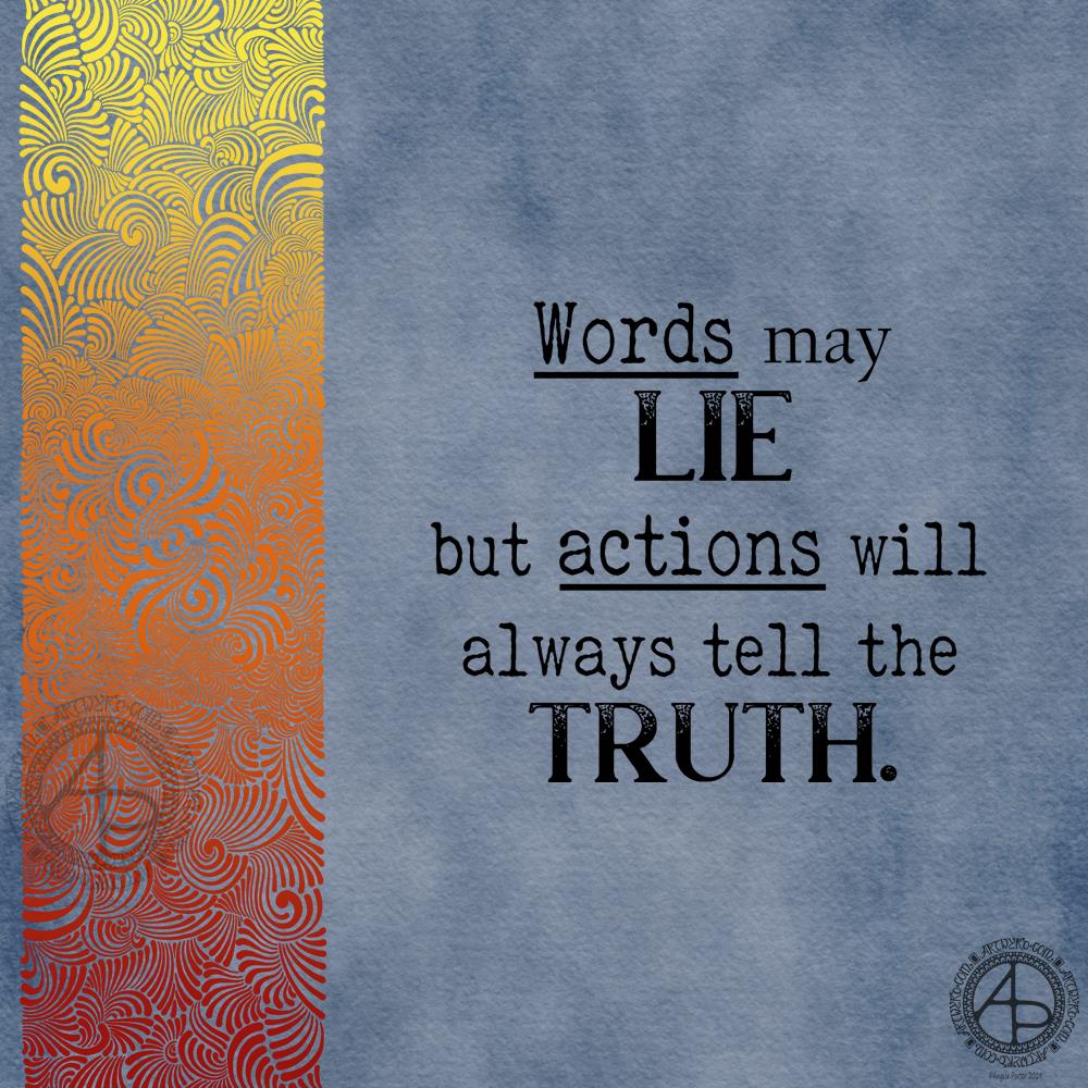
Words may lie … Artwork ©Angela Porter | Artwyrd.com

I had some arty fun creating a similar, but different background for a quote. This time I went for a blue-grey background with the patterned border in fiery shades of red, orange and yellow.

Rather than hand letter the quote, I chose to use fonts.

I’m not sure I’e developed this particular style of creating abstract patterns much, but I do like the results.

Entangled Quote

©Angela Porter 2019

I’ve worked on this design over the past three days. I wanted to do another version of this particular quote in my more characteristic pen and ink, intricate, entangled style of art.

I used various pens to draw this on recycled copy paper (I know, but it’s preserved for posterity as a digital file now). The quote and the boundary lines were printed out on a laser printer. I could have hand lettered it, but I wanted a typewritten look for the quote.

I did add colour and texture to the background using Autodesk Sketchbook Pro along with a Microsoft Surface Pen and Microsoft Surface Studio, but the drawing was all done traditionally with various black pens.

This is so characteristic of my work from quite a few years ago, before I worked on colouring books. I think last week’s stresses and strains – EMDR, Time to Talk Day – had me wanting to escape into the familiar, the comforting, the easy (for me at least) which is why I defaulted to this style of art.

I do have to push myself out of this very comfortable art zone to work on templates for my next coloring book, one which could have an added bit of stress for me concerning its theme. I’m determined to do it though!

It’s taken me until today to fully recover from all of last week’s emotionally tiring events, just in time for my weekly EMDR session! So, I plan to get some drawings done for the book this morning before I head to Neath in what looks like it’s going to be a sunny late winter day. I also really need to get a brisk walk in nature in today. My fragile state has had me remaining in the safety of my home or car. Today, I feel the need to move my body a bit more.

Decorated Terry Pratchett Quote and Chameleon Pencils first impressions

Angela Porter 23 July 2018

Another quote from Terry Pratchett. This one from one of my favourite characters – Death. Death tries so hard to understand humanity, yet he gets it both very wrong and quite right at the same time.

I like the way I’ve added colour to my black and white line art in this example, but one day I hope to get around to colouring in the black and white version.

Maybe I’ll print the art out and then colour it in using Chamelon Pen’s ColorTone Pencils, which arrived yesterday.

I have spent some time  colouring with them and so far I quite like them.

They are softer than Polychromos and others, but not quite as soft as Prismacolours. They blend quite nicely, and a little help from a blending pencil results in really nice blends.

I like the colour palette; the colours are nice and bright and just the colours I love to use in my art, which is a huge, huge bonus! As I often struggle to choose and use colours in a sensible manner when I have a huge choice, the limited palette of 50 colours is really useful for me, as are the double ended pencils. Being able to flip to add shadow or light is a nice touch, though I would like a bit more contrast between some of the colours as some are a bit too similar.

The leads are a bit thicker than other pencils, such as Prismacolours. However, this makes the barrels of the pencils a bit too thick for a standard pencil sharpener. My Staedtler pencil sharpener – the ones with the handles that you turn around – should cope well with them though.

At a price point of £45 on Amazon.co.uk with free prime delivery I think they’re good value for money, even though you essentially have 50 half-sized pencils. However, the thicker colour leads make up for that to some degree.

I’ve not been able to find out if you can buy individual pencils when some wear down. However, I can’t see that being a big issue as I suspect that I’ll use most of the pencils fairly equally.


Monday motivation

Angela Porter 18 June 2018 watermarked

Today has been a quiet day where I’ve spent time playing with colour and pattern. These are some of the results.

I’ve not finished added patterns to the ‘Colourful’ design. The other two I’ve left just as patterns in colour. I like both styles, though it is hard for me not to go to town with entangled embellishments!

I did do another drawing, while having some tea at the Garwnant Centre in a forest at the edge of the Brecon Beacons. It’s in a sketchbook and a bit wibbly wobbly. It was a nice place, a nice way to spend an hour or so, somewhere a bit different.