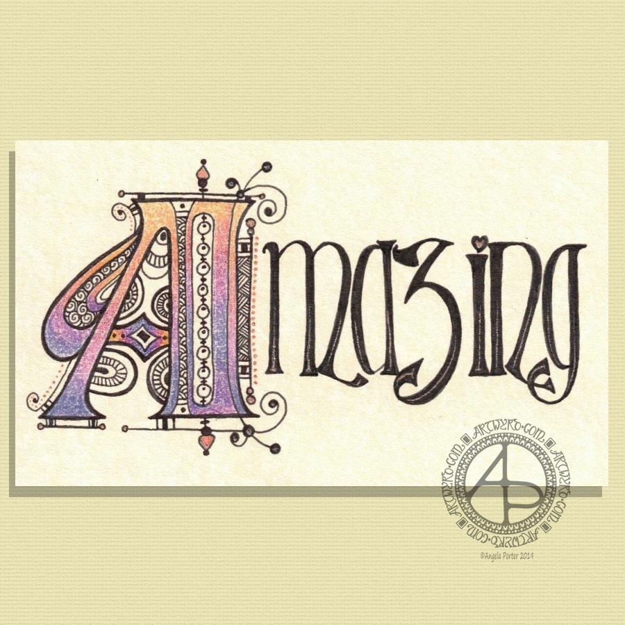
My morning warm up art session today was this little bit of hand lettering. I had a completely different idea in mind when I started this off but, as often happens, the creative energy flowed in a different direction.
I had wanted to do a monogram, perhaps with a dangle or maybe one set into a pattern border as a drop capital to a quote.
As I worked on first the pencil outline of the A, and then inking it in using fine and extra fine fountain pens filled with black ink, the lines that flowed out dictated the form of the letter rather than me consciously trying to force it into what I thought I wanted to create.
I think I’ve over patterned the inner space of the monogram, or not used the right kind of patterns there. However, it’ll do.
I wanted to use some birdwing copper FW Pearlescent ink from Daler-Rowney to add metallic highlights with a dip pen. I soon found out that dip pens and parchment paper that has been coloured with black ink don’t work well together. So, I ended up with the copper highlights at the bottom of the letters that fade up naturally. Adding dots of metallic colour to the monogram was easier on the unworked parchment. Over the black ink dots it wasn’t so easy. I’m also not sure that the ‘string of beads’ in the monogram actually works but I know it’s missing something. I need some time to reflect on this. As I do about adding any more copper highlights to it. I may yet decide to add some dangles to the word.
On the whole, I’m quite happy with how this turned out. I could add ‘You are’ in small letters above the letters. Either way, I think this would make a lovely notecard. I also think it could be used in a bujo, planner, journal, scrapbook or as framed art. I think I need to review the card making and mixed media techniques I once knew and have sidelined to focus on other aspects of art and adapt them to my current needs/ideas.

