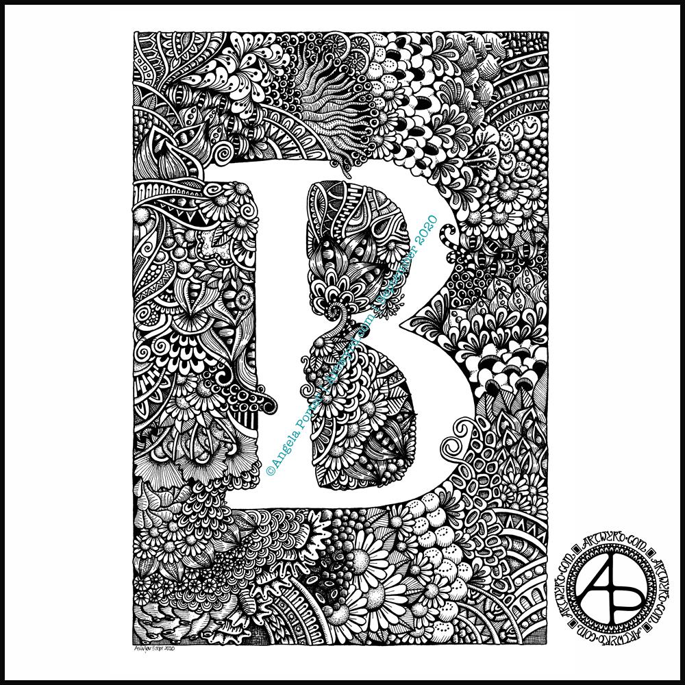
I got this monogram finished yesterday evening. I think I may have been a bit heavy handed with shading in some places. However, overall I like it and I like the volume or dimension that the shading adds.
I definitely enjoy working in such a detailed, intricate and organically intuitive kind of way. Having the monogram as a design to work around does help quite a bit.
On a kind of related point, I had a new A5 dot grid notebook delivered yesterday so I can start to make a collection of motifs and patterns as I use them or create them. The idea is I can winnow out those that I never/rarely use. The reason for this is that the dot grid notebook I’ve kept as a visual dictionary for the last couple of years is just about full! I will keep it as a reference, but it’s time to start a new, more relevant one I think.
I have a snazzy, teal coloured notebook, covered in vegan faux-leather. It has 218 numbered white pages that are a tad thicker than the usual dot grid notebook pages, The paper is velvety smooth and a pleasure to write/draw on. It’s made by Wordsworth & Black and I came across it on Amazon. Oh, the ink doesn’t feather, bleed through or ghost on the pages. I paid £15 for it and I’m very happy with it so far.
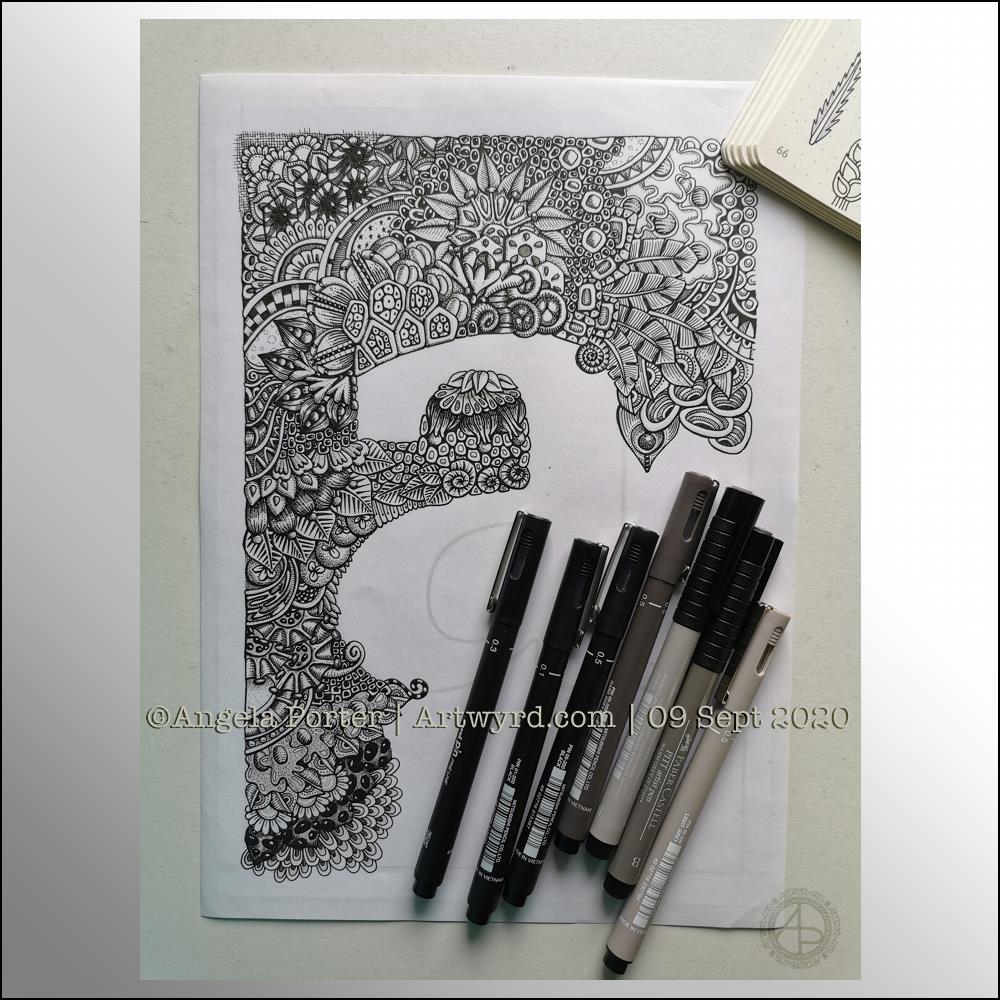
Wednesday is work in progress (WIP) day. So, I thought I’d share my monogram “a” and the progress I’m making on it.
There’s a clutch of pens there! I decided to see if I could add grey to heop areas of the design stand out more, as well as adding some depth and dimension. I figured I had nowt to lose if I tried as the the design was becoming all much of a muchness to my eye. Looking at the image above, it seems to be working well in some areas!
I started using some grey unipin pens to add shades of grey to the design. They worked kind of well enough, but they were picking up pigment from the black and moving it around.
So, I thought I’d see what greys in Pitt Artist Brush pens I had and found some warm greys. They worked better as the colour could be laid down more smoothly.
I do have some new motifs to add to my visual dictionary, a corner of which you can see at the top right of the photo.
I’m not sure if I like adding the greys more than if I don’t add them. I suspect I’ll like them more as I work with them as I love the sense of volume that has appeared in various areas thanks to the contrast they confer on the design.
Finally finished it! It’s taken many hours to do – probably around 15 I think, and it’s taken some perseverance by myself to get it done.
Uniball Unipin pens (05, 03 and 01) on Claire Fontaine Paint-on mixed media paper. Two pen nibs now wrecked; the paper is velvety smooth to touch, but just too rough for the tips of the Unipin pens. Will move to Bristol board for the next monogram.
Seven more days of the pandemic over and done with and gone to the past. That means seven less days before it comes to some kind of end! Always trying to look on the plus side of things, not always succeeding.
In the past week we’ve also left August behind us and entered September.
This week, I’ve created one of my signature ‘Entangled’ designs that includes seed pods, flowers, berries, foliage and plenty of arches with abstract, geometric patterns.
I drew this template on Canson Bristol Board with 05 and 03 Uniball Unipin pens. I’ve added colour digitally.
As I can feel autumn ready to burst forth soon, I’ve chosen colours that represent that season. Of course, any colour palette will work well. The aim is to have fun, relax, and take time out for creativity. There’s no coloring police to tell you you’ve done wrong, apart from our own inner critics.
As always, I look forward to seeing how everyone brings this template to life with colour!
I started doing the Inktober52 challenge at the start of the year, but quickly fell off the wagon, so to speak.
I really enjoyed doing Inktober last year, though I didn’t use the official prompt list as it really didn’t do anything for me. Instead, I used two alternative lists – one of skulls, the other of fungi.
I’m thinking of using this year’s list to practice typographic art. Mind you, that depends on what alternative lists I stumble upon, as I may use one of them instead.
I also discovered this Slowtember challenge on twitter from @megaelod:
I am tempted to use this for this month. I’ll see what happens!
It’s free to join the group, and the template is a freebie for members of the group.
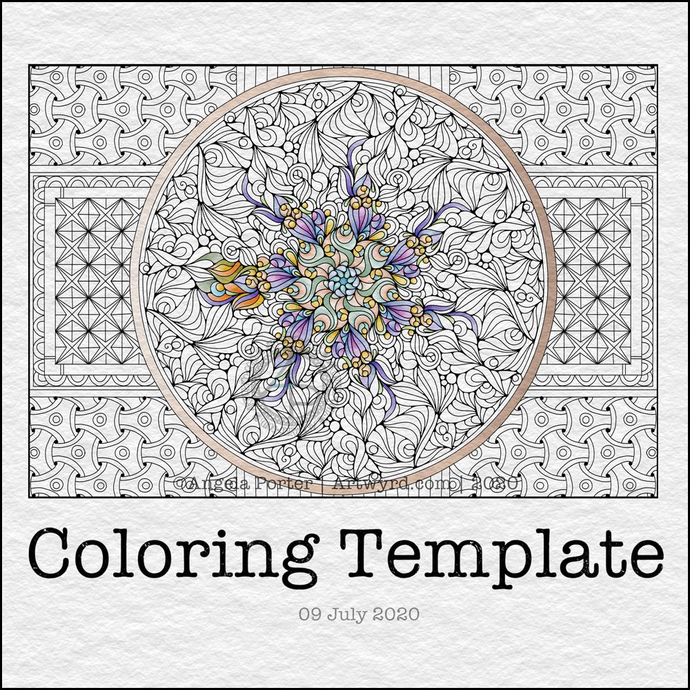
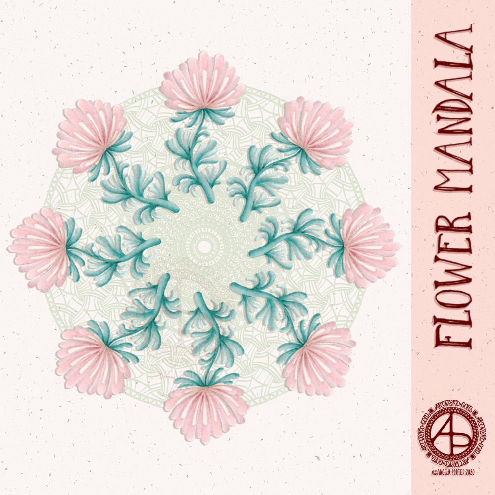
This week, I created a mandala design with a background of geometric, repeating patterns.
I’m still recovering from the stress of my first trip out since March 2020. Drawing (and colouring) mandalas is an incredibly peaceful, relaxing and mindful activity. So, it was natural that I drew one.
The mandala design is based on some of the abstract art I’ve been doing of late. It’s a bit unusual for my mandalas, but I really do like the organic flow of the lines.
Even though the design is abstract, the repeating symmetry of a mandala bring some structure to the design. I am looking forward to seeing how members of the group add colour to the design.
The geometric patterns in the background also result in a soothing, repetitive rhythm for colouring; a rhythm that results in soothing and calming ones mind and emotions.
De-stressing
I have been totally shaken by the level of anxiety/stress that resulted from my trip out on Tuesday. I am beginning to feel more my contented and calm self. However, I find I’m still irritable and grumpy and have withdrawn from social media and the like for most of the day.
It was a sobering thought when I realised I’d lived most of my life constantly at elevated stress levels, often as higher than what I experienced in the past couple of days.
It’s also a wonderful realisation that I can recognise this now, and I also am able to allow myself self-care time to let all the stress hormones leach from my body. It’s been a long time since they peaked in this way.
It makes me extremely grateful to my therapist for her years of patient work with me. Experiences like the Tuesday Trip remind me of how I used to be and show me how far I have come in recovery from cPTSD.
Yesterday, after my social media post, I binged watched the Harry Potter films from The Order of the Phoenix. I found I was irritated by crochet. I tried cross-stitch, which irritated me too. Eventually, I settled on knitting, which, oddly, soothed me. I think it’s because I could knit and watch the film. Knitting allowed me to channel my irritability into something creative. As I can knit without looking at the knitting, I could also watch and immerse myself in the films at the same time.
My fingers are itching to knit again, now I’ve thought about it.
Even though I slept well last night, I’m still feeling really tired today. This happens as part of the post-stress come-down. It can last a few days. I’ll not be rushing to nap, however. Napping has a knock-on effect on my ability to sleep at night when I’m like this. My naps tend to end up as periods of deep sleep, so I try not to take them unless it’s absolutely necessary.
Last night, I had a play around with one of my latest watercolours in an app that creates patterns from your artwork. The process was mesmerising. I didn’t realise that they now do metamorphosing patterns like these two!
The top image is directly from the artwork, the bottom one has been lightened, the colours more saturated and adjusted slightly.
I fell in love with metamorphosing tessellations thanks to the works of M C Escher, like so many other people. I love the detail, observational skills and the way he plays with the illusion of space.
Anyways, creating these patterns, albeit digitally, was fascinating and something I can definitely lose myself in for hours! Being able to adjust colours in Autodesk Sketchbook Pro or Affinity Photo is an added fascination too.
I like both colour variations of the same metamorphosis above.
I have made both available in my RedBubble Shop on a wide range of quality products. Please take a look and support my art by sharing with others. #findyourthing
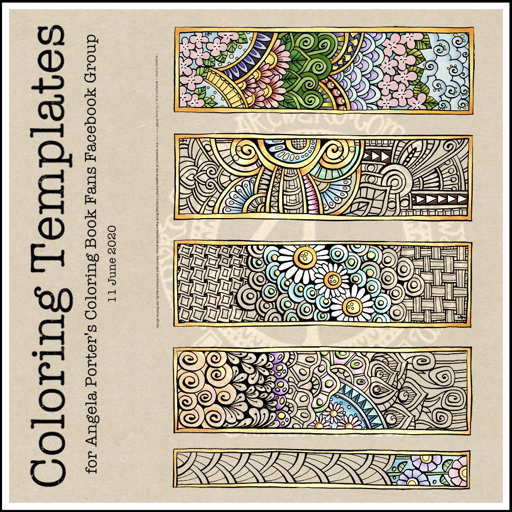
This week’s coloring template is a series of bookmarks. A member of the Angela Porter’s Coloring Book Fans facebook group said they’d like some designs that could be used as bookmarks, and so I went with the suggestion.
The designs are typically ‘Angela’ and ‘entangled’. I used a Tombow Fudenosuke along with an 04 Pigma Sakura Sensei pen to draw the designs. After scanning and cleaning up, I’ve partially coloured the designs, as well as adding a pale kraft paper background.
To use them as bookmarks, I suggest printing them on some card. If that’s not possible, then gluing the whole sheet to some card and then cutting out the book marks would make them sturdier. Of course, a laminator could prove most useful in preserving your beautiful coloring, as well as making really long lasting book marks that could be given as beautiful gifts, or used to mark the coloring page you’re working on too.
This morning’s warm up art is this mandala featuring some flowers as well as some zentangle and geometric patterns.
I’m not entirely sure this works, but sometimes an idea just has to be tried out. The flowers are a bit ‘flat’. The zendala/mandala background may be a bit too busy or just not the right colour. I’m really not at all sure.
However, whether it’s worked out or not, it’s been a relaxing process. It’s always pleasant to create for the sake of creating, and also working digitally too.
I used Autodesk Sketchbook Pro, Microsoft Surface Pen and Microsoft Surface Studio to create this design.
A new month and a new coloring template, exclusive to members of the Angela Porter’s Coloring Book Fans facebook group. If you’d like to download and print this template for your personal use, then pop along to the group.
The days are slowly lengthening here in the Northern Hemisphere. The first signs of nature waking up can be seen in the form of snowdrops and crocuses. It can also be heard in the raucous and beautiful birdsong.
To the template. I drew this on Rhodia dot grid paper using a Sakura Pigma PN pen. For my partially coloured version, I added a coloured background and colour digitally.
I wanted a circular frame in which to put quotes. So, I started by drawing some pencil guidelines for the circle and the outer borders on some dot grid paper.
I used 08 and 02 Uniball Unipin pens to draw the circle of flowers and foliage. Then, to start filling the space around the flowers with entangled designs.
It’s very much a work in progress. Part of me thinks I could’ve left an empty border around the circular flower and foliage arrangement to separate it from the background. The other part of me likes it as it is.
I want to try to get a balance of less detailed areas with the more densely detailed sections so that there’s space for the eye to rest.
I also suspect I’ll be adding colour or, at the very least, shadow and highlights to the design to bring it to life.