Entangled Art

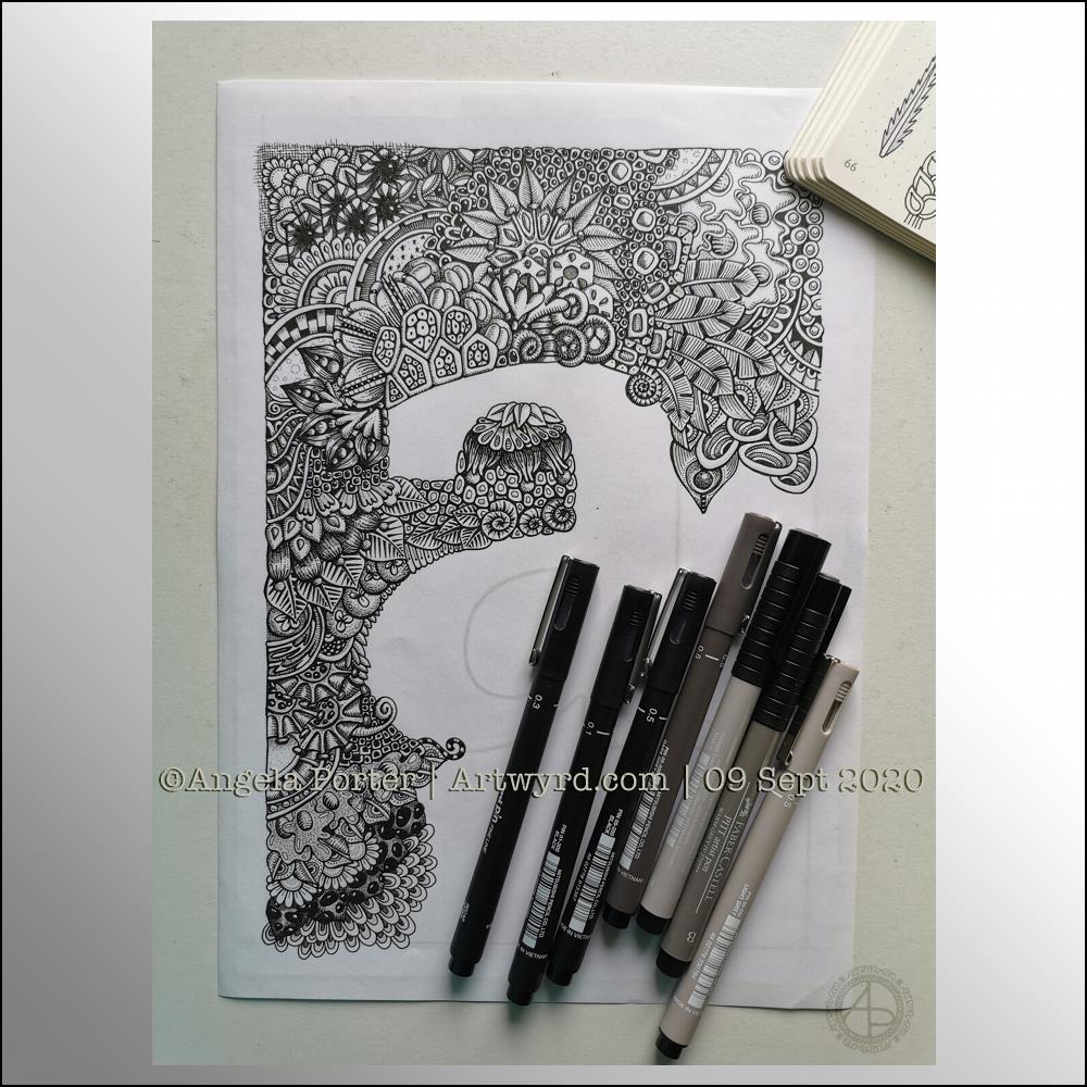
I finally have this particular drawing finished.

It was drawn on marker paper using Unipin pens. Shadows were added using cool grey Copic markers. Next, it was scanned in and a kraft paper background added. Finally, highlights were added digitally to help bring out some sense of dimensionality.

I like the way the highlights and shadows work. However, in future I need to add the shadows digitally along with the highlights.

It’s a very typically “Angela” style of art – intricate, detailed, and full of botanical motifs, arches and geometric patterns that I enjoy using so much. I even managed to leave some areas that are not so busy with line and pattern!

So, it’s on to the next one, once I’ve designed the coloring template for Template Thursday!

Moth

Finally finished! The moth with mandala and entangled background. A4 in size.

It’s taken quite a few hours work to complete this one, but it’s nice that it is finally done.

Lots and lots of my favourite motifs/patterns used in the entangled background – flowers, seeds, seedpods, leaves, arches, spirals and geometric patterns.

Plenty of line work to add depth and volume to the design.

I like that the white area behind the moth means the moth isn’t lost in the background. There are some areas where the resulting values aren’t sufficiently different, but I can live with that.

No colour (other than my watermark). A very graphic design.

Moth and Mandala

A new moth design this morning, with a subtle mandala background. Perhaps a little too subtle when the image is reduced in size and resolution for social media.

The moth is very ‘graphic’ and stands out well against the background, but the background has plenty of interest as well.

I really enjoy adding the glowing centre to the mandala, which also helps the moth to stand out. There’s a feel of the moth having been attracted to the light.

Moth v03

Yet another artwork featuring a moth today.

I re-drew the moth from yesterday to try out some ideas I had when reflecting on the artwork. I’m not entirely sure if it’s an improvement, but it is what it is.

I also have drawn a new mandala-style pattern for the background. This time, I’ve added it as a subtle design. I think it works quite well as the moth really stands out.

Mossy green today, no idea why other than it appealed to me. It may mean a desire to be in nature to have my mood uplifted. I’m not feeling the brightest or upbeat this day. A headache isn’t helping. A walk is required in a while. It’s a sunshiny peri-autumn day, so a good day to walk I think.

Moth Mandala 02

Moths are becoming a bit of a thing with me at the moment. They’re great for practicing my line work. They’re also surprisingly cute, in a buggy kind of way.

Of course, I’m still working on the first moth entangled drawing/illustration, so adding a mandala behind this drawing is a quick and easy way of adding to the moth. Mandalas are kind of my thing to do.

Again, I’ve used that spot of highlight behind the moth to draw attention to the centre of the design along with the main motif.

Today, a terracotta background seemed to be just right. Perhaps because it’s quite an autumnal colour. This morning there’s a definite nip in the air that I associate with autumn and we are just a couple of days away from the equinox.

Terracotta is a deeper shade of orange and is comforting in it’s warmth and earthiness. I find it quite soothing.

I’m also enjoying floating the graphic black and white elements of my artwork above a simple coloured background. That way I have some colour in my art, but the colour doesn’t distract from the design elements.

WIP Wednesday

Wednesday is work in progress (WIP) day. So, I thought I’d share my monogram “a” and the progress I’m making on it.

There’s a clutch of pens there! I decided to see if I could add grey to heop areas of the design stand out more, as well as adding some depth and dimension. I figured I had nowt to lose if I tried as the the design was becoming all much of a muchness to my eye. Looking at the image above, it seems to be working well in some areas!

I started using some grey unipin pens to add shades of grey to the design. They worked kind of well enough, but they were picking up pigment from the black and moving it around.

So, I thought I’d see what greys in Pitt Artist Brush pens I had and found some warm greys. They worked better as the colour could be laid down more smoothly.

I do have some new motifs to add to my visual dictionary, a corner of which you can see at the top right of the photo.

I’m not sure if I like adding the greys more than if I don’t add them. I suspect I’ll like them more as I work with them as I love the sense of volume that has appeared in various areas thanks to the contrast they confer on the design.

Let me know what you think – drop me a comment.