Another day, another Inktober drawing – this time a gecko skull along with stinkhorn fungi.
No colouring, no shading, just pen work this time.
I love the skull and the leaves and spirals around it. I’m not so fussed on my fungi. The only thing I would change about the skull is the pattern around the eyeballs; the chequerboard and dots is just a tad too heavy handed.
I’m starting to struggle adding the fungi to the skulls; my drawings are all becoming more than a bit ‘samey’.
Digital art using Autodesk Sketchbook Pro and a Surface Pen and Surface Studio by Microsoft.
I’m using Inktober 2019 prompt lists from @book_polygamist and @nyan_sun on Instagram.
I thought it would be fun to do a really simple turtle skull drawing along with those Xerocomus fungi and turn them into a dangle design.
I kept to simple line drawings, focused on ocean-themed charms for the dangle, and added really simple colour in places just to give an idea of how it could look fully coloured in.
I worked digitally, with Autodesk Sketchbook Pro along with a Surface Pen and Surface Studio by Microsoft.
The splashes of colour show how the line drawing, as simple as it is, just comes to life with colour.
If you’d like to know more about drawing dangle designs, then my book “A Dangle A Day” is a good place to start. I show you how, one step at a time, you too can draw dangle designs and I have over 150 examples of dangle designs you can copy or use for inspiration.
Inktober – day 5
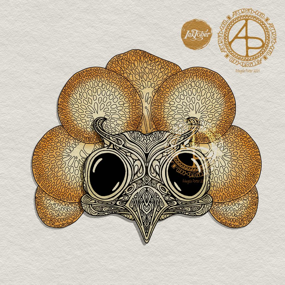
My prompts for day 5 are owl skull and Favolaschia calocera. The prompt lists I’m using are from two people on instagram – @book_polygamist and @nyan_sun.
I’m partway through my design – the owl skull is drawn and I’m rather pleased with it. I have yet to draw the Favolaschia and other design elements around it.
Again, I’m working digitally for day 5 and pushing stylised design just a little bit more with this one.
Reflecting on Inktober so far.
Five days in and I am really enjoying it. The hardest thing for me is to not let it dominate my arty work each day. For three out of the four days so far I have also managed to get my goal of at least two illustrations for the coloring book I’m working on done. The Inktober drawings are also giving me some ideas for the illustrations for the book as well.
I’m also finding I’m ‘rediscovering’ styles of art that I haven’t done for a long time; the owl skull is an example of this and I will write more about that when I post day 5’s ink.
I used, mostly, traditional media for the first two days, but today I decided to use digital tools.
My Surface Studio and Pen from Microsoft mean I can draw on my screen just like I do on paper, especially as I have set up pen brushes with lines mimic those left by my favourite fine liner pens.
The added bonus of drawing digitally is that I get to use tools that aren’t available to me when working traditionally. In this case, I made use of the symmetry tool. As my illustration today is rather stylised, perfect symmetry works well in the design.
Stylised, symmetrical designs do make my arty heart and soul smile and sing. Yes, I still like to be challenged from time to time to draw more realistically, however I’ve just realised how much this kind of art really please me.
Yet I still struggle with accepting it as a valid way of producing art – it always seems so simple, like I have no great skill like those who produce wonderfully realistic art, or thought provoking pieces, or abstract wonders. I still struggle to see my style of art, of expression as valid and I think that is why I flip-flop betwixt different styles and media and projects. It’s that lack of self-belief perhaps, or maybe I just have a choir of creative voices in me, each of which need expression in it’s own way.
I think this kind of reflection is part of what Inktober is about.
Anyway, after completing the line art, I added some simple colouring to the image using a marker brush and then an airbrush with the synthetic paint setting, which nicely blends one colour into another.
I am very happy with the stylised skull design, along with the higher contrast colouring that I’ve used for it, which helps it stand out a little from the other coloured elements of the design.
This is, of the three days so far, my favourite Inktober2019 artwork.
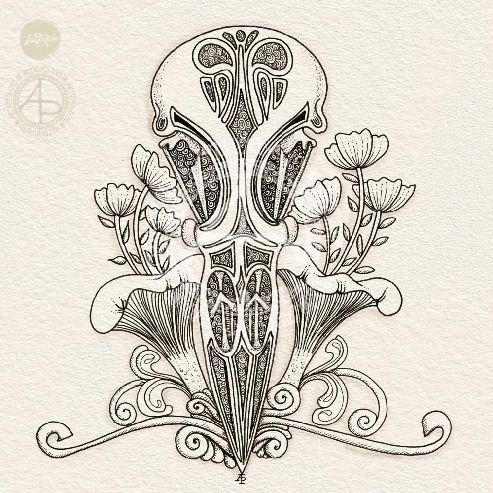
Pen drawing with digital shading and texture added.
I’m quite happy with this one, though I messed up a bit with the twiddly swirly foliage. I also can see how I could’ve had the flowers growing out of some of these curly bits. However, if I ever choose to rework this drawing I can do so at another time.
This one is much more stylised than yesterday’s drawing of a chameleon skull. I like how I’ve used a combination of patterns and stippling to add shadow and depth to the skull. I also like how I’ve kept the rest of the design fairly simple in contrast.
I decided not to add colour to this, for now.
Tools used:
To draw the design I used Sakura Micron and Uniball Unipin pens on an 8″ x 8″ piece of Claire Fontaine Paint On multi techniques paper.
For the digital texture and shading I used Autodesk Sketchbook Pro along with a Microsoft Surface Pen and Surface Studio.
Can you believe that September is nearly over? I swear that the older I get the faster time seems to go.
Anyway, a new month on the horizon means a new colouring template for the members of the Angela Porter’s Coloring Book Fans facebook group. There just has to be a Hallowe’en theme for October’s page, and you can see a sneak peek of it above. I couldn’t resist colouring some of it in as a way of trying out some new digital brushes and some ideas too.
I put some of my favourite All Hallows’ Eve motifs into the drawing, including a raven, skulls, fungi and a vampire cat! I always enjoy drawing stuff to do with Hallowe’en; it’s my favourite time of year because I don’t have any past traumas associated with it.
If you’d like to colour this template, pop over to the Angela Porter’s Coloring Book Fans facebook group and become a member; each month I do one drawing exclusively for group members (terms and conditions of use and sharing apply).
About the art
I used a combination of fountain pens and fine-line pens to draw the design on dot grid paper. I then scanned the drawing in and cleaned up smudges and smears digitally.
Then, I set about adding colour digitally using my usual tools – Autodesk Sketchbook Pro, Microsoft Surface Pen and Microsoft Surface Studio. I also added a background and surface texture that I had purchased via Creative Market.
I am really quite pleased with how the colour is bringing the illustration to life, especially the skull in a jar. I hope to be able to continue to add colour as the month progresses, though I do know I have quite a bit of work to do and focus on.
To Inktober or not Inktober, that is the question.
Last year, I really enjoyed taking part in Inktober. Inktober has become a really popular social media event where artists and creatives use a daily prompt to draw (or create) something based on that prompt and share it on social media.
There is an official prompt list, but people do create alternative lists and I may look at some of them as there may be variations that might be less time intensive than last years’ was!
I shall see what I find and go from there I think.
So, Angela, how are you today?
Tired. However, I’m am quite content, my mood is good enough today. I do have EMDR later on, and I often feel ‘flat’ before my therapy session. I think my unconscious mind starts to bring stuff up in preparation for EMDR.
I know that the likelihood of me being exhausted later is rather high, so I’m not planning to do loads of stuff later on. Self care will be the order of the late afternoon and evening.
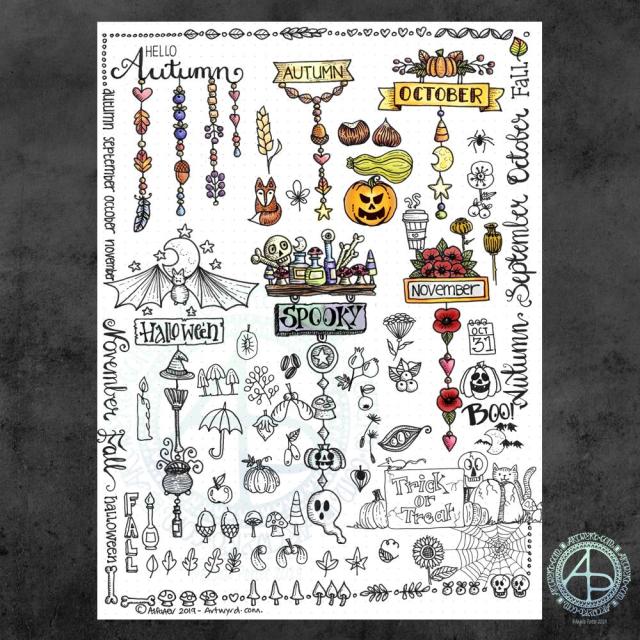
It’s been a while since I did any whimsical dangle designs, so here’s an A4 sheet full of ideas!
There are six complete dangle designs on this sheet along with lots of ideas for motifs to use. I’ve also done some hand lettering, something I don’t do often enough these days.
I know there are likely to be things associated with autumn missing from the sheet, but it is a collection of some of my favourites. I had a lot of fun filling in some of the space around the dangle designs with the lettering and design elements.
I used Tombow Fudenosuke and Faber-Castell Pitt Artist pens to draw and hand letter on an A4 sheet of dot grid paper by Claire Fontaine.
After scanning in, I decided I’d like to add some colour digitally. I used a different kind of brush setting – natural blend with an airbrush. I’ve not quite worked out how it works, but I like the way it’s turned out here. The colour blends turn out quite soft and gentle, however this brush setting does need some more experimentation by me.
These are lovely, simple designs that would be perfect for using in bullet journals (BuJos), planners, diaries, scrapbooks and journals as well as for greeting cards, bookmarks and more.
My book “A Dangle A Day” is a great resource for dangle designs and design elements (called ‘charms’ in the book), even if I say so myself. It also has easy to follow step by step instructions for beginners to more confident creatives, as well as lots of inspiration – there’s nearly 200 dangle designs in the book!
So, Angela, how are you feeling today?
I’m feeling content, fairly upbeat and the exhaustion of the past few days seems to have mostly subsided. There’s still some tiredness there, but I feel more able to cope with the demands of daily life.
I do have to venture forth into the world; in my rather emotionally fragile state the thought of going grocery shopping filled me with, well not horror but trepidation. Fortunately, I keep a fairly well stocked fridge, freezer and cupboard, but now I do need to go get some fresh fruit and veg, which I will do in a short while I expect.
It is good to be back to having the contentedness the dominant feeling – it’s not as strong as it has been which tells me there’s still some emotional distress lingering. However, it is the prevalent emotion.
I’ve weathered another emotional storm. I do try to remind myself that I’ve come through plenty of hurricane force emotional and mental storms in the past and I can come through them again. Nowadays, I know what contentedness feels like and during emotional storms it acts a lighthouse to guide me back to emotionally calm waters.
This is my way of saying thank you to those who follow my work, particularly the colouring books I have created.
If you’d like to download and colour, you need to be a member of the group and agree to follow the T’s & C’s.
I’m looking forward to seeing what members of the group will do with this one! I love to see the different colour schemes and media that they use to bring the drawing to life with the magic of colour.
To create this template, I started with a sketch on square gridded paper. It was a very basic sketch with just outline shapes, lines and so on. I then scanned it into the Surface Studio and completed this drawing using my Surface Pen along with Autodesk Sketchbook Pro.
I had to include some of my favourite design elements – butterflies, stars, flowers, fungi, seed pods, arches and geometric patterns.
It was fun to draw, even the sketch was as I love to use a Koh-i-Noor Magic pencil to do the sketching with, one that has quite different colours in the lead so that I get a fair rainbow of colours.
I’m warming to sketching things out before drawing them in ink (either traditional ink/pens or digital) to give me a skeleton I can put flesh on in terms of details and patterns.
So Angela Porter, how are you feeling today?
I’m feeling contented. My stomach/digestive system is back to normal. All just in time for today’s EMDR session this afternoon.
That’s all I have to say about that today. I’m sure I’ll have more tomorrow post EMDR.
I spent some time drawing this design yesterday (around 4 hours) and didn’t finish it. This morning I woke up wondering if I could tuck a letter away in the design, making it part of the design rather than putting the design around the letter, kind of.
So, I looked at the small-ish space I had left to the right of the design and managed to, rather clumsily, tuck a capital A in amongst the design.
The A is a bit more obvious than I’d wanted, but I worked with what I’d already done to see how it could work, or how I’d mess it up and learn from it.
Yes, I know, another A. There are letters of the alphabet I’ve never either done as a monogram or used in a design of some kind.
I quite like the idea of adding letters as part of the design, either as one occurrence of the letter or by creating a motif of some kind that contains the letter which can then be repeated as part of the overall design.
My mind is ticking over on this one…I definitely need at least one more, if not several more, cuppas before I get my head around my own idea!
I’m positive that this idea is not likely to be unique in the realms of creativity, but it is a new idea for me. Now all I have to do is to follow through with it and see where it leads.
The original drawing is approx 6″ x 6″ (15.5cm x 15.5cm) in size. I used Tombow Fudenosuke, Sakura Pigma Sensei 04, Unball Unipin 0.1 and Pentel Sign pens to draw the design on Daler Rowney Simply… Sketch extra white paper. The paper isn’t as smooth as I usually like and it tends to ‘grab’ pencil lines, even in soft 2B, but it did the job.
Digitally all I did was to clean up the image and create a transparent background and then add a coloured, textured watercolour paper as a background to the drawing before adding my watermarks.
I do want to do some shading on this drawing, but I also have hankering to draw a mandala. Which will win out with me?
This morning, I thought I’d start my day by colouring in yesterday’s shaded, abstract floral design. And this is the result.
I didn’t remove the shading, but added simple gradient colours above it so that the shading would add to the depth and dimension.
Although this image, thanks to whatever WordPress does to the colour of images when uploaded, doesn’t show this, it actually works really well.
Yes, I know. It’s taken me a couple or three years to get around to working out I can underlay shadows and used colour over the top to add depth and dimension. However, I’ve said it before, I learn tricks at my own pace and when they are relevant to me or when I’m ready to try them out.
I may try this design again, but with more vintage-y colours. Maybe. It’s all learning for me that’s for sure!
The design was drawn with Tombow Fudenosuke and Sakura Pigma Sensei pens. Shading and colour was added digitally using Autodesk Sketchbook Pro, Microsoft Surface Pen and Microsoft Studio.