Sketchtember Day 12

I’m still on the seed-pod kick as far as Sketchtember goes. Today, I sketched out some lovely heart-shaped nuts/seeds.

After drawing and adding colour to the first couple with Arteza EverBlend markers, I re-drew more stylised versions. Finally, I had a go at designing some Zentangle style ribbon patterns. I particularly like the one on the bottom right.

A quiet Sunday morning has been had, and the afternoon is likely to be pretty much the same.

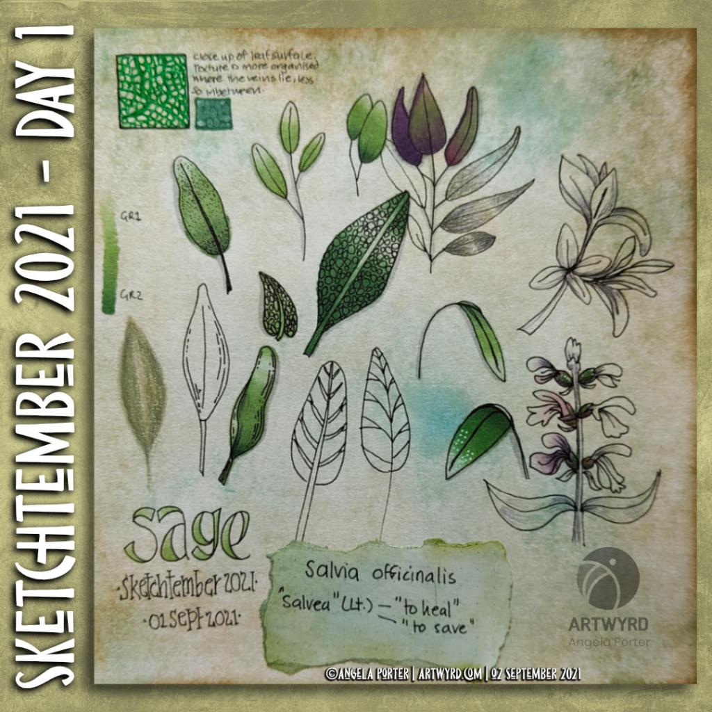
Sketchtember 2021 | Day 1

Link to today’s vlog on YouTube.

I’ve decided that it would be quite nice to take part in a monthly art challenge, perhaps as a warm up to Inktober next month. Maybe.

So, I looked around at the challenges I could find, and settled on one from @DecayingDots on Instagram and Twitter. Their list of prompts is all herbs/plants. That, unlike others, inspired me to take up the challenge.

It’s been a long time since I used a sketchbook truly as a sketchbook. It may take me awhile to get back into such things. I do have some lovely, pre-coloured pages to make use of as a start.

Not only will I practice my kind of sketching – which is usually with a pen – I can practice hand lettering and handwriting. My idea is not only to sketch the day’s plant/leaves, but to add notes and information. Those notes may be about the plant, or about the colours I’m using, or even recipes/uses for the particular herb.

As it’s a sketch challenge, there’s also no pressure to complete every drawing, or even to do perfect drawings. It’s all about observational drawing for me.

Now, as i don’t have green thumbs (I can kill any self-respecting plant in a matter of hours, well days maybe) and I’m not feeling able to visit shops or gardens at this time ( social anxiety is a heckofa thing), photographic references will have to do. But that’s ok.

So, here’s my page for day 1, which is all to do with sage. In today’s vlog I talk about this page, the media I’ve used, and I add some drawings to day 2’s page – Rosemary.

I’ve got some work still to do on both pages I think … but that’s the fun of a sketchbook. It’s not meant to be finished at one go, pages can be revisited and added to as needed!

Buggy Sketchbook

Time Lapse Video

Drawing

Today is a lazy, artsy day, Sunday. It’s raining, on and off, so I’m disinclined to wander out anywhere.

I started the morning drawing some half insects. Why half? Well, the plan is to scan the sketches in (which I’ve done), ink them in digitally (done too!) and then add colour (started!). Digitally, I can use the symmetry tools to complete the other half of the insect.

Of course, I could create mutant hybrids … but that doesn’t appeal to me much, that’s for sure.

I did film me drawing and wittering about my sketching and other arty stuff. I haven’t published the full-length video; I was very wittery and disjointed. My attention was focused on the process of observing and drawing. It seems that my ability to speak coherently vanishes as my concentration increases!

I enjoyed the half hour or so of quick sketches. I was focusing on creating simplified, stylised drawings, rather than detailed realistic ones.

Thoughts

Some connections were made as I wittered on. One was that when I draw in a stylistic way, I have no problem with using non-representational colours. It’s when I’m drawing more realistically that colours vex me. This is a problem that occurs with traditional media in particular.

I had a memory of falling in love with the work of Kandinsky, Juan Gris, and similar artists while doing my A Level art two decades ago. I particularly love the use of colour to communicate inner emotions, relationships with the art, and symbolism and metaphor.

I found this an interesting connection to make, even though I’m not entirely sure what that means yet. Other than that I’ve always found non-representational colour and stylised, abstract art something I’ve enjoyed doing. Indeed, as I write I remember that in front of me are three oil paintings I did for one of my art exams. They are abstract patterns from locomotive parts and Romanesque sculpture. Fiery reds, oranges, yellows and magentas were used for the locomotive parts. The painting based on Romanesque sculpture was in cool, calming blues. My focus for all the paintings was on pattern and contrast to get a feeling of volume/dimension.

Last summer, I was playing with watercolours and patterns abstracted from rock strata and nature. I used colours that appealed to me in these paintings.

I keep circling around this style of art. I return to it from time to time, enjoying the process of creating such art, often on a small scale too.

Where art comes from is a mystery. It comes unannounced. It has the quality of gift. The source from where it comes is hidden from us. Like all creativity, it stands us in possibility. It comes from impulse and dream, from raiding the inarticulate, from going below the floor of consciousness. To do this we must break free of the confines of the known and fixed. As artists we do this with our materials—with our hands. And in this confluence of mind and matter abstraction is not only relevant, it is essential. —Timothy Hawkesworth

Working from my creative subconscious is something I do…a lot. All my entangled art that just flows onto the page. Mandalas. Using observations of pattern and texture to create something that is non-representational, just, to my mind, pretty, pleasing.

I do the representational for coloring books, but my personal art … well … that can be anything I want it to be. I can use any colours I wish to use for it, and accepting that isn’t an easy thing.

The Inner Critic

I do my best to let colorists know that there are no rules for colour, that if they want purple trees and green people, that’s fine! And I’m able to do this in my coloring template style work. The stylised nature of these drawings allows that freedom. There really are no rules other than the ones we impose on ourselves.. I love to see the different ways people use colour, and the unexpected ways especially.

Yet, I am just realising that I’m very critical of myself when it comes to representational colors.

My problems start when I’m trying to create work that is representational of what I see with my eyes, such as succulents, or plants or anything else.

I can draw these things fairly well. Sketching and line art isn’t a problem, though it could be improved no doubt. But that improvement comes through practice.

My problems come when I start to add colour. If I can work with something that is non-representative then it works out OK, if often full of quite bright colours. Monochrome or limited color palettes really work well for me and produce a coloured piece of art that is cohesive.

It’s when I have a representational drawing that I want to add colour, that’s when my inner coloring critic comes knocking.

This inner critic took up residence most probably in my earliest school days when I was five or six. Well meaning teachers making sure you coloured inside the lines, that the sky was blue, the grass green and so on. If you deviated from these rules, well … trouble followed.

Trying to stay safe by using representational colours, and keeping this inner critic happy isn’t working at all. It’s time to sort this limiting inner voice out.

Moving along

Making observations, creating stylised, imaginative versions of what I see, using patterns and textures I collect and not worrying about realistic colours is my way forward.

As Yoda said, “You must unlearn what you have learned.”

I thought I’d done that, I didn’t realise I was subject to the attentions of the inner coloring critic. Not until I started talking and writing about this as starting to dip into a book full of exercises for creating abstract art.

Time to invoke my inner art jedi master and deal with the self-criticism that is limiting me! “This is Jedi business, go back to your drinks.”

Sketchbook Musings

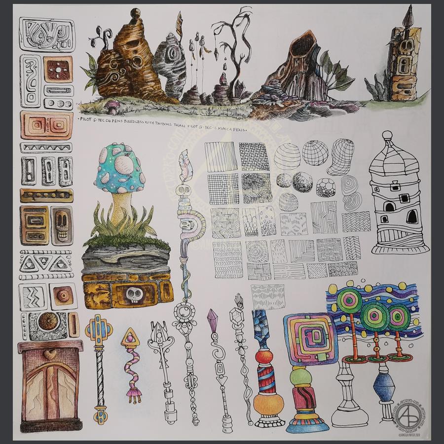
Over the past week or so I’ve been gradually adding to this sketchbook page. It is entirely what a sketchbook should be, in my opinion. Pages full of ideas, sketches, unfinished drawings, practice of techniques, written notes… a visual zibladone for the creative soul!

It is a reflection of what is catching my attention in my world. That world encompasses the inner worlds of imagination and emotion, as well as the outer world of books, nature, architecture, photographs, and so on.

This page includes inspiration from Mayan glyphs/sculpture, rocks, nature, mushrooms, magic wands/staves/sceptres, pen textures and some inspiration from Hundertwasser.

Everything on the page is a bit wonky (not perpendicular), and I’m OK about that – it’s a sketchbook! But then wonky art, particularly colouring pages, seems to be part of my signature style. Perfectly straight lines just don’t look right to me, nor do sharp corners. Perhaps that’s why I like Hundertwasser so much.

The English gardener William Kent said, “Nature abhors a straight line”. Hundertwasser said, ” The straight line is godless and immoral.”

A sketchbook is always a work in progress (WIP), even when every page is full, it’s full of incomplete drawings and ideas, sketches and notes, jottings and doodlings. Nothing has to be perfect. Not a single thing.

A sketchbook is a place to try things out, experiment, just see what happens. With that comes an acceptance that not everything will work out, and where surprising things happen and discoveries are made that may otherwise never happen.

Sometimes the gems of ideas and colour combinations and ways of using media remain hidden until much later. A sketchbook is a place to practice and learn, to note down what is of interest at this time, what needs to be expressed, without any pressure to produce a finished, polished artwork.

That doesn’t mean, however, that a sketchbook can’t be something interesting to look at, even with it’s own kind of beauty. They are a reflection of the artist that creates them and so is a window into their arty heart and feelings. They are very personal things.

A sketchbook encourages me to use media that are gathering dust because I do so much art digitally. In a physical sketchbook, if I want any colour, then I have to use some of these media.

On this one page I’ve used Pilot Hi-Tec C4, Pilot Maica, Rotring Rapidograph and Uniball Unipin pens. To add colour, watercolours, Tombow Dual Brush pens, Derwent ColorSoft pencils, Derwent Procolour pencils, Derwent Inktense pencils have been used.

Capsules, Pods and Seeds

©Angela Porter | Artwyrd.com

I had a very fitful night’s sleep (or non-sleep) last night. So, around 5:30am I decided to get up and ‘art’.

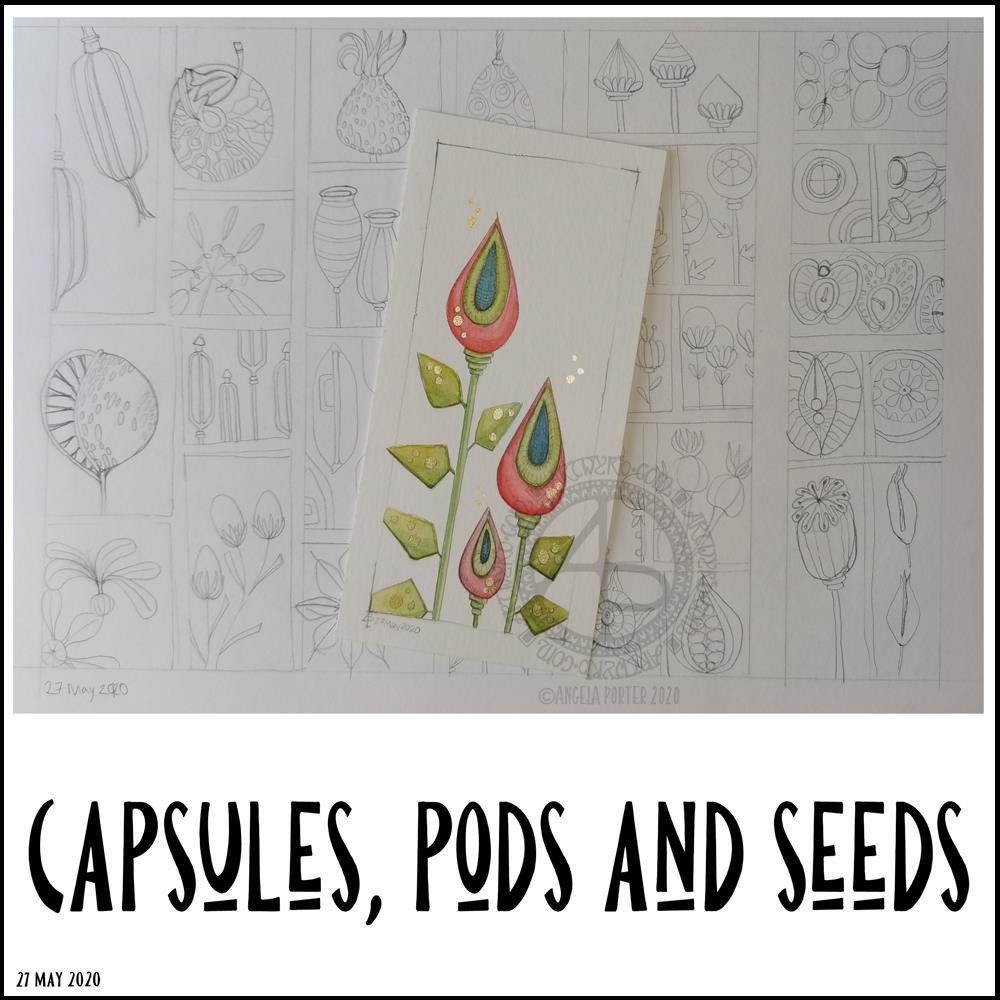
I finished off the watercolour of some seed capsules.

I’m really, really happy with this watercolour illustration, with an unusual color palette for me. I smile when I look at it! I decided to use a 0.5mm HB pencil to add heavier lines to the more shadowed parts, as well as a little bit of subtle line to help give the pods some volume. It’s difficult to see on the image.

I am so happy I drew a ‘window’ on the paper to draw within. I’m never happy drawing without a frame to keep within and the edge of the paper just never feels right for me. I also like the way that it feels like you’re looking through a window and that it’s OK to cut things off (apart from one cheeky leaf that I just had to have overlying the frame!).

There may be a bit too much white space above the seed capsules, I don’t know for sure. It’s so unusual for me to leave space around the various elements in a design that it feels a bit weird. However, I do like the space in this illustration.

Once I finished the watercolour, I turned my attention to drawing more capsules, pods and seeds in my A4 sketchbook. I completed two pages of small drawings, one of which you can see in the background.

Unusually for me, I drew in pencil. I’d usually use pen straight away. I have no idea what that is about, but it was a pleasant and soothing experience for me. I now have plenty of sketches I can use to create more watercolour paintings from, small ones as I really enjoy working on a small scale. Creating my own little treasures, complete with some precious, metallic details.

Painting little treasures will have to wait though. My eyelids are becoming leaden with a need to sleep. This frustrates me as I had things I wanted to get done today, things that need focus and concentration. So, I’ll soon be back in the land of nod.