Draw With Me – Part 2 – Adding texture, pattern and colour to circle motifs

Click on this link to view the video that accompanies this image on YouTube.

I felt the need to spend some time adding more pattern and texture to some of these abstract, stylised circular (ish) motifs. First, however, I added some colour to most of them. I used Ecoline Brush Pens which contain Ecoline watercolour ink. The colours are very intense and vibrant and so I use a water brush to add them to my drawings. I listened to Andy Serkis’ reading of Lord of the Rings while colouring before starting to video.

Water-based media do vex me somewhat. However, I’m beginning to see how the textures that can be achieved with them make interesting backgrounds behind the patterns/textures drawn in pen.

It was fun to experiment with dropping colours and/or water into the first layer of watercolour ink and watch them spread and mix. It’s a kind of magic and is totally mesmerising. The paper I’m using, Canson Imagine mixed media paper, isn’t the best for this, but it’s adequate. Time to dig out the watercolour paper again for sketchbook exercises like this I think.

It was a lovely way to spend a couple of hours this Saturday morning. I don’t know when I’ll add more pattern/texture with pens, or possibly metallic inks or paints with fine brushes, to the remaining motifs. What I do know is it will be both explorative and intriguing and mesmerising and magical, and I’ll work out my relationship with all these mediums a little bit more.

And, perhaps, have a better relationship with colour!

This is one of the important functions of sketchbooks. Yes, I often do complete, polished, finished drawings in them. But finally working out that I can also practice, experiment and ‘art’ just for enjoyment in them is a bit of a revelation. One that I’m enthusiastic to share!

It’s also lovely that, through the medium of YouTube, I can ‘teach’ and encourage others to do the same. Hopefully, I make things clear and simple. And increasing someone’s confidence, the willingness to give it a go and see what happens without judgement, just learning from the experience. Sometimes the lesson to be learned is that it’s a relaxing process, a break from the outer world that can bear down on us. Other times it is trying out media or colour schemes or just practising.

I’m sure I’ve not given a comprehensive list! One of the most important things is that, just like a diary, no one ever has to look inside your sketchbook, unless you choose to share.

Creativity is part of being human. Working out the ways to express that creativity, what expresses a part of the inner self, is part of who we are. Art is one way to do that, and the only person we need to compare ourselves to is ourselves! As we journey and try things out we find out who we are by discovering who we are not. And it’s a journey that never ceases!

Sketchbook Musings

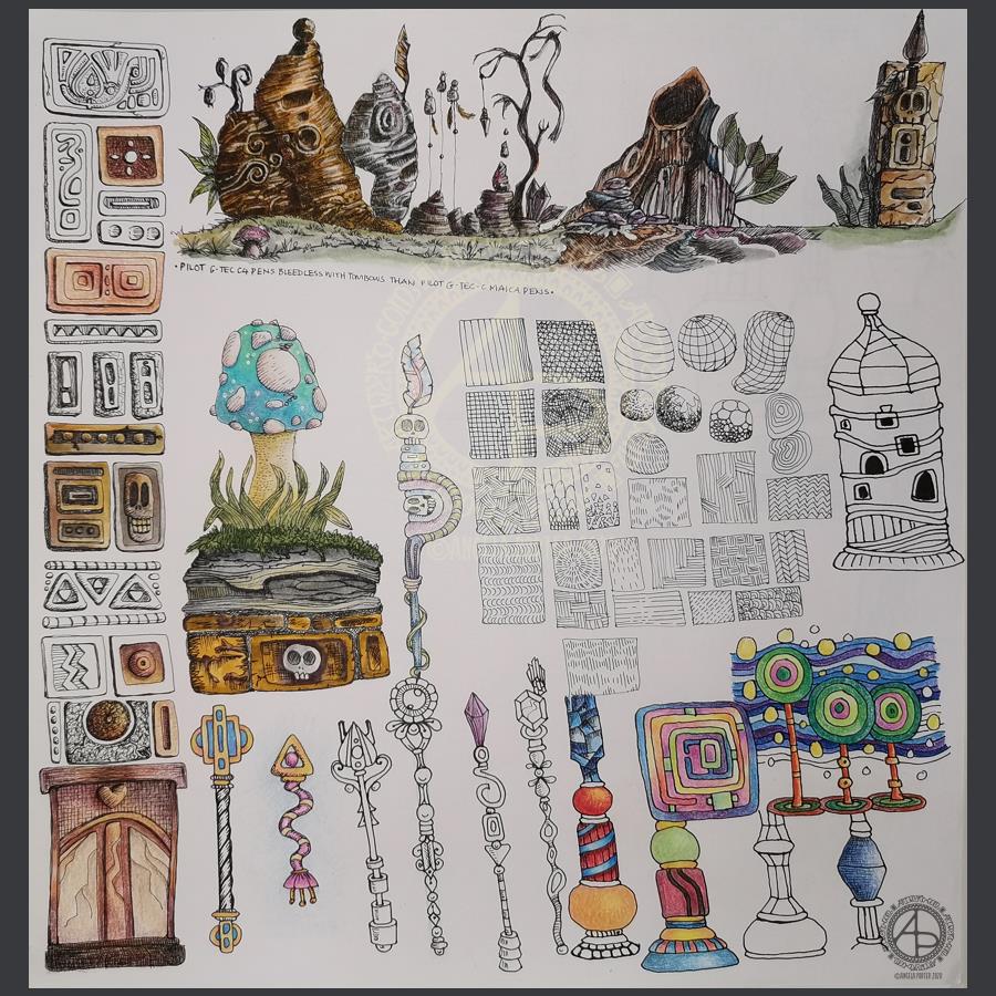
Over the past week or so I’ve been gradually adding to this sketchbook page. It is entirely what a sketchbook should be, in my opinion. Pages full of ideas, sketches, unfinished drawings, practice of techniques, written notes… a visual zibladone for the creative soul!

It is a reflection of what is catching my attention in my world. That world encompasses the inner worlds of imagination and emotion, as well as the outer world of books, nature, architecture, photographs, and so on.

This page includes inspiration from Mayan glyphs/sculpture, rocks, nature, mushrooms, magic wands/staves/sceptres, pen textures and some inspiration from Hundertwasser.

Everything on the page is a bit wonky (not perpendicular), and I’m OK about that – it’s a sketchbook! But then wonky art, particularly colouring pages, seems to be part of my signature style. Perfectly straight lines just don’t look right to me, nor do sharp corners. Perhaps that’s why I like Hundertwasser so much.

The English gardener William Kent said, “Nature abhors a straight line”. Hundertwasser said, ” The straight line is godless and immoral.”

A sketchbook is always a work in progress (WIP), even when every page is full, it’s full of incomplete drawings and ideas, sketches and notes, jottings and doodlings. Nothing has to be perfect. Not a single thing.

A sketchbook is a place to try things out, experiment, just see what happens. With that comes an acceptance that not everything will work out, and where surprising things happen and discoveries are made that may otherwise never happen.

Sometimes the gems of ideas and colour combinations and ways of using media remain hidden until much later. A sketchbook is a place to practice and learn, to note down what is of interest at this time, what needs to be expressed, without any pressure to produce a finished, polished artwork.

That doesn’t mean, however, that a sketchbook can’t be something interesting to look at, even with it’s own kind of beauty. They are a reflection of the artist that creates them and so is a window into their arty heart and feelings. They are very personal things.

A sketchbook encourages me to use media that are gathering dust because I do so much art digitally. In a physical sketchbook, if I want any colour, then I have to use some of these media.

On this one page I’ve used Pilot Hi-Tec C4, Pilot Maica, Rotring Rapidograph and Uniball Unipin pens. To add colour, watercolours, Tombow Dual Brush pens, Derwent ColorSoft pencils, Derwent Procolour pencils, Derwent Inktense pencils have been used.

Hand-drawn typography practice

This morning, I decided to leave portraits alone for a little while. I woke with the idea of using typography to fill some typography!

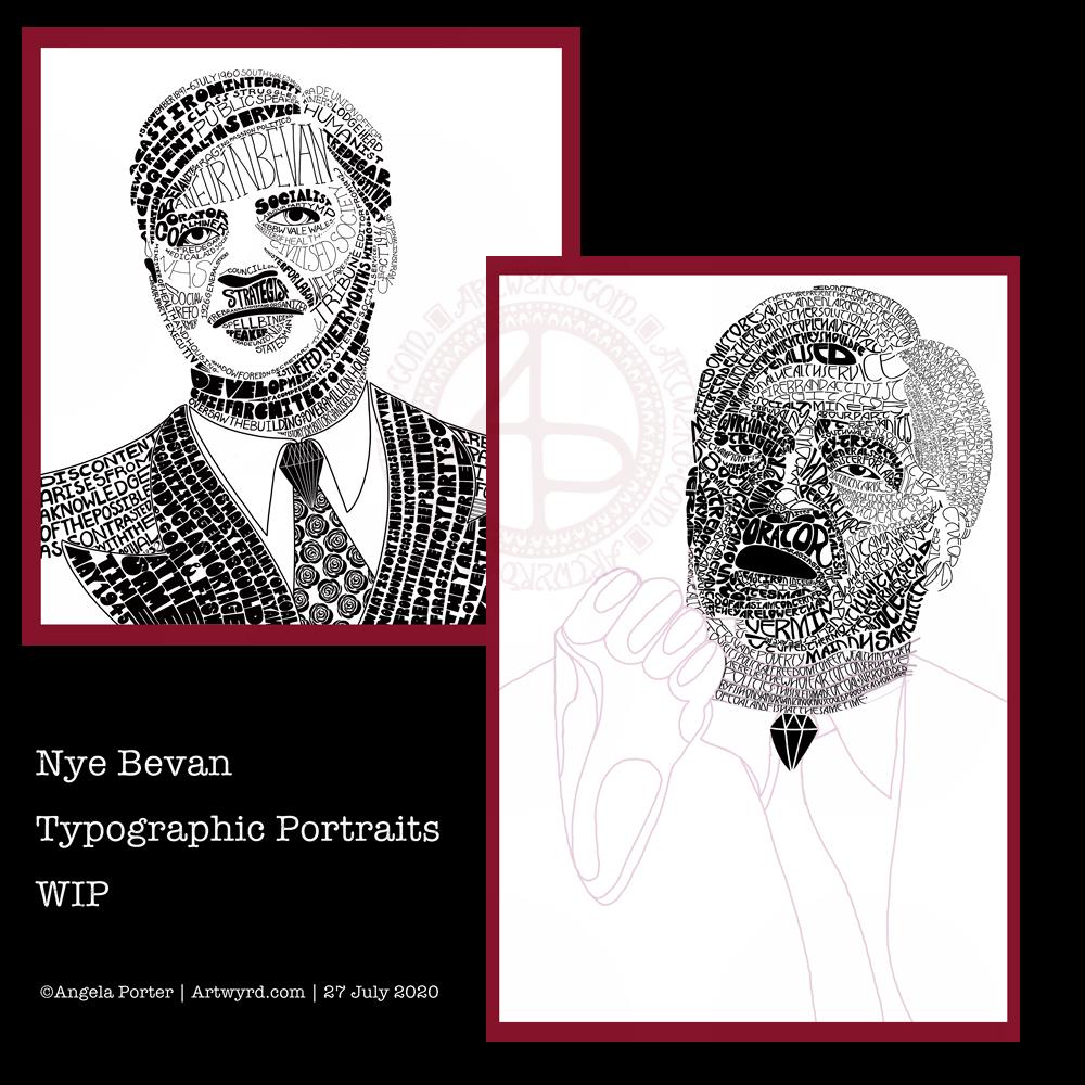
So, I drew the outlines of ‘Nye’, for Aneurin Bevan. I then used wavy lines to split the outlines into interesting sections. Then, I pencilled in some quotes by Aneurin Bevan. This let me adjust size/ spacing so that the quotes fit and made sense. In some places I’ve stretched the letters as there wasn’t enough space for the next word. I could’ve made all the letters in the line wider, but thought the wider letters would add some interest and flow. Of course, I now realise I could’ve stretched some letters at the start of the lines too, but I can always do that as I ink in the lettering.

Anyway, my next step was to scan the sketch into Autodesk Sketchbook Pro so I could do the inking digitally, and you can see what I’ve done so far. I do need to adjust some letters, like the B at the start of the line I’ve started to ink. I will also need to go back and clean up some of the edges of letters.

It’s a nice project for me to do today. I didn’t sleep at all well last night; I was up and down to the loo. I had a sudden attack of anxiety yesterday, a really intense one. The pilot light on my boiler had gone out and I couldn’t light it, so I had to arrange for a breakdown visit. There was the stress of ‘what if they can’t fix it’ as well as a stranger in my home for the first time since most probably February.

Panic mode! And it didn’t abate all day, no matter what I tried to do. This kind of anxiety/stress always hits me in my digestive system, so it was an unpleasant night for me.

All needless of course. The gas engineer arrived this morning and he lit the pilot light first go. And it’s stayed lit. I felt like a right numpty. However, all is well, as I have now booked it for a service too.

I’m still feeling on edge, as well as really tired. So, working on a portrait wouldn’t be the best idea for me as at the moment they are frustrating and overwhelming me.

So, I thought I’d go for some hand-lettering or hand-drawn typography practice. Just practice. No pressure. However, the idea I had may turn out to be a fairly good one. Maybe.

Typographic Portraits WIP

I’ve been working on another portrait of Nye Bevan while I take a break from the first one. I really think I’ve gone over the top with detail in this one. I wanted to do one of him in one of his typical oration-giving stances, but I really do feel I’m messing it all up. I really think that’s because I am trying to get too much in the way of quotes into the portrait.

So, I’ll be going back to the drawing board (or in my case, the Surface Studio screen) to try this one again.

Having said that, I’ve had a lot of hand lettering /hand drawn typography practice and have played around with the brush settings to find one that will work for me!

I also have just noticed that there’s not much differentiation between the different weights of text in the second version, and that adds, I think, to the more confusing appearance of it.

I was struggling with the values of the gesturing fist in the second image. So, I put the photo into Affinity Photo and used the Posterise tool to simplify the areas of shade for me. There’s still a personal interpretation to be done on how I translate these areas into spaces of text.

Hands, feet and faces. These were always the parts of humans I struggled with when doing life drawing.

Drawing typographic portraits is a new endeavour for me. I’m learning, experimenting. One of the main lessons I have to take away today is to not over complicate such a portrait! But there is a fine balance betwixt having enough detail to capture the essence of the person, and having too much so that the essence of who they are is lost.

The first portrait I did, on the left, does look better, but I do think it lacks a bit of detail in the face.

The second one, on the right, is way too busy!

So, my task is to find that point where less really is more.

So, I’ll take a break from them, again, and regroup and try once more!

Watercolour Practice

Yesterday, after taking a walk and getting a few bits and bobs done, I settled down to spend some time with watercolours.

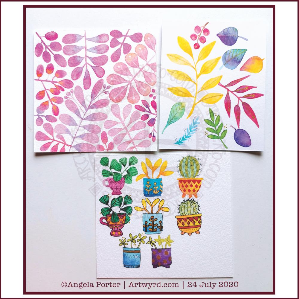
Each piece of paper is approx 4″ square. The top ones were just playing around with foliage, wet into wet, and adding some details with metallic ink, a gold glitter gel pen and a white Souffle pen. I just wanted to see how the different details could add to, or mess up, the watercolours.

I do like the one on the top left. It satisfies my inner need to not leave much in the way of white space.

The bottom image was me trying out painting plants in pots – the top row with very faint pencil guidelines and the middle with Pitt Artist pen outlines in black. The bottom two were comparing like ot like with black outline and pencil outline.

I had trouble with the details in the first two plants in pots on the top row. That was when I thought I’d try the black outlines.

I’m really not sure which I like most, or if either of them really work out.

I’m rather tired and headachy, again, today. I think that I’ll soon be going out for a walk. It’s another overcast and cooler day with a breeze. I love to walk on days like this.

October’s Bujo Spread

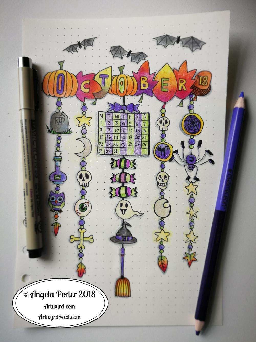
Angela Porter October BuJo Spread 2018Can you believe it? September is just about all and over with. Time does seem to be flying by at the moment.

This was a really quick bujo spread due to me being away last week.

It’s also a very messily coloured one. I can tell I’ve barely wielded a pen in the last week! Talk about shaky and wobbly and lacking the fine skills I had.

Goes to show you gotta keep working it daily, even if it’s for a short while.

Mind you, I have new glasses and getting used to them is going to take a little while. For work, I have ‘occupational varifocals’. This means the lenses gradually change from intermediate distance at the top to reading distance at the bottom. I didn’t get to use them much last week, so it’s going to take a little while and some practice with them.

I also have varifocals of the usual kind (distance, intermediate and reading). They’re great if I’m sitting down and out sketching, or drawing, or knitting and watching TV. I find them a bit disconcerting for walking around and going up/down hills or stairs or twisty turny ways they cause me to feel a bit dizzy. I know my problem is that I have really good peripheral vision and there’s a part of the varifocal lens on the outside and innermost areas that causes fuzzy vision.

So, yesterday I took my favourite pairs of glasses which double up as sunglasses (they’re very cleverly designed to have removable polaroid lenses that look like they’re part of the glasses, which essentially they are) to have single vision distance lenses put in them so I can use them for walking around and driving. I can drive with the varifocals, but that fuzzy bit bothers me.

Anyways, I have a lot of practice to do with drawing in the next day or two before I return to my next Entangled Coloring book. I’m half-way through the templates and I have some lovely reference photos from my trip for the next ones, including some ideas inspired by Forbidden Corner, maybe.

Back to the BuJo spread. I drew the design on dot grid paper using Sakura Pigma Micron pens and coloured in with Chameleon pencils.

I like the design, not fussed on my colouring skills today that’s for sure.

What theme should I go with for November? Remembrance, bonfires, fireworks…feel free to leave suggestions!