ICAD2020 Day 02 Marigold

#DYICAD2020 #ICAD2020 – Day 02 – Marigold

I took an index card and used Dried Marigold and Bundled Sage Distress Oxide inks to colour it. I spattered on water to create some bleached spots. Then, I edged the card with Ground Espresso Distress Ink.

I knew I wanted to draw a marigold, which is what I did. In fact, I drew a few. The large one is a French Marigold (Tagetes sp.). The others are pot marigolds (Calendula sp.)

All the drawings are quick, loose, sketchy ones using an 04 Sakura Pigma Sensei pen. I did use a pencil to roughly sketch out the flowers.

As the theme for week one of the ICAD2020 challenge is typography, I added some hand lettering. I also looked for a couple of quotes about marigolds, which I hand lettered.

Finally, I added a wash of iridescent orange and yellow watercolours to the flowers, sage-y green to the leaves. I also added some graphic lines in iridescent orange to the letters. And I couldn’t resist spattering some of the iridescent paint on the card itself.

I think I may add the ICAD2020 creations into my journal, or maybe make one from them as time goes along. No need to make a decision today, I’m not really thinking straight at the moment.

Experimenting with watercolours

I woke with another raging headache this morning. So, some art was in order until the pills kick in and I can sleep the dregs of it off.

I thought I’d try some ways of adding texture and interest to watercolour backgrounds.

Putting some clingfilm (saran wrap I think it’s called in the US) onto wet watercolour creates a lovely texture. It’s not easy to see but I used it on the pieces at the top middle and top right. This is something I will definitely be experimenting with going forward.

I also tried salt again, on fairly damp, less damp and almost dry. The darker pink tile under the Marigold ICAD was where I added salt to rather damp watercolour and the blooms are just beautiful.

I also tried using white gouache. I spattered it onto a couple of tiles, but I also used it mixed with water to paint into wet watercolour. It adds a really interesting effect, the opacity of gouache looking intriguing against the transparent watercolour.

Finally, I used a straw to blow drops of watercolour around. That was a lot of fun and really created random, abstract patterns.

I added these to my journal with notes on how I achieved the effects so I can reference them in future. Today, I may not remember much about what I’ve done, all thanks to the dratted headache. All due to stress/anxiety/worry yet again.

Mixed media index cards – 5 June 2017; my own library of digital drawings

AngelaPorter_5June2017_MixedMediaIndexCard1

Mixed media index cards

Two index cards worked on over the last day or two.  The focal points are shells I drew, first on paper, then the image was worked on on my Surface book with Autodesk Sketchbook Pro and my Surface Pen,

I had to use scissors to cut out the shells (not my favourite task as I’m not good with scissors) after I’d coloured them using the Chameleon Color Tones and Color Tops marker pens.  I’m really pleased with the colouring.

Lots of different techniques/media were used on the index cards – stamping, stenciling, inktense pencils, distress inks and distress oxide inks, pebeo dyna paints, perfect pearls sprays, gesso, clear holographic embossing powder from WOW!

I’m happy with them, though I’m not sure they’re quite finished, especially the little one.

Digital drawing library

I’m beginning to build up a library of my own digital drawings – fungi, flowers, shells at the moment, oh and one angler fish skeleton that I’ve not used yet (but that’s an idea for later or tomorrow maybe).

I have to decide if I put these images together as packs of ‘digi-stamps’ for sale…I’m really pleased with my shells here, but the fungi have worked out fine too.  With my limited scissor skills, I’m keeping it in mind I need to keep the outlines relatively simple, but the inside of the design can be rather detailed, which is fun.

Mixed media index cards – 3 June 2016

AngelaPorter_3June2017_MixedMediaIndexCard1

Two more index card done!

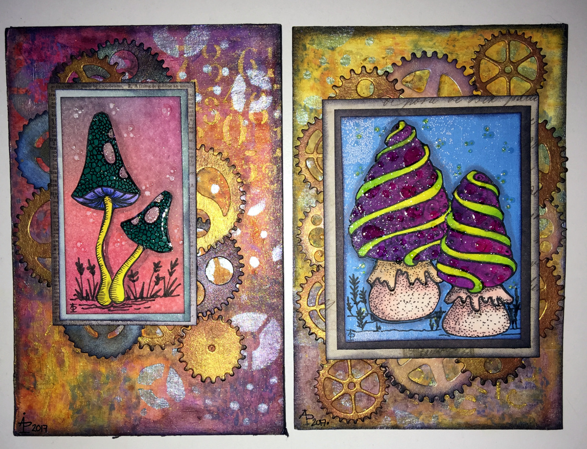
I drew the fungi then coloured them with the Chameleon Color Tones and Color Tops pens.  Cogs have appeared in the background once again – gotta have a lil bit of steampunkishness!

I’ve used 3D Crystal Lacquer on the fungi caps and on the stars in the background.

I’m liking the slightly bigger format of the index cards compared to ATCs.

Yesterday’s Mixed Media Index Cards – update

AngelaPorter_1June2017_MixedMediaIndexCard4

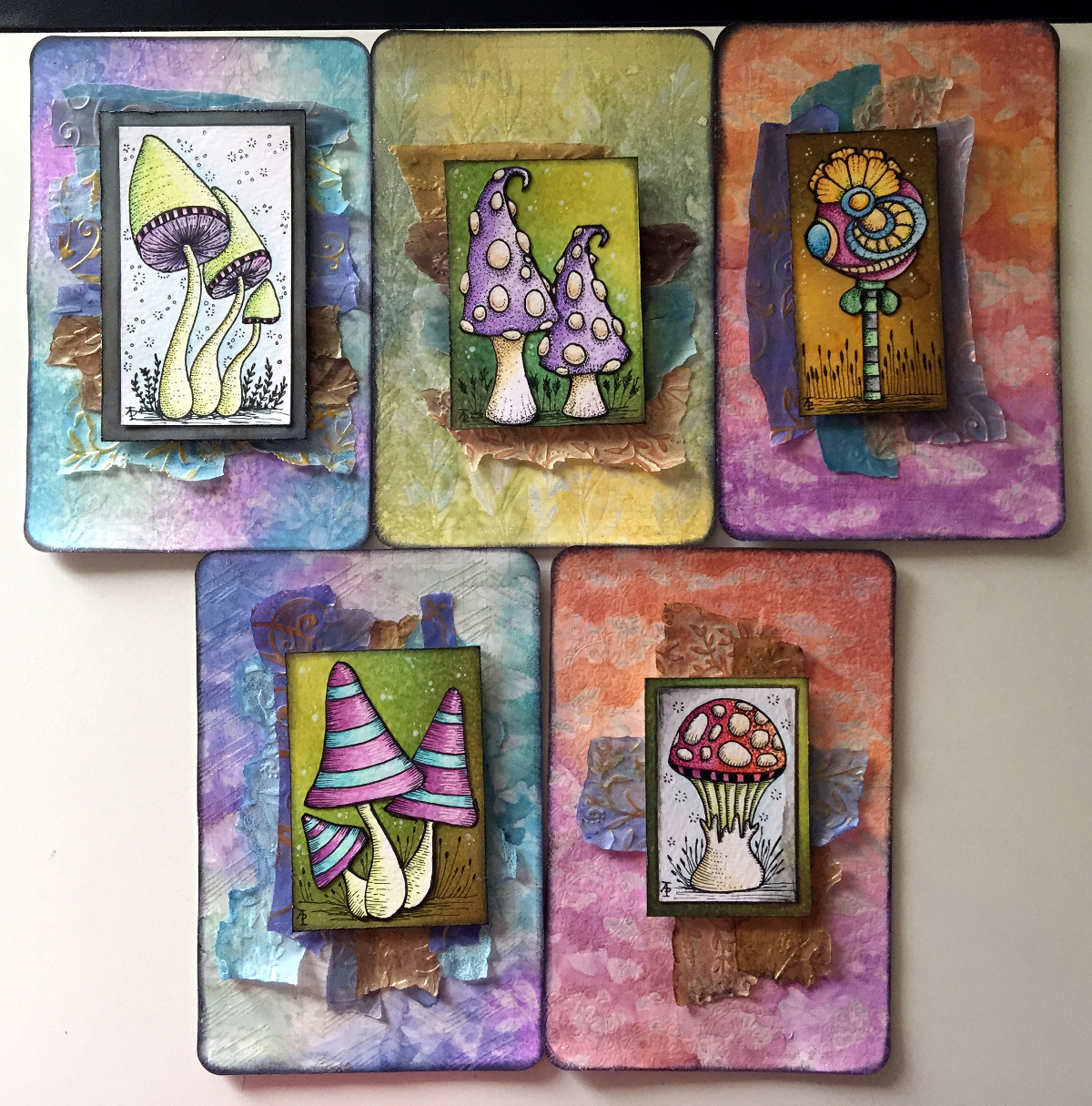
I spent some time yesterday and this morning adding some details to drawing on each of the index cards.

I added stippling and lines to add shading on the focal points, both in black and white.

I also added some ground for them so they weren’t floating in air; the grasses or plants in the background I wanted as black silhouettes just so interest/texture/pattern was added.

Finally, I added either white dots or black ‘popping bubbles’ to the ‘sky’ for more visual interest.

I’m now much happier with them and feel that they are complete.

Mixed media index cards

AngelaPorter_1June2017_MixedMediaIndexCard3

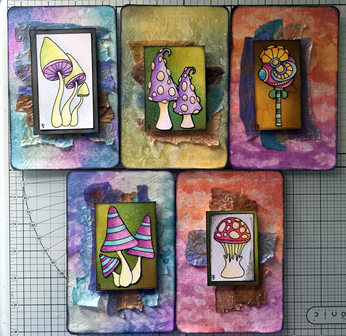
I started these 5″x 6″ cards yesterday and finished them (I think) this morning.

The focal images I drew myself on watercolour card.  I used Caran D’Ache Supracolour watercolour pencils and a damp brush to colour them.  I was quite happy with the colouring; I do find pencils a lot easier to use than traditional watercolours.

Nex, I cut three of them out around their edges and used a black marker to colour the white edges (and disguise my poor cutting out skills).  I had to use a craft knife in a couple of places.  The other two I cut out as small panels.

The drawings are a little bare of detail, mabye, but I can go back and add detail once I’ve decided what I’d like to do.

I’m not all that happy about the torn paper behind the focal images; you try things out and learn, maybe.  The torn paper is Gelli printed tracing paper made using PaperArtsy Fresco paints.  I then ran them through my Sizzix Big Shot in various embossing folders, and on some the embossed images have had some metallic waxes gently brushed over them. I also added some Inktense to the papers to darken the edges and add shadows.

What I am really happy with are the index cards themselves.

I started by covering them with gesso.  Then, I used some foliage stamps from IndigoBlu with grey Archival Ink by Ranger to add patterns.  I really liked this, as the patterns were softer and already ‘ghostly’ in the background, a much better choice than black Archival.

My next step was to add colour using ink blending sponges and Distress Oxide inks, followed by a spray of Gold perfect pearls mixed with water.

This is where there was an unexpected effect – the wet Distress Oxides were repelled from the Archival ink.  I loved the result, as well as the way the colours mixed as they pooled around the stamped patterns.

Here’s a close up where you can see how the Archival Ink has repelled the Distress Oxide inks:

AngelaPorter_1June2017_MixedMediaIndexCard1

Then, I used Versamark Ink to stamp more foliage on some of the cards, and mini-mandala type patterns on others.  I then sprinked WOW Embossing powder (clear holographic) over the ink then melted it with a heat tool.  This added an extra layer of interest – a subtle layer as it can only be seen from certain angles.

I framed the cards using black Archival ink and a foam blending tool to give a distressed looking edge.

Then, it was just assembly of the focal points and so on, before sticking the index cards to some really thick card to get them nice and flat; the cards are so thin that they curl a lot when working on them, even with the layer of gesso to seal the card in.  Cosmic Shimmer’s Specialist Acrylic Glue worked beautifully for this.

I had intended to make more ACEO cards, but I drew the focal images a tad too big for that format, so thought I’d try out an index card instead.  I quite enjoyed working on the slightly larger scale.