The difference colour makes…

The difference colour makes © Angela Porter 2019 - Artwyrd.com
The difference colour makes © Angela Porter 2019 – Artwyrd.com

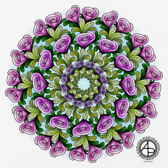
This morning, I wanted to do a small drawing (the bristol board is approx. 10cm x 21cm) and try not to get overly fussy and trying to fill every space in. I used fountain pens to draw the line work, and I’m using Autodesk Sketchbook Pro, a Microsoft Surface Pen and a Microsoft Surface Studio to add colour to the design.

I’ve often said it on the Angela Porter’s Coloring Book Fans facebook group that the members work some fantastic magic in using colour to bring my drawings to life. And they do.

So, I’m working a little of my own magic here!

I don’t often colour my own art in – time constraints can limit me in this. Also, I love drawing so much and it takes me a lot less time to draw a design than it does to colour it. I can safely say I’m quite prolific when it comes to drawing, not so when it comes to colouring.

I’m also colouring this relatively small and less detailed design to fathom out the mysteries of the synthetic brush setting. I think I may be getting the hang of it and how I can make it work for me.

I actually like the less than perfect finish I’ve achieved, which has surprised me for sure. I actually really like the slightly battered feel to the orange pods in the artwork.

I’m usually obsessed with perfectly smooth colour gradients, whether achieved by digital tools or by more traditional methods of blending (whether working with traditional or digital media).

A good friend of mine (yes, you know who you are if you read this) did tell me when I bought my first Microsoft Surface a couple of years ago that it would open ways for me to create art and develop my artistic skills. It certainly has, and continues, to do that for sure.

I am aware that it’s quite a slow process where I’m concerned. Yes, I could go and watch and read tutorials on how to use the various brushes and settings.

I’ve tried that. The information given totally overwhelms me.

Being easily overwhelmed by information or sensations is something that is part of my cPTSD. If I get too overwhelmed, I tend to either walk away, end up in a panic or become fearful to face something again.

However, I do get a sense of satisfaction out of working out or discovering something for myself, when I actually need that something. Once I’ve become confident and comfortable with a particular skill, I’m then ready to discover more add more skills to my personal skill/tool box.

I never stop learning, discovering, and finding new ways to express myself creatively. I may no longer try to use a huge range of different media – my default these days is definitely digital. I don’t think there’s anything wrong in that. No doubt I will dabble with new kinds of media or creative skills from time to time (such as my toe-dipping into paper quilling; it’s not at all my kind of thing, but I had to try it to find out).

I still love drawing with pen on paper, but being able to scan that in and add colour digitally means I can make the best of both worlds. I can also keep all the little imperfections and smudges that result from drawing with pen and ink on paper, that add that more human touch to them, if I wish. Or I can draw digitally, keeping things clean and a bit more perfect. Either way works for me.

And so I finally overcome my own personal stigma concerning digital art vs traditional.

Therapy day!

It’s Monday so it’s EMDR day for me. I have no idea what the session will bring for me.

What I can say, though, is that though last week’s session was rather emotional and distressing, I seemed to recover quite quickly from it. By Wednesday I’d returned to a state of some contentment and that has mostly stayed with me since then.

I do know I have a busy week with anti-stigma talks for Time to Change Wales being given tomorrow, Wednesday and Thursday, and then a double talk next Monday. As well as working on templates for the newest coloring book for Dover Publications Inc, I need to make sure I have time to look after myself and not avoid the feelings I may have after EMDR today.

I also know I have a busy week with other commitments too…

At least there’s some sunshine today, even though there are some big, puffy, grey and white clouds mostly covering the sky. There’s plenty of breaks in the clouds.

Rosy Mandala

© Angela Porter 2019 - Artwyrd.com
© Angela Porter 2019 – Artwyrd.com

A simple mandala today, with some very stylised rose-like buds in shades of pink and purple. Just two colours of foliage too. Something a little pretty today.

I used my Microsoft Surface Pen, Microsoft Surface Studio and Autodesk Sketchbook Pro.

RedBubble account

I now have an account at RedBubble – Angela Porter | RedBubble.

I have just two images up there at the moment – the recent Daffodil Mandala and the Dragon with Daffodils. Both are available on a range of quality products including wall art and stationery.

My Journey to cPTSD Recovery

Today, I’m feeling more content and settled than I have for a number of weeks. Even though EMDR floored me on Monday, I seem to have been able to find my balance faster than previously. This is a good thing as I do have a contract to fulfil by the end of the month.

I am writing in a journal most days, particularly any insights I have through the day. They seem to be coming more quickly now I’m working on seeing where I’ve told myself a story to avoid any emotional or mental pain. I know this is a coping strategy that people with CPTSD use to protect themselves. However realising this, that I may have avoided the truth of a difficult, traumatic experience or situation makes me feel really stupid. Realising that this is a coping strategy I learned at a very, very young age doesn’t help stop me feeling stupid. There’s also a lot of guilt too as I’m stuck between the story I want to believe, the one that is nice and pleasant, and the truth of the emotional and mental distress I was experiencing and denying I was experiencing. It’s not an easy place to be in. It also makes me quite sad and teary that I’ve done this all my life.

Realising these kinds of things, no matter how painful they are, is part of my journey to recovery from CPTSD. I won’t stop though. To do so would mean I would have to live with the pain the realisation has caused me without any way of dealing with that pain. So the only way is to face up to these things, process them in EMDR and find a way to a healthier relationship with myself, to find a way to become a friend to myself.

Entangled Art – Transition

Transition © Angela Porter 2019 - Artwyrd.com
Transition © Angela Porter 2019 – Artwyrd.com

Yesterday I had some fun drawing some postcard sized pieces of Entangled art. Especially fun as I stumbled across a book I’d bought some years ago and had forgotten about. The book is “Zibu – The power of angelic symbology” by Debbie Zylstra Almstedt.

As it says, the book contains loads of symbols with different meanings and I think that’s what drew me to the book in the first place. It was nice to stumble upon it and it seemed to be a moment of synchronicity as I was thinking about what I could put on the postcards, so this was perfect!

Transition was the first symbol I turned to, particularly symbolic for me as I’m going through a transition via my CPTSD healing journey. And in the book, the author suggests aquamarine and green are colours that go with this particular symbol, so that’s the choice of my colour scheme.

I drew the design on an A6 sized piece of Bristol Board using Sheaffer and Pilot medium point pens. After scanning the design in I coloured it digitally using Autodesk Sketchbook Pro, a Microsoft Surface Pen and a Microsoft Surface Studio.

I found both the drawing and colouring rather peaceful processes, the colouring made more so as I wanted to stick to the green and aquamarine colour scheme, though I did sneak in some greyish blue and greenish yellow.

It won’t be long before I head off to Neath for my weekly EMDR session. The day is gloriously sunny and is due to be rather warm for a late winter day. I’ve a window or two open to let the fresh but cool air into my home. This weather certainly does lift my spirits somewhat. I plan to go early so I can have a walk around before my appointment later this afternoon, as well as a leisurely lunch with some journaling and drawing too.

A simple mandala

©Angela Porter 2019

Yesterday was very much a quiet, self-care day. Today, I’m feeling better in terms of energy and concentration.

This mandala was a product of yesterday’s quiet downtime doing art for arts sake. Though it was this morning I thought I’d like golden outlines to the design rather than the usual black. It took me a while to get my head around doing that!

I like the way I’ve repeated the simple spiral pattern in three layers. Keeping the colour palette simple has also worked nicely for me, even though the combination of colours is an unusual one for me. The colours remind me of cacti with flowers and a soft, golden sun.

I could mention that green is about achieving balance, the red is the energy I need to stoke up on, but a softer, more gentle kind of motivational energy. Golden sunshine is the healing I see. The way the spirals flow outwards and are unfurling suggests growth , springing forth from seeds long lain dormant in the ground of my soul. There’s hints of buds ready to bloom there too. Maybe the golden background and lines are suggesting that I am worth more than I think I am, that I do deserve better.

Oops, I have mentioned that! But somehow this mandala seems to show how I’m progressing in my recovery from cPTSD.

Now how’s that for an insightful piece of art?

No matter whether you agree with the interpretation of the mandala or not, it was definitely a calming and soothing experience, both the drawing and colouring.

It is a piece of digital art. I used my usual Microsoft Surface Pen, Microsoft Surface Studio and Autodesk Sketchbook Pro to create this mandala.

Tomorrow is Time to Talk Day

©Angela Porter 2019

I’ve created two coloring templates for Time To Talk Day, which is tomorrow, and the art above was created using one of them, but more about that later in this wittering.

Time to Change Day and mental health

The whole idea of the day is to get people talking about mental health. Mental health problems affect 1 in 4 of us, yet people are still afraid to talk about it. There’s still a huge stigma surrounding mental ill-health and that leads to discrimination of those experiencing mental illness.

I’m one of the 1 in 4. My cPTSD means that I am constantly anxious and it’ doesn’t take much of a trigger to get me into a full state of panic. I can have bouts of depression, nowadays not as deep or dark as they have been in the fairly recent past. I get emotional flashbacks to times of trauma. I don’t remember many traumatic experiences, but my body remembers the feelings associated with that trauma and I experience them yet again, retraumatising me.

Thanks to EMDR, however, these emotional flashbacks are less common and sometimes aren’t quite as intense, sometimes just as intense.

I have a whole host of other issues related to cPTSD and a quick google will bring back lots of information if you’re interested.

Tomorrow I will have my champions hat on for Time to Change Wales as I go to give an anti-stigma talk to a group of police officers in Ton Pentre and then on to man (woman?) a stand in Port Talbot after that. That means I won’t be parking in the police station car park again after my last experience there!

The anti-stigma talk has me telling people a little about Time To Change Wales, the statistics for mental illness, what stigma and discrimination there are and then I tell my story of my mental illness.

The talks wipe me out emotionally. I end up exhausted and often with what I call an emotional ‘hangover’ – I feel headachy and spaced out, sometimes quite upset too.

However, I consider that a small price to pay if my talks (and my blogs) help one person to recognise their mental health isn’t what it should be, or to find the courage to seek help as they know they are struggling.

It’s also important as meeting champions who have experienced or are experiencing mental health problems helps to break the stereotypes of what people with mental illnesses look like and behave.

I’m well on my path to recovery. I don’t know if that will be a full recovery from cPTSD or whether it will be a good enough recovery that I’m resilient to lifes ups and downs, that I’ll be able to form meaningful relationships, trust people, be able to travel by myself, be able to go places because I can go there not because I have to have some reason…and more.

I know that crowded, noisy places are always likely to be a no no – I don’t appear it, but I am an introvert. I learned to wear a mask of extroversion (among other masks) when I was very young and that mask kind of protects what is beneath it. Wearing that mask is exhausting.

So, back to the art.

I’ve created two coloring templates for Time to Talk Day 2019. Originally they were for the colouring day being run as part of Time to Talk Day at the Welsh Office! I’ve also made the templates available to Time to Change Wales and Mind have copies of them too, so they’ll be available over social media.

I’ll also be adding them to my facebook page – Angela Porter Illustrator as well as on the Angela Porter’s Coloring Book Fans facebook group too.

To create the art above I used one of the templates as a basis for the art. I think you’ll agree that this is a very different piece of art from me. It’s rather graphic and quite 1960s psychedelic too!

I had a lot of fun doing this artwork and I’m surprisingly happy with the result.

It is digital art; I used my usual trio of Microsoft Surface Studio, Microsoft Surface Pen along with Autodesk Sketchbook Pro to create it, along with my creativity.

February dangle design

©Angela Porter 2019

Friday is dangle day here in my arty world, and as it’s the first day of February the dangle needs to relate to that!

I created this design for members of the Angela Porter’s Coloring Book Fans facebook group (where today is furbaby friday). If you pop over then, join, then you can download the template to colour yourself.

The world is still in the grip of winter; I woke up this morning to a coverlet of snow covering everything. Yet again, I’m am so grateful that I work at home and don’t have to go out until it clears, even if that takes a day or so.

I wanted the colours in the dangle to reflect winter, but I also made Valentine’s Day a focus for the design, and I used that as an opportunity to include some more bits of hand lettering.

I did sketch the design out on Rhodia dot grid paper then scanned it in. I then re-drew the design digitally using my usual trio of Autodesk Sketchbook Pro, Microsoft Surface Pen and Microsoft Surface Book.

Today, I have a template or two to create for a colouring day at the Welsh Office in Cardiff on Time to Talk Day next Thursday. Time to Talk Day is the day where we’re encouraged to talk to people about mental health and well being. I don’t have anything to do on this day for Time to Change Wales, yet, or at any point in the week. I do have other projects to work on as well.

My own anxiety seems to have slid back to it’s usual constant background level after a stressful time earlier this week. It takes time. Mindfulness meditation helps somewhat, but it does take time for those stress response chemicals/hormones to leach out from my body even when I calm myself down.

Doing art does help too.

My book that takes you through drawing and designing dangles step by step – A Dangle A Day – is now published. Lots of ideas and examples of dangle designs are included in the book.

C is for … dangle design

Angela Porter C is for 10 Nov 2018

I don’t know what’s occurring with WordPress, but the colours of this particular dangle design aren’t quite so grey and dull. I’ve noticed over the past couple of weeks that when I upload an image the colours change. Never used to do that…

Anyways, today’s dangle design was fun to draw and I chose to use a different color palette than is usually for me. It’s not more pastel, it’s more subdued perhaps. I actually quite like it, which has surprised me!

I do tend towards bright colour palettes, bright and vibrant. For me to choose a more subdued one is very unusual, but it’s something I think I may work with more now as I rather like this one.

Also, I’ve chosen just  7 colors that I’ve used tones/shades of – cool grey, cool violet, antique pink, a blue-green, a yellow-green, soft blue-grey and old gold tones.

Again, using just a few base colors rather than a whole host of different colours is not my usual way of working. What I’m beginning to realise about this is that it gives a much more cohesive look to the finished design. With the colours being more subtle, it also gives a much more grown-up even, dare I say it, more sophisticated look to what is a rather simple and whimsical kind of design. It particularly works well with the monogram ‘C’.

In fact, the cute kitty is really the only whimsical element of this design. The others are simple, yes, but not quite so cute and whimsical. However, I wouldn’t remove the kitty-cat as cats are the theme of this series of monogram dangle designs.

I’ve said it before that I really struggle with seeing my art as others see it. I often think my art, like this, is rather childish, simple, unsophisticated, naive with no real artistic value at all.

This is part of how I think of myself and it’s part of my CPTSD. I’m working on it. For me to recognise that I’ve done nice things, things I feel proud of is a step or two forwards. However, there’s that nasty inner critic that does its best to derail any positive thoughts I may have about myself or the things I do.

Anyways, onto the nitty gritty of how I created this dangle design.

The steps I took were:

  1. sketched out the design on dot grid paper
  2. scanned the sketch into Autodesk Sketchbook Pro
  3. used a technical pen ‘brush’ to ink in the design
  4. worked out the color palette I wanted to use
  5. coloured the design, in this case using gradient fills for speed
  6. added shadows to the design
  7. created a drop shadow
  8. created a coloured background
  9. added texture to both the design and background

I sketched the design out last night, and it took me between 2 and 3 hours to complete the steps above as this is a relatively small design.

If you’d like to learn how to create your own dangle designs, then my upcoming book ‘A Dangle A Day’ is a good place to start. You can pre-order it so it’s arrives on it’s release date in January 2019.

Autumn mandala 6 November 2018

Angela Porter Mandala 4 Nov 2018

This has taken me a couple of days to complete, mainly because of appointments but also a big need for some self-care.

Autumn Mandala

I don’t get to create many mandalas at times. So, On Sunday, after creating the cute angel kitty dangle design, I put my creative energy into drawing and starting to colour a mandala.

I worked directly on my Surface Studio screen with the Surface pen using Autodesk Sketchbook Pro and it’s fab symmetry tool to outline the the design in black ink.

Next, I used a marker brush and a blender brush to colour the design.

It’s the colouring that takes a lot of time.

I wanted to keep the colour scheme fairly simple, so I chose some vibrant shades of blue, green, yellow, orange and red.

Finally, I added a beautiful blue background and texture to the finished artwork.

On the whole, I’m quite pleased with it. The bright colours have been needed today as it’s a rather grey and damp day here in the Valleys of South Wales. Someone has a bonfire burning on the hillside opposite my home and the smoke is floating down the valley. There’s a temperature inversion that’s trapping the smoke quite low.

Add to that all the smoke and particulates from the plethora of fireworks that have been set off in the past few days and the air is rather fuggy, hazy.

However, the golden hues of the autumn trees glow all the more brightly against the grey skies, especially with a dusting of rain on them.

What I absolutely love to see are the dark trunks and branches becoming more visible as the leaves fall from the trees. The architectural contrast fascinates me; it’s being able to clearly see the skeleton that gives the tree form.

I didn’t have autumn in my mind when I was drawing or coloring this mandala, even though autumn is my favourite season. However, the jewel tones and the gradual predominance of the autumnal golds, oranges and reds on the outside of the mandala give it that kind of autumnal feel. The greens gradually change from blue-greens to more yellow-greens from the centre out, adding to that sense of a seasonal progression.

The coloured mandala also has a feeling of stained glass. I love stained glass windows and this one would make a very interesting ‘rose’ window! That I adhere to using black lines to delineate my design only reinforces the suggestion of stained glass.

What I haven’t done is add detailed patterns to the mandala. I don’t think this one needs it, though the leaves may need a bit of shadow and highlight to make them feel less ‘flat’.

On the whole, I’m quite pleased with this one. I think I’ve manged to get enough contrast from dark to light in each section to give that sense of dimension – something else I like to incorporate into my artwork.

The need for self-care

I’ve been rather emotional over the past few days. The post about remembrance and my Dad tapped into some grief, a door that had never opened before I had to say goodbye to my beautiful white cat Cuffs back in May.

I took time out of things to watch some Harry Potter films. I do get emotional when I watch them (or read the books) even though I know what’s going to happen. However, this weekend I was more emotional than I’ve been before.

Yesterday, was EMDR therapy day, and various memories had cropped up and one we worked with yesterday. That left me absolutely pole-axed, emotionally that is.

Part of my mental health – the CPTSD – is that I avoid emotions and when I get emotional I have shoved it aside and locked the emotions in a box, symbolically. I also shove the memories away, something referred to as dissociation.

I have very few memories of my childhood, adolescence or even adulthood. That’s because many of them are painful in some way or another and they have been locked away.

Locking them away means I have never worked through, processed, them and the trauma or emotions that go with them. The trauma is still there and is still hurting my emotional and mental health.

EMDR is helping to unlock memories, sometimes very painful memories I don’t want to believe happened or believe certain  things about people. I always want to see the best and believe the best in people, except when it comes to myself; then, it’s always the worst possible.

I’ve been experiencing some cognitive dissonance and some very uncomfortable times as I try to come to terms with various realisations.

Add into the mix a busy week or so with appointments and events and I’m emotionally tired. Oh, not to mention the constant jumpiness with all the fireworks going off.

So, self-care is important. I watch films. Knit. Drink lots of tea. Snuggle up under a cosy throw. Nap if I need to. Eat healthily, when I can. Create art that I want to create rather than any that I feel I have to to meet a contract or some deadline or other, either real or self-imposed. Have some alone time – being an introvert beneath the face I present to the world I need alone time to recharge.

I know I’m on a jolly tomorrow with my pal Liz, so it’s even more important I recharge before that day out.

So, that’s why I’ve needed some self-care time.


Dangle Day Friday 21 September 2018

Angela Porter Dangle Day 21 September 2018

It’s Friday, so that means it’s #dangleday!

A simple, elegant design with a sweet sentiment for this week’s dangle design. I like the symmetrical nature of the dangles.

I did sketch the design out in pencil on dot grid paper which I scanned in to ink in digitally and make use of the symmetry tool in Autodesk Sketchbook Pro. I also coloured and added texture with various brushes in Sketchbook. Naturally, I made use of a Microsoft Surface Pen and Microsoft Surface Studio to do this.

I kept to a really simple colour scheme, using just one pink, golden, blue and green colour gradient for the design, with the exception of the rainbow beads in the central dangle.

It would be really easy to put a different sentiment or greeting in the box, but I like this one.

A different colour scheme, of course, would result in a very different ‘feel’ to the card, matching all kinds of seasons and occasions.

This would make a lovely greetings card or note card. I think I’d like to use it for the beginning of each month in a BuJo, planner or diary, changing the colour scheme as appropriate for that month. I do like playing with themes for my BuJo, but there’s something in me that likes a cohesiveness in design/style.

What would you do with this design? Let me know by leaving a comment.

Of course, I could print the uncoloured version out and colour with different media. It would be no great chore to re-draw the design on paper more suitable for, say, watercolours, where my printer doesn’t cope with decent quality watercolour paper.

Just a little reminder that my book ‘A Dangle A Day’ is available for pre-order, just click on this linkIn the book I give help, guidance and advice on creating your own dangle designs, as well as providing many examples of monogram dangles and dangle designs that you can use for your own projects.

Abstract Botanical 16 September 2016

Angela Porter 16 September2018

Another abstract botanical. Here are the steps I took in creating it.

  1. Draw the black and white line art design on dot-grid paper from Rhodia using Sakura Micron pens.
  2. Scanned the drawing in, removed the dot-grid, removed noise and created a transparent background in GiMP opensource photo editing software.
  3. Imported the image with a transparent image into Autodesk Sketchbook Pro and added colour and texture.

It took a couple of hours to draw the design and several hours to colour and so on.

My digital tools are a Microsoft Surface Pen and Microsoft Surface Studio.

I love the way many of the elements seem to glow against the dark green-blue background.

Many of my latest works like this seem to have an ocean, watery background going on. So, in the one I have on the go at the moment I’ve done a kind of sunset background. I’ll see how that turns out. Working digitally means I can alter my backgrounds really easily for sure.

I’ve been creating backgrounds digitally, but I want to create some on paper with Distress Inks and scan them in to use instead of the digital backgrounds.

I also made use of a more limited colour palette in this work – going for a more cohesive look/feel. These aren’t colours I’d normally choose to go together, but they seem to work fine.

I now have a fair few of these images and so now really need to try to work out what to do with them. I may try to import them into Repper and create repeating patterns from parts of them; that could be an interesting exercise for sure, but a fun one!

If you have any ideas of how my artwork could be used, leave a comment – I’d love to hear!