Wednesday is WIP day! WIP is work in progress, and this is one of my current one.
I’m working on A4 (29.7 cm x 21 cm) Claire Fontaine Paint-On mixed media paper with 05 and 01 Uniball Unipin pens.
It’s taken several hours so far, and there’s several yet to go! I’m enjoying creating such detailed drawing in just black and white. Lots of botanical elements, but there’s also arches and spirals and geometric patterns in there too.
I never have much of a plan in mind when I tackle a drawing like this. I know what patterns I like, and if I lack inspiration I can always refer to my visual dictionary or design motifs and patterns. It’s all about intuition. It’s not entirely mindless. I do make conscious decisions about what design element to use, how to use line and pattern to add volume and contrast.
I sometimes wonder, when I see my work like this, why I try to work with colour. I always feel I struggle with colour, but black and white, with or without grey, always seems to work so well for me.
I love to play with the illusion of volume in a drawing, and whether that is done with density and shape of line/pattern, or with colour (even though I really do feel I struggle with colour).
I will persevere with this illustration, drawing, artwork over the coming days. In fact, I may spend time on it today. I’ve completed my morning errands, so I can remain at home, which is where I need to be. I’m tired today; I didn’t sleep at all well last night, or for the past few nights and my mood and ability to concentrate is suffering as a result.
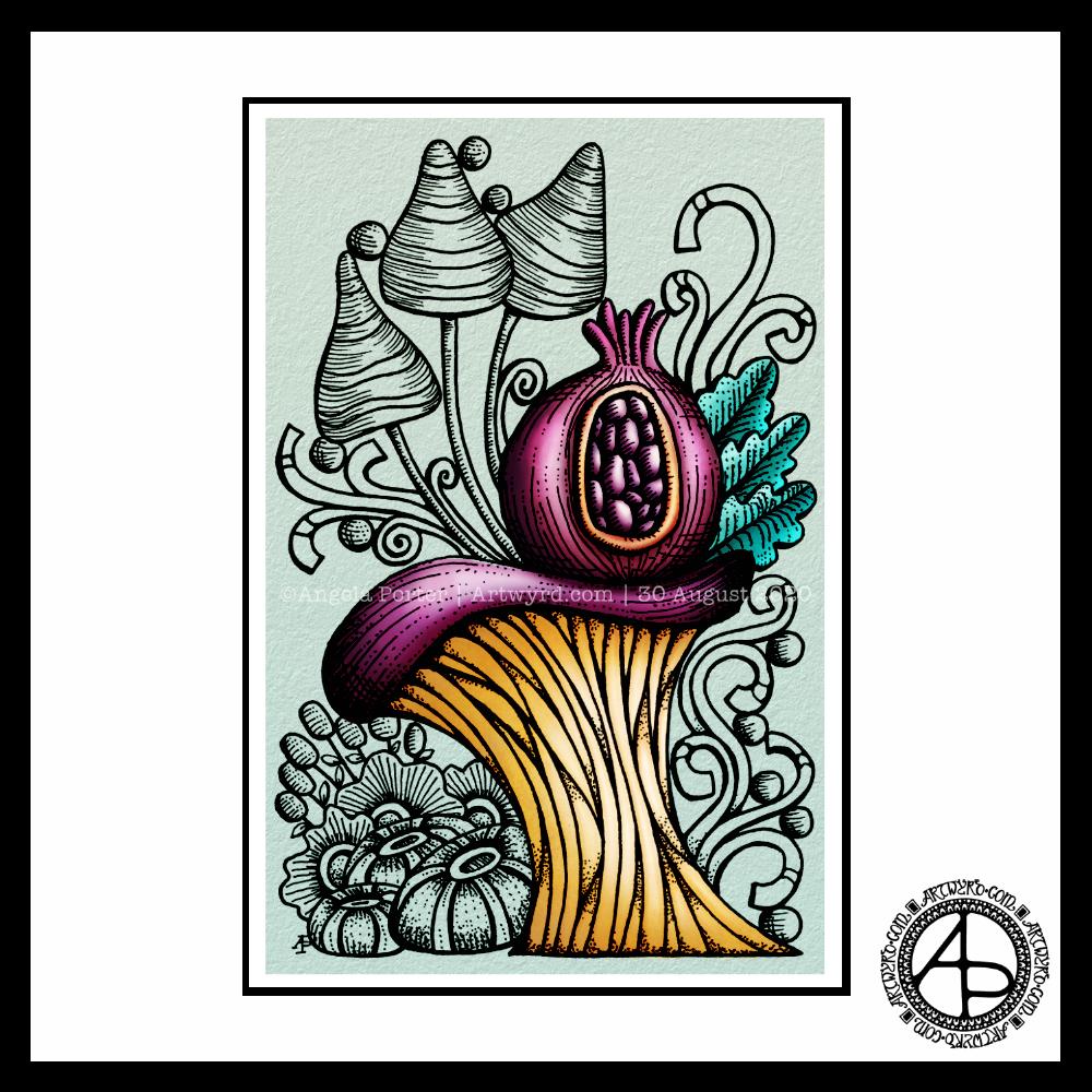
Today, I thought I’d digitally colour one of my recent drawings. I thought it would be nice to compare and contrast digital colouring with traditional colouring.
It’s been a while since I did much art digitally, I’ve been lost in traditional media this week as I slowly heal from some emotional wounds. Art helps with healing. Meditation helps too. But time is still needed for the healing to take place, and for rest to relieve the exhaustion that lingers still.
Any kind of art, digital or traditional, soothes my mind, emotions and body.
What I like about digital art is the way I can get such high contrast in colours to enhance the sense of volume the design elements have. I also like the vibrancy of colours. I also like the ability to add texture to the colour in so many different ways.
Of course, I like the ability to alter colours when they don’t work, without having to start over. I’m not sure if those leaves are going to stay that particular green-ish colour. Nor am I sure about the background colour.
As is my wont, I’ve used Autodesk Sketchbook Pro to add the colour and textures. My hardware is a Microsoft Surface Studio and Surface Slim Pen.
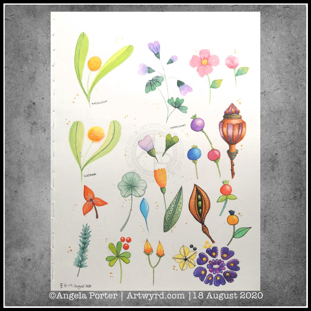
More art therapy was required yesterday and today. This time I messed around with watercolours and botanical motifs.
Some I like, some are hideous, but all resulted in me finding some calm amidst a maelstrom of emotional and mental pressures being exerted against me.
Although I’ve not yet tried to express my emotions via colour and pattern today, working with motifs from nature is soothing in it’s own way.
Perhaps there’s more of me expressing my needs in creating botanical art. I do feel the need to be out walking where there is nature. With Covid19 still doing the rounds, my places of choice are cemeteries; so few people visit them and I feel safe there in a way I don’t feel safe in nature when I’m by myself.
So, as it’s fairly overcast and there’s a good breeze, I’ll head out as soon as I’ve completed my social media stuff for the day.
Materials and method
I used mostly watercolours, but I did try out the Inktense paint palette I received yesterday for one motif. For some of the motifs I used a faint pencil outline. On others I darkened that outline once I’d painted the motif. And I tried black outlines using a Signo DX 0.38 pen on some others. I also used white Signo gel pens to add highlights. Finally, I splattered some gold watercolour over the page, and added some bigger dots of gold.
Oh, I worked on one of the smooth textured pages in my A4 Arteza watercolour journal.
The calendar page turns over and we’re into a new month.
August always heralds the end of summer and start of autumn, my favourite season. It is the last full month of summer here in the Valleys of South Wales. The evenings come noticeably earlier, always a sign that the year is continuing on its endless cycle of seasons.
We have a grey, damp and blustery start to the first day of the month. There are shafts of sunlight finding their way through gaps in the clouds, but there’s a deliciously refreshing snap to the cool and fresh air after the night-time rain.
I thought I’d create a really simple mandala design for the start of this month, one that is full of warm colours, but that hint of autumnal tones in the background.
I kept things simply stylised in the design. If nothing else, working on it made me smile, inwardly as well as on my lips.
I woke early-ish today and did some work on one of the typographic portraits I’ve been doing. Then, in my rush to get to the shower, I clicked the wrong button and lost my work. Thankfully, it’ll be easy enough to do it again. I also think that with the version I’m working on, I’m finding my way with the process. I have a lot of the portrait left to do, but I feel less frustrated with it and have a clearer idea of what I’d like to achieve now I’ve taken a few days break from this kind of work.
Before I settle back to the typography, I am going to take a walk in the fresh air of the morning. Well, after I’ve done my social media posts!
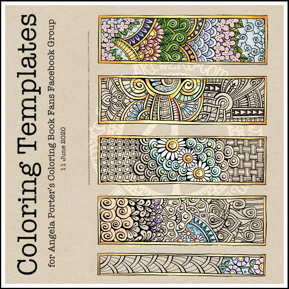
This week’s coloring template is a series of bookmarks. A member of the Angela Porter’s Coloring Book Fans facebook group said they’d like some designs that could be used as bookmarks, and so I went with the suggestion.
The designs are typically ‘Angela’ and ‘entangled’. I used a Tombow Fudenosuke along with an 04 Pigma Sakura Sensei pen to draw the designs. After scanning and cleaning up, I’ve partially coloured the designs, as well as adding a pale kraft paper background.
To use them as bookmarks, I suggest printing them on some card. If that’s not possible, then gluing the whole sheet to some card and then cutting out the book marks would make them sturdier. Of course, a laminator could prove most useful in preserving your beautiful coloring, as well as making really long lasting book marks that could be given as beautiful gifts, or used to mark the coloring page you’re working on too.
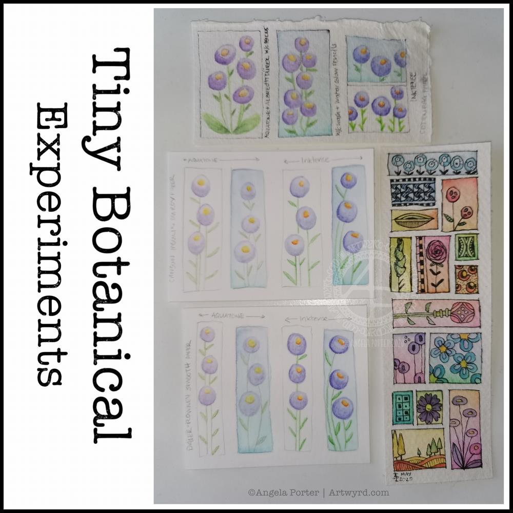
I thought I’d start Sunday morning off with some experiments with my tiny botanical drawings.
I apologise for the photograph quality – I’m really not a good photographer, something I really do need to work at! The pale colours really don’t help at all.
The artwork on the bottom right is one where I applied rectangles of watercolor on 100% cotton rag paper. Then, I used Sakura Pigma Micron pens to draw designs in the windows. Finally, I added some watercolours to the designs to help bring them forward from the background.
I don’t think I messed the drawings up at all, which was my worry. Mind you, I do have to be careful what colours I do add so I don’t make weird colours.
That led to me wanting to try watercolour pencils and Inktense pencils on different watercolour papers: top – 100% cotton rag paper middle – Canson Moulin du Roy paper bottom – Daler-Rowney Smooth watercolour paper.
On each paper, I drew four rectangles, two of which I coloured with a wash of watercolour.
I used the same colours of Derwent Aquatone and Inktense pencils to draw the stylised/abstract floral design and a waterbrush to activate the pigment. I did my best to apply the same amount of pencil in each case. However, I noticed that the papers grabbed different amounts of pencil even though I was using the same kind of pressure.
The amount of pigment grabbed, however, wasn’t at all indicative of how vibrant the colours would be.
The 100% cotton rag paper seemed to have the smallest amount of pigment from the pencils, yet it gave the most intense colours of them all. This paper is quite ‘hard’ in feel and very textured and I was surprised it didn’t seem to take as much pigment. Appearances are deceiving it seems. This paper also allowed me the longest ‘wet’ time to move the coloured pencil pigment around, and to lift some of it where it had got too intense.
The Moulin du Roy paper was a softer texture and it was lovely to colour with the pencils on it. The resultant drawings have a soft quality to them too that I rather like.
The Daler-Rowney seemed to grab the most pigment, yet the colours are not as vibrant, except the for the Inktense on the watercolour background. I think that’s because the watercolour background was still very slightly damp and Inktense pigment activates with the tiniest amount of water. I also think that’s why this one was the hardest to blend the colour smoothly. This was the paper that was the hardest to add the watercolour background to as it dries so darned quickly, or water just puddles on the surface with a tiny bit more water.
The cotton rag paper is, again, my favourite for working with watercolour and Inktense pencils. The vibrancy of the noticeable too – much less pigment is needed to get a rich colour on this paper.
For the other two papers, I did enjoy drawing the flowers on the plain paper and activating the pigment with a waterbrush. I partiuclarly like the Moulin du Roy paper for this technique, though the Daler-Rowney gave a pleasing result on the plain paper.
I have been really enjoying drawing tiny botanicals in little ‘windows’. So, I combined drawing with watercolor practice.
The image on the left involved me using a pencil to draw the boxes and their contents, then watercoloring. For some, I tried painting the image in sections and with layers of colour. I really wasn’t happy with the results. I painted the rest of the boxes with washes of watercolour and then either inked or re-drew the designs in pencil. I felt happier with these.
I used Daler-Rowney Smooth watercolour paper and I’ve been struggling to get the paper to stay wet enough for long enough to mix colours wet in wet. Not even on these tiny little windows. It was becoming very frustrating.
A couple of days ago, I’d ordered a pack of 100% cotton rag paper and it arrived early evening. I used a small piece of it for the illustration on the right.
I started by painting rectangles of colour on the paper. I used a waterbrush rather than a paintbrush for this. I used the same kind of transparency of watercolour for each as I did for the illustration on the left. Oh my gosh, did the colours shine and show up so much more vibrantly! Not only that, it was so easy to mix colours, wet in wet. The cotton rag paper is an absolute joy to work with!
I was beginning to get frustrated with myself and watercolors once again. This has been a common feature of my love-hate affair with them over many years. This paper may change that totally.
This morning, after letting the paper dry, I drew tiny botanicals in each window. I used, as in the image on the left, a 005 Sakura Pigma Micron pen to draw with. I was worried it would struggle with the paper’s rough texture. The lines aren’t as uniform as they’d be on, say, smooth Bristol board. I just went with the rougher nature of the lines and was surprised at how much I enjoyed them. They meant I loosened up my drawing style a little.
I really enjoyed creating these little artworks (the one on the left is approx. 5″ x 5″, the on on the right 4″ x 4.75″). There is something I find really satisfying about creating teeny tiny drawings, in the same way I find drawing intricate designs makes something inside me smile.
What I do want to try later on today is adding some more colour to some of the design elements on both drawings using both watercolours and watercolour pencils or inktense pencils. On second thoughts, I think I’ll do some samples to experiment on, annotate and add to my journal, just in case I don’t like what transpires.
Before I do any of that, I woke with a headache. It’s beginning to shift, but as it lifts it’s leaving me feeling really tired.
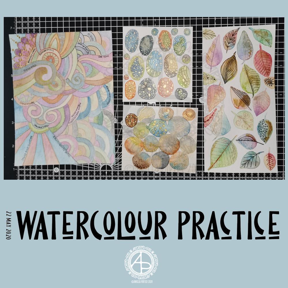
Yesterday was another day where I got lost in watercolour practice – unintentionally! I had planned to do some editing of drawings for ‘Entangled Gardens’. However, time ran away with me.
Panel 1
The first panel I completed was the one with leaves on. They do have plenty of gold metallic/iridescent watercolour paint along with traditional paint, though it doesn’t show up in the photo.
I tried different ways of adding details to the leaves – Faber-Castell Pitt Artist Pen (F) and metallic watercolour and brush. I find the black pen either too black or I used too thick a point. The metallics in a red-copper, gold and grey-black were more sympathetic to the colours of the leaves, in my opinion.
Panel 2
The next panel I created is the one at middle bottom. I made circles of watercolour and let them touch while wet so there was some flow of colour from one to another. After they’d dried I used a fine brush and both watercolours and metallic watercolours to add line and pattern to it.
I enjoyed making this one very much. I used some quite earthy colours that are unusual for me. The line and pattern added a lot of interest, though I did wonder if I’d covered up too much of the underlying watercolours.
Looking at this with fresh eyes today, I think it shows through just fine. I want to try using metallic paints that are complementary to the main colours in the watercolour to see how that works out.
Panel 3
This is the one at the middle top. I created ovals of watercolour, again using unusually muted, earthy tones.
Once they’d dried I used some Caran D’Ache Luminance coloured pencils, well sharpened, to add patterns to each oval. I used the variation in colour/tone to help me add the patterns, as well as to choose the colours of pencils I used on each oval.
Finally, I used a yellow-green metallic/iridescent watercolour paint to fill in some of the patterned areas.
I enjoyed making this panel too. Again, I thought when I finished it that the pencil lines were a bit thick. However, after a night’s sleep and with fresh eyes I can see that it’s worked out well. I think that using coloured fineliner pens may work out better than coloured pencils – something I’ll try another time.
Panel 4
The last panel I created yesterday was the fourth panel. I used a different kind of watercolour paper, by Tim Holtz. The paint just dried so quickly on it I couldn’t really drop colours in, though the paints would re-wet and I could blend colours that way. I didn’t really enjoy using this paper.
Anyway, I thought I’d make a typically ‘Angela’ entangled style painting. I did use a raw umber Caran D’Ache Luminance pencil to draw the design on the paper. This was such a pale colour it disappeared into the watercolour sections. Again, I used uncharacteristically earthy, muted colours.
The final panel was nice enough, however, it was lacking in pattern and interest. So, I decided to use it to experiment with different ways of adding outlines and pattern to the various sections. I also noted on the panel what method I’d used next to each one.
The metallic paints and pens worked nicely and were practically or totally opaque. I prefer using a pen rather than a brush, though I’d not be averse to adding line and pattern using a fine brush and watercolour.
The gold and silver Uniball Signo glitter pens worked really nicely, and because the glitter is suspended in a transparent ink, there’s interesting effect where the watercolour shows through. I actually really like this a lot.
I couldn’t find a gold Sakura Gelly Roll pen, so I used a silver one instead. This, surprisingly, wasn’t as shiny as the Signo silver pen, but it worked just as well in terms of opacity.
I tried two white gel pens – a Uniball Signo and Sakura Gelly Roll. Both seemed to be fairly opaque, the Sakura being very slightly more so.
Finally, I dug out some really fine black pens – 005 and 01 OHTO Graphic Liners and a 01 Sakura Pigma Micron. These worked much nicer than the thicker pen I’d used on the leaf panel.
Of course, I left some areas of the panel without any lines added for comparison.
Of all the pens I tried, I like the metallic and glitter gel pens the best for this.
On reflection…
I’ve found I really like to work on a smaller scale. I feel like I’m creating small ‘treasures’ full of interest and fascination. I’m happier working smaller and more detailed than I am working on a larger scale.
I want to try coloured fineliner pens to draw patterns on watercolours.
Another experiment will be for me to use metallic and plain acrylic and other inks to draw with. I do have a glass pen that will work nicely with indian ink and writing ink. I’ll have to dig some dip-nib pens out to try with the metallic acrylic paints as well as a brush. I think that ball tools could be used to dot spots of ink onto the work rather than a brush; something else to try.
I also need to find a way of leaving a border on the page! When I draw a colouring template or other piece of lineart, I start by drawing a pencil line to demarcate the area I want to draw in, leaving a border around the line. I need to do the same for watercolour panels, either using a pencil or masking or washi tape.
Something else I’ve worked out is that I tend to use too much water when I paint, and I need to experiment with using less and trying dropping colours in when the area is at different levels of dryness.
Lots of things to try and consider.
Doodling? Really?
I see a lot of people calling the addition of line, texture and pattern as part of an artwork ‘doodling’. I don’t like doodling being used in that way.
Here are the definitions for ‘doodle’ from Dictionary.com
verb (used with or without object), doo·dled, doo·dling. *to draw or scribble idly: He doodled during the whole lecture. *to waste (time) in aimless or foolish activity. noun *a design, figure, or the like, made by idle scribbling.
When I add line or pattern to my drawing, it’s not an idle or unconscious activity. I deliberately choose what patterns and textures I want to use and where to place them. The process of adding the lines, patterns and textures may be a more mindful process if the pattern is familiar to me.
The lines, textures and patterns are used to add interest to elements of the overall design. But they are not meaningless, as implied in the words scribble and doodle, and they are anything but idle or mindless scribbles. There is purpose in them, and this is why the use of the word ‘doodle’ irks me!
What am I going to do with the panels?
The leafy panel I created to add to a tag to put in my journal. The other panels will also live in my journal, even the one with annotations, possibly with a pocket behind it for my notes and reflections!
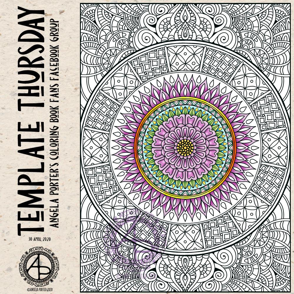
It’s Thursday again, and one more week of quarantine is behind us. That means one week of lockdown ahead of us. Feeling sad about all those who are sick or who have died as as a result of the sanctions, but the sanctions have kept others safe from Covid-19, thus reducing serious illness from the virus, or death.
As always, the template is available free to members of the group, which is also free to join. So, if you would like to colour it, meet some like-minded people, and share your colourings with us, pop over the the group and join in!
I drew and partially coloured today’s template digitally using Autodesk Sketchbook Pro. I needed to draw a mandala to soothe me. I’m tired today and feeling ‘meh’. That is reflected in my colour choices.
Just a quick bit of fun this morning. I thought it would be nice to create a little banner for my facebook account and page, and this is the result. Something a bit mystical in nature.
Digital art created with Autodesk Sketchbook Pro along with the usual Surface Slim Pen and Surface Studio from Microsoft.
I used this as an opportunity to try out some new ideas, and it’s worked out well enough I think.
Today, I’m feeling content, at ease and that inner smile is back. It’s nice, once again, to have the windows open a little and to feel the gentle flow of cooler air into my work space warmed by hazy sunlight.
Being creative certainly does help me to find and keep my sense of contentment and to keep the anxiety and fear at bay.
Now, it’s time for me to go get my breakfast. I was so determined to create this new border that I got lost in it!