Yesterday was another day where I got lost in watercolour practice – unintentionally! I had planned to do some editing of drawings for ‘Entangled Gardens’. However, time ran away with me.
Panel 1
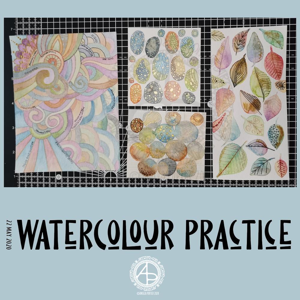
The first panel I completed was the one with leaves on. They do have plenty of gold metallic/iridescent watercolour paint along with traditional paint, though it doesn’t show up in the photo.
I tried different ways of adding details to the leaves – Faber-Castell Pitt Artist Pen (F) and metallic watercolour and brush. I find the black pen either too black or I used too thick a point. The metallics in a red-copper, gold and grey-black were more sympathetic to the colours of the leaves, in my opinion.
Panel 2
The next panel I created is the one at middle bottom. I made circles of watercolour and let them touch while wet so there was some flow of colour from one to another. After they’d dried I used a fine brush and both watercolours and metallic watercolours to add line and pattern to it.
I enjoyed making this one very much. I used some quite earthy colours that are unusual for me. The line and pattern added a lot of interest, though I did wonder if I’d covered up too much of the underlying watercolours.
Looking at this with fresh eyes today, I think it shows through just fine. I want to try using metallic paints that are complementary to the main colours in the watercolour to see how that works out.
Panel 3
This is the one at the middle top. I created ovals of watercolour, again using unusually muted, earthy tones.
Once they’d dried I used some Caran D’Ache Luminance coloured pencils, well sharpened, to add patterns to each oval. I used the variation in colour/tone to help me add the patterns, as well as to choose the colours of pencils I used on each oval.
Finally, I used a yellow-green metallic/iridescent watercolour paint to fill in some of the patterned areas.
I enjoyed making this panel too. Again, I thought when I finished it that the pencil lines were a bit thick. However, after a night’s sleep and with fresh eyes I can see that it’s worked out well. I think that using coloured fineliner pens may work out better than coloured pencils – something I’ll try another time.
Panel 4
The last panel I created yesterday was the fourth panel. I used a different kind of watercolour paper, by Tim Holtz. The paint just dried so quickly on it I couldn’t really drop colours in, though the paints would re-wet and I could blend colours that way. I didn’t really enjoy using this paper.
Anyway, I thought I’d make a typically ‘Angela’ entangled style painting. I did use a raw umber Caran D’Ache Luminance pencil to draw the design on the paper. This was such a pale colour it disappeared into the watercolour sections. Again, I used uncharacteristically earthy, muted colours.
The final panel was nice enough, however, it was lacking in pattern and interest. So, I decided to use it to experiment with different ways of adding outlines and pattern to the various sections. I also noted on the panel what method I’d used next to each one.
The metallic paints and pens worked nicely and were practically or totally opaque. I prefer using a pen rather than a brush, though I’d not be averse to adding line and pattern using a fine brush and watercolour.
The gold and silver Uniball Signo glitter pens worked really nicely, and because the glitter is suspended in a transparent ink, there’s interesting effect where the watercolour shows through. I actually really like this a lot.
I couldn’t find a gold Sakura Gelly Roll pen, so I used a silver one instead. This, surprisingly, wasn’t as shiny as the Signo silver pen, but it worked just as well in terms of opacity.
I tried two white gel pens – a Uniball Signo and Sakura Gelly Roll. Both seemed to be fairly opaque, the Sakura being very slightly more so.
Finally, I dug out some really fine black pens – 005 and 01 OHTO Graphic Liners and a 01 Sakura Pigma Micron. These worked much nicer than the thicker pen I’d used on the leaf panel.
Of course, I left some areas of the panel without any lines added for comparison.
Of all the pens I tried, I like the metallic and glitter gel pens the best for this.
On reflection…
I’ve found I really like to work on a smaller scale. I feel like I’m creating small ‘treasures’ full of interest and fascination. I’m happier working smaller and more detailed than I am working on a larger scale.
I want to try coloured fineliner pens to draw patterns on watercolours.
Another experiment will be for me to use metallic and plain acrylic and other inks to draw with. I do have a glass pen that will work nicely with indian ink and writing ink. I’ll have to dig some dip-nib pens out to try with the metallic acrylic paints as well as a brush. I think that ball tools could be used to dot spots of ink onto the work rather than a brush; something else to try.
I also need to find a way of leaving a border on the page! When I draw a colouring template or other piece of lineart, I start by drawing a pencil line to demarcate the area I want to draw in, leaving a border around the line. I need to do the same for watercolour panels, either using a pencil or masking or washi tape.
Something else I’ve worked out is that I tend to use too much water when I paint, and I need to experiment with using less and trying dropping colours in when the area is at different levels of dryness.
Lots of things to try and consider.
Doodling? Really?
I see a lot of people calling the addition of line, texture and pattern as part of an artwork ‘doodling’. I don’t like doodling being used in that way.
Here are the definitions for ‘doodle’ from Dictionary.com
verb (used with or without object), doo·dled, doo·dling.
https://www.dictionary.com/browse/doodling
*to draw or scribble idly:
He doodled during the whole lecture.
*to waste (time) in aimless or foolish activity.
noun
*a design, figure, or the like, made by idle scribbling.
When I add line or pattern to my drawing, it’s not an idle or unconscious activity. I deliberately choose what patterns and textures I want to use and where to place them. The process of adding the lines, patterns and textures may be a more mindful process if the pattern is familiar to me.
The lines, textures and patterns are used to add interest to elements of the overall design. But they are not meaningless, as implied in the words scribble and doodle, and they are anything but idle or mindless scribbles. There is purpose in them, and this is why the use of the word ‘doodle’ irks me!
What am I going to do with the panels?
The leafy panel I created to add to a tag to put in my journal. The other panels will also live in my journal, even the one with annotations, possibly with a pocket behind it for my notes and reflections!


