The new name…
Yesterday, I did a live stream on YouTube, where I tried my hand at creating collage papers, making collage and mark making. It was an interesting experience, but more about that later on.
The topic of adventures came up in my wintering and the change in title is a result. For me, art is always an adventure. I’m always trying out new things, exploring older ways of working, and developing in my artistic expression.
Adventures aren’t necessarily big trips to far away places. There are so many little daily things that feel like adventures to me- the change in light through the day, the weather, the rhythm of the seasons and stars, the humourous behaviour of my neighbourhood jackdaws. There’s also reading new books, listening to stories and documentaries, trying new dishes, listening to music that is new to me, and so much more. I have a great deal of curiosity and desire to know more about myself and the world that I live in.
It’s a good thing that an adventure can be described as new ideas and grand mysteries. It’s about enjoying the journey with no time pressure, no idea of a destination, just a desire to discover more about how I like to express myself creatively and, through that, learn more about the more profound mystery that is me.
Over the years, I’ve dabbled a bit with collage but never really found how I like to use it other than as an interesting background in a sketchbook or maybe a pleasing arrangement of papers at the edge of a sketchbook page.
I love paper, however, and want to use different kinds of paper, and perhaps fabric, in my work. However, whenever I try to, it doesn’t feel right.
All of my artsy journey has been an adventure. I try out new things and retreat into the familiar when I feel uncomfortable with art, life, and myself. But even with familiar methods, things change due to experiences. Progress is always made. Lessons are learned. Insights are gained, especially from what I don’t like about something and what can be done to ‘fix’ it.
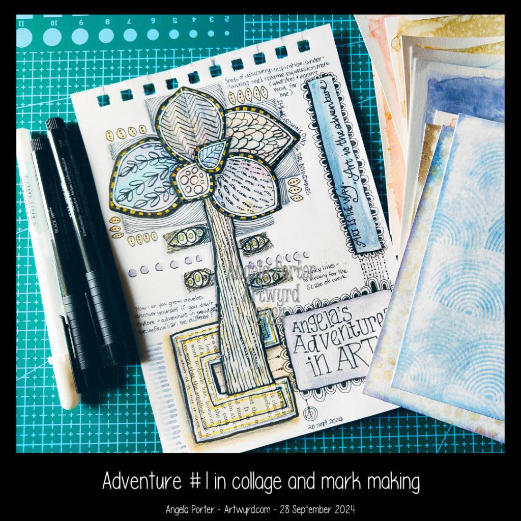
So, chatting in the live chat as I created part of this collage, the idea of my blog changed to reflect my description of how art is a great adventure. I thought of “Angela’s Adventures in Art,” but Judy suggested “Art is the Adventure.” I chose that, though I was tempted by “Art is the Way,” a bastardization of “This is the Way” from the Mandalorian.
And so, now the time is to change the name, but not the web address of my blog; that will remain artwyrd.com.
Collage
I am intrigued by collage, mark-making, and mixed media. Yet, whenever I’ve tried them in the past, I’ve usually felt disappointed in myself.
I remember looking at the collages by Juan Gris during my A Level and loving his work. I actually created a quite nice collage using his methodology. However, I never really followed it up. Yet, the distant memory still brings a sense of joy and, I think, excitement. I have problems identifying my emotions, and they are often faint to boot.
Anyway, I love the work of so many mixed media artists, and I admire their skills and creativity. Again, I’ve tried mixed media many times, and each time felt like a fishie out of water.
I’ve recently looked at collage and bought some books that demystify the process, or so I thought until I tried my hand.
I wasn’t happy with the colours. I glued papers down before I should have. I didn’t think about the scale of the page (A5) when I decided to put really thick black lines. I had to troubleshoot the mess I felt I made of the little leaves down the stem/trunk.
Today, I’ve spent sometime treating this page as a page to reflect on my experience and create a kind of journal page as a result. (Hence all the writing on the page). I’ve also added some patterns and makes in pen and watercolour.
Also, I made some more collage papers to try again. This time, I used Canson Imagine mixed media paper, as watercolours and Distress Inks work well enough on it.
I know I need to consider the size of the paper I’m using as a substrate when cutting or tearing the collage elements. The same is true for the pen thickness.
I have an inkling that my strength may be in more abstract work. Last night, I tried creating a collage that would look like a collection of buildings, but it didn’t feel right. That’s a good thing, though, as it’s something else to reflect upon and make notes on the page.
I really hope I can find my way with collage/mixed media. It will let me use my love of pen drawing, patterns, textures, symbols and stylised art in a different way. I have a desire to involve my love of different kinds of paper in my work.
At the moment, I just feel lost at sea, without a paddle or rudder, and at the whims of the currents of creativity and art.
I was dithering about showing this debacle of a collage publically. Then, I realised that if I am going to write about my arty adventures, then I need to recount the tougher, messier, unsuccessful parts.
The perfectionist and the messy debacle
I have been plagued by perfectionism all my life. I can get very disheartened when my desire for something pleasing to the eye and heart falls even a little bit short. In this case it falls, to my mind and heart, a lot short.
One thing I have learned that this is ok. I’ve learned that even if something is a messy ‘failure’ it is a success in many ways as it’s an opportunity to learn!
I certainly have a lot to learn from this particular collage mini-adventure. But the adventure isn’t over. I have some new coloured papers to use. I’m going to stick with the A5 sketchbook and work on a smaller scale and try out more abstract/stylised shapes. Keeping it simple to begin with may be a very good idea.
I like the idea of using the colours in the collage paper to be the colours used in any artwork, lettering, stitching etc.
And, if nothing else, learning that my adventure may be to discover that while collage and mixed media may not be for me, I can still enjoy the work of others. It may lead to new ideas, new techniques, a different way of deconstructing and reconstructing motifs and patterns going forward.
I can’t possibly predict how this side-adventure in my artsy adventure will work out. All I know is it will lead to interesting places with plenty of things to learn from the experiences it offers.


