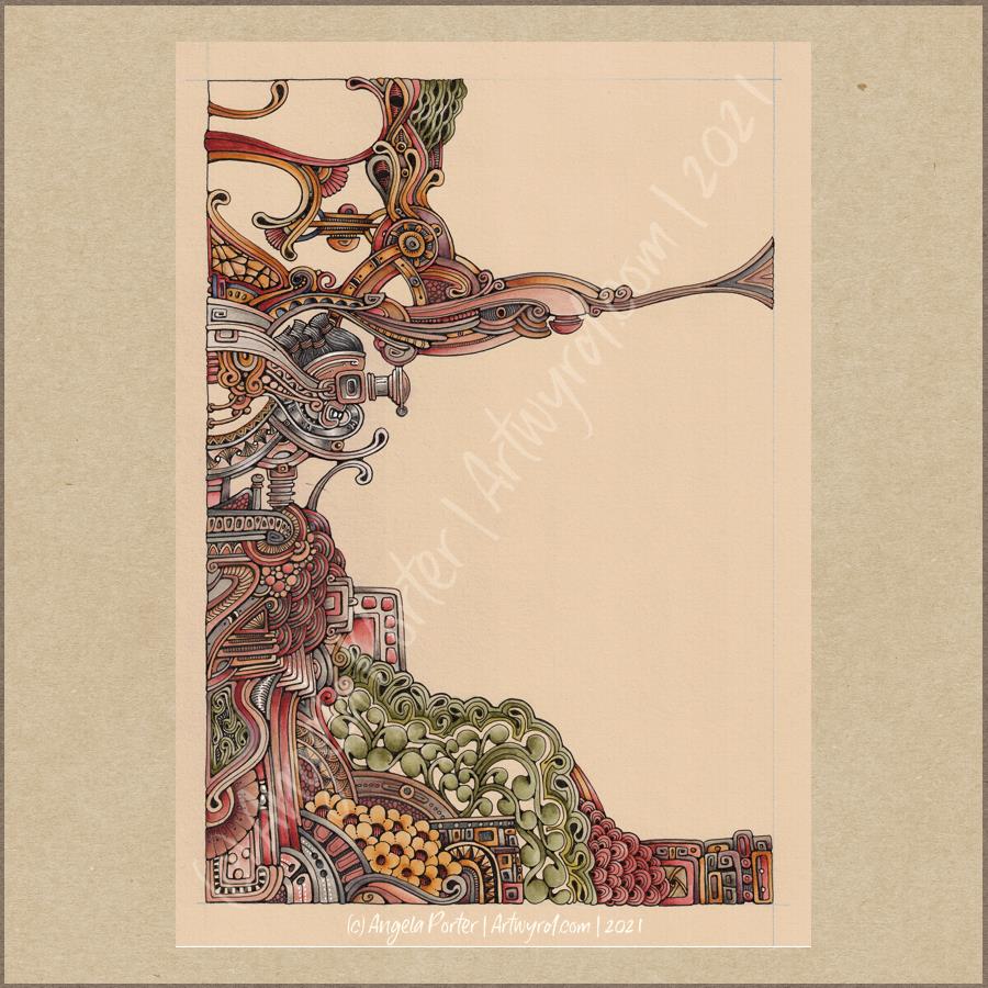
Tiny Botanical Experiments

I thought I’d start Sunday morning off with some experiments with my tiny botanical drawings.

I apologise for the photograph quality – I’m really not a good photographer, something I really do need to work at! The pale colours really don’t help at all.

The artwork on the bottom right is one where I applied rectangles of watercolor on 100% cotton rag paper. Then, I used Sakura Pigma Micron pens to draw designs in the windows. Finally, I added some watercolours to the designs to help bring them forward from the background.

I don’t think I messed the drawings up at all, which was my worry. Mind you, I do have to be careful what colours I do add so I don’t make weird colours.

That led to me wanting to try watercolour pencils and Inktense pencils on different watercolour papers:
top – 100% cotton rag paper
middle – Canson Moulin du Roy paper
bottom – Daler-Rowney Smooth watercolour paper.

On each paper, I drew four rectangles, two of which I coloured with a wash of watercolour.

I used the same colours of Derwent Aquatone and Inktense pencils to draw the stylised/abstract floral design and a waterbrush to activate the pigment. I did my best to apply the same amount of pencil in each case. However, I noticed that the papers grabbed different amounts of pencil even though I was using the same kind of pressure.

The amount of pigment grabbed, however, wasn’t at all indicative of how vibrant the colours would be.

The 100% cotton rag paper seemed to have the smallest amount of pigment from the pencils, yet it gave the most intense colours of them all. This paper is quite ‘hard’ in feel and very textured and I was surprised it didn’t seem to take as much pigment. Appearances are deceiving it seems. This paper also allowed me the longest ‘wet’ time to move the coloured pencil pigment around, and to lift some of it where it had got too intense.

The Moulin du Roy paper was a softer texture and it was lovely to colour with the pencils on it. The resultant drawings have a soft quality to them too that I rather like.

The Daler-Rowney seemed to grab the most pigment, yet the colours are not as vibrant, except the for the Inktense on the watercolour background. I think that’s because the watercolour background was still very slightly damp and Inktense pigment activates with the tiniest amount of water. I also think that’s why this one was the hardest to blend the colour smoothly. This was the paper that was the hardest to add the watercolour background to as it dries so darned quickly, or water just puddles on the surface with a tiny bit more water.

The cotton rag paper is, again, my favourite for working with watercolour and Inktense pencils. The vibrancy of the noticeable too – much less pigment is needed to get a rich colour on this paper.

For the other two papers, I did enjoy drawing the flowers on the plain paper and activating the pigment with a waterbrush. I partiuclarly like the Moulin du Roy paper for this technique, though the Daler-Rowney gave a pleasing result on the plain paper.

Abstract Botanical 22 August 2018

Angela Porter 22 August 2018

Another day, another drawing/artwork/illustration/design. This one is only a little one; it’s approximately A5 in size.

I used some new watercolour paper from Canson – Moulin du Roy. It’s smooth, slightly off-white, pure cotton mould made and seems to work nicely with Intense pencils and a waterbrush.

I’m waiting for some metallic paints to arrive so I can add some highlights to this – there are places where a dot of gold will really work nicely, but not too many places methinks.

Also, I chose just seven colours to be my palette – sherbert lemon, apple green, iron green, lagoon, violet, red-violet and sienna gold. I thought that a smaller number of colours could result in a more cohesive feel to the design, and I think that it may have done so!

For this one, I drew the design first in pen then added colour.

When I draw first I do tend to fill the space with drawings. When I add colour shapes first I end up with more white space and a more random ‘edge’ to the design.

Why that is, I don’t know, other than it may have something to do with me filling spaces in with pen and ink habitually.

A habit I need to modify I think.

All the same, it’s nice to do little designs. I already have another drawn out waiting for colour!

Cirque-doodle

AngelaPorter_17Aug2017_ZenCircle01

This is what I’ve done with one of the Distress Oxide coloured circles I blogged yesterday.

It’s essentially finished, though I may add a few metallic highlights, and maybe some drops of 3D Crystal Glaze.

The Distress Oxides give a lovely soft feel to the paper and it is lovely to draw on.  The mixed media paper on it’s own is quite hard and bumpy and not a surface I enjoy working on with pen; the Distress Oxides and water spray have changed that.

I still have a few circles to draw on, but shortly I need to turn my attention back to things of an eerie nature.

Mixed media cards – shells and fish

AngelaPorter_Cards1_10June2017AngelaPorter_Cards2_10June2017AngelaPorter_Cards3_10June2017AngelaPorter_Cards4_10June2017

Over the past few days I’ve been drawing shells, flowers, fish and fungi and sorting them out to be digi-stamps, work all done on my Microsoft Surface Book.  Some have been printed, coloured using my Chameleon Color Tones and Color Tops pens, cut out and mounted on mixed media backgrounds.  The photos above show the fruits of my labours.

Apart from the Chameleon markers, the media I have used are:

  • Distress and Distress Oxide inks
  • Iridescent and metallic paints from Liquitex and Pebeo.
  • Perfect pearls sprays
  • Stencils
  • Stamps
  • Black Archival Ink
  • Inktense pencils
  • 3D Crystal Lacquer
  • Alchemy Wax

I think that’s the complete list of media.  I used mixed media paper for the backgrounds, and the paper was cut out using rectangular dies.  Behind the backgrounds, I used silver mirriboard as a mat.

I’m quite pleased with them.  No so sure about the kraft card bases (which are 5¾” x 4″ in size), but they were what I had.

Now, all I have to do is work out a price for them and pop them into my Etsy shop, though I think I will have to take better photos for that!

Mixed media index cards – 5 June 2017; my own library of digital drawings

AngelaPorter_5June2017_MixedMediaIndexCard1

Mixed media index cards

Two index cards worked on over the last day or two.  The focal points are shells I drew, first on paper, then the image was worked on on my Surface book with Autodesk Sketchbook Pro and my Surface Pen,

I had to use scissors to cut out the shells (not my favourite task as I’m not good with scissors) after I’d coloured them using the Chameleon Color Tones and Color Tops marker pens.  I’m really pleased with the colouring.

Lots of different techniques/media were used on the index cards – stamping, stenciling, inktense pencils, distress inks and distress oxide inks, pebeo dyna paints, perfect pearls sprays, gesso, clear holographic embossing powder from WOW!

I’m happy with them, though I’m not sure they’re quite finished, especially the little one.

Digital drawing library

I’m beginning to build up a library of my own digital drawings – fungi, flowers, shells at the moment, oh and one angler fish skeleton that I’ve not used yet (but that’s an idea for later or tomorrow maybe).

I have to decide if I put these images together as packs of ‘digi-stamps’ for sale…I’m really pleased with my shells here, but the fungi have worked out fine too.  With my limited scissor skills, I’m keeping it in mind I need to keep the outlines relatively simple, but the inside of the design can be rather detailed, which is fun.

Mixed media index cards

AngelaPorter_1June2017_MixedMediaIndexCard3

I started these 5″x 6″ cards yesterday and finished them (I think) this morning.

The focal images I drew myself on watercolour card.  I used Caran D’Ache Supracolour watercolour pencils and a damp brush to colour them.  I was quite happy with the colouring; I do find pencils a lot easier to use than traditional watercolours.

Nex, I cut three of them out around their edges and used a black marker to colour the white edges (and disguise my poor cutting out skills).  I had to use a craft knife in a couple of places.  The other two I cut out as small panels.

The drawings are a little bare of detail, mabye, but I can go back and add detail once I’ve decided what I’d like to do.

I’m not all that happy about the torn paper behind the focal images; you try things out and learn, maybe.  The torn paper is Gelli printed tracing paper made using PaperArtsy Fresco paints.  I then ran them through my Sizzix Big Shot in various embossing folders, and on some the embossed images have had some metallic waxes gently brushed over them. I also added some Inktense to the papers to darken the edges and add shadows.

What I am really happy with are the index cards themselves.

I started by covering them with gesso.  Then, I used some foliage stamps from IndigoBlu with grey Archival Ink by Ranger to add patterns.  I really liked this, as the patterns were softer and already ‘ghostly’ in the background, a much better choice than black Archival.

My next step was to add colour using ink blending sponges and Distress Oxide inks, followed by a spray of Gold perfect pearls mixed with water.

This is where there was an unexpected effect – the wet Distress Oxides were repelled from the Archival ink.  I loved the result, as well as the way the colours mixed as they pooled around the stamped patterns.

Here’s a close up where you can see how the Archival Ink has repelled the Distress Oxide inks:

AngelaPorter_1June2017_MixedMediaIndexCard1

Then, I used Versamark Ink to stamp more foliage on some of the cards, and mini-mandala type patterns on others.  I then sprinked WOW Embossing powder (clear holographic) over the ink then melted it with a heat tool.  This added an extra layer of interest – a subtle layer as it can only be seen from certain angles.

I framed the cards using black Archival ink and a foam blending tool to give a distressed looking edge.

Then, it was just assembly of the focal points and so on, before sticking the index cards to some really thick card to get them nice and flat; the cards are so thin that they curl a lot when working on them, even with the layer of gesso to seal the card in.  Cosmic Shimmer’s Specialist Acrylic Glue worked beautifully for this.

I had intended to make more ACEO cards, but I drew the focal images a tad too big for that format, so thought I’d try out an index card instead.  I quite enjoyed working on the slightly larger scale.

Mixed Media ACEOs, and updates

ACEOs_28May2017_AngelaPorter

Mixed Media ACEOs/ATCs

I’ve spent the last four or five hours creating this set of four ACEO/ATC cards.  It’s been a while since I did any mixed media work, but I felt the need to get a bit messy.

Each card measures 2½” x 3½” (approx. 6.5 cm x 9 cm) with the substrate being some fairly thick Kraft card.

I started by using some yellow Frog Tape to hold the cards together so I could make the background at the same time.

I started by applying PaperArtsy Fresco Paints to the kraft card until I had a finish I liked.  The colours I used were Cheesecake, Rose and Sherbet.

The next step was to add some Windsor and Newton Modelling Paste through a couple of stencils (one was the dot fade stencil by Tim Holtz, the other a mini dragonfly stencil by Creative Expressions).

Once the modelling paste was dried, which I hurried along using a Tim Holtz Heat Tool from Ranger, I watered down some Alchemy Waxes from Imagination Crafts  (white gold, tulip and apple green)and used a paintbrush to colour the dragonflies.  I then used the wax and a piece of Cut and Dry Foam from Ranger to apply some of the waxes over the dot patterns.

Once I’d finished applying the wax, I wasn’t happy with the result on the dragonflies, so I used Daler Rowney System 3 acrylic paint in Rich Gold to re-colour them. I was much happer with the results, especially the dragonflies that I’d coloured pink/red.

The next step was to have a furtle through various coloured diecuts I have in my stash.  Every now and again, I spend a day cutting out various die cuts (mainly cogs, flowers and foliage, but sometimes other things too) and then colouring them to add to my stash.  It saves on time when I have the urge to do some mixed media work. It also makes use of my rare urges to do die cutting, which I find a very tedious process.

After a good furtle, I found some cogs that would work on two ACEOs that had just the dots on the background. I couldn’t find anything I’d want to add to the dragonflies; I was just happy with them as they were.

The die cuts were applied with Cosmic Shimmer Acrylic Glue from Creative Expressions, then some Vintage Photo Distress Oxide Ink with a wet brush was used to add shadows.

I used a Quickie Glue pen from Sakura and Gold Superfine Embossing Powder from WOW to add some gold dots and to areas where there was no embossing paste.  Following this, I edged the cards using a piece of Cut and Dry foam and black Archival Ink from Ranger.


I then chose some words from the Tim Holtz Chit Chat stickers and glued them down with the Cosmic Shimmer Acrylic glue, and used a damp brush and a China Black Inktense pencil from Derwent to add shadows around the stickers.

The very final step was to add some sparkly gems, and they were done!  Once all is dry, I can add my information to the back and so on, and I have some ACEO cards to use on other mixed media projects or in my art journal.

Other arty news

Over the past week I’ve been keeping myself artfully busy learning a bit more about Autodesk Sketchbook Pro and how it works for me; you could say I’m building up a relationship with it.

For now, I’ve been drawing LOTS of mandalas!  I’m keeping them back from t’internet as I hope to publish them (some are already spoken for by the Colorist app), and other people asked if I was going to make some available for purchase.  So, I’m building up a collection of them for that purpose – either with a publisher, or I’ll self-publish if necessary.  I’ve also done a couple more small mandalas that work nicely as designs to be coloured and made into greetings cards, kind of like digital stamps.

Talking of digital stamps (digi stamps), there are some ideas rattling around my noggin that I’d like to try out, so there’ll be more news on this later on no doubt.

It looks like I’m going to be doing a colouring book of spooky templates in the near future, so if anyone has any ideas for ‘spooky’ or ‘eerie’ then feel free to share!

I also have a few ideas for written books rumbling around my noggin; however, it’s really hard for me to do something with them as I doubt myself so much, think they’re silly ideas, and so on.  The ideas aren’t wholly in my noggin, I do have notes on them on the ‘puter which need tidying up…but I’m finding it difficult to do this because of all my self-doubt and self-criticism. I just need to keep saying to myself, ‘But you have recorded these ideas so they are there for you, so you have made progress).

Other things going on in my life

A week ago, I finally had the hedge at the front of the house removed, as well as the back garden completely cleared.  My garden is tiny, but it’s amazing how much space was hidden by the cotoneaster and forsythia!  I do have some clean up to do, but there’s no great rush on that.  I also need to consider what to do with the back garden.

The process of getting this done has caused me great anxiety, but there was an ah-ha moment when I realised that some voile panels in the windows in my front room would help me to feel ‘safer’ and more ‘private’ while letting in daylight.  For a long time I’ve hid behind curtains; well, I still am, but at least I can see out through the voiles even if people outside can’t see in!  Why I didn’t think of this a long while ago, I don’t know, but thank goodness I did!

I’ve done a couple of anti-stigma talks for Time to Change Wales, and I’m seriously wondering if I’m really making any difference as my story is so bland and ordinary … after all it’s not a dramatic tale to tell, and I really don’t think it’s anything people haven’t heard/seen on TV on the soaps and so on…so I’m really feeling quite downhearted about that at the moment.

I know it may very well pass, but at the moment … it’s difficult….my therapy?  Art of course!


Poppy capsules mixed media

IMG_0622

I’ve decided to do my best to be brave and confident and use my own drawings and designs in my mixed media work.  The poppy seed heads and the ‘zentangle’ patterns are drawn by myself.

The inchie with the quote on – creative journey – is milky as the Glossy Accents on the tile hasn’t dried yet, but it will dry clear and glossy.

Here’s a list of the media I used:

  • Papers – 300gsm watercolour paper, cream paper for pencil and pastel work, marker paper, kraft card, mixed media paper
  • Paints – Paperartsy Fresco paints, Liquitex copper paint, Cosmic Shimmer copper iridescent watercolour paint
  • Pens and pencils – Faber-Castell Pitt artist pens, Derwent Inktense
  • Leafy and flower stencils
  • Sizzix Big Shot and dies for cutting some of the gears and an embossing folder to add texture to one of the background papers
  • Metal gears and keys
  • Glossy Accents
  • Cosmic Shimmer acrylic glue
  • Archival Ink in black and sepia
  • Distress inks
  • Spray bottles – one filled with plain water, the other filled with water and copper Perfect Pearl
  • Gems
  • Wow Holographic Sparkle embossing powder and a Versamark pen
  • Cut and dry foam
  • Various brushes

Live gently upon this Earth – Mixed media artwork

IMG_0614IMG_0615

I’ve had a bit of a week with appointments and then yesterday was a day where I needed some self-care.  I did, however, begin work on this particular piece, and I’ve gone crazy on making ATC sized backgrounds ready for work on them, particularly using the Dylusions paints which have laid dormant in my stash for a long, long time.

This particular mixed media pieces has a colour scheme that is not typically ‘Angela’.  There’s lots of god in it, and the flowers look more like succulents than flowers, bu tthey do kind of work!

The close-up image shows the ATC that’s become the focal point of the piece, along with the metal charms and keys that have been added.

A colourful bunch

IMG_0579

This is just finished, though the 3D Crystal Lacquer on the flower centres hasn’t dried yet, so they’re a tad on the cloudy side.

I’m really pleased with this.  Not least of which for bravely, possibly even crazily, using some of my entangled, abstract art to make the flowers!

So, how did I do this?

Firstly, I made the background.  I used a piece of cream paper that has a texture on it that is designed for use with pastels, charcoal and coloured pencils, and I added colour using Distress Oxide inks.  I then sprayed it with a solution of gold Perfect Pearls which gave water spots and gold shimmers to the background.

Next, I’d had this crazy idea to use some of my art to create the flowers.  I chose some art that had colours that would stand out against the background and each other and I used circle punches to cut out circles of varying sizes.  I used a mini ink blending tool and sponge to add jet black Archival Ink to the edges of the circles to distress them as well as to give them a definite edge against each other.

The circles were stuck together in groups of three and then stuck onto the background in a pleasing arrangement, as if they were flowers in a bunch.

Next, came the outlining with a black Sharpie, as well as adding patterns to the circles to create petals and so on.  The white was added using a Sakura Glaze pen.  I also added gold patterns and highlights using a UniBall Signo pen.

The next step was to draw the stems and leaves, which was done with the Sharpie pen.  I used a waterbrush with paint from some of Derwent’s line painter pens.

Next, I intensified and added shadows under and around the flowers, stems and leaves using Inktense pencils and a waterbrush.

This was followed by the creation of the border using a black Posca pen.

Finally, the mixed media panel was adhered to a black background and the gold pen was used to add lines around the panel.  Oh, and then I decided to add 3D Crystal Lacquer to the flower centres.  An accidental drop of the lacquer on the background led to me adding more drops.

I’ve really surprised myself with this project.  I really enjoyed it, and even though I was wondering what on Earth I was thinking in ‘destroying’ some artwork I liked, I came to realise it was repurposing the artwork to create something new, different and allowing me to explore the world of mixed media more, particularly how it relates to myself.