Template Thursday

Another week has gone by, so it’s time for a new template for members of the Angela Porter’s Coloring Book Fans facebook group.

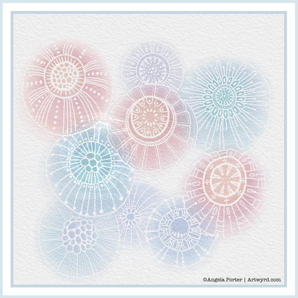
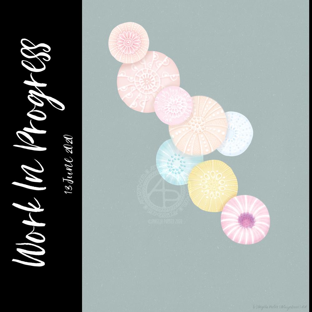
This week, it’s another of my collections of little windows. Yesterday was a day where I needed to draw a template that wouldn’t overwhelm me, and a collection of tiny drawings and patterns is a way to break the task down into bite-size, cute, whimsical pieces. As I result, I enjoyed the process and found some contentment and peace too.

In fact, some of the colorists in the group have told me that the really like the way the page is broken down into pieces that can be finished quickly if they are limited for time. The different sizes allow them to choose something that can be coloured in the time they have available. That part can then be left finished, freeing them of the worry of leaving something unfinished.

Coloring, like any creative activity, can help calm, relax, soothe and give a break from negative self-talk, to name a few of the benefits. I know that scientific studies have shown this to be the case and that losing yourself in coloring has a similar effect on brain activity as mindfulness meditation.

I use art to help me with times when my emotional weather is stormy, dull, unsettled. As I said earlier, drawing a collection of small designs was far less overwhelming than drawing a full page illustration yesterday. Yet, I still end up with a full page of mini-templates to colour.

I feel I struggle with colours. I tend to try to put all colours available to me into one template. Every now and then I do work with a limited palette, which also has it’s own problems. My window templates take away any pressure I put on myself regarding colour. Each window is a unique image in it’s own right and I can use whatever colours I wish in it without worrying about the overall cohesiveness of the project.

These window templates are also great fun for trying out different colour combinations, for blending colours, and even for trying out new techniques. You could make notes on the template, or cut out the pictures you want to keep and start an art journal where you note down the media, colours and techniques used to get the effects/blends you like. No longer any need to remember what they are, just refer to the journal!

Talking of cutting the designs out, that is a perfect way to make use of a finished coloring page like this one. The individual images, or groups of them, can be used to make greeting cards, bookmarks or to embellish art journals, journals, scrapbooks, diaries, planners and bullet journals!

As always, I love to see what people create using my templates – share with and/or tag me on social media :
f: @artwyrd
t: @artwyrd
i: @artwyrd

Digital watercolours?

Another morning, another play around with watercolours, this time digitally.

Soft balls of watercolour, fuzzy edges, with white ink details added on top. Layers of transparent colour.

I overlaid a watercolour paper texture, which helps give the right ‘feel’.

This is my favourite attempt at digital ‘watercolours’ so far. I definitely like using white ink in this instance; black ink was just too harsh, hard and jarred uncomfortably with the softness of the watercolours.

I tried lots of ways of adding colour; not just brushes, but different brush effects. In the end I was happiest with white ink.

A nice way to spend a couple of hours as I wake up.

Flower?

I’ve spent several hours exploring and trying ideas out in the realms of both digital and abstract art, and this is the result.

I’m really not at all sure about it in any shape or form. I think I was influenced by watching a few YouTube videos about mixed media and abstract art.

It’s been an “interesting” time, as well as a frustrating time in some ways. I also have a bit issue with choice of colours.

I’m pleased to say that I’ve calmed down an awful lot from the stresses of the last week or so. I actually slept for nearly 12 hours last night, which happens once all the adrenaline/cortisol have left my body. It’s nice to be back to my ‘normal’ state of contentment.

#MondayQuotes

I found this appropriate quote this morning, and thought I just had to try to add some pretty art behind it, and this is what I came up with.

I worked digitally and used some symmetry tools. I’m not entirely sure about it, but it let me try things out and let my mind work out some things, including how I’ve really been doing things a hard, long and laborious way in the past, digitally speaking. All part of the learning process, of course.

Yesterday, I had to take a total self-care day. I’ve had a very stressful couple of days, and that does take its toll on me. Today I feel less emotionally overwhelmed, I can sense that touchstone of contentment inside me, and the maelstrom of emotions concerning the events has mostly calmed down, and I hope the stressful situation will have done so, for a few days at least!

Shatterpoints of change causing stress and distress for someone in my circle, and supporting through it has been…difficult and unpleasant for me. Still, I think the situation has calmed, for now at least. The quote is really relevant to this situation, far more than for this person than for me.

As difficult as it has been, I have been able to see how far along my healing journey I have come. I can also see how my relationship with myself has become so much healthier. So that’s the positive pay off for me in all of this.

Work in Progress

Yesterday turned out to be an incredibly stressful and tiring one. By the time a crisis was sorted out, it was late evening and, try as I might, art just wasn’t going to happen.

So, I did what I do when I’m emotionally overwhelmed – watched a Star Wars film or two! Sadly, I had no Ben and Jerry’s in the house, and just couldn’t be bothered to order any in as a take-away order. But Star Wars always soothes me.

I didn’t get enough sleep last night, so a nap may be in order shortly. However, when I finally came around enough to turn my attention to art, I knew I wanted to try a digital art version of the watercolour painting “Seeking Calm” that I posted yesterday.

I’ve been working on the image for the last four hours, give or take a half hour. It’s been lovely to work digitally once again, and fascinating to workout how to achieve a similar kind of ‘feel’ to this as I had in “Seeking Calm”.

I know that, for now, I’m not going to be able to replicate digitally the way watercolour paints move and blend. I need to work out how to set up and use brushes that will let me at least capture a flavour of that. My head isn’t working well enough this morning to work on that.

Watercolors are transparent, but I didn’t want to work with transparent colours today. I have worked with rather delicate colours, just as I tend to do with watercolors, which is odd for me given that I usually love bright, vibrant colours.

Today, I think the soft, gentle, warm colours are just what my soul needs to soothe my frayed emotions. I even have ClassicFM on, which is unusual for me. I started by listening to the audiobook version of “Shatterpoint”, a Star Wars novel about Mace Windu. However, I realised I wasn’t really listening. So, I switched to ClassicFM.

Anyway, I also used white ‘ink’ to draw in details on the shapes along with various brushes to add shadows. The white ink adds to the delicate feel of the image; black would be just too stark and heavy I think.

I’m not sure if the background will remain as it is. I like how the colours almost glow against it, but it’s not the right colour or tone yet. But it’ll do for now.

I’ve made a bit of a mess of the colours in the centre of the bottom right motif, I think. I need a break from that to work out how to correct them. It may be that the colours are just too saturated and I need to desaturate them a tad.

I’ve had quite a serious break from digital art over the past couple or few weeks. It’s nice to return to it with fresh ideas for ways of working digitally.

So, I look forward to finishing this image sometime soon. But for now I’ll need some tea and I fancy some toast to nibble on, and maybe I’ll take a nap as my eyes feel really heavy.

Seeking Calm

Another morning, another migraine-y headache. Yet again caused by stress and worry. Painkillers taken, just waiting for the pain to go so I can sleep the remains off.

I also completed this peace of art which I started last night. I painted circles of watercolour on a 5.5″ x 6.5″ piece of Canson Moulin Du Roy watercolour paper and left it to dry overnight.

This morning, I wanted to add pattern to the circles. I tried using a white gel pen, but it wasn’t quite opaque enough. So, I used a fine brush and white gouache. That worked really well. It was also good practice using a brush like a pen or pencil. Is it still drawing if you draw with a brush, or is it painting? I don’t know!

The circles have ended up looking like diatoms, formanifera, microscopic bits and bobs, seeds, sea urchins…

Once the gouache dried, I added some more watercolour to add shadows and details to help bring some sense of dimension or volume. The white gouache works really nicely with the watercolour. Black pen can often feel too harsh to me with delicate colours. The white lines of gouache seems a lot more sympathetic with the delicate colours. It adds a lightness, airiness, delicateness to the design. The opacity gives a sense of more solid support, architecture.

While I like the transparency of watercolour, the way I’ve added the lines and shadows doesn’t quite work being able to see the lower layers, and my head doesn’t quite work right at the moment to work out how to add details from the lower layers that could be seen. Mind you, it does give me something to think about (when ny head will let me think) in doing similar kinds of work in the future. I definitely want to explore using gouache with watercolours.

I did think of adding some metallic dots, but haven’t done so at this time. I can always revisit this painting in the future.

It’s also giving me something to think about in working digitally, though I’m not sure what those thoughts are at the moment.

While I was doing this, I felt calm, content, at peace, and the headache wasn’t so noticeable. Hence the title – “Seeking Calm”. That’s exactly what I was hoping to find while finishing this artwork off.

Detailed drawing is something I love to do. Creating abstracts based on patterns/shapes that I’ve observed in the world around me and in nature is also something I love to do.

Exploring different ways of working with different media to see how I can get it to work for me (or not work for me) is also important. Watercolour is something I do struggle with and would like to work with. This little work of art is something that is a stepping stone on my way to finding a way of working that works for me.

Template Thursday

This week’s coloring template is a series of bookmarks. A member of the Angela Porter’s Coloring Book Fans facebook group said they’d like some designs that could be used as bookmarks, and so I went with the suggestion.

The designs are typically ‘Angela’ and ‘entangled’. I used a Tombow Fudenosuke along with an 04 Pigma Sakura Sensei pen to draw the designs. After scanning and cleaning up, I’ve partially coloured the designs, as well as adding a pale kraft paper background.

To use them as bookmarks, I suggest printing them on some card. If that’s not possible, then gluing the whole sheet to some card and then cutting out the book marks would make them sturdier. Of course, a laminator could prove most useful in preserving your beautiful coloring, as well as making really long lasting book marks that could be given as beautiful gifts, or used to mark the coloring page you’re working on too.

What is self-love?

Self-love is a concept that isn’t fully understood. It took me a long time to understand it, or to accept that it is possible.

Self-love isn’t about ego, grandiosity, boastfulness. It’s not about thinking you’re perfect or the most beautiful or the cleverest person in the world.

Self love is about accepting yourself as you are, strengths and weaknesses, successes and failures, mistakes and all. It’s about accepting that all these, and more, make you who you are and that it is OK to be perfectly imperfect.

It’s about learning to treat yourself kindly, not to be so hard on yourself. It’s about being compassionate towards yourself.

Self love is about nurturing yourself, taking care of the needs of your body, mind, emotion and spirituality.

It’s about having a high regard for your own happiness and well being. It’s about not sacrificing these to please others. It’s about not settling for less than you deserve, about setting healthy boundaries.

It’s a practice, some days it will be easier to do this, others a bit harder. But it’s an importance practice for mental and emotional health.

Over the past few days, I’ve had to practice a lot of self love and self care. I don’t profess to be an expert; I’m constantly learning more about it, as well as constantly having to refer back to what it means and what I need to do.

So, I thought I’d do a blog post about it, as well as some arty stuff. I’ve not done much digital art of late. I became lost in the world of watercolour and journal making and paper crafting. This morning I felt the need to do some digital art. I dug out a sheet of small designs I’d created back in January 2020 and picked one to colour. The rest just fell into place.

#DYICAD 2020 #ICAD2020 Day 03 “Album”

This index card #ICAD2020 #DYICAD2020 was a bit of fun to create.

I used a mixture of Distress Oxide inks to colour the 6″ x 4″ index card. The colours I used were Old Paper, Bundlesd Sage, Dried Marigold and Chipped Sapphire. I built the background up in two layers, with chipped sapphire lightly dragged across the texture that the spray of water from the first background created. A final spray of water, a dab with some paper towel to leave some bleached areas and the background was done.

I decided I’d go with the typography theme today, so hand-lettered monograms for each letter. I used pieces of Canson XL Bristol paper coloured either with Distress Inks or Distress Oxide inks. After spraying the paper with water, I squished some cling film onto the surface to create abstract patterns in the colour.

Anyway, I used 06 and 03 Sakura Pigma Sensei pens to draw the monograms. Once I was happy with the designs, I edged the monograms with Ground Espresso Distress Ink. Then, I glued them to some brown-ish card, and cut them out with a border. I edged the brown paper mat with Ground Espresso Distress ink.

I then set to adding pattern and colour with Paul Rubens metallic watercolour set. Tiny dots and highlights were sparingly added to the monograms. Then, I used the same 01 brush to draw patterns around each monogram in colours that picked up the background colours of the monograms.

My final step was to edge the index card with Ground Espresso Distress Ink.

This was a perfect little project to practice my hand lettering as well as trying out the Paul Rubens paints. It was also good practice at using a fine brush to draw patterns. I do think a finer brush would’ve worked better.

The scan hasn’t picked up the sparkly, shimmery gorgeousness of the metallic paints.

This was a really nice way to come round after I’d slept off yesterday’s migraine-y stress-come-down headache. It was a small project that I didn’t feel overwhelmed by and there was no pressure on me for it to be perfect, as would be the case for my contracts for coloring books. So, it helped me calm and settle and find that sense of contentment, for a while at least.

ICAD2020 Day 02 Marigold

#DYICAD2020 #ICAD2020 – Day 02 – Marigold

I took an index card and used Dried Marigold and Bundled Sage Distress Oxide inks to colour it. I spattered on water to create some bleached spots. Then, I edged the card with Ground Espresso Distress Ink.

I knew I wanted to draw a marigold, which is what I did. In fact, I drew a few. The large one is a French Marigold (Tagetes sp.). The others are pot marigolds (Calendula sp.)

All the drawings are quick, loose, sketchy ones using an 04 Sakura Pigma Sensei pen. I did use a pencil to roughly sketch out the flowers.

As the theme for week one of the ICAD2020 challenge is typography, I added some hand lettering. I also looked for a couple of quotes about marigolds, which I hand lettered.

Finally, I added a wash of iridescent orange and yellow watercolours to the flowers, sage-y green to the leaves. I also added some graphic lines in iridescent orange to the letters. And I couldn’t resist spattering some of the iridescent paint on the card itself.

I think I may add the ICAD2020 creations into my journal, or maybe make one from them as time goes along. No need to make a decision today, I’m not really thinking straight at the moment.

Experimenting with watercolours

I woke with another raging headache this morning. So, some art was in order until the pills kick in and I can sleep the dregs of it off.

I thought I’d try some ways of adding texture and interest to watercolour backgrounds.

Putting some clingfilm (saran wrap I think it’s called in the US) onto wet watercolour creates a lovely texture. It’s not easy to see but I used it on the pieces at the top middle and top right. This is something I will definitely be experimenting with going forward.

I also tried salt again, on fairly damp, less damp and almost dry. The darker pink tile under the Marigold ICAD was where I added salt to rather damp watercolour and the blooms are just beautiful.

I also tried using white gouache. I spattered it onto a couple of tiles, but I also used it mixed with water to paint into wet watercolour. It adds a really interesting effect, the opacity of gouache looking intriguing against the transparent watercolour.

Finally, I used a straw to blow drops of watercolour around. That was a lot of fun and really created random, abstract patterns.

I added these to my journal with notes on how I achieved the effects so I can reference them in future. Today, I may not remember much about what I’ve done, all thanks to the dratted headache. All due to stress/anxiety/worry yet again.