#DYICAD 2020 #ICAD2020 Day 03 “Album”

This index card #ICAD2020 #DYICAD2020 was a bit of fun to create.

I used a mixture of Distress Oxide inks to colour the 6″ x 4″ index card. The colours I used were Old Paper, Bundlesd Sage, Dried Marigold and Chipped Sapphire. I built the background up in two layers, with chipped sapphire lightly dragged across the texture that the spray of water from the first background created. A final spray of water, a dab with some paper towel to leave some bleached areas and the background was done.

I decided I’d go with the typography theme today, so hand-lettered monograms for each letter. I used pieces of Canson XL Bristol paper coloured either with Distress Inks or Distress Oxide inks. After spraying the paper with water, I squished some cling film onto the surface to create abstract patterns in the colour.

Anyway, I used 06 and 03 Sakura Pigma Sensei pens to draw the monograms. Once I was happy with the designs, I edged the monograms with Ground Espresso Distress Ink. Then, I glued them to some brown-ish card, and cut them out with a border. I edged the brown paper mat with Ground Espresso Distress ink.

I then set to adding pattern and colour with Paul Rubens metallic watercolour set. Tiny dots and highlights were sparingly added to the monograms. Then, I used the same 01 brush to draw patterns around each monogram in colours that picked up the background colours of the monograms.

My final step was to edge the index card with Ground Espresso Distress Ink.

This was a perfect little project to practice my hand lettering as well as trying out the Paul Rubens paints. It was also good practice at using a fine brush to draw patterns. I do think a finer brush would’ve worked better.

The scan hasn’t picked up the sparkly, shimmery gorgeousness of the metallic paints.

This was a really nice way to come round after I’d slept off yesterday’s migraine-y stress-come-down headache. It was a small project that I didn’t feel overwhelmed by and there was no pressure on me for it to be perfect, as would be the case for my contracts for coloring books. So, it helped me calm and settle and find that sense of contentment, for a while at least.

Adventures in Watercolor

I’ve had a stressful couple of days to say the least and all my plans to edit templates and create new ones went out of the window. It was like I had ‘ants in my pants’ and I just couldn’t settle to anything that required concentration and focus.

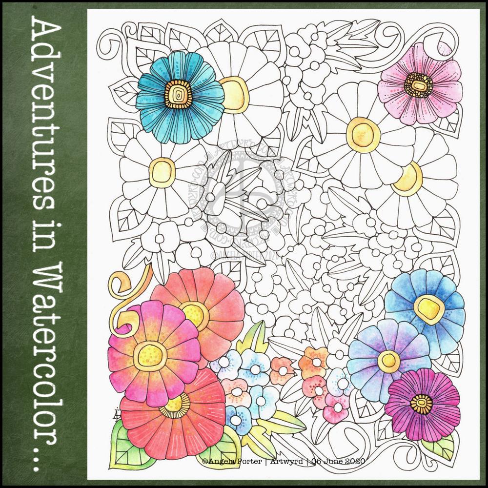
Last night I was beginning to settle a bit. I’d had some news that had helped to calm me a little, but not enough. While I was attending an online talk, I drew this design on watercolour paper. I used a 05 Sakura Pigma Micron pen. I also scanned the finished drawing into the ‘puter. I really like this drawing, I have to say.

This morning, I wanted to start the day with something relaxing and meditative, so I broke out the watercolour pencils. I have a collection of Derwent Aquatone and Faber-Castell Albrecht Durer. I used them to colour the trios of large flowers at the bottom left and bottom right. For the small flowers, leaves, tendrils and the large flowers at the top I used White Knight watercolours.

I found the watercolour perncils slow and laborious on such a large scale, and I had to lay down layers to get the intensity of colour I like. However, they did mean I could control the gradients a lot more.

On larger flowers, watercolours frustrate me a bit. I can’t seem to get to the right amount of dampness so that colours will flow one into another.

I also found that by drawing the flowers to begin with, I felt compelled to paint each petal one at a time, and I found that may work against me in terms of making the most of watercolour.

Watercolour has always been a medium that vexes and frustrates me, and it’s continuing to do so at times, even as I explore adding colour. I think I’m realising that the best way for me to work with watercolor is by using it for backgrounds which I then draw upon and add more colour to the drawings.

Or, its where I make use of the randomness of loose watercolour, droping colours into a damp surface where they can bloom, flow and blend as they will, without me trying to make them anything in particular. Then, I can draw on this, picking out shapes and colours, bringing structure to where there is none, and I can get intricate with the details too.

Anyway, with the flowery drawing above, I tried to add details using some Paul Rubens metallic watercolours to add patterns of dots, as well as drawing more black or white lines onto the drawing. I really don’t feel they worked out at all well.

I knew this was going to be a bit of an experiment, and I have plenty of flowers to try out different media, such as Inktense pencils, and maybe adding more lines to to add more detail before I start coloring.

It’s been a nice way for me to spend Saturday morning, lost in art whilst listening/watching season 1 of The Clone Wars. I think I’ll continue to watch that this afternoon as I turn my attention to drawing.