Work in Progress

Yesterday turned out to be an incredibly stressful and tiring one. By the time a crisis was sorted out, it was late evening and, try as I might, art just wasn’t going to happen.

So, I did what I do when I’m emotionally overwhelmed – watched a Star Wars film or two! Sadly, I had no Ben and Jerry’s in the house, and just couldn’t be bothered to order any in as a take-away order. But Star Wars always soothes me.

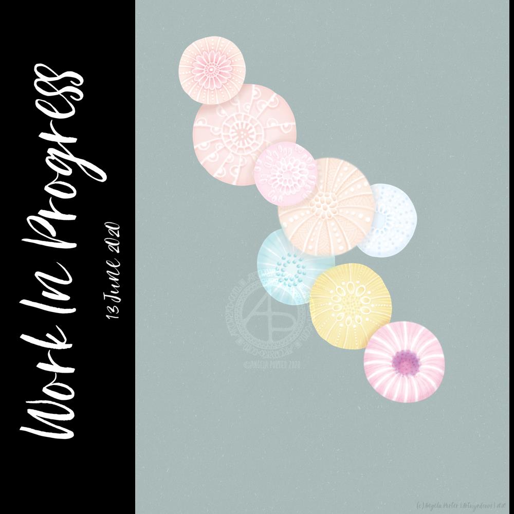
I didn’t get enough sleep last night, so a nap may be in order shortly. However, when I finally came around enough to turn my attention to art, I knew I wanted to try a digital art version of the watercolour painting “Seeking Calm” that I posted yesterday.

I’ve been working on the image for the last four hours, give or take a half hour. It’s been lovely to work digitally once again, and fascinating to workout how to achieve a similar kind of ‘feel’ to this as I had in “Seeking Calm”.

I know that, for now, I’m not going to be able to replicate digitally the way watercolour paints move and blend. I need to work out how to set up and use brushes that will let me at least capture a flavour of that. My head isn’t working well enough this morning to work on that.

Watercolors are transparent, but I didn’t want to work with transparent colours today. I have worked with rather delicate colours, just as I tend to do with watercolors, which is odd for me given that I usually love bright, vibrant colours.

Today, I think the soft, gentle, warm colours are just what my soul needs to soothe my frayed emotions. I even have ClassicFM on, which is unusual for me. I started by listening to the audiobook version of “Shatterpoint”, a Star Wars novel about Mace Windu. However, I realised I wasn’t really listening. So, I switched to ClassicFM.

Anyway, I also used white ‘ink’ to draw in details on the shapes along with various brushes to add shadows. The white ink adds to the delicate feel of the image; black would be just too stark and heavy I think.

I’m not sure if the background will remain as it is. I like how the colours almost glow against it, but it’s not the right colour or tone yet. But it’ll do for now.

I’ve made a bit of a mess of the colours in the centre of the bottom right motif, I think. I need a break from that to work out how to correct them. It may be that the colours are just too saturated and I need to desaturate them a tad.

I’ve had quite a serious break from digital art over the past couple or few weeks. It’s nice to return to it with fresh ideas for ways of working digitally.

So, I look forward to finishing this image sometime soon. But for now I’ll need some tea and I fancy some toast to nibble on, and maybe I’ll take a nap as my eyes feel really heavy.

Monogram S dangle design

©Angela Porter 2019

Over the last couple of days we’ve had some glorious late winter, sunny, mild weather. The kind of weather that can uplift my spirits.

It’s also lovely to see the late winter flowers bursting into bloom – snowdrops, crocuses, daffodils – and even celandines and daisies showing the heads in the sunshine. I also spotted the first signs of pussy willow about to burst into its furry delightfulness. The cascading catkins always lift my spirits. They’re all signs that winter is coming to an end and spring is waiting ready to burst forth.

I woke this morning with the idea of a simple monogram dangle design in my head. I knew it had to have a pusscat in it along with a snowdrops. It’s been a while since I included a cat in a dangle design, but today is the perfect day for that. Actually, every day is a perfect day to draw a cute, cuddly cat. A white cat to match the white snowdrops. I also included a paw print charm; my beautiful white cat, Cuffs, certainly left very deep paw prints on my heart and though I said goodbye to him last year after over 16 years with him as my companion he lives on in those paw prints and my memories of him.

The monogram had to be an S for snowdrops and spring. The monogram also had to have a spring flower as part of it’s design.

I’ve chosen quite a pastel and simple colour scheme for this dangle design to reflect the more pastel colours of spring. I also included a black and white chequerboard frame for the monogram, to add some contrast and some ‘weight’ to the design, grounding it onto the paper.

A sunny blue background with the cooler sky colours of winter but with the warmth of the sun seemed appropriate. It reminds me of these glorious days we’ve had that are presaging the coming spring.

I started by sketching my design out with pencil on paper. I scanned this sketch in and then re-drew the design with a technical pen ‘brush’ in Autodesk Sketchbook Pro using a Microsoft Surface Pen on the screen of a Microsoft Surface Studio. Then it was time to colour, again working digitally in this instance.

My final job was to choose a square background and I wanted one that spoke of sunshine and the threshold of spring, so I went for a soft yellow watercolour wash.

The whole task has taken me around 2 hours to do. It’s a simple design, with simple colouring.

If you like this dangle design and would like to learn how to draw your own then my book ‘A Dangle A Day’ takes you through the steps and has lots of dangles you can use to create your own designs as well as suggestions for where you could use them.

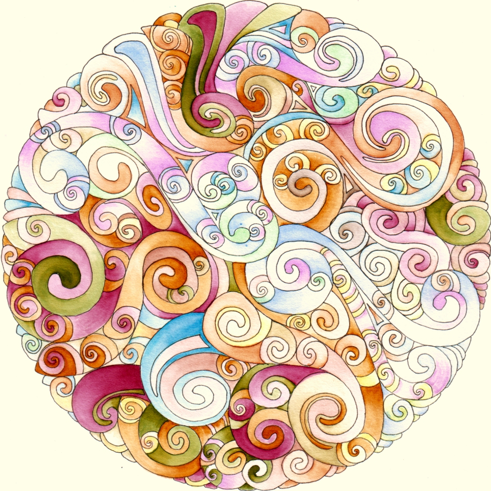
A little, pastel mandala

Angela Porter mandala 17 July 2018 watermarked

Today, I’ve been artfully busy with drawings for a new book for Dover Publications Inc., but have taken time out this evening to draw a simple mandala, and to colour it in.  Oddly, I’ve chosen lots of pastels!

Mandala created using Autodesk Sketchbook Pro and my Microsoft Surface Book.

A different kind of mandala from me

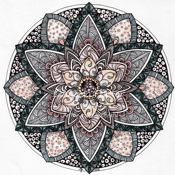
August Mandala 9 © Angela Porter 2013

This one is a little different for me.  The colours are rather subdued for a start.  It shows the influence of my love of Romanesque architectural details, geometric patterns, natural patterns, doodly patterns, and, dare I say it, zentangles, though I do have to say the use of repeated patterns and doodly patterns has been around for thousands and thousands of years not just through the cleverly packaged and marketed brand of Zentangle!  I’ve used patterns like this in my art for a very long time, drawing on my own observations as well as those of others…

Anyway, this mandala has been created using Unipin pens, coloured pencils, a Pentel white hybrid gel pen, and gold and silver Sakura pens.  Yes, there are some very subtle metallic highlights on this one that don’t really show up in the scan.

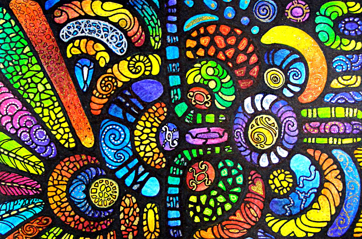
Emergence 2

Emergence 2 © Angela Porter 2013

Outlines worked using an Umber Letraset Promarker with an ultra-fine tip.  Colours applied using watercolours, watercolour pencils and metallic paints.

Approx. A4 in size.

As usual, I own the copyright to this work and it may not be used or altered in any way without written consent from me.

Three little artworks…

These three little artworks have all been completed within the last week.  Each measures approx 10cm x 15cm (4″ x 6″) and have been worked with black sharpie pens, inktense pencils, zig art and graphic pens, metallic/glitter pens/paints.

Thanks from the Heart - Dec 2012 - ©Angela Porter

At The Heart of it all - Dec 2012 - ©Angela Porter

Looking for direction - Dec 2012 - ©Angela Porter

Mandala 24 October 11 and The Sketchbook Project

Approx. 7″ in diameter.  Zig Art and Graphic Pens with water wash and 0.1mm technical drawing pen.

Not sure that pastels are my thing…scan of mandala isn’t all that good either.

The Sketchbook Project

I signed up for The Sketchbook Project last week so am awaiting my sketchbook for it.  I chose the ‘Prehistoric’ category – no surprises there!  I’m looking forward to the challenge of filling the sketchbook by the last posting date on 31st January 2012.  It seems a pretty fun and cool thing to do!  More work on rock art, La Tene culture art, spirals and swirls and patterns from prehistoric pottery … and so on and so forth!