Another abstract entangled drawing for today. The original art is black and white line art with grey shadows and shading. It’s been drawn on A4 acid-free paper. I used various sizes of OHTO Graphic liner pens for the line work and Chamaeleon Color Tones cool grey marker pens for the shading.
However, I’ve altered the colour from black and grey pen and ink to a gradient of blue, purple and magenta digitally, just as an experiment. I’m really surprised with how the grey shadows/shading has turned out – pleasantly surprised and really pleased.
A nice start to my Sunday, a day to be filled with art and completing the transfer of information into my new bullet journal.
I’ve worked on this image over the past three days or so. Adding the shading took a surprisingly large amount of time.
I really enjoyed creating this one. I say that about all my art though, but this one was particularly enjoyable as it helped me to calm and relax after the crazyily emotionally exhausting week I’d had.
It reminds me very much of work I used to do before I had so much work to do for colouring books, not that I’m complaining about that, not one bit. I love doing the drawings for them as much, but I can’t work in this kind of detail for them. I can’t put in all the fine line shading and shadow for them, nor the teeny-tiny details in the patterns as they’d be nigh on impossible to colour the gaps individually.
In my past couple of drawings like this, I haven’t added any shadow to them in the way I have in this particular design. The shadow really helps with that sense of ‘dimension’, though I do think I could have added some deeper shadows in some places.
Though it reminds me of the kind of drawings i used to do a lot pre-coloring books, it’s also shows a change in perhaps sophistication of line but also in the variety of patterns and design elements I like to include in my designs. I’ve even left some ares not heavily patterned so they give the eye spaces to rest without being overwhelmed with pattern and design.
Now to the nitty gritty of how I drew this.
After yesterdays discussion about digital vs traditional art I’d like to say I did this digitally, but I didn’t. I used Unipin Uniball and Sakura Pigma Micron pens on an A4 sheet of Bristol Board from Daler-Rowney. Pencil lines were sometimes used, especially for the circles, which I used stencils to draw them in lightly before inking them in free-hand. I’ve noticed I’ve not erased the pencil lines before scanning the artwork in.
To add the shading I used Chameleon Color Tones and Color Tops in shades of cool grey and neutral grey.
Today, I plan to do some more drawing similar to this before my new bullet journal arrives to replace the one I wrecked by spilling mocha over it and my lovely flowery bag. Thankfully, the notes I need to keep from the media training and events this week are still readable so I can transfer them across, as well as edit them in the process.
First up is the coloured version of Inktober 2018 day 15 ‘Clock’. I got so frustrated trying to color it digitally that I printed the drawing out and used Chameleon Color Tones and Color Tops to colour it.
I’m really not happy with some of the colours I’ve used in some places, however. But I went with it. It’s not as vibrant as I’d like and some of the colours have ended up a bit murky.
I also added some highlights with a white Sakura Gelly Roll pen, and a few shadows/textures with a fineline Faber Castell pen.
It took me most of yesterday and another hour today to complete colouring this image. It does take me a lot less time to draw the outlines!
Today’s prompt is ‘Angular’, so I had to go with geometric designs based on straight lines and point and create a pattern sampler. Some of these patterns aren’t in my pattern directory.
Yes, I have a kind of visual directory for patterns and other images that I can refer to when I need some inspiration. So, some of these will be added to that directory later on today after I’ve run some errands.
It was not easy to draw all straight lines; I miss my curls and swirls and spirals and arches.
Having said that, it was a good workout for my straight line drawing skills.
It took me around 2 hours to draw and it’s only a tiny drawing at 12cm x 12cm in size! That’s a tad shy of 5″ x 5″ for those who work in ‘old money’.
I used Fabercastell Broadline and Fineline pens on Rhodia dot grid paper. I then scanned it in and used Gimp to remove the dot grid, mostly.
Between counselling and errands today, I’ve managed to create over 30 shell ‘digi stamps’ or individual images I can re-size and print out as needed by me, though I am considering putting them together as sets of digi-stamps, though I do need to add line detail to quite a few; that’s a job for another day.
I printed out a few of them on A4 paper, and used my Chameleon Pens to colour them in, and here’s the result – very brightly coloured.
My only problem is to work out what to do with them! Do I use them in some mixed media index cards or bigger work? Do I use them to make greetings cards? Is there something else I could do with them?
At the moment I don’t quite know, but I’ll work it. First I need to cut them all out. Hopefully, my scissor skills will improve …
Oh, I drew the shells on my Microsoft Surface book in Autodesk Sketchbook Pro.
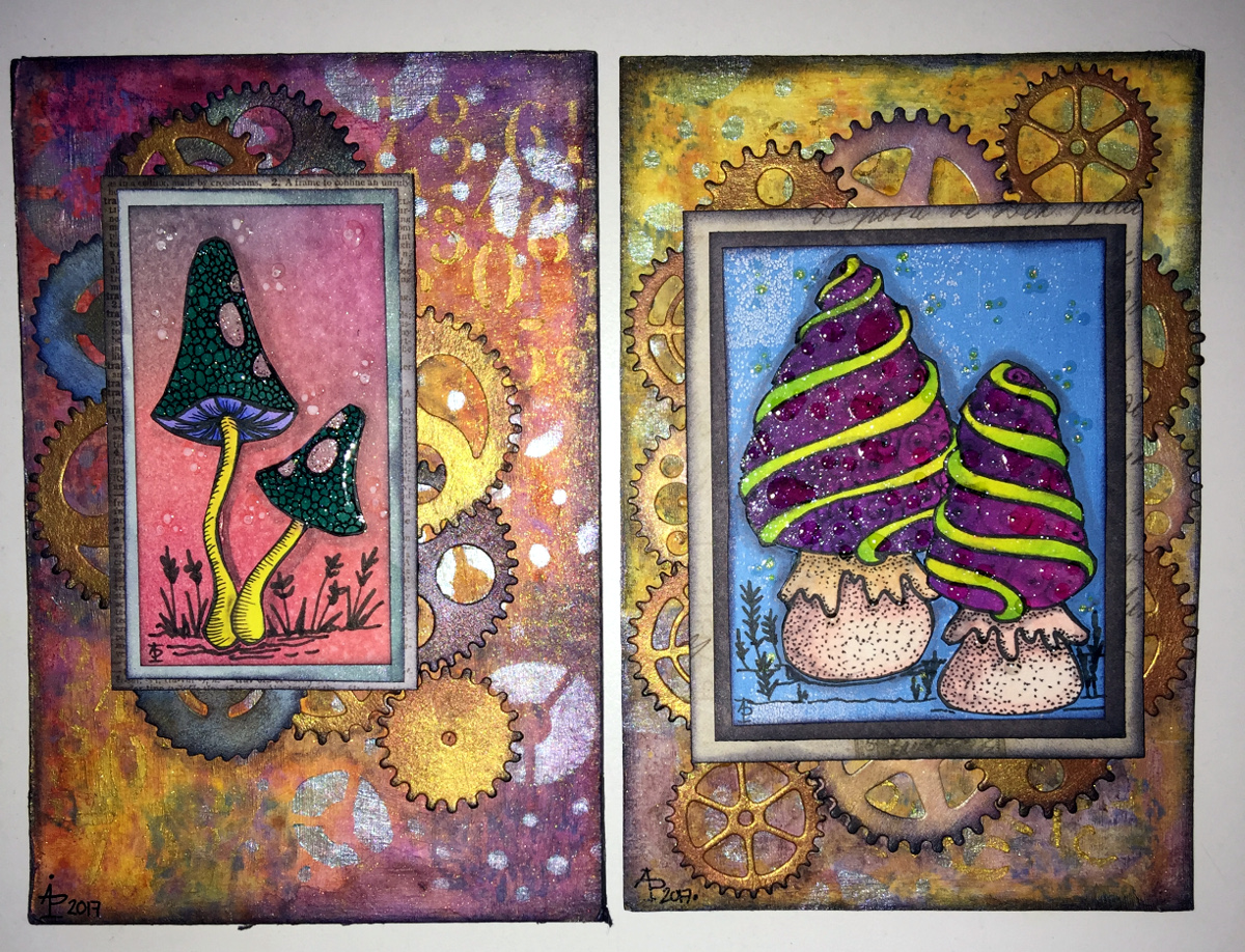
I drew the fungi then coloured them with the Chameleon Color Tones and Color Tops pens. Cogs have appeared in the background once again – gotta have a lil bit of steampunkishness!
I’ve used 3D Crystal Lacquer on the fungi caps and on the stars in the background.
I’m liking the slightly bigger format of the index cards compared to ATCs.
Yesterday, I recieved a big box filled with goodies – a full set of the Chameleon Color Tops to go with my Chameleon Color Tones markers, as well as a full set of ink refils for them
I couldn’t wait to try them out, and did on a couple of small fungi I’d drawn, which you’ll see in another blog post as I want to use them on some mixed media index cards. I loved using them, and so wanted to do something a bit bigger, and the mandala above was the result.
What I love is the ability to create smooth gradations between one colour and another, with out the fuss of using two color tone pens to achieve this. Of course, I still love the original colourless to full colour color gradation, and have used this in the mandala on parts of the butterflies.
However, I love strong, bright colours, and the Chameleon Color Tops are fab for doing this!
Now, I do have a full set of Copic Ciao markers, which are great. However, achieving a smooth colour blend is quite difficult, especially with colours that are far apart in intensity or colour. You can use the tip to tip method of transferring colour from one pen to another and use the pen to blend the colour a bit better, but I still struggle, even on specialist marker paper.
Not any more!
What I haven’t done is to look at how the pens blend when the colours are from different colour groups, such as blending a green to a red, but you can guarantee I’m going to try them out. Apart from them maybe creating some mud where the colours overlap (which would happen anyway), I have confidence they’ll do this just fine and dandy.