Sketchtember Day 28 | Zentangle Tile

This morning, I needed to have some calm and relaxed creating time.

I started by drawing a pencil grid of squares and triangles to work in. Next, a visit to TanglePatterns.com led me to the motifs, or fragments in Zentangle-speak, that I wanted to use.

The central motifs are a slight variation on Nayu by Eniko Kaneko CZT. This morning, I just couldn’t get the overlapping of the ‘ribbons’ right.

The triangle motifs around the edge are Caro by Lucy Farran CZT. This wasn’t the first choice. I had wanted to do a kind of triangle Celtic Knot, but again, I just couldn’t get it to work for me. Caro has worked out well, with the little flowers reminding me of spring violets.

Materials used:
• 4″ x 4″ grey Fabriano Tone Paper
• Tombow Fudenosuke pen, black
• Inktense pencils in Lagoon, Violet and Sun Yellow along with a damp brush
• White, grey and black pastel pencils with a paper stump / tortillon
• White Sakura Soufflé pen
• Purple and yellow Sakura Stardust pens

I especially needed some time with no pressure on me. Yesterday’s headache turned into a headache with a really upset stomach and I’m feeling fragile and still not right. So, it’s definitely going to be a quiet, easy day for me.

A Zentangle tile for day 27 of Sketchtember 2021

This morning, I needed to create something that wasn’t too taxing, that was meditative, that could be completed relatively quickly in a process that was familiar to me. So, I chose to create a Zentangle tile. Perfect for when I’ve woken with a stinking headache.

I cut a 4″ x 4″ square of Fabriano Sand Toned Paper and added a few pencil lines to act as the ‘string’ for the design. Next, I had a look on TanglePatterns.com for a pattern to place in the diagonal area. The latest one posted is called TIWA, designed by Ria Mattheussen, one I’ve not drawn before. So, I used that, and let the design grow from there.

To create the tile I used the following: 0.3 Unipin pen, various Stabilo Carbothello pastel pencils and a paper stump, a white Sakura Soufflé pen, and a BR3 Chameleon fineliner for the spiral pattern (Printemps in Zentangle-speak!).

The whole tile took about an hour to create, and I have a speeded up video of this process on YouTube.

I need a quiet, restful, and possibly nap-filled rest of the day. As the headache is beginning to fade, it’s leaving me feeling exhausted in it’s turbulent wake. I do think I may do a little more drawing first.

Sketchtember 2021 | Day 26

Zentangle style abstract art is my sketchtember artwork today.

The small ones have colour added by Arteza Ever Blend markers. The larger drawing is having colour/shadow applied with Carbothello pastel pencils.

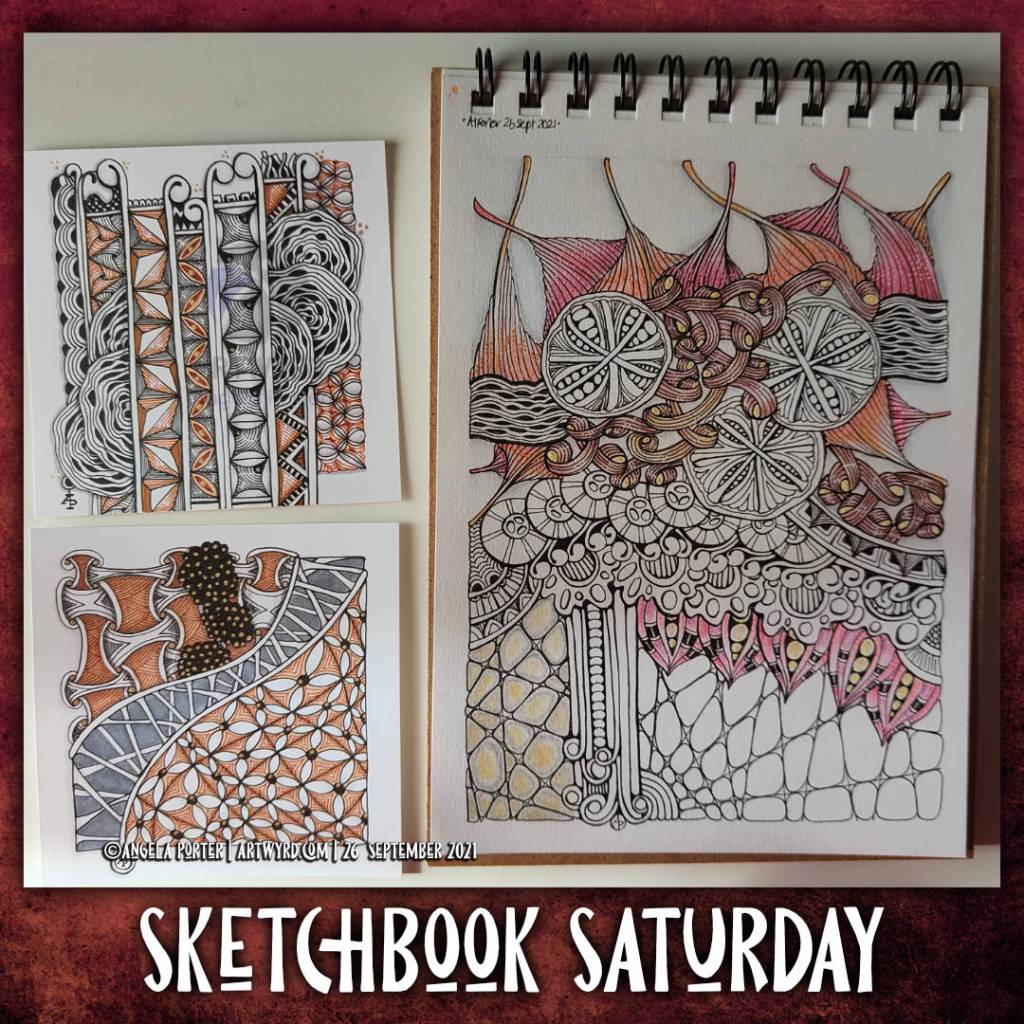
Sketchbook Saturday | 25 Sept 2021

As autumn has arrived, at least astronomically, As we’ve passed the astronomical point of season’s change, from summer to autumn here in the northern hemisphere, I continue to long for the fiery costume of nature. Warm memories to sustain us as the cold, architectural skeletons of nature are all that remain. A reminder burned in our minds that nature will once again blossom and bloom once the days begin to lengthen once again.

To complete the line art, I used a Tombow Fudenosuke pen. Colour was added with Stabilo Carbothello pencils and a paper tortillon.

Today’s vlog is a sketchbook flip-through showing my week in art.

Link to today’s vlog on YouTube.

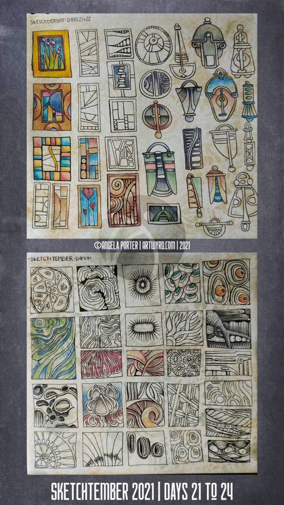
Sketchtember 2021 | Days 21 to 24

Two sketchbook pages done over the past four days. Abstract patterns and shapes, that’s the theme! Just small drawings, lots of them. Perhaps they’ll inspire work in the future.

Pen drawings done on paper coloured and patterned with Distress Inks. Colour adding using Inktense pencils or Cartothello pastel pencils.

Sketchtember 2021 | Day 21

I’m still on the mushroom kick it seems. Today’s sketches/drawings for Sketchtember feature some mushrooms. One is a typically, perhaps, entangled style of art. The other is much more of a pen and ink drawing, making use of stippling and cross-hatching to add shadow and a sense of volume.

I used a Uniball Eye micro pen to draw on a piece of Distress Ink coloured mixed media paper from Claire Fontaine for the entangled drawing on the left.

For the drawing on the right, I used a Tombow Fudenosuke pen on a piece of Ohuhu marker paper. This paper is surprisingly nice to draw on.

I’ve yet to decide if I’m going to add colour to these drawings. I have scanned them in so that I have a record of them as they are.

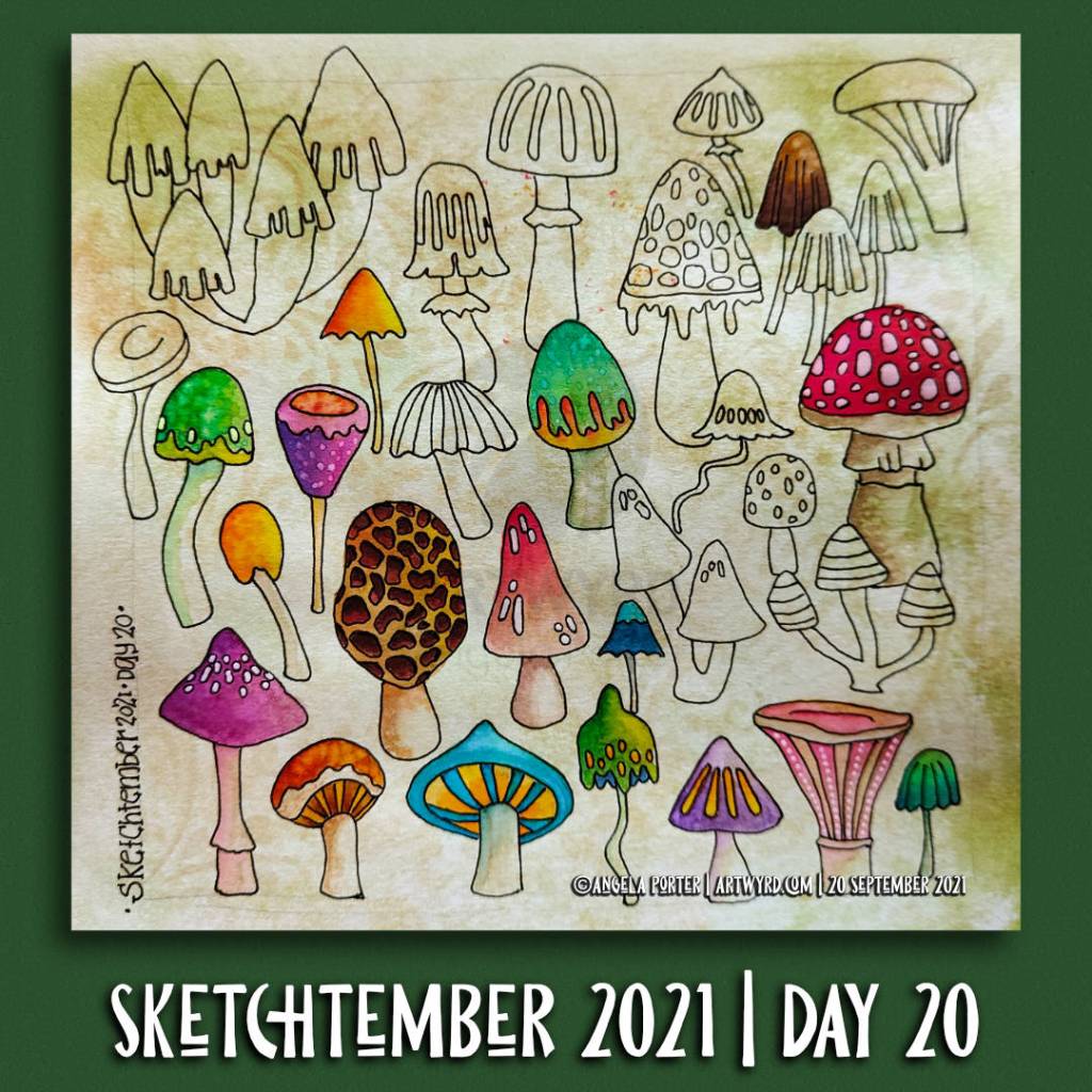
Sketchtember 2021 | Day 20

Click on this link to see today’s vlog on YouTube.

Mushrooms. Lots of mushrooms. A sketchbook page full of simple line drawings of mushrooms drawn from memory and/or imagination, some brightly coloured with Ecoline watercolour ink.

This page was a lot of fun to draw. I wasn’t aiming for realism or detail. It was all about drawing simple, stylised, imaginary mushrooms. I planned to add colour to bring volume to the drawings.

As I used imagination to draw these whimsically wonky mushrooms, it was easier to give myself permission to forgo the pressures I put on myself to be realistic in adding colour. I could use whatever colours I wanted to for each mushroom, I could be as stylised as I wished about the colour too.

Adding colour in this way is easy when I add colour to my coloring book pages/templates. As these pages are stylised, I can add colour in a simpler, more fun way. This is especially true for my Doodleworlds style of art.

Transferring that mindset to my drawings from nature, architecture and so on isn’t quite so easy for me. I still hear that critical voice of ‘It’s not good art if it doesn’t look like photograph or like the real thing’ in my head. This is a message that is repeated to us time and time again from our earliest days of starting to draw. It was these critical messages that led to me having a belief that I was no good at art, and those messages were seared deeply into my view of myself.

In fairness to myself, I have overcome some of these critical beliefs foisted upon me by others. However, some linger and rise up from time to time. I suspect their influence is most noticed in my lack of confidence in myself when it comes to colour.

Identifying these ‘inner critics’ is the first step to dispelling them. This is a multi-step process as the inner critic is armed with many weapons to destroy my self-confidence. I’ve disarmed this critic time and time again, but it always seems to find a new weapon. Eventually though, it will run out of weapons to use.

It’s a process, a long winded process, but it’s one that’s worth doing, step by step.

Sketchtember 2021 | Day 19

A page full of whimsical, wonky butterflies. Partly coloured with Ecoline Brush Pens. Embellishments with a variety of Uniball and Sakura gel pens.

I have a sheet of whimsical flutterbys drawn on a piece of marker paper that I’ve started to colour with alcohol ink pens.

A lovely way to spend a quiet Sunday at home. Mind you, every day for me is a quiet day at home, which suits me rather well.

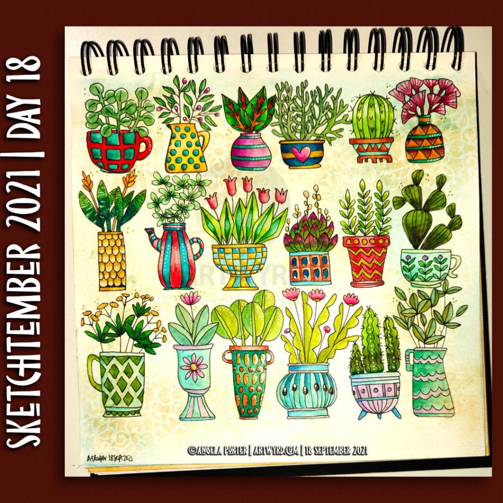
Sketchtember 2021 | Day 18

Link to today’s ‘Sketchbook Saturday”, a sketchbook flip-through of this week’s art projects on YouTube.

Saturday is here again. So, over on my little corner of the YouTube universe, I do a flip-through of this week’s arty projects, and a bit of a chat about stuff at the same time.

Here, above, is my sketchbook page for Sketchtember 2021. For day 18, I’ve chosen to draw plants in pots, mostly cups, mugs, teapots and jugs it seems. They’re still plants in pots. They’re all drawn from my memory and/or imagination.

After completing the pen sketches, I added colour using Ecoline Brush Pens and a Water brush. I had to try to mix colours too, particularly varieties of green. I may have done OK with some of them. Others are abject disasters, such as the succulent style plant with red tips to it’s leaves. Ho hum.

Everything is a bit wonky, but perhaps that is no bad thing at all. A lot of my artwork is a tad wonky, and that’s part of my signature style, probably.

I’ve also used a clear Glaze pen, a gold sparkle Signo gel pen and a clear Star Sakura Gelly roll pen to add shiny highlights. A white Sakura Soufflé pen added highlights to some of the areas too.

This, like yesterday’s buttons, has been a fun project. This time, though, I’ve completed adding colour, which has surprised me no end. I suspect that increasing familiarity with Ecoline watercolour inks and how I like to apply them has helped greatly with this.

Trying to work in a more ‘illustrative’ and a bit expressive way of adding colour is helping too. It’s a work in progress, but I may just get there!

Now, all I have to work out is what to do with the rest of Saturday!

Sketchtember 2021 | Day 17

Link to today’s vlog on YouTube.

Anxiety-ed Out!

I’ve had a few days of periods of intense anxiety/stress. The come down from each of these has left me exhausted and my mind unfocused. I’m much better now that all the appointments related to the anxiety are over, and all is well. I knew it would be, but my mind and emotions have other ideas about that at times!

Anyhoo, as I had a bit of focus yesterday afternoon/evening, I decided to draw a few buttons for Sketchtember Day 17. A few turned into a whole page full of pen drawings! And some really not good hand-lettering, ho hum.

So, I thought I’d spend some chilled out time this morning starting to add colour to some of the buttons.

Ecoline and an insight..

Ecoline Brush Pens were my medium of choice this morning. A lot of the details on the drawings were just a bit too small for marker pens to cope with. Also, I thought a change of medium could be good for me, and it was!

To start with, I scribbled some colour onto a palette and then picked it up with a damp brush and worked with it like watercolour. However, as the areas dried, the intensity of colour faded.

So, I decided to brave trying to directly add colour to the page and then spread it out with a damp brush. It worked! I suddenly realised that I have a much more illustrative way of adding colour, rather than realistic. It’s about time I accepted that and embraced it too!

A page full of different objects, rather than a single illustration, has helped me to realise this, as well as put it into practice.

Now, I just have to remember this insight, which isn’t as easy as you may think!

Perhaps I should write a list of Angela’s Artwork Insights to refer to before I do any work, as well as while I’m working.

Bright and cheerful!

The other thing I really loved was working with these really bright, vibrant colours. I’ve been using a lot of more muted and vintage colours of late, and I love them. But these bright colours were just what I need during a post-anxiety funk.