Entangled Art Infinity Card – Parts 1 and 2

I’ve had some fun with this, and there’s more to come. And a bit of a story to tell first.

I was asked on my YouTube channel how I know which patterns go with each other. That’s not an easy question to answer; experience, experimenting, trusting instincts, and having some patterns or motifs that are your go-to ones.

Then, yesterday morning, as I was slowly coming around from sleep, I watched a video on YouTube at Jen’s Arty Inclinations on how to make a fast and simple infinity card for a junk journal.

Jen recommended going to Lynn at Playing with Paper and Glue to watch her video about making a slightly different infinity card. So I did that.

And as I watched and saw how easy it was to make the infinity card (yes, it really is!), I realised that this would be a lovely and different way to collect together my favourite go-to motifs and patterns. And that thought linked back to the comment on my YouTube channel.

So, I made an infinity card, mucked it up a bit, but learned from that. Then I made a HUGE one, which was ridiculously big! So, I made another one to the sizes Lynn gave, which you can see me doing in part 1. Then, I had to add the first panel on the left of the image above.

I went with variations of pokeroot, pokeleaf and pokepods! I’m not sure there’s a pattern called pokepods, but there is now. I cut a notch out of the card and created a little pocket for a drawing, note, colour palette, or something else to be hidden.

I drew with Copic Multiliner Sp pens (0.5 and 0.25, I think). Colour was added with yellow-grey and neutral-grey Ohuhu markers. A white gel pen was used to add dotty highlights and the pattern to the back.

In the video for part 2, I created the panel to the right. Daisies are always a flower I love to draw; I have many variations of them in my memory hoard. The flowy pattern and Diva Dance are two of my go-to patterns; they share some similarities in my head.

For this panel, I used a Uni Emott 0.4 ever fine pen to draw the design, then green-grey Ohuhu markers to add colour. Then, I used a white gellyroll pen to add the dotty highlights.

I wasn’t sure about the Tim Holtz scrapbook paper I used to make the infinity card, but as I added the panels, it mostly got covered up, just a hint of a background behind the drawings.

It may not be the best choice of paper to make the infinity card from, in terms of colour and pattern. However, as I’ve never done anything like this, it was a sacrifice I was willing to make!

Actually, I wasn’t sure about the entire project. I thought it may be a bit odd, whacky, and weird. But, now two panels are done, I’m looking forward to completing the infinity card.

I will be adding more pocketses, possibly even panels that open out to reveal more. There are, possibly, 32 panels to be done, though I’m not sure as I keep losing count! But it’s a longer-term project.

Having said that, the panels are small. Cute even. Perfect for when I have just a little time to draw.

Medieval Inspired Botanical Bookmark

I have no idea why, but tall, thin drawings (bookmarks) just appeal to me. Indeed, they always have.

I enjoyed drawing this one, and I’m fairly pleased with the chosen colours. There’s a soft, muted, vintage palette along with the flowers, seed pods, berries and leaves mainly inspired by Medieval Illuminated Manuscripts and the work of the Arts and Crafts Movement artists.

If you’d like to follow a #comedrawwithme video for this design, just click on this link!

Two Seed Pod Posies

This morning I finished the posy to the right, and I thought it would be interesting to post both versions together.

The version on the right was actually drawn before the one on the left; it was the inspiration for yesterday’s drawing tutorial video on YouTube. I decided to add colour to it yesterday evening, and I added the subtle background pattern this morning.

I like both and would find it hard to pick one as a favourite. There are pros and cons to each for sure.

What do you think? Which do you prefer?

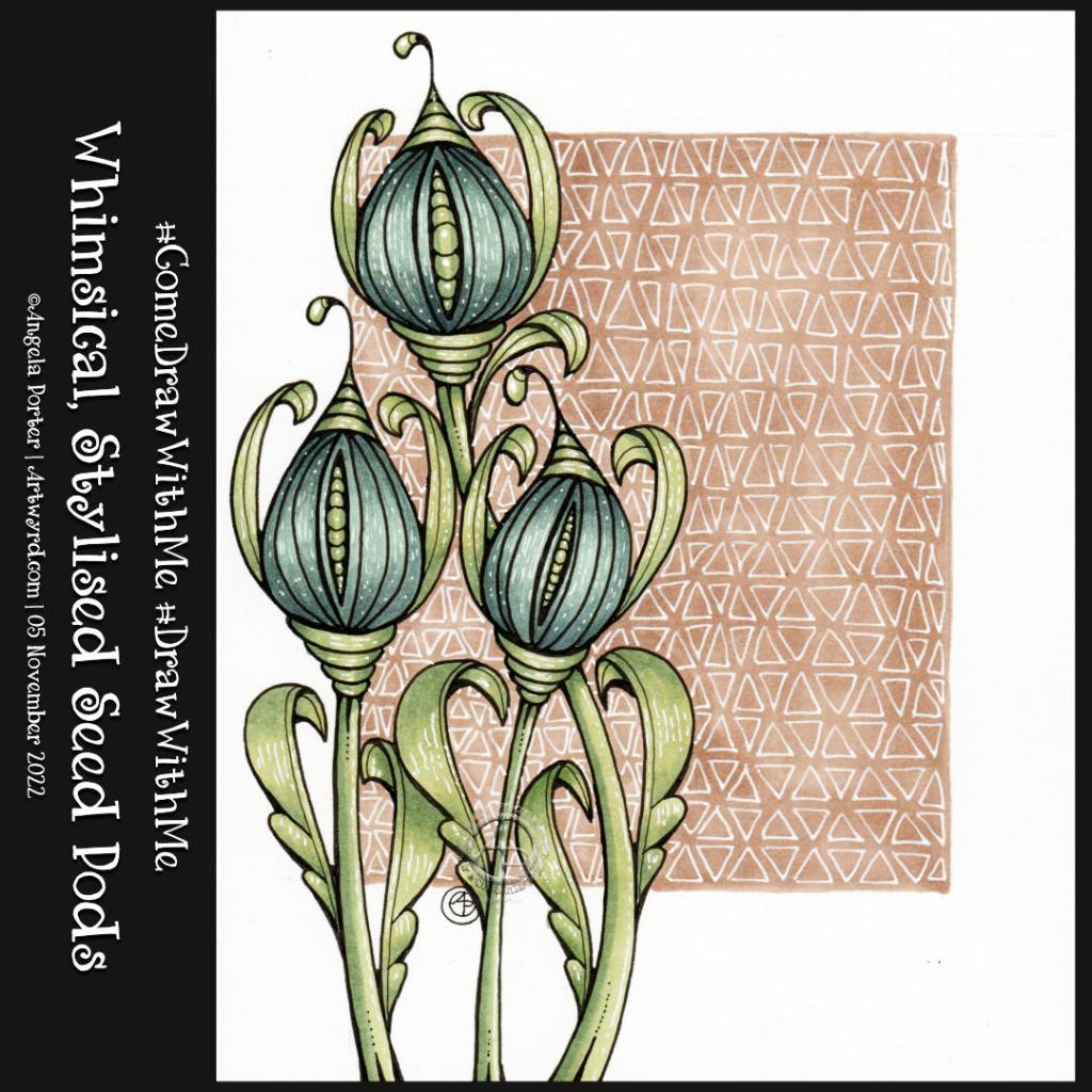
Whimsical, stylised Seed Pods #ComeDrawWithMe #DrawWithMe

I love seed pods! They are often so architectural in nature. They lend themselves to whimsy and stylised drawings so well too.

I love giving them sturdy stems with tops that look like column capitals. The leaves on these are inspired by medieval illuminated manuscripts, something else I absolutely love!

For the panel behind them, I decided to keep the pattern fairly simple – Tripoli, a Zentangle tangle pattern.

If you’d like to draw your own seedpods, then take a look at the accompanying draw with me tutorial on YouTube.

Hollibaugh and Kwazeela – Days 24 and 25 of Inktober Tangles 2022

Click on this link to watch the accompanying video tutorial on YouTube

Today’s tangle pattern is “Hollibaugh” by Zentangle Inc. It forms the white ‘beams’ that overlap and form the gaps between them. Instead of adding patterns to the beams, which is what I would usually do, I decided to add patterns to the gaps. In some of these gaps, I added Kwazeela, a lovely leafy tangle pattern by Eni Oken CZT.

I drew all of this design in today’s video, but I added the colour and highlights while the video was uploading and processing. To add colour, I used Ohuhu markers and a white Gelly Roll pen to add the highlights.

It was a nice way to spend a couple or so hours while I recover from a bout of tiredness, headache and upset digestive system as side effects of my ‘flu jab on Saturday.

#DrawWithMe – Adding colour and contrast with alcohol markers

Please click on the “Watch on YouTube” button. Cheers!

I had a lovely time this morning adding colour to yesterday’s drawing.

To be precise, I chose to use Arteza’s EverBlend markers. I’m not at all sure about that green at the moment, but it may look quite different when I’ve finished colouring the drawing in.

In the video, I focus on explaining my method of adding colour and showing how I’ll add colour and contrast to each section of the design.

#DrawWithMe – Botanical Motifs

In today’s YouTube video, I started to draw the design on the right. While the video was uploading, I finished drawing it. Also, I drew some motifs on a separate piece of paper so I could practice using alcohol markers (Arteza EverBlend).

Colour combinations do vex me, continually. And they certainly do on this practice sheet! But it’s best I practice somewhere before adding colour to my completed drawing. But first I’ll scan that drawing in so if all else fails I can add colour digitally!

Either way, it’s been lovely to spend time drawing and adding colour just for the joy of it. It is far too warm to do anything else.

Fineliners, alcohol markers and contrast – hints and tips video

The past couple of days have seen me creating videos that go in a slightly different direction to my usual.

Yesterday’s YouTube video was a look at using and blending coloured pencils – not a skill I’m great at, especially when it comes to choosing colours.

I carried on experimenting with my drawing and trying out various media either alone or in various combinations – coloured pencils, Inktense, and/or graphite. I quite like the way graphite dirties up the colours and creates an almost metallic feeling. Not a shiny metallic, but a dull kind of one.

Today’s video was a response to a comment left for me on YouTube about fineliners smearing with alcohol markers. So, I thought I’d do a look at some of the various fineliners I have, the tricks I use to avoid this, and a bit more about achieving contrast, volume and blending markers.

Draw With Me – A pattern and motif sampler.

Link to today’s video on YouTube.

This seems to be the natural progression of my work earlier this week where I put motifs in boxes and added background colour only.

When looking at Rebecca Blair’s artwork, which I absolutely love, I got inspired to create the first ‘sampler’ on the left. I say sampler because splitting space up in this way reminds me of needlework samplers created to practice different stitches.

This is a lovely way for me to indulge my love of hand-lettering, patterns, stylised motifs, colour, shadow, texture and boxes split into boxes!

Colour continues to vex me. I think my favourite is the centre example in a monochrome colour scheme. No chance of any weird colour combinations with that one!

I keep saying this about me and colour, don’t I? But I really need a huge sign that lights up and flashes to remind me to stick to monochrome colours, possibly analogous, and with tiny flashes of a complementary colour. Actually, I need the sign to detect when I reach for colour and shout this advice at me!

Of course, I wanted to share my experiments with the world; well, a few hundred people may be, who may find this an interesting idea to try. If you’d like to see the video then click on this link!

It’s been a quiet day for me. My digestive system is playing up, and self-care is the order of the day. That means not doing anything that has to be the best I can do. I know today that it’ll be harder for me to get things done because I’m under the weather. Fingers crossed, I’ll be fine and dandy again tomorrow.

Draw With Me… Fungi and other organic things. An idea for a sketchbook page

I had to revisit this idea by using the correct kind of paper for alcohol markers. And bullet tipped markers.

I really enjoyed doing this. Adding the details made a difference for sure, as did adding some shadows to the motifs.

If you’d like to see me draw these and, perhaps, draw along with me, then take a peek at this video on YouTube.