Mandala – 7 Jan 2019

©Angela Porter 2019
©Angela Porter 2019

This evening, I needed a bit of quiet, therapeutic arty-creative time. I had quite an emotional time in EMDR therapy (or not EMDR this week, a lot to talk about in preparation for the next phase of EMDR) and felt very much the need for some self-soothing and self-care.

I thought I’d spend some time drawing in colour again, using my digital toolbox of Autodesk Sketchbook Pro paired with Microsoft’s Surface Pen and Surface Studio.

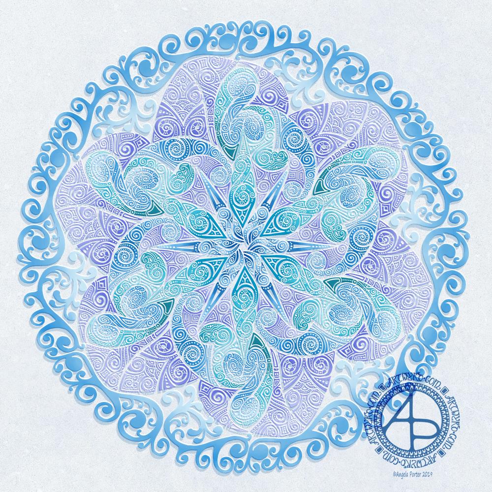
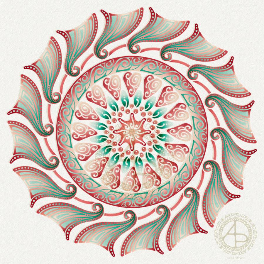
I’m really quite pleased with how this little experiment has turned out. I like the way the colours play against each other – teal and coral being almost complementary colours. I like my La Tene/Celtic kind of swirls and motifs. I like the way I’ve put areas of background colour behind some of them to help them stand out from the background ‘paper’ more.

I’m getting more and more of a ‘feel’ as to how this style of art works for me, and I’m really enjoying creating these mandalas as a way of exploration.

People have asked if I’d turn these mandalas into a coloring book. The answer is probably yes. However it may take a little while to get to doing it.

Carl Jung is credited with introducing the Eastern concept of the mandala to Western thought and he believed it is symbolic of the inner process by which individuals grow toward fulfilling their potential for wholeness.

I’m sure Carl Jung would have a lot to say about my mandala and how it reflects what is going on inside me on an unconscious level, even though I’m not quite capable of making sense of it myself at this time of night!

An ‘A’ Dangle Mandala…

©Angela Porter 2019

I’m definitely on a mandala kick at the moment! This one, though, includes some dangle designs!

A Dangle A Day’ is released on 15th January 2019, and I just wanted to get yet another dangle design out in the interwebs to inspire you.

While checking out the release date (which I’ve been getting a tad wrong, oops!) I noticed there were some reviews of the book. I’d like to say thank you to all the reviewers who wrote such lovely words about the book! It’s filled me with a bit more confidence and belief in myself as this is my very first art tutorial book.

There’s some hand lettering with the letter A. The letter A has dangles forming the inner part of the mandala. Then, the outer ring has simple and cutely whimsical doodle designs and yet another dangle forming it.

Of course, hearts and stars had to appear; they are my favourite design elements for many of my projects. I also like beads and gems too. Flowers and foliage are also favourite motifs, as are spirals.

I decided the ring of A’s need to be in a rainbow colour scheme and I chose a bright colour scheme for the design elements.

It looks complicated, but if you look at just one A and follow the dangle towards the centre and the design out to the outer rim you’ll see that it really isn’t all that complex.

Of course, drawing mandalas on paper can be time consuming. I usually draw mine digitally.

Autodesk Sketchbook Pro is now free and it’s my drawing software of choice. It has a symmetry tool that is really easy to use. You only draw one segment of the mandala which is then automatically repeated around the circle. I find Autodesk Sketchbook intuitive to use, and it’s easy to use almost straight away. It also has some rather sophisticated features on it and it does all that I need it to do, and more. I use a Microsoft Surface Pen along with Microsoft Surface Studio to draw and colour digitally, and they work wonderfully with Autodesk Sketchbook Pro.

I do colour my designs digitally. However, sometimes I will print out the black line art and then use traditional media (often Chameleon markers) to bring the line art to life with colour.

I do hope you will have a go at creating your own dangle designs. They look complicated, but they really aren’t! If you do have a go, then please share your designs with me on any of my social media homes – facebook, instagram, twitter or here!

Another cool-toned mandala

© Angela Porter 2019

I’ve spent another quiet, calm and contented few hours drawing this mandala. Admittedly some of the shapes look a bit weird around the edges. However, it’s all about me learning and embedding new skills when it comes to drawing digital art.

Microsoft Surface Pen, Microsoft Surface Studio and Autodesk Sketchbook Pro were my tools for this one.

Some of the areas have patterns in them that remind me of Celtic, La Tene art, or of illuminated manuscripts such as the Book of Kells. These are art forms I’ve loved for as long as I remember and I think there are times when those patterns bubble up to the surface of my mind and find their way out through the tip of my pen! It’s nice when that happens and it surprises me!

One Frosty Morning – a mandala design

©Angela Porter 2019

I’ve had a very pleasant two or three hours this afternoon creating this mandala.

It’s quite different to my usual styles of mandalas and I rather like it. I also rather like the monochrome colour scheme which inspired the title of this mandala.

Drawing in colour is a departure for me from the usual black line drawings which are then filled in with colour and/or pattern. I’m uncomfortable drawing other things in colour without that black line to define their shape/form. But mandalas are a whole different thing. They are a way for me to explore this way of working with colour.

What is exciting is that I carve into bold shapes, removing colour and adding more designs and interest. This is something that working digitally has allowed me to both discover and to begin to explore. The ability to add colour, remove colour, refine by adding more colour, and so on is what makes creating something like this a little easier than with traditional media, but it is what is allowing me to express my creativity in different ways.

I am really pleased with this design. It’s one of those that makes me smile for two main reasons. The first is I like it, lots. The second is the satisfaction of exploring something new and discovering a new, different and personally satisfying way to work.

My drawing tool was a Microsoft Surface Pen. My paper was the screen of my Microsoft Surface Studio. Autodesk Sketchbook Pro provided my colours and other tools so I could create this mandala design, which I think is lovely.

Entangled Art ‘b’

© Angela Porter 2-19

Yesterday, I just felt the need to do a bit of an entangled drawing. So, I started with the lower case b and added designs around it.

Not at all sure this works. The letter just looks ‘plonked’ on top of the design rather than part of it.

I do like the entangled stuff though.

Always something to learn – that’s my piece of Wednesday Wisdom. If you don’t try something, you never know if you can either do it or if it’ll work out. This one isn’t one of my better lettering adventures, but, I can reflect on what I like and what I don’t like and then try again another time.

I’m not at all sure I can ‘fix’ this one, but I can try again.

For this one I used Daler Rowney Bristol Board along with 08 Unipin Uniball and 04 Sakura Pigma Sensei pens.

Hello January! A Dangle Design

©Angela Porter 2019

What a bright, sunshiny morning it is here in South Wales in the UK. The first sunshine of the new calendar!

I’ve been up for around 3 hours and have had a fairly artsy time.

My first job was to print out the lineart for this dangle design, which is one of many in my book ‘A Dangle A Day’ which is due for release on 8 January 2019 – just a week away!

In the book, I take you through how to draw this design, one step at a time. Not only this design, but well over 100 more – designs for all seasons and many, many celebrations and occasions.

This design I drew in Autodesk Sketchbook Pro using a Microsoft Surface Pen and Microsoft Surface Book. For the book, I coloured it digitally. Today, I printed out my black and white lineart and then coloured it using Chameleon Color Tones and Color Tops marker pens. I also added some details to some elements of the design using a 08 Uniball Unipin pen and a white Sakura Gelly Roll Pen.

Yesterday, I said I need to to spelunking through my stash of mixed media and cardmaking supplies to find forgotten supplies I could use to embellish my designs.

This dangle design would make a lovely monthly cover page for a BuJo (bullet journal), planner, diary or journal. It would also make a pretty greetings card or notecard to drop a line to a friend wishing them a wonderful January. Change the words and colours to suit the occasion or recipient! It would also be a lovely, whimsical, cute design for a winter party invitation.

I realised then that my old watermark wouldn’t do for this year. So I hand lettered a new one. I made my symbol, the one I hide away in my artwork, part of the design, along with a little intricate but simple geometric pattern around it. A little touch of the uncials for my blog address, along with a typed copyright statement and it’s done and saved! I may end up changing it a little, or having variations on the theme, as time goes on. But I’m fairly happy with it.

So, I’ve already had a productive morning! It may be a Bank Holiday in the UK, but I really do need to focus on those templates that need colouring for Entangled Forests…and I may venture forth into the peopley world later on today, maybe.

Hello 2019

©Angela Porter 2018
©Angela Porter 2018

Two colourful pictures to mark the changing of the calendars and dairies!

I created both for members of the Angela Porter’s Coloring Book Fans facebook group, and the colour explosion has already started over there! These coloured templates are set to be added to the group at midnight, so in around 40 minutes time as I tippy tap this blog post!

I drew the top one digitally using Autodesk Sketchbook Pro, Microsoft Surface pen and Microsoft Surface Studio. The bottom one I drew on dot grid paper, then coloured digitally using the same tools.

In both I went for a kind of psychedelic colour scheme – I needed a bit of brightening up today.

However you spend your New Year’s Eve and Day, May I wish you all the very best for each and every day ahead of you.

Monogram J Dangle Design

©Angela Porter 2018

Yesterday I said I wanted to turn one of the J monograms into a dangle design, and that’s exactly what I’ve done here!

I do seem to be favouring teals and pink as a colour combination for these letters lately. The colours were added using a combination of Copic markers and Chameleon Color Tones pencils. Again, I chose to use Copics simply because I wanted a ‘wash’ of pale colour to which I could add shading with the pencils. I also used a metallic silver pencil to add some subtle silver elements as well as a white Sakura Gelly Roll pen to add some white dot embellishments.

For the charms in the dangle, I drew inspiration from my recent delving into things Medieval to create some that are a bit different to my usual kind. A heart seemed to be an obligatory charm for me to include.

I worked on Daler Rowney Marker paper and used Uniball Unipin pens for the black lines.

There’s quite a nice juxtaposition between the sharp, angular lines of the monogram and the rather softer, rounded shapes of the charms.

I also could’ve dug into my neglected stash of media from my days of mucking about with mixed media and card making and so on to find Stickles, NUVO drops, foil glue and foil, sequins, sparklies and so on to add more sparkle and shine to the design. Something I need to think about again in the future. I’d also have to work on sturdier paper than the Marker paper.

I feel that the dangle could be a bit longer to give a more elongated and elegant design. However, I ran out of paper! I may have been able to squeeze one more charm in at the bottom … but it would’ve been a squeeze!

Note to self – when doing monogram dangle designs on A4 paper, make the letter a little smaller so the dangle(s) can be longer!

Today, my attention must turn to colouring the 2019 templates I designed for members of the Angela Porter’s Coloring Fans facebook group for the New Year’s Day Color Explosion event, starting at midnight as 2018 turns into 2019. I think some may jump the gun on that though! Still, it’s a bit of colourful fun.

It’s only just over a week until ‘A Dangle A Day’ is published. In the book, I take you step by step how to create over 100 dangle designs for yourself, as well as giving some advice about hand lettering, using dangle designs, and creating your own using elements in the book, or your own too. I really do hope you will all give drawing dangle designs a go – they look complex, but, as I show in the book, they only take a few simple steps. They also suit my rather intuitive way of designing, drawing, creating. However, they also work for those who like to plan things out first.

‘J’ Monograms

©Angela Porter 2018

What a troublesome letter J is! Well, as far as creating a monogram. Early sketches showed me that if I add too much fanciness outside of the letter, the letter gets lost in the embellishments! So, here are a few that I’m vaguely pleased with.

I used Daler Rowney Marker Paper to draw these letters on, with a mixture of black pens. I used Copic Markers to colour some of the letters. Others I used to experiment with Tombow Dual brush pens and a blender pen. Chameleon Color Tones pencils were used on a couple more.

The Copics work really well on the marker paper – no surprises there!

The Tombows tend to cause the pen I use to draw the designs with – Uniball Unipin and Sakura Pigma Sensei pens – to smear. I keep forgetting the Tombows do that. So, I tried drawing a J with the Tombow Dual Brush pen and then add the lines and patterns after it had dried. That worked. But white space needs to be created outside of the letter, and again, if I got too intricate, entangled, ornate with the embellishments I would’ve lost the letter. Or perhaps not if it was only the letter that was coloured in.

I was surprised at how easily colour from the Chameleon Color Tones coloured pencils laid down on the marker paper. Surprised because I’d forgotten how nice it is to colour on the marker paper! I did need a good layer of padding paper beneath the 70g/m² or 48lb marker paper.

I foresee similar problems with the letters I, L, and S. Not sure about the other letters I’ve not tried this kind of decorating with yet. Time will show!

What I can see here is that the style of embellishment I’ve used, while not always successful, such as the heart and arrow one (where did that idea come from? Sheesh!), it is different to the previous letters I’ve played around with. That is all down to the shape of the letter and the edges I have to play around with, while keeping clarity of the letter too.

What to do today? Well, I do have the 2019 template to colour for the colour explosion over on the Angela Porter’s Coloring Book Fans facebook group set to run through New Year’s Day. I’m also aware that I haven’t done a cutely whimsical cat monogram dangle design for a few weeks. I also have three templates to colour for ‘Entangled Forests’ so that book can be put to rest ready for publication, before I start on the next one.

Monogram ‘R’ – with colour

©Angela Porter 2018

Yesterday’s black and white, graphic monograms of the letter R now coloured, with added lines and metallic highlights.

For all of the letters I used a combination of Copic markers and Chameleon Color Tones colored pencils to add the colours.

I chose Copics over Chameleon Markers as I really wanted soft, gentle, almost pastel colours for these letters. The only way to get these with the Chameleon markers is through gradients with the colourless blending chambers. I wasn’t at all confident I could get the soft, gentle colours with slight blending. So, I went with something I knew that would work for me – Copic Markers with Chameleon Color Blends pencils .

I think I got way too fancy with the added lines on the lower letter R, but it’s all a learning process.

I am really pleased with the others. The colours I chose or, rather, the pastel nature of the the colours, isn’t characteristic of me, but I think they work really well here.

Of course I had to add some metallic highlights. For the smaller Rs I used Uniball Signo metallic gold and silver gel pens.

On to my next letter…