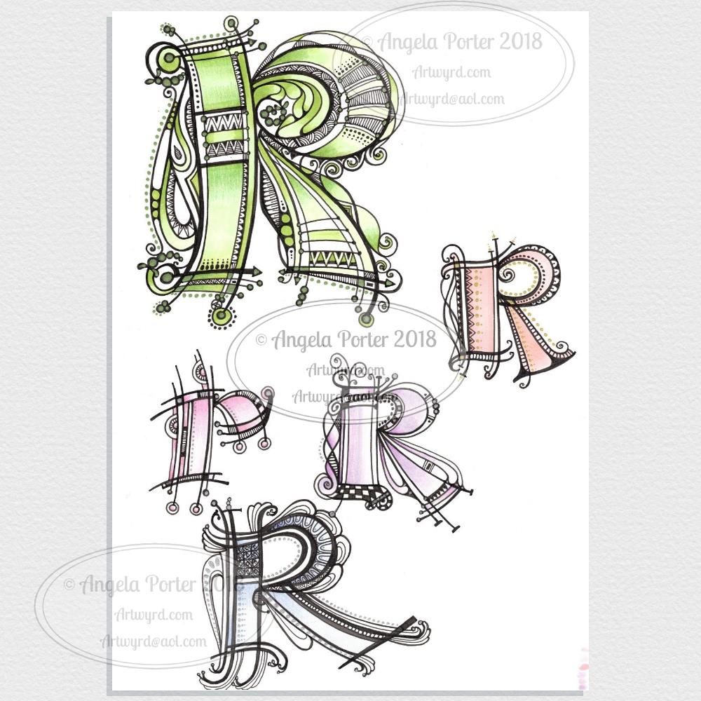
Monogram ‘R’ – with colour

©Angela Porter 2018

Yesterday’s black and white, graphic monograms of the letter R now coloured, with added lines and metallic highlights.

For all of the letters I used a combination of Copic markers and Chameleon Color Tones colored pencils to add the colours.

I chose Copics over Chameleon Markers as I really wanted soft, gentle, almost pastel colours for these letters. The only way to get these with the Chameleon markers is through gradients with the colourless blending chambers. I wasn’t at all confident I could get the soft, gentle colours with slight blending. So, I went with something I knew that would work for me – Copic Markers with Chameleon Color Blends pencils .

I think I got way too fancy with the added lines on the lower letter R, but it’s all a learning process.

I am really pleased with the others. The colours I chose or, rather, the pastel nature of the the colours, isn’t characteristic of me, but I think they work really well here.

Of course I had to add some metallic highlights. For the smaller Rs I used Uniball Signo metallic gold and silver gel pens.

On to my next letter…

Monogram R

©Angela Porter 2018

I started work on these early this morning – around 7am. And I’ve finished for now – it’s around 9am. I’ll return to them later today or tomorrow as I have a lil trip out for lunch with a friend.

Some different kinds of styles appearing in this little bunch!

The big R at the top is mostly done – it just needs some colour I think. It’s also similar in style to the previous monograms, starting with the yellow K did a couple of days ago. It’s been drawn with 08 Unipin and 04 Sakura Pigma Sensei pens. Green metallic embellishments have been added with a metallic Sakura Gelly Roll pen.

The R at the bottom, with the thick lines, was drawn using a Tombow Fude brush pen. Not easy to control the thickness of lines, so I used a Uniball Unipin pen to tidy up the lines and add the bits on the end. Not sure how I’m going to progress with this one.

The two in the middle row have been drawn with the Unipin and Sensei pens.

The R to the right was drawn with a Uniball Unipin brush pen, which is a bit easier to control the line thickness than the Tombow Fude pen. I did neaten up the lines and ad more using the Unipin and Sensei pens.

The bigger the letter, the more space for embellishments – the paper size is A4 (approx 8″ x 10.5″) in size and it’s white and very smooth Daler-Rowney Bristol Board. The smoothness of the paper makes it so easy to draw smooth, even lines on it. It won’t take water colours or watercolour washes, but markers and coloured pencils work fine on it. Tombow Dual Brush pens and similar tend to cause the paper to pill. Of course, I can always use a scanned image to colour them digitally.

Yes, I could also add dangles to each monogram. However the purpose of this exercise is to practice my hand lettering, particularly in this rather ornate and embellished style. Dangles can be added in the future.

I cover drawing monogram dangle designs in my book ‘A Dangle A Day’, which is due to be published in just over a week! Exciting!