Journal – pages 4 to 7

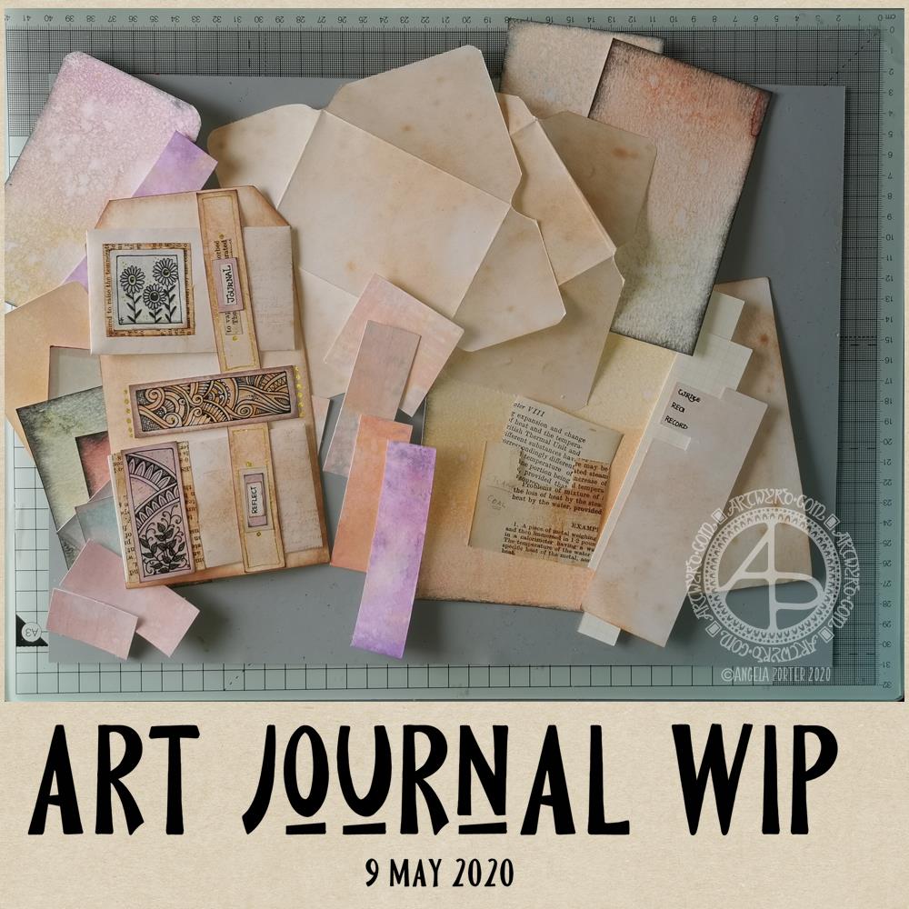
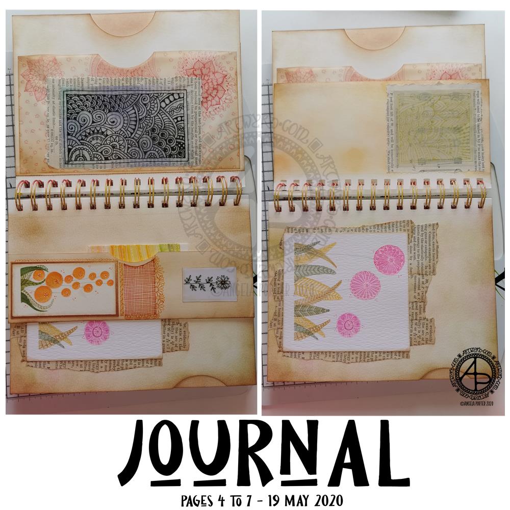
Over the past day or so, I’ve done some work on my journal and have pages 4 to 7 mostly complete. I’ve included lots of pockets to slip paper or artwork or other surprises into. I’ve also used some artwork I created as ephemera and embellishments.

Page 4 – top left.

This page has three pockets. One made by adhering two pages together, with a thumb notch punched out. Another is made from a sheet of tracing paper. The third is behind one of my signature entangled drawings; it’s a fairly secret pocket, unless I add something that peeks out from it.

I coloured the reverse of the drawing with Distress Inks as I didn’t know how they’d react with the pen drawing. Then, I adhered the tracing paper to some old book paper, and then adhered this to the tracing paper pocket, applying glue along three sides to create the pocket.

Once the glue was dry, I added some zentangle style patterns to the tissue paper pocket, just for fun. I used one of the Chameleon Fineliner pens to do this, using a colour that went well with the colours I’d used to ink the paper.

Page 5 – bottom left.

Page 5 is a little bit bigger than half the width of a page. I folded up the bottom of the page and adhered it along the edges to make a tuck-in. I punched out the thumb notch with a circle paper punch.

I decorated the tuck in with flower art at that I created myself. I also added some zentangle style patterns in between the flowers. I used Chameleon Fineliner pens, this time using a red and orange to get a gradient.

Page 6 – top right.

Again, a page that is a little more than half the width.

The drawing was done in gold ink on tracing paper. I used Distress Oxide inks to colour the reverse of the tracing paper before adhering it to some old book paper. The text and diagrams on the book page shows through faintly, as it does with the drawing on page 5.

Page 7 – bottom right.

This page just has a flower painting I created along with old book paper that have been collaged onto the journal page.

You can see the thumb notch on the edge of the page, showing I created a pocket by adhering two pages in the journal together.

Next steps…

None of the pages are fully completed. I’d like to add quotes or meaningful words or phrases. Some pages have gaps where I can add ephemera or pockets and so on. There’s certainly many spaces on the pages where I can draw patterns and designs.

I’m going to let the pages rest for a while as I turn my attention to other things today.

I’ve been feeling a bit ‘off’ or ‘meh’ in the last couple or so days. I’m finding it hard to settle to work of any kind. That I’ve been able to focus on getting some little bits and bobs done for the journal shows I’m feeling a bit more focused than of late.

Art Journal WIP

Art Journal WIP © Angela Porter | Artwyrd.com

I’ve been awake since around 4 am yet again, and after watching a couple of journal making videos on youtube by Wendy’s Journal Adventure and Tracie Fox LoveJunk Journals, I wanted to get up and have a go at creating a tri-fold tag for my own art journal.

I had an idea that I can use the little drawings I like to do as ephemera and embellishments and focal points in my art journal, rather than using ephemera from other sources like books, printables, and so on. I’m sure I’ll find more uses for them if I persevere with this project.

So, back to the tri-fold tag. It was my plan to make such a tag for my art journal. However, as usual, my plans often take a slightly different route!

I started by working out the size of tri-fold tag I wanted to make – to fit an A5 sized art journal.

I settled on a piece of mixed media paper cut down to 11.5″ x 7″, which I scored at 3.75″, 4″, 7.75″ and 8″ to create the three tags joined by hinges. I cut the top corners off each tag panel.

I coloured the front and back of the paper using Distress Oxide inks and sprayed water to distress the surface more. Then, I used vintage photo Distress ink to edge all the sides and folds to frame the panels .

I’d chosen colours that would go with some ATC s I was drawing last night while attending a webinair and listening to the speakers. However, the Distress Oxide inks resulted in a much brighter colour and I really wasn’t happy with the result. I will use this panel to use as a reference in future, not so much for sizes but for ideas for pockets and panels and envelopes and so on.

So, I started again. I used Distress Oxide inks, but this time I used tea dye and vintage photo, applying them as lightly as I could. I also coloured some copier paper using the same colours in Distress Inks, with a hint of rusty hinge added to the mix.

I was much happier with the colours this time around.

I liked the idea of using a ‘belly band’ with little envelopes tucked into it. So, I used 5″ square pieces of the coloured copier paper to make some little envelopes (2.5″ x 3″). Two of these would fit neatly on one of the panels. So, I made a 0.75″ x 7″ belly band, and coloured it with the same inks as the panels. I applied thin beads of glue to the ends and centre of the belly band and then adhered it to the panel, off-set to the right of the centre line.

When the glue dried, I had two sections that would hold one envelope each.

My next job was to rummage through my stash of coloured papers to find ones that would go together and were sympathetic with the background.

I drew some panels to add to the envelopes and also the space between them. I backed the panels with vintage book paper. Then, I hand lettered some words on a piece of coloured copier paper. I chose ‘Journal’ and ‘Reflect’ from the selection, cut them out. I used both vintage book paper and a piece of coloured paper behind them to make labels that I attached to the belly band above each envelope.

Finally, for now, I used a gold glitter Signo gel pen by Uniball to add dots and highlights.

It was then that I realised I really wasn’t happy with the tri-fold tag as I’d made it. So, I set about cutting the tags apart so I had three individual tags. I want to join them together in a different way, using hinges of some kind.

But for now, tiredness has caught up with me, as well as the need for some breakfast. So, I will put my project to one side for now and return to it later.

Reflections

I’m not entirely sure where I’m going with this, not yet anyway. I kind of like what I’ve seen other people do as far as ideas go for pockets, tags, labels, envelopes, pouches and all kinds of ephemera for art journals. However, they’re also not really ‘me’. I’d like to find a way of expressing ‘me’ in an art journal.

The one I have, in an A4 sketchbook is fine, and a perfect place to try things out. But, I’d like to do a smaller art journal that has sturdier, mixed media paper in it.

I do know I want to make use of my own artwork. Today, I drew the designs onto the coloured card. However, I quite like the idea of building up a digital library of my own drawings and designs that I could print out on paper and colour accordingly.

Although I hand lettered the words I used today, part of me isn’t happy with them and wants to create them in Affinity Publisher.

All the paper I start with is bright white in colour. Perhaps I could look at using different papers and colours of paper for future projects.

One other thing I’m doing, is keeping notes and diagrams showing templates and dimensions for various ephemera.

I’m babbling here, now. The early morning and lack of enough sleep last night is really catching up with me now. Time to post this then go get breakfast and more tea!

One dangle design, four colourways

One dangle design, four colourways © Angela Porter 2019

In my book, ‘A Dangle A Day’, I mention that just by changing the colour scheme you can easily change the appearance of a dangle design for an occasion or to match someone’s favourite colours. So, I thought it would be nice to show an example of this.

I chose a simple monogram dangle design from the book; you can see it in the top left corner. This dangle design has a very spring-like feel to it with the lovely bright pinks and greens of the new, fresh flowers and leaves that blossom and bloom at this time of year.

Taking my cue from this, I coloured in three versions of this design in the seasonal colours.

At the top right is a summery version, with a lovely warm sunrise as the background to the letter, blue summer skies, warm golden sun, and the bright and warm colours of the flowers. A golden summer glow could be achieved by using a hint of gold Wink of Stella brush pen from Kuretake, or by adding dots of gold glittery wonderfulness.

Autumn tones were used in the bottom left version. Fiery oranges, reds and yellows and clear autumnal sky blues were used. Enamel dots, glitter pens or stickles would add sparks of autumnal glory to this design.

The final design has a definitely cool wintry colour scheme – icy blues, cool purple and the blue-green tones of evergreens, along with silver. To this I could add white snowflakes or stars with a gel pen, or dots of silver glitter with Stickles from Ranger or Nuvo Drops or a glitter gel pen. Using a Wink of Stella brush pen from Kuretake to colour over the design would result in a lovely, sparkly, frosty finish.

Of course, there are many, many ways that the designs could be embellished to suit your taste, supplies or the recipient. So much fun can be had adding embellishments which also personalise the design even more.

I hand drew the original design on paper and then digitally for the book. My tools were Microsoft Surface Pen, Microsoft Surface Studio and Autodesk Sketchbook Pro, which I also used for the colour variations above. I set the ‘brush’ pens up for the book so they mimicked the shapes/patterns pens on paper create and left lines a little wobbly and imperfect, just as I would when drawing on paper. Indeed, I very much treat my Surface Pen and Surface Studio screen as if they’re pen and paper in the way that I draw (and colour).

I do hope you’ll give dangle designs a go, and that you’ll show me the results of your work. You can find me online here:

‘J’ Monograms

©Angela Porter 2018

What a troublesome letter J is! Well, as far as creating a monogram. Early sketches showed me that if I add too much fanciness outside of the letter, the letter gets lost in the embellishments! So, here are a few that I’m vaguely pleased with.

I used Daler Rowney Marker Paper to draw these letters on, with a mixture of black pens. I used Copic Markers to colour some of the letters. Others I used to experiment with Tombow Dual brush pens and a blender pen. Chameleon Color Tones pencils were used on a couple more.

The Copics work really well on the marker paper – no surprises there!

The Tombows tend to cause the pen I use to draw the designs with – Uniball Unipin and Sakura Pigma Sensei pens – to smear. I keep forgetting the Tombows do that. So, I tried drawing a J with the Tombow Dual Brush pen and then add the lines and patterns after it had dried. That worked. But white space needs to be created outside of the letter, and again, if I got too intricate, entangled, ornate with the embellishments I would’ve lost the letter. Or perhaps not if it was only the letter that was coloured in.

I was surprised at how easily colour from the Chameleon Color Tones coloured pencils laid down on the marker paper. Surprised because I’d forgotten how nice it is to colour on the marker paper! I did need a good layer of padding paper beneath the 70g/m² or 48lb marker paper.

I foresee similar problems with the letters I, L, and S. Not sure about the other letters I’ve not tried this kind of decorating with yet. Time will show!

What I can see here is that the style of embellishment I’ve used, while not always successful, such as the heart and arrow one (where did that idea come from? Sheesh!), it is different to the previous letters I’ve played around with. That is all down to the shape of the letter and the edges I have to play around with, while keeping clarity of the letter too.

What to do today? Well, I do have the 2019 template to colour for the colour explosion over on the Angela Porter’s Coloring Book Fans facebook group set to run through New Year’s Day. I’m also aware that I haven’t done a cutely whimsical cat monogram dangle design for a few weeks. I also have three templates to colour for ‘Entangled Forests’ so that book can be put to rest ready for publication, before I start on the next one.