I’m not a brilliant card maker, but I do like to have a go from time to time. Cards are quick, simple projects for me. They’re also a way to practice hand lettering.
I did have fun creating this design and also decorating the envelope. I used Faber Castell Pitt artist pens to draw the black and white line work. I added colour with Copic markers. I used a white Sakura Gelly Roll pen, a blue Sakura Glaze pen and a silver Uniball Signo pen to add the details on the card. I also used a mini blending tool and Mermaid Lagoon Distress Ink to edge the paper. For the envelope I used a white Sakura Gelly Roll pen.
I lifted the card design up using adhesive foam squares. However, I think it would’ve looked better if I’d attached the design to some white card, maybe some silver card and didn’t put the silver border lines on the design. Maybe some ink blending around the design would’ve added interest instead of the blue and silver dots – the blue are a bit heavy handed.
Always easy to be wise in hindsight. However, I don’t want to rework the design just now. I also think it’s useful that I share when I get things not right and how I would change things if I did this again.
Art doesn’t always work out right the first time. I always try my best to review why I’m not happy with something and what I could do the next time to improve things. There’s always something to learn and consider, and there’s always something good in each design.
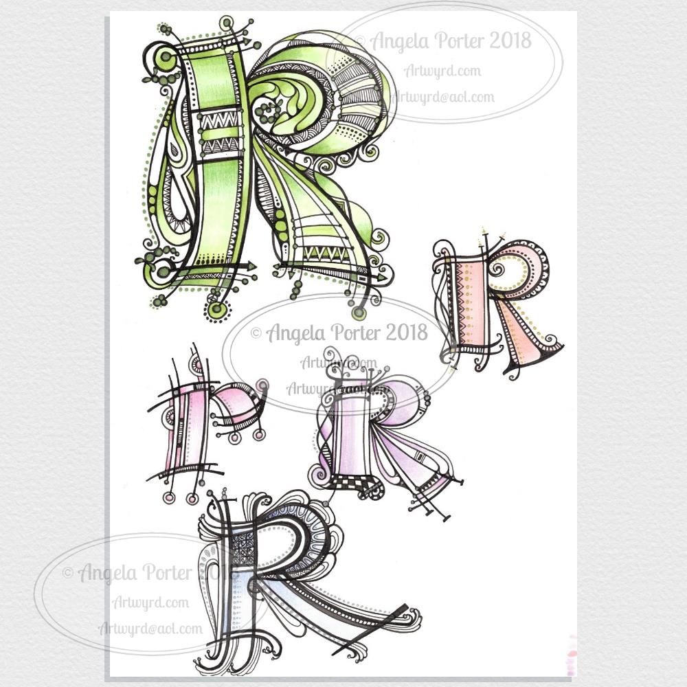
I’m actually really quite happy with the snowdrops – the copic colouring worked out quite well on the leaves/stems particularly. I like the cat too, but I’m not too sure about the spiral embellishments. My hand lettering worked out ok this time too.
I know from personal experience that when I’m finding life a struggle as my mental wellbeing deteriorates from time to time I tend to withdraw from people. It’s weird as I want to be with people but I also don’t want to as I don’t want my Eeyore-ness to be a burden or a bother to them. It can be too much to deal with social media too.
However, a little piece of happy mail in the form of a whimsically cute card would be welcomed. Happy mail may not be quite the right term for this, caring mail maybe. Thoughtful mail perhaps. No matter what it’s called, it would be something I could accept to know that someone was thinking about me.
At the worst times of my depression/anxiety it may have taken me a long time to contact the sender and say ‘thank you’. I really would have appreciated the gesture.
Even more, it’s a physical, constant reminder that someone, somewhere is thinking of you. It’s something I would now put into a ‘self-care box’ to use when I am having a struggle with my mental and emotional health.
I have enjoyed making personalised cards to send to people for their birthdays and other celebrations. I can be really dim, but I’ve just realised here and now that it would be lovely to send cards or bookmarks to people to just say hello, to let them know they’re being thought of, something tangible that can be a constant reminder that they are important to me at least.
Talking is good. But sometimes it’s too much to talk, to leave the house, to use social media. A little something in the post though … especially something handmade, personalised … that’s something that speaks more loudly than words at times when spoken words don’t make sense.