Dangle Design Greeting Cards

Dangle Design Greeting Cards © Angela Porter | Artwyrd.com

Today I have two card designs for you, both featuring dangle designs, but in different ways.

If you like dangle designs and you’d like to give drawing them yourself but need a little help or inspiration, then you may find my book “A Dangle A Day” of interest. In the book, I take you, step by step, through how to draw over 100 dangle designs, along with some ideas of how you could use them. 

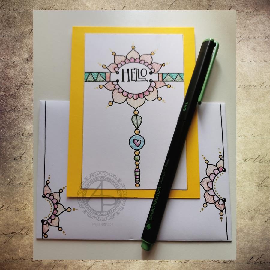
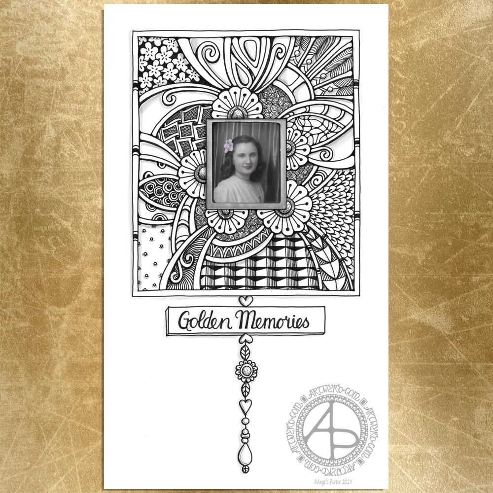
Love Ya and With Love Card.

I started by using the Foursquare Backdrop: Portrait die from lawn fawn to cut the frames and panels from a piece of Winsor and Newton Bristol Board. I purchased this die, and the one in the second card, from Seven Hills Crafts here in the UK.

Next, I used Stormy Skies and Broken China Distress Inks to add a subtle colour gradient to the panels.

My idea was to draw four different dangle designs for each small square panel. I also wanted to include some hand-lettering, which I did.

So, I used Unipin pens from Uniball to do the drawings and lettering. I did use pencil outlines for the ribbon banners and lettering to make sure their placement was just right.

I coloured the design elements and charms using Copic markers. As the individual design elements were so small, I just used two colours to achieve shading in the bigger ones.

I also added a drop shadow around the designs using a BV marker that is a greyish-violet. It’s a very subtle drop shadow.

I had to add some sparkle and shine to the card, so I used a clear Spectrum Noir Sparkle brush pen along with a gold glitter Signo gel pen to do this.

To assemble the card, I glued the frame to the card base using Tombow Mono adhesive. Then, I glued the square panels into place.

I managed to get glue onto the front of the card and trying to rub it off while wet just left a dark, dirty smear. I’ve ordered some Tombow Sand erasers to see if they’ll remove the mark. If not, I’ll have to either work out another way to cover it up or just consign the card to the pile of things not to do again!

Black and white floral card.

Again, my first job was to cut out the frame and panels using a die. For this card, I used the Foursquare Backdrop: Landscape die from lawn fawn along with Winsor and Newton Bristol Board. I also decided to use this die in portrait mode.

To draw the design elements, I used Unipin pens from Uniball. I hung dangle designs from the top of each card to fill in some of the space that was there. I wish I’d used a slightly thicker pen than the 01 though. They look almost like an afterthought.

Anyway, once I finished the drawings, I wasn’t sure whether to add colour or not. So, I’ve left the pictures as black and white line art for now.

I used Tombow Mono glue to attach the frame and panels to a 5″x7″ piece of Winsor and Newton Bristol board. I did this as I realised that the dies are made to fit card blanks made from half a sheet of US letter-sized paper folded in half. In the UK, we use A4 sized paper, which is different enough in size to make it awkward to cut the paper to fit the card. I have ordered some 5″ x 7″ card blanks with envelopes, and then I can finish assembling this card. I’m likely to trim the foundation panel down a little and maybe try to carefully add some colour around the edge. Maybe.

It’s at this point I’ll decide whether or not to add colour and to see if I can thicken the lines around the dangles without messing it up. Mind you, if I do mess it up, it’s another experiment I can learn from, hopefully remembering not to do this again.

Things I’ve learned and techniques I want to try.

The lawn fawn dies work great! They come with smaller dies – heart, cloud, small star, large star, sun, small sun and speech bubble – which may be useful in the future. I had made my mind up that I’d limit myself to die sets that are simple in shape to for cutting out panels to draw on and maybe for layering. 

I rolled my eyes at myself when I worked out that dies from an American company would work best with American sized paper for card bases. However, I can work around that now I’ve realised that. I’m comfortable working with inches; most of my craft tools have both inches and centimetres on them. However, the inches are visibly the most dominant measurement system. 

Glue. Me and glue. Not sure how I can avoid smearing in the future. Hopefully, the sand eraser will help to remove my gluey, sticky, dirty-looking mistakes.

I like using Distress Inks for backgrounds. However, the pale colours of markers that I prefer to use are translucent and so combine with the background. I could use other media such as coloured pencils for colouring. Or I could use distress inks or water-based marker pens with a damp brush to add colour. I could also use a damp brush to remove some of the distress inks. In that case, I may have to use watercolour paper instead of Bristol Board.

I could also use a Versamark pen – which contains transparent, sticky ink – to colour over my design elements once coloured and then use clear embossing powder and a heat gun to protect the colours. I could then add the distress inks after heat-setting the embossing powder. The embossing powder would add some dimension and shine to the cards. If I used a sparkle pen or gold gel pen, for example, the embossing would encase it and highlight these embellishments Ieven more, I think. I need to try this idea out!

So, there are lots of possibilities for going forward with this.

So, Angela, how are you feeling today?

I’m feeling the more content and optimistic than I have for the past two or three weeks.

I’m still feeling out of kilter; changes are happening in my perceptions around my emotional/mental wellbeing. I’m also aware of shifts that are happening in other parts of me.

I’m still poop-scared about what is going on in the world. I can’t see that ending anytime soon, however. This, and the rest of the emotional rollercoaster I seem to be on, are still upsetting my digestive system, so I’m not feeling too well much of the time. 

Yesterday, I was so unsettled and scared that I couldn’t settle to do much art, and I became so dissatisfied and frustrated with whatever I did. I couldn’t settle to anything else either – not crochet, reading, nothing. 

As I’ve said, today I do feel better, so I need to turn my attention to trying out Affinity Publisher to create some materials I’ve been commissioned to do (the artwork and inserts for a CD by a band!). I’ll see about setting the templates up first and go from there. I’ve not tried to do this the past couple of days as I know my head and my emotions weren’t in the right place. I’m not sure that they are today; it’s only by doing that I will find out whether they are or not.

Hello – A dangle design card with coordinating envelope.

Hell - A Dangle Design card with coordinating envelope © Angela Porter | Artwyrd.com
Hell – A Dangle Design card with coordinating envelope © Angela Porter | Artwyrd.com

Yesterday I decided to make a second card with a coordinating envelope. I wanted to try out using the Chameleon fine-liners to add colour in the form of lines and cross-hatching. Finally, I added some gold dots to the points of the petals on the flower design.

To draw the design and execute the hand-lettering, I used a Uniball Unipin pen. I then used various pairs of Chameleon fineliners to add the colour.

I prefer this way of adding colour with the Chameleon fine-liners, though I’m not entirely happy about it either. Looking at it now, in the clear light of dawn, I think I could have added a flat colour below the coloured lines. I may go and add that colour in a little while. After all, it’s just a card, an experiment, and if I mess it up, I can always make another one! A lesson learned, an experience gained is worth the few pennies worth of materials and the time it took just as long as I remember the lesson in the future.

I’m also not happy with my hand-lettering; I like the idea of the letter layout, but it’s not centred between the arcs.

I do like the ‘banner’ I’ve used to enclose the hand-lettering. However, there’s something about the rectangular ribbons and the patterns within that I don’t particularly like. I’ll work out what it is in time.

For now, I’ll try adding flat colour to the coloured sections to see how that works out and not worry about messing up the card. I’ll use it as a learning experience.

And that reminds me, I’ve still not set up my One Note journal for my private critiques and what kinds of methods and techniques I use in my art.

Materials

A piece of yellow card cut to 4″ x 11″, scored and folded in half to make a top-fold card measuring 4″ x 5½”.

A piece of white card approx. 4″ x 5″ for the top layer.

A We R Memory Keepers Envelope Punch board and an piece of paper measuring 7⅞” x 7⅞” or a blank envelope that will fit a 4″ x 5½” card.

A pencil and ruler for the guide-lines and a good eraser to remove them.

A black fineliner pen for drawing and hand-lettering; I used a Uniball Unipin pen.

Pens to colour the design; I used Chameleon fineliner pens.

A gold gel pen for the dot embellishments; I used a Uniball Signo gold gel pen.

If you’d like to learn more about dangle designs or are looking for some more inspiration for them and how they can be used in cards, BuJos, scrapbooks, bookmarks, journals, and more then my book ‘A Dangle A Day’ is a good place to start. It takes you through how to draw monograms and dangle designs for all kinds of occasions around the year in simple steps.

Thinking of you – dangle design card and envelope

Thinking of you © Angela Porter | Artwyrd.com

Dangle designs

Today, I have a dangle design card along with a coordinating envelope for you. I’ve kept the construction of the card simple with just one layer on the card blank. The dangle design and hand lettering are also quite simple as well as whimsical in character.

If you’d like to find out more about drawing dangle designs, then
A Dangle A Day is my book about dangle designs with plenty of inspiration and suggestions.

Materials and dimensions of the card and envelope

The yellow card blank is 5½” x 4″ in size with a top fold. So, I started with a piece of card measuring 11″ x 4″.

I also cut a piece of Winsor and Newton Bristol board to 5″ x 3½” for the top panel.

Next, I used some thick printer paper to make an envelope. I used the We R Memory Keepers Envelope Punch Board. The size of paper needed and the position of the first score line are printed on the board. This tool from WRMK makes it so easy to create custom envelopes.

To make an envelope to fit a 5½” x 4″ card I needed to cut a piece of paper measuring 7⅞” x 7⅞”. I used 120gsm white printer paper for the envelope.

Pencil guide-lines

Before I started, I used a ruler and pencil to draw in some faint guide-lines for the banner ribbon and the hand lettering on the top layer. I also pencilled in the hand lettering.

On the envelope, I added some guide-lines on the left and bottom to give me a border.

Hand-lettering and drawing the design

I started by hand-lettering the sentiment, then I drew the ribbon banner around it.

My next task was to draw the dangle comprising of beads and hearts.

Finally, for the top layer, I drew in the arrangement of plants and added some shells and butterflies.

I didn’t use a pencil to sketch the design before I drew it in ink simply because I’m confident in drawing these kinds of designs. However, it is a good idea to do so if you’re less than confident. I started with the central flower pot and let the design grow out from there.

I then took my attention to the envelope. I started by drawing in the ledge on the bottom. Next, I added the plants, flowers, shells and butterflies. I then drew a black border around the envelope, just inside the edge. This line gave me something to hang the dangle from; I added a dangle similar to the one on the card.

Adding colour

With all the drawing complete, it was time to add some colour.

I’d received my Chameleon fineliners yesterday, so I thought I’d try them out as there are lots of small areas in this design. I love my Chameleon markers, but using them to add colour to tiny spaces can be a little tricksy.

I did try the Chameleon fineliners out yesterday for drawing lines and hand lettering. I found that they give a very long gradient, even with the shortest of touches of the cap to the pen. I thought this might work well in colouring the flowers in. I achieved a pleasing change of colour of the petals on each bloom from just one blending process. This blending also worked well for the butterflies.

What I did notice is that the fineliners moved some of the black pigment from the Uniball Unipin pens that I used to draw the design with. That was a bit disappointing. It may be that in the future I will need to draw, scan and then laser print the design out. That’s a bit of a faff, but it’s doable.

I’ve never been a fan of fineliners for colouring; I find they leave lines and tend to pill the paper. This is just a personal gripe about all fineliners.

The Chameleon fineliners are pleasant and comfortable to write with – comparable to other fineliners. So, unless I want to add colour using lines and cross-hatching, writing is going to be my primary use for these pens.

To colour the pots, banner, leaves, cacti, shells and ledge, I used some of my Copic Ciao markers. I chose to use these as the brush nib lets me colour tiny areas. Also, I wanted to use pastel-ish colours to tone in with the colouring from the Chameleon fineliners.

I did add some very simple Copic shading to the design.

The Chameleon fineliners had spread the black dots I’d added to the flower centres. So, I broke out a gold Uniball Signo pen to colour in the centres of all the flowers. I also used it to add a sprinkling of little dots around the design.

Reflections

I enjoyed creating this card and envelope. It was a quick, simple project. I also do enjoy drawing whimsical designs.

I like the sunshiny yellow card blank; it makes me smile, especially as it is currenty a grey and rainy day here in the valleys of Welsh Wales.

I think the card may benefit from the use of a bit of Wink of Stella to add some shimmer and shine to the wings of the butterflies and maybe the hearts.

I could’ve ink blended a background to the design using Distress Inks. I also could’ve added a drop shadow around the design to give it some dimension. Today, I chose not to do these things to keep the card relatively simple.

I also only added one layer to the card. I could’ve cut a piece of contrasting colour to go beneath the top layer to give a bit more of a layer. Alternatively, I could’ve used amarker to colour the edge of the layer to give a border, or ink blended some distress ink around the edge. Again, I chose not to do so; I wanted to keep the card simple and easy to do.

I think the result is cute and whimsical. I now have to find someone to send it to! I think that I’ll use some Distress Micro Glaze to protect the artwork on the envelope before posting it though.

Hand writing matters!

In a blog post called “Handwriting matters!” by Marie Celine she discusses why she thinks handwriting still matters in this age of digital communication.

I agree that handwriting does matter. Handwriting is as unique and individual as the person creating it. It’s also a much more personal way to communicate with others. It takes longer to handwrite a letter, note or memo and then deliver it either to the person or the post office.

It’s always nice to receive chatty, friendly emails from friends, and of course this is a quick and instant communication. However, there’s something to be said about the slower nature of communication by traditional post and that personal touch that handwriting gives.

I make these cards but rarely send them to another person, let alone include a handwritten note or letter. The cards sit around my home and never get shared with another person.

I think that needs to change, don’t you?

Not sure how to go about it, but if anyone who reads this would like to receive one of my cards and maybe a letter then leave a comment or contact me via social media or email.

I actually do love to hand-write; I always have and I’ve always taken a lot of pride in my handwriting. I remember making a huge effort to change it when I realised it was looking like my mother’s writing.

My preferred way of learning was to write and re-write my notes, condensing them into just a few lines of ‘memory joggers’. If my notes in lessons or lectures were messy, I would make it my task to tidy them up as soon as I could, which was also a way for me to review, consolidate and learn.

I have the facilities to hand-write digitally. I could keep a journal by writing on the screen. However, such activities frustrate me as I can’t turn the writing area to the angle I like to write at!

Also, as much as I love working digitally in so many artistic pursuits, there’s nothing quite like the feel of pen on paper, and I do love pens! I have a bit of an obsession with stationery, even though much of my work is digital these days.

Handwriting and therapy

Nowadays most of my handwriting is in my journals. It’s not as neat as I’d like it to be. I make mistakes. I like to hand-write my journals as the process of putting pen to paper slows my mind down. It gives me a chance to reflect and review what’s been going on in my life and also with my emotions.

Of course, reflecting on my thoughts and emotions, catching them in action is important to me as I continue with my journey to recovery from CPTSD. It also helps me to record events, emotions and thoughts that need to be discussed in EMDR therapy.

Handwriting vs Hand Lettering

Handwriting is that almost unconscious way we write things down – thoughts, notes, memos, to-do lists etc, as well as our signatures.

Hand lettering is a much more deliberate activity. It is like drawing the shapes of letters, not writing the whole word in one go. It’s consciously deciding what the shape, size and embellishments of a letter should be.

I enjoy hand lettering and I do tend to use the shapes of letters that I use in my handwriting. But that’s where the similarities end for me.

Do you still hand-write? How do you make use of handwriting? Do you think it’s still an important skill?

Leave a comment, I’d be really interested to hear what you think?

‘F’ Dangle Design

'F' Dangle Design ©Angela Porter | Artwyrd.com
‘F’ Dangle Design ©Angela Porter | Artwyrd.com

Friday is dangle day!

Today I thought I’d create a monogram dangle design for ‘F’ with some cute fish, as well as a couple of shells. Of course a whimsical crown with golden foliage tops the design off just nicely!

Fish means a water theme, so I used blues, and blue-greens quite liberally. However, golds and shades of red and magenta really give a tropical feel to the jolly little fish.

Fairly simple gradient colouring this week. No drop shadows, other than the one around the whole design.

Looking at it now, I think the monogram might benefit from a drop shadow or two. However, it’ll do just fine as it is I think.

It would be lovely on a card for someone with the initial F, especially if they love fish or fishing. Of course the colours can be adjusted accordingly, as can the particular kind of fish. I’m particularly fond of cute, whimsical, happy little fish.

It could happily find a place in a BuJo, scrapbook, planner, journal or diary. Making the monogram narrower and the dangles longer, it would make a lovely bookmark too, I think.

Just a little mention here about my book “A Dangle A Day”. It’s a dangle design tutorial book, Angela -style dangles that is. Lots of monograms as well as dangle designs for use around the year. It’s a good place for beginners, but is also full of ideas for the more experienced among you. And, of course, I add a new dangle design on this blog most Fridays which you can use for inspiration.
I’d love to see what you create! Tag me on social media!

Monogram Idea

Monogram Idea ©Angela Porter | Artwyrd.com

I had an idea yesterday for a different way of creating a monogram. This is my work on it so far. The green-grey background is just to show the letter shape. I did hand letter the outline of the A.

I wanted to try this out with the way I’ve been creating digital art of late. I’m trying to keep the motifs simpler just so I can see how, or if, this will work out. So far i’m really not all that sure about it. As I’ve put a few hours into it so far, I’ll keep going and see how it progresses.

I’m wondering if using flowers may be the wrong kind of idea and I should’ve stuck to my more abstract patterns, arches and so on.

I’m really not sure about my colour choices either.

However, as it is a test piece of an idea that popped into my head I do need to work with it some more.

My mood isn’t helping me today, more about that further along this blog post.

As usual, I’m using Autodesk Sketchbook Pro along with my Microsoft Surface Pen and Microsoft Surface Studio.

So, Angela, how are you today?

I’m fecking shattered. I hadn’t fully recovered from EMDR on Monday and doing an anti-stigma talk drained me more than I thought it would, even though I focused on what CPTSD is, how it affects my life, the stigmatisation I’ve experienced, and both the helpful and unhelpful things people have said and done.

After the talk I was absolutely ravenous and rather than go home before going out again to something I had on in the evening, I thought I’d eat out.

So, I went to a pub/restaurant I’ve been to before and bravely went in and had a meal! All by myself! Whether this was out of sheer hunger and desperation, or whether I really was feeling brave and more confident I don’t know. But I did it!

I didn’t get home until late after the evening meeting, and though I slept long and well I am still tired now.

I have that weird double, or even triple, feeling inside me. I can sense the underlying anxiety, though it does seem to be diminished a little since EMDR on Monday. I can also feel that contentedness that seems to have taken up residence in me. However, I’m overly emotional, tearful, and sad in waves.

My therapist has said that it’s a very Western thing to think that we can only experience one emotion at a time. In the East they accept that we can feel multiple emotions at a time.

For some reason that helped me to accept that this is what is happening in me, and that I’m more aware of my emotions and thoughts after a lifetime of avoiding/ignoring them and pushing them away.

I think my mindfulness training with a Buddhist tutor really helped in accepting this too. One of the metaphors he used is that we are like the sky. The sky it’s self is calm, still, peaceful. However the winds and clouds move through the sky and they are like our emotions, the come and go in different amounts and strengths.

The contentedness I feel is that sky within. Today I have multiple clouds scudding through and circling around. Just like the clouds in the sky above me today, they will float on by.

These moods and tiredness don’t help me at all with my confidence in my creativity. When I’m emotionally exhausted I do find it hard to find the good in anything I say or do.

However, I know that in time my exhaustion is healed and my confidence increases once again.

Today is another day where I need to be kind to myself. And that kindness will begin with another mug of tea and then a good long nap. After the nap, I may feel refreshed and ready to tackle colouring a template for the cover of a book. If not, there’s tomorrow to do so.

Wednesday

Wednesday ©Angela Porter | Artwyrd.com

A cute and simple mandala today with a little bit of hand lettering in the centre.

I used a Microsoft Surface Pen on the screen of my Microsoft Surface Studio in Autodesk Sketchbook Pro to create this mandala.

So, Angela Porter, how are you today?

I’m a lot less exhausted than yesterday. I slept, lots. I’m still feeling a bit light headed and tired, but I am able to mostly function this morning, as evidenced by the cute mandala.

I have to get my self sorted soon to head off out to give an anti-stigma talk for Time to Change Wales. I’m sure I’ll be able to do it and I can take time to recover afterwards if I need to.

I’m still quite surprised about how deeply the last EMDR session has affected me. Not only tiredness, but my digestive system is again a bit out of kilter. It will all settle down again given time, just has it always has in the past. It’s all just part of the healing process. It’s the after effects of ‘surgery’ to release the trauma. No surgery is without unpleasant after effects and time needed to heal.

Nikita Gill – poet

I found this wonderful poet the other day and I have ordered three of her books. She so eloquently creates poems that describe aspects of my CPTSD, trauma and my healing journey too.

Kintsugi

On the days
when you feel
ashamed of your scars,
your mind only registering
how ugly they are
rather than the beauty
they prove of you having survived,
remember that
there is an entire art form dedicated
to filling the cracks of broken things with lacqurered gold.

An entire art form that proves that
even the broken and damaged history of an object
is beautiful and should be treasured.

Remember
how much more you are
than an object.
Remember
your survival, your journey,
your scars deserve
to be treasured too.

______________________
Nikita Gill

That is just one of so very many poems that spoke to me. I look forward to the delivery of the books so I can read through many, many more.

Be Brave WIP 30 June 19

Be Brave ©Angela Porter | Artwyrd.com

Another 6 hours work done on ‘Be Brave’ since I posted yesterday.

I rather like the ‘tubes’ arcing off to the top right. I love geometric patterns. I also love playing with light and shadow.

In my home I have quite a few pieces of artwork from my AS and A level art days, some 15 or so years ago now. Three of them are oil paintings. They’re abstract paintings of patterns taken from rusty worm screws from a steam locomotive, some kind of gear thingy from a diesel locomotive (also rusty) and detail from an angel from the tympanum above the door to Malmesbury Abbey. Each one is done in a simple colour palette – magenta, red, orange and yellow for the locomotive parts and blues and white for the Romanesque angel abstract.

I discovered I hated working with oil paints. They’re slimy and messy. I don’t like slimy nor messy (I think that’s why I’ve fallen in love with digital art!).

However, I remember the exhibition where these were show after the AS exam. I recall being puzzled why people were coming up and touching the paintings. So, I asked a friend who’d attended why she had felt my oil paintings.

She said they looked so three-dimensional she had to touch them to see how I’d achieved it and was amazed they were flat.

I hadn’t seen this 3D property of my artwork until someone pointed it out to me. Then, just like magic, I could see what others could see and why they were touching the paintings.

As I worked on the ‘tubes’ I remembered this experience. I know that I don’t see my work as others see it and it can often appear ‘flat’ to me as I know it really is flat! I don’t always see the illusions of depth that I create in my work, illusions I bring out mostly unconsciously as I add colour.

I think this memory cropped up as, like with the oil paintings, I’m working with pure colour – no black lines to outline the design elements.

As you can see, I am using a drawing of mine as the guide, the map for what I will produce in colour.

This is a difference in the way I usually work, that’s for sure.

The amazing mandala I completed a week or so ago now opened the door for this way of working. I did start with an outline drawing for the mandala, and it really was a basic line mandala. It gave me the basic forms and shapes. I then started to go to town on embellishing that basic design.

I discovered I really enjoyed working this way, not least because I realised my digital art skills had progressed enough for me to succeed.

Mandalas are one thing, but working on a drawing like this is a bit different for me. It’s full of self-doubt and worry it’s not going to work out. Because it’s not so symmetrical it requires thinking about what order I complete each design element.

It is, however, turning out ok. And I’m really learning a lot more about my favourite digital brushes, and new ones, and how I can get the effects I want.

I use a Microsoft Surface Pen, Microsoft Surface Studio and Autodesk Sketchbook Pro to create my digital art.

So Angela, how are you today?

I’m feeling content and I can feel a gentle smile inside me and a slight smile on my lips. Yes, I know that sounds weird, but it’s the only way I can describe how I feel today. Also, my digestive system has settled down as well.

Yes, there’s still the background ‘noise’ of anxiety, but it’s not as vociferous as it was just a day or so ago, and one heck of a lot quieter than it was last Monday post-EMDR.

I do have EMDR again tomorrow. The same thing may happen in terms of heightened anxiety and upset digestive system.

I have to say to gain days like today – days where I have that contentedness, that inner gentle smile – are more than worth the days of feeling not so well both physically and emotionally.

Even my bad days are nowhere near as bad as they were in the years leading up to my first serious ‘breakdown’. That is an excellent thing. I am progressing along slowly but surely on my journey to recovery from CPTSD.

July 2019 Dangle Design

July 2019 Dangle Design © Angela Porter | Artwyrd.com

July Dangle Design

July is nearly upon us. It seems hardly anytime at all since June started! So, close to the eve of a new month it’s time for a dangle design.

This month I wanted to do a floral wreath with a little hand lettering. As I live in the Northern Hemisphere July means summer. So, my charms are a glowing sun, an ice cream cornet, and a tiny feather. I chose colours that remind me of summer too.

Now, for those of you in the Southern Hemisphere where winter has begun, feel free to substitute different charms – perhaps a snowflake instead of a sun and a steaming mug of hot chocolate instead of the ice cream cornet. Of course, a more wintry colour palette would be lovely.

I designed this to be A5 in size so that it would fit nicely in a BuJo, but equally it would look lovely in any planner, journal, diary or scrapbook. Of course the sentiment could be changed too.

I don’t know if you’ve noticed, but the wreath has a seven-fold symmetry. Well, July is the seventh month after all!

If you’d like to learn more about how I design and draw dangle designs, along with plenty of designs to use or adapt, then my book “A Dangle A Day” is a good place to look.

I did create this dangle design digitally, using my trifecta of Autodesk Sketchbook Pro, Microsoft Surface Pen and Microsoft Surface Studio. It would be quite easy to draw with pen on paper and then use any media you like to add colour.

So Angela, how are you today?

I’m feeling quite content today within myself. I seem to have rested quite well. My digestive system still doesn’t feel quite right, but it’s certainly a lot better than post-EMDR on Monday.

In my blog yesterday, I wrote about my CPTSD and the prejudices I seem to face for having therapy. I’m amazed at how that post garnered a lot of interest on twitter; a lot of interest for a tweet by me that is, the most I’ve ever had.

I was humbled by this, but the best thing for me was someone letting me know my blog post had helped them.

That’s why I write about my CPTSD, mental health and emotional health. It’s not for attention (I don’t deal well with being shown attention of any kind – all part of the CPTSD). I share my story and journey so that it may help others.

It took me nearly 50 years of life to work out that I had a problem, and a couple longer to work out that it wasn’t just anxiety and depression, that it was something more, that it was CPTSD.

This is a label I needed to have. As I learn more about CPTSD it helps me accept that I am stuck in the past; not in terms of reliving memories and events over and over, but in the way I behave, feel, react to life.

Being traumatised means continuing to organise your life as if the trauma were still going on – unchanged and immutable – as every new encounter or event is contaminated by the past.

After trauma … the survivor’s energy now becomes focused on suppressing inner chaos, at the expense of spontaneous involvement in their lives. These attempts to maintain control over unbearable physiological reactions can result in a whole range of physical symptoms including fibromyalgia, chronic fatigue and other autoimmune diseases.

“The Body Keeps the Score” Bessel Van Der Kolk

Today, as I read a little of “The Body Keeps the Score” this quote really struck me.

If I think back to the weeks, months and years before my first bout of serious anxiety and depression, I can see how I was trying to control the inner chaos during my daily life. I struggled every single day with exhaustion, fear, fighting back the tears and wanting to hide away or run away. I also hoped I would die in my sleep so I didn’t have to continue with this.

I certainly had physical symptoms of illnesses for which there were no physical causes – upset stomach, losing my voice, problems with my lungs, outbreaks of weird spots on my skin. I’ve also developed a couple of chronic illnesses along the way too.

I don’t lose my voice anymore, but I certainly still get a dodgy digestive system and asthma attacks when the lightly napping anxiety monster is provoked and awakens. Oh, and I still get weird flare-ups of skin problems.

It’s taking me quite a while to read this book. I lost my ability to read during my first big ‘breakdown’; I still have problems retaining what I read. Sometimes I even have trouble making sense of what I’m reading. I used to be an avid reader. I miss that. However, I am aware that my ability to read is returning… slowly. In the meantime, audiobooks are a great source of pleasure for me.

Be Brave – Entangled Art WIP 25/06/19

Be Brave WIP ©Angela Porter 2019 | Artwyrd.com

A bit more done this morning. Another 2.5 hours today for a total of 15.5 hours. Some hand lettering has been done today as well.

It’s coming along, slowly but surely.

I don’t think I’ll be doing much more today. I’m not feeling too well. More about that below though.

As usual, my tools for digital art are Autodesk Sketchbook Pro, Microsoft Surface Pen and Microsoft Surface Studio.

So, Angela, how are you today?

I’m not feeling too well. I woke up in the night all hot and sweaty with a very upset tummy again.

I was ok before my weekly EMDR therapy session. I think this bout of illness is linked to EMDR. It turned out to be a rather surprising session.

I had a bit to talk about with my therapist, Linda, to do with interesting bits of the book I’m reading “The Body Keeps The Score” by Bessel Van Der Kolk who is one of the foremost experts on traumatic stress.

For real change to take place, the body needs to learn that the danger has passed and to live in the reality of the present.

“The Body Keeps the Score” by Bessel Van Der Kolk

Linda and I had a little chat we had about how important she thinks it is that I blog and talk about my CPTSD and how trauma in my life has affected my life so much.

Our scans had revealed how their dread persisted and could be triggered by multiple aspects of daily experience. They had not integrated their experience into the ongoing stream of their life. They continued to be “there” and did not know how to be “here” – fully alive in the present.

“The Body Keeps the Score” by Bessel Van Der Kolk

She said she thinks its particularly important as people assume that PTSD/CPTSD can only come from major traumas in life, sexual abuse, physical abuse. We talked about how neglect from birth – emotional and physical – can be traumatic and can cause problems with relationships with others and the self, and how it sets up the patterns for the negative beliefs about oneself.

I certainly did experience emotional and physical neglect and I never really had somewhere that was safe. I do now. I live alone. My home is my sanctuary, my safe place, and I rarely invite people into my home. Even though my home is safe for me, noises outside – doors slamming, car horns beeping, loud voices (even happy ones) can provoke a startle response in me. This is relevant to what happened in EMDR this week.

Scared animals return home, regardless of whether home is safe or frightening. I thought about my patients with abusive families who kept going back to be hurt again. Are traumatised people condemned to seek refuge in what is familiar? If so, why, and is it possible to help them become attached to places and activities that are safe and pleasurable?

“The Body Keeps the Score” by Bessel Van Der Kolk

It’s not just having a safe home that’s important for me. I can feel safe here. However, leaving my home can mean I feel unsafe, anxious, on edge and this prevents me from doing things that I’d like to do. Simple things like going into a cafe for a cup of tea, or into an unfamiliar shop, to get out of my car in an unfamiliar place and walk around, to name just a couple.

I never felt safe at home or anywhere else for as long as I can remember.

That one thing has had a huge impact on my life, and though I now have a safe place, there’s still so much to work on when I attempt to venture into the world and interact with it and with the people that inhabit it.

Anyway, back to yesterdays therapy session.

We went on to continue EMDR processing of the traumatic event that we were working on last week.

Lots of pain/feelings in my body as the trauma was being processed. The front door to the building was slammed and the noise caused me to become startled. Linda was really surprised at how strong my startle response to the noise was, especially as this hadn’t happened before. She asked how long I’ve had startle responses; I informed her for as long a I can remember. She checked back on a PTSD questionnaire (not the right word but I can’t think of what that is now) I’d done a number of years ago now and the startle response was there.

I was instantly on edge, anxious, wide eyed and hypervigilant and we did some calming and grounding exercises before going back to the orginal memory.

It was obvious that the memory we were working on was being flooded by the startle response. So the EMDR was brought to a close for this week.

We did some calming and safe space work before I left.

Apart from feeling a little more anxious than usual, I felt ok on my drive home, other than I was aware that my body was still processing trauma in the way I experience it during EMDR – so odd aches, pains, sensations. Linda did tell me to be prepared for this happening as the startle response had really upped the ante on the processing and has brought forward new stuff to work with, even if I don’t know what it is at the moment.

However, as time went on I started to feel more anxious, extremely exhausted, and rather teary.

I still feel that way now, even though I also feel quite content at the same time.

The contentedness is that ocean that is me, the other feelings are the weather that causes waves on the surface of that ocean. The weather is rather stormy today.

Doing art helps me to be more aware of that contentedness, that’s for sure, which is why I focus on doing art on days like this, or at least on creative ventures.

Having an an upset stomach after therapy is quite a common occurrence for me, and Linda tells me it happens to a lot of her clients. It’s part of the continuation of the processing and/or the heightened anxiety that I experience in EMDR and in the startle response and I feel that anxiety in my stomach/abdomen strongly.

It’s always there and it’s part of the reason I tend to overeat; if I’m overly full I feel uncomfortable from food not from the anxiety I feel.

So, I’m feeling exhausted today, my digestive system is feeling tender, fragile, and still a little (maybe more than a little) yeuchy. A quiet self-care day is in order I think with light food for sure. I suspect a good sleep will be on the cards too.

As much as I find comfort in doing art, there comes a time when I become dissatisfied with all that I do, and I reached that point with my ‘Be Brave’ WIP. I think a day of crocheting hexagons and adding them to the blanket I’m making for a friend may be in order, and watching something on TV or DVD that soothes me, so that may be Star Wars, Lord of the Rings, Harry Potter or the like. It may be that I listen to an audiobook, though I tried doing that earlier and I kept having to rewind as I couldn’t pay attention to it in the way I’d like to.

Golden memories – a dangle design

Golden memories dangle design ©Angela Porter 2019 Artwyrd.com

As it’s Friday it’s time for a dangle design, and here it is. All in monochrome, well nearly. I added some subtle colour to the photograph.

If you’d like some ideas and step by step instructions on drawing your own dangle designs then my book “A Dangle A Day” is a good place to start. Just saying like.

I decided to use one of the images from the ‘Photobooth’ collection in the Idea-ology range by Tim Holtz. I thought that around it it would be nice to create an entangled frame, and to add a simple dangle design to this frame.

With the vintage nature of the photo I thought that the hand lettered sentiment of ‘golden memories’ would be a good one to add.

In keeping with the vintage design I thought a monochrome colour scheme would be appropriate. Mind you, a color palette of subtle vintage colours would work quite nicely too. It would be nice if I’d changed the colours from greys and blacks to sepia tones.

I drew the design and did the hand lettering with Unipin pens on Winsor and Newton Bristol board. I then cleaned up the scanned image, and added the subtle colours to the photo, using Autodesk Sketchbook Pro, Microsoft Surface Pen and Microsoft Surface Studio. I also added some subtle grey shadows to the design.

This would look absolutely charming framed, a lovely way to display cherished photo-booth images. I drew this image on a sheet of A4 paper (approx. letter size).

However, this would work on a smaller scale for a scrapbook, journal or even a BuJo. It would also make a lovely greeting card or note card for someone too.

It’s also an idea that can easily be altered for a more masculine tone, perfect for father’s day or a male birthday.