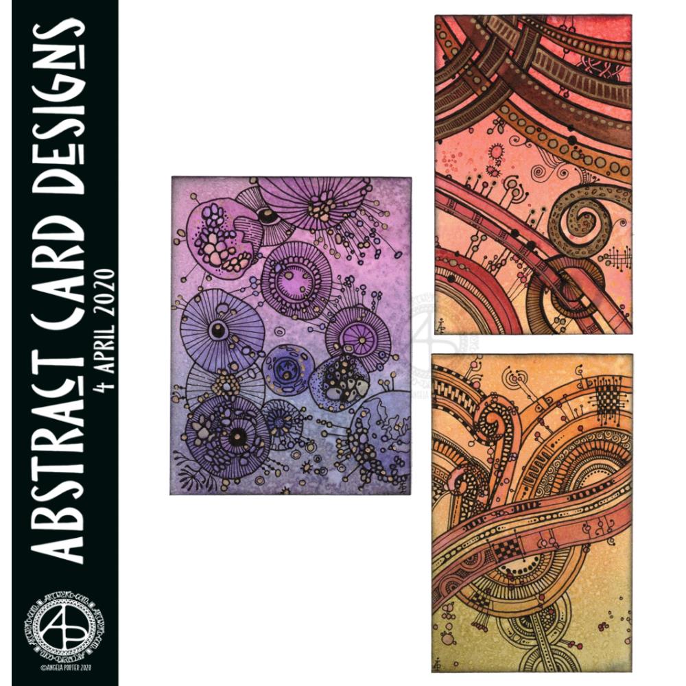
I had so much fun making these little abstract art creations! They really do go back to my roots, but in the way I like to create now.
To give you an idea of size, the purple one is 3″ x 4″, the other two are 2½” x 4″ in size. I have mounted them on cards that are 4½” x 5″ in size, made from some white Daler-Rowney mixed media paper, and I love how they look!
I started by creating the backgrounds using Distress Inks, a mini foam blending tool and a spritz of water.
Then, I painted on some basic shapes using a brush, water and either colour from Zig Clean Real Brush pens or Distress Inks, followed by some splatters of colour.
The the real fun began. Taking some things I really wasn’t happy with and adding line and pattern to them to give them form, definition, and some dimension.
I used Sakura Pigma Micron pens (05 and 02). I also used a glass pen and gold ink in the top right design. For all designs, I used a gold Sakura Gelly Roll pen to add gold highlights, which haven’t shown up well in the scans.
There was something so satisfying and pleasing in working with vague shapes and patterns, the random nature of the background, and using them to inform how my art would develop in each case.
I really, really enjoyed creating these, and I will do more in the future.
I’m not sure how I could create similar digitally – the randomness of wet media isn’t something I’ve worked out how to do…yet. Maybe I never will. Maybe it’s the case of me creating the backgrounds separately using traditional media, then adding the lines digitally. I don’t know yet, however. It may be that this is something I reserve solely for traditional media.
What I do know, is that each design is a work of art in it’s own right and these would look fab framed. In fact, I had a huge inner smile as I mounted them on the card blanks, giving them a simple frame, and saw how finished they then looked. Teeny, tiny pieces of art, by me, Angela.
Yet again I woke with my mind swimming with an idea I wanted to try out. I’d had a problem when I was trying to add colour to drawings I’d done on distress ink backgrounds. Whether I used water and a brush or a Tombow Blender pen, the pigment from the Sakura Micron and Uniball Unipin pens bled, and I really wasn’t happy with that.
I spent some time yesterday trying different pens out, with no luck in finding any that didn’t smear/bleed. So, I put this to one side until I had a chance to think about it.
I slept on it and woke with an idea to try.
Why not use the Tombow blender to draw the basic shapes of my design in colour and then add black lines afterwards. Seed pods seem to be my default design when I’m experimenting, but I’m fine with that.
So that’s what I did. And this card is the result.
As I was starting to add the black lines to the design I thought I’d made a horrible mistake, had a bad idea. However, as I added more and more detail, I realised it would work out, and I think it did.
I added some gold to the seeds in the seed pod with a glitter gel pen. I also splattered some gold watercolour paint over the design.
The envelope is really simple; three seed pods, black line art with golden seeds.
Not a unique artistic approach, but it is something that has never worked for me before.
It’s not a dissimilar approach I take to my digital art, where I start with the basic shapes and then add shading and detail. I do use line art as a guide for my design, and that is an approach I can apply to traditional art in that I may need to pencil in the design, then colour, then add the line art.
Who would’ve thought it – working digitally is helping me develop my traditional art methods and skills.
I’ve enjoyed creating this sketchbook sampler page. I drew the designs with a mixture of Uniball Unipin pens, Faber-Castell Pitt Artist pens, a medium nib Schaeffer fountain pen, and an extra-fine nib Faber Castell fountain pen. I used dot grid paper from Claire Fontaine.
After scanning the page in, I removed the dot grid and added a grungy paper background. I then decided I’d like to add some colour and shadow/light to the designs. To do this, I used a messy chalk brush, so my colouring isn’t as precise as I usually like it. However, it’s loosened up my expectations of myself as I went with it.
Pastel colours were my palette of choice as I like the way they seem to almost glow against the grungy kraft background. I also like the way they help to enhance the 3-D appearance of the designs. I do enjoy playing with shadow and light.
Some of the designs are examples of my organic, entangled style of drawing. Others are repeating, geometric zentangle-style patterns. And then there’s some inspired by Medieval illuminated manuscripts.
I also enjoy working within a clear border. I like the sense of structure it brings to my work. It also satisfies some kind of aesthetic need within me. Every now and then I try work without a border, but the artwork I produce just never feels quite right to me. So, it’s time for me to accept the need for borders is part of my artistic voice.
There is a purpose for me creating these borders. I’m building up a library of them that I can use to embellish quotes and other projects.
Some of these borders would look fab as greeting cards note cards, bookmarks, and to use in other paper craft projects. They’d also work well as embellishments for BuJo, planner, diary, scrapbook and journal pages.
Others would be a great foundation for dangle designs (my book “A Dangle A Day” is a good place to start drawing dangle designs).
What I do know, is that I find drawing soothing and relaxing. So, I’m going to be spending the rest of my Sunday drawing more borders.
This could be the last piece of mail art from me for a few days. I need to get focused on art that is ‘work’ rather than just ‘for fun’. I enjoy my art, no matter what it is, but I can be easily distracted by the metaphorical shiny, bright new toy.
Mind you, once I’ve spent time doing art ‘for fun’, the commissioned work then feels like fun. A change is as good as a rest for sure. Different styles and methods of working keep everything fresh for me.
Here’s a brief outline of how I created the card:
Distress Ink background on watercolour paper. Use torn paper to use as a mask for the landscape. Use a circular mask for the sun.
Spray with a mixture of Perfect Pearls and water.
Use Faber-Castell Pitt Artist Pens to draw the design.
Add metallic highlights using a fine brush and Cosmic Shimmer Iridescent Shimmering Watercolour paints.
Add a distress ink ‘frame’ to the image.
Mount the design on black card. Attach the black card to the 6″ x 6″ card blank.
Use a gold glitter Uniball Signo gel pen to outline the top panel and black panel.
And here’s a brief outline of how I created the envelope:
Use a white Sakura Glaze pen to draw the flower motifs.
Use a fine paintbrush to add Cosmic Shimmer Iridescent Shimmering Watercolour paints.
For the envelope, I used a rainbow of colours for the flowers.
I like using Sakura Glaze pens to draw motifs when I’m adding watercolour; the ink dries to give a raised line that is waterproof. The thicker line width can also give stained glass feel to the artwork; this is particularly true for the black Glaze pens.
Today I have two card designs for you, both featuring dangle designs, but in different ways.
If you like dangle designs and you’d like to give drawing them yourself but need a little help or inspiration, then you may find my book “A Dangle A Day”of interest. In the book, I take you, step by step, through how to draw over 100 dangle designs, along with some ideas of how you could use them.
Love Ya and With Love Card.
I started by using the Foursquare Backdrop: Portrait die from lawn fawn to cut the frames and panels from a piece of Winsor and Newton Bristol Board. I purchased this die, and the one in the second card, from Seven Hills Crafts here in the UK.
Next, I used Stormy Skies and Broken China Distress Inks to add a subtle colour gradient to the panels.
My idea was to draw four different dangle designs for each small square panel. I also wanted to include some hand-lettering, which I did.
So, I used Unipin pens from Uniball to do the drawings and lettering. I did use pencil outlines for the ribbon banners and lettering to make sure their placement was just right.
I coloured the design elements and charms using Copic markers. As the individual design elements were so small, I just used two colours to achieve shading in the bigger ones.
I also added a drop shadow around the designs using a BV marker that is a greyish-violet. It’s a very subtle drop shadow.
I had to add some sparkle and shine to the card, so I used a clear Spectrum Noir Sparkle brush pen along with a gold glitter Signo gel pen to do this.
To assemble the card, I glued the frame to the card base using Tombow Mono adhesive. Then, I glued the square panels into place.
I managed to get glue onto the front of the card and trying to rub it off while wet just left a dark, dirty smear. I’ve ordered some Tombow Sand erasers to see if they’ll remove the mark. If not, I’ll have to either work out another way to cover it up or just consign the card to the pile of things not to do again!
Black and white floral card.
Again, my first job was to cut out the frame and panels using a die. For this card, I used the Foursquare Backdrop: Landscape die from lawn fawn along with Winsor and Newton Bristol Board. I also decided to use this die in portrait mode.
To draw the design elements, I used Unipin pens from Uniball. I hung dangle designs from the top of each card to fill in some of the space that was there. I wish I’d used a slightly thicker pen than the 01 though. They look almost like an afterthought.
Anyway, once I finished the drawings, I wasn’t sure whether to add colour or not. So, I’ve left the pictures as black and white line art for now.
I used Tombow Mono glue to attach the frame and panels to a 5″x7″ piece of Winsor and Newton Bristol board. I did this as I realised that the dies are made to fit card blanks made from half a sheet of US letter-sized paper folded in half. In the UK, we use A4 sized paper, which is different enough in size to make it awkward to cut the paper to fit the card. I have ordered some 5″ x 7″ card blanks with envelopes, and then I can finish assembling this card. I’m likely to trim the foundation panel down a little and maybe try to carefully add some colour around the edge. Maybe.
It’s at this point I’ll decide whether or not to add colour and to see if I can thicken the lines around the dangles without messing it up. Mind you, if I do mess it up, it’s another experiment I can learn from, hopefully remembering not to do this again.
Things I’ve learned and techniques I want to try.
The lawn fawn dies work great! They come with smaller dies – heart, cloud, small star, large star, sun, small sun and speech bubble – which may be useful in the future. I had made my mind up that I’d limit myself to die sets that are simple in shape to for cutting out panels to draw on and maybe for layering.
I rolled my eyes at myself when I worked out that dies from an American company would work best with American sized paper for card bases. However, I can work around that now I’ve realised that. I’m comfortable working with inches; most of my craft tools have both inches and centimetres on them. However, the inches are visibly the most dominant measurement system.
Glue. Me and glue. Not sure how I can avoid smearing in the future. Hopefully, the sand eraser will help to remove my gluey, sticky, dirty-looking mistakes.
I like using Distress Inks for backgrounds. However, the pale colours of markers that I prefer to use are translucent and so combine with the background. I could use other media such as coloured pencils for colouring. Or I could use distress inks or water-based marker pens with a damp brush to add colour. I could also use a damp brush to remove some of the distress inks. In that case, I may have to use watercolour paper instead of Bristol Board.
I could also use a Versamark pen – which contains transparent, sticky ink – to colour over my design elements once coloured and then use clear embossing powder and a heat gun to protect the colours. I could then add the distress inks after heat-setting the embossing powder. The embossing powder would add some dimension and shine to the cards. If I used a sparkle pen or gold gel pen, for example, the embossing would encase it and highlight these embellishments Ieven more, I think. I need to try this idea out!
So, there are lots of possibilities for going forward with this.
So, Angela, how are you feeling today?
I’m feeling the more content and optimistic than I have for the past two or three weeks.
I’m still feeling out of kilter; changes are happening in my perceptions around my emotional/mental wellbeing. I’m also aware of shifts that are happening in other parts of me.
I’m still poop-scared about what is going on in the world. I can’t see that ending anytime soon, however. This, and the rest of the emotional rollercoaster I seem to be on, are still upsetting my digestive system, so I’m not feeling too well much of the time.
Yesterday, I was so unsettled and scared that I couldn’t settle to do much art, and I became so dissatisfied and frustrated with whatever I did. I couldn’t settle to anything else either – not crochet, reading, nothing.
As I’ve said, today I do feel better, so I need to turn my attention to trying out Affinity Publisher to create some materials I’ve been commissioned to do (the artwork and inserts for a CD by a band!). I’ll see about setting the templates up first and go from there. I’ve not tried to do this the past couple of days as I know my head and my emotions weren’t in the right place. I’m not sure that they are today; it’s only by doing that I will find out whether they are or not.
I woke this morning and had a fancy to make a card along with a coordinating envelope. I’m going to be sending these to someone, so I didn’t want to show the whole design, so a sneak peek it is. I don’t think it gives much away about the mail art. I hope it doesn’t spoil the surprise for the recipient.
I used a pre-made card blank and envelope. The card is nearly 8½” x 4¼” in size and is plain white.
I cut a piece of Winsor and Newton Bristol board to 3½” x 7½”. I added some score lines ⅛” in from each edge and let them overlap to form little squares at the corners. To do this I used a score board and bone folder. I’ve never done this before, but it actually adds a nice touch. It also gives me an even border to work within, which is always useful.
My next step was to add colour to the top layer and the envelope. I decided to do some ink blending with Distress Inks. Here’s a list of the colours I used:
scattered straw
wild honey
crushed olive
candied apple
evergreen bough
Once I was happy with the colour gradient, I broke out my Uniball Unpin pens and started to draw the design. As I had a coloured background, I made use of lines and patterns to add texture and dimension.
When I was happy with the design, it was missing something. It needed some colour or shading. I decided to add some colour with Copic markers, being mindful of using colours that would work harmoniously with the background.
My final step was to add some dots of gold glitter to add some ‘bling’ to the card.
My attention then turned to the envelope.
First, I added some pencil lines to help me keep my hand lettering level and neat. I then used a black Tombow Fudenosuke pen to brush letter the recipient’s name. I then used a grey Tombow Fudenosuke pen to add shadow to the letters.
I then used a Uniball Unipin 08 pen to add the address. For this, I used simple capital letters for the hand-lettering.
My next task was to draw the design on the envelope. I used some elements from the card for this, plus a couple of extra ones. I also added texture and shadow with lines.
My final task, after I’d written my name and address on the back of the envelope, was to seal the envelope art with a thin layer of Distress Micro Glaze, carefully avoiding the area where stamps will be affixed. The Micro Glaze creates a waterproof layer so the Distress and Tombow inks shouldn’t run if they get wet.
Once the recipient has the card, I’ll post a full image of the mail art, carefully obscuring their information.
So, Angela, how are you today?
I’m ok today. I’m a tad tired, but I don’t seem as emotionally fragile as I have been. There’s still a bit of ‘flatness’ or ‘heaviness’ inside me, but the contentedness is of equal or greater intensity.
Today I need a quiet day at home; the last week or so has been crazy busy with either emotional upsets occurring or commitments I have to keep. The next commitment I have is on Thursday evening, so I’m going to make the most of the time I have to myself. Creating mail art was one activity in self-soothing.
I doubted that I would find this more settled state any time soon. That it’s appeared today is a real bonus. How long it stays for I don’t know as I know what is in my diary.
I’m not going to worry about that, well not much. I’m going to enjoy the contentedness and Use my quiet time to soothe my still fragile emotions.
Yes, I feel mostly content, but I also know that it won’t take much to provoke me to tears and some emotional distress.
One thing we talked about in therapy on Monday was the need for me to protect myself in situations where I’m emotionally vulnerable. I’ve had a lot of time interacting with people over the past few days. I now need time to relax, breathe, re-energise.
I enjoy being with people, but it also drains me. That’s one of the consequences of being an introvert. When I’m socially exhausted, it makes me more emotionally vulnerable than I usually am. So, I need time to recover from this.
I will recover. Nowadays, I always do given enough self-care and self-soothing time.
I also am self-aware enough to know that to start important projects is not a good idea at this time. It becomes all too easy for me to find fault with everything I do and for me to end up spiralling downwards into a mood where I am harsh to myself.
It is still hard to be kind to myself on days like this. There’s a nagging voice that I should be doing this or doing that and not indulging myself in activities that help me to heal. Other inner critics join in, telling me I’m worthless, useless, a failure, unloveable then join in, sensing the vulnerability in me. So, I’m learning to ignore that voice, even if I still feel a little guilty. As I feel better, refreshed and re-energised and more emotionally resilient, the inner critics become inaudible once again.
So, as hard as it is to accept that I need to be kind and to spend today doing what will help me heal, this is precisely what I am going to do. And that starts with me writing a letter to accompany the mail art. I also want to create some designs that I can print to colour and use to create greeting cards.
I’ve spent much of the day so far making these two little books. The smaller one is made out of one piece of 12″x12″ designer paper and some raspberry red cardstock with some strips of designer paper for the front. The interior of the book has little pockets as well as places for words and pictures on the front and back of the pockets. It’s not perfect, not by a long shot, but it’s a learning experience.
The bigger one is made from envelopes – I have blue and red ones that vibrate against each other. I’ve decorated the front but am not too happy with it. I’ve not done a brill job of putting the book together either.
However, in both cases I see it as a learning experience, and they are perfectly imperfect given that they are my first attempt at such projects.