Wednesday Work In Progress

©Angela Porter 2018

Wednesday is #wipwednesday around the interwebs and sometimes it manifests itself on this blog.

This is my current work in progress, well just a part of it. I drew the design using various pens on paper and then scanned it in. I’m part way through colouring the image. It’s going to take me many hours to finish it, but that won’t be today. I have appointments this afternoon.

I am coloring it digitally with the usual tools – Microsoft Surface Studio, Microsoft Surface Pen and Autodesk Sketchbook Pro. I’m trying to keep to a winter/yule/christmas kind of colour scheme. That means the purple coloured ‘berries’ may have to be changed, but that’s easy enough to alter when working digitally.

#createdonsurface #quartoknows #autodesksketchbook

Abstract Botanical 27 August 2018

Angela Porter 27 August 2018 small

Started yesterday, finished this morning. Another intricate, abstract botanical

I coloured the paper first and worked with the patterns made, mostly. Intuitive drawing with detail and intricacy and black lines is my favourite to do. Botanical things, abstract motifs, from my imagination are also some of my favourite things to draw.

My colour choices are a bit different for me, the way I blended the colours resulted in some unusual, subdued, almost grungy tones. I think I like it.


Angela Porter 18 August 2019

Here’s today’s drawing, design, artwork; yesterday’s ‘just colour’ design.

I did try a small design using coloured pens to add lines, but it just doesn’t feel or look right.

I’m happy with this one, like I was with the one yesterday.

These last couple of artworks have been a bit of a change in the way I usually work. Perhaps more of quite a change.

Usually, I start by drawing my design and then adding colour. Over the past couple of days I’ve been drawing the basic shapes/design with colour from a brush, starting with the broad structure of the design. Then, I add the architecture of the design in pen.

The laying down of colour first means there is, for me, not a lot of control over the gradation of colour/tome and the precise shapes. Using watercolours means that colours can bleed from one shape into another if I forget to move to another area and let each shape dry before adding another next to it.

The resultant colour design, the variations as mentioned, is then the basis for my drawing. I work with the shapes as they are, trying not to be overly concerned if my pen lines done precisely match the edge of each shape. I try to work with the variations in colour/saturation/tone as I add the patterns.

I have tried doing something like this digitally, but so far haven’t been all that happy with the results. I will keep trying though. I know eventually I’ll work out how this will work for me.

It’s a nice way to spend a Sunday, no matter what I do precisely.

Decorated Terry Pratchett Quote and Chameleon Pencils first impressions

Angela Porter 23 July 2018

Another quote from Terry Pratchett. This one from one of my favourite characters – Death. Death tries so hard to understand humanity, yet he gets it both very wrong and quite right at the same time.

I like the way I’ve added colour to my black and white line art in this example, but one day I hope to get around to colouring in the black and white version.

Maybe I’ll print the art out and then colour it in using Chamelon Pen’s ColorTone Pencils, which arrived yesterday.

I have spent some time  colouring with them and so far I quite like them.

They are softer than Polychromos and others, but not quite as soft as Prismacolours. They blend quite nicely, and a little help from a blending pencil results in really nice blends.

I like the colour palette; the colours are nice and bright and just the colours I love to use in my art, which is a huge, huge bonus! As I often struggle to choose and use colours in a sensible manner when I have a huge choice, the limited palette of 50 colours is really useful for me, as are the double ended pencils. Being able to flip to add shadow or light is a nice touch, though I would like a bit more contrast between some of the colours as some are a bit too similar.

The leads are a bit thicker than other pencils, such as Prismacolours. However, this makes the barrels of the pencils a bit too thick for a standard pencil sharpener. My Staedtler pencil sharpener – the ones with the handles that you turn around – should cope well with them though.

At a price point of £45 on Amazon.co.uk with free prime delivery I think they’re good value for money, even though you essentially have 50 half-sized pencils. However, the thicker colour leads make up for that to some degree.

I’ve not been able to find out if you can buy individual pencils when some wear down. However, I can’t see that being a big issue as I suspect that I’ll use most of the pencils fairly equally.


#Weekendvibes

Angela Porter 21 July 2018As you  may have guessed, I love Terry Pratchett’s Discworld books. I’ve used a few quotes from them of late, and there’s more to come.

After printing out the quote, I drew the designs around it with Uniball Unipin pens. After scanning and printing again I added colour with Chameleon marker pens.

Drawing and colouring is definitely something that brings me #weekendvibes, which means I have those all week! I am so grateful that my job is doing something that doesn’t feel like work.

Wednesday Wisdom – Fear…

Angela Porter 18 July 2018

Another Sirius Black quote.

I printed the quote out, then hand-drew the design around it.  I enjoyed using some of my Lamy ink pens to do this. However, I needed to clear some smudges and smears up when I scanned it in.  Thank goodness for GiMP, and the magic that I’m learning to use in Autodesk Sketchbook Pro.

I can see I do have some details to add to the drawing, but as I want to, eventually, colour this in in my more usual style, they can wait until then, perhaps. With colour there may be no need for additional details in pen and ink lines.

So, as well as this being a #wednesdaywisdom artwork, it’s also a #wipwednesday work too!

It’s #wipwednesday over on the #angelaporterscoloringbookfans facebook group. New members are always welcome!

Today is also the release day for Eerie Entangled Art, at least in the USA.

Don’t forget, you can pre-order A Dangle a Day and Entangled Butterflies, both of which are due out in the Autumn


If you want to know what a person’s like – revisited

Angela Porter 16 July 2019

I thought I’d revisit the previous quote, alter the words a bit and this is the result.

I used an oldy looking type-writer font for the quote and printed it out, I used a Sakura Pigma Micron PN pen to draw the design around it. I then scanned it in and altered the colours in Autodesk Sketchbook.

I learned a new ‘trick’ when using sketchbook, completely by accident, and it’s one I want to explore a little more in the future, especially for adding gradient colours to black and white work.

This would look lovely printed out and added to my BuJo, or even framed and hung on my wall.

If you want to know what a man’s like…

Angela Porter 14 July 2018 Sirius Black Quote 1

One of my most favourite quotes of all, from one of my most favourite book characters.

I printed the words out using Publisher, and then I added the design around them by hand, using a Sakura Pigma Micron PN pen.

I have scanned the finished image in, created a transparent background, and filled the background with a rainbow gradient for now. It’s going to be a long term project to colour it in as I’d like it, though I’m not sure how that is going to be. Having said that, a rainbow gradient may be the most appropriate colour scheme of all for this.

I think I need to learn a lot more about typography and setting out words in a quote, however. That will come with time should I choose to continue to use fonts and computers to generate the wordage for an illustrated quote.

As always, I’d be interested in hearing your thoughts, suggestions, advice and so on.

Definitely got some #weekendvibes going on here!

Kindness is the light that…

Angela Porter 11 July 2018

Uniball eye pens on heavyweight cartridge paper (acid free). Coloured using Chameleon Color Tones marker pens.

Today is #wipwednesday over on #angelaporterscoloringbookfans facebook group.

Eerie Entangled Art, Entangled Butterflies and A Dangle A Day are new books from me that are available to pre-order now.

Illustrated Quote 9 July 2018


Angela Porter 9 July 2018

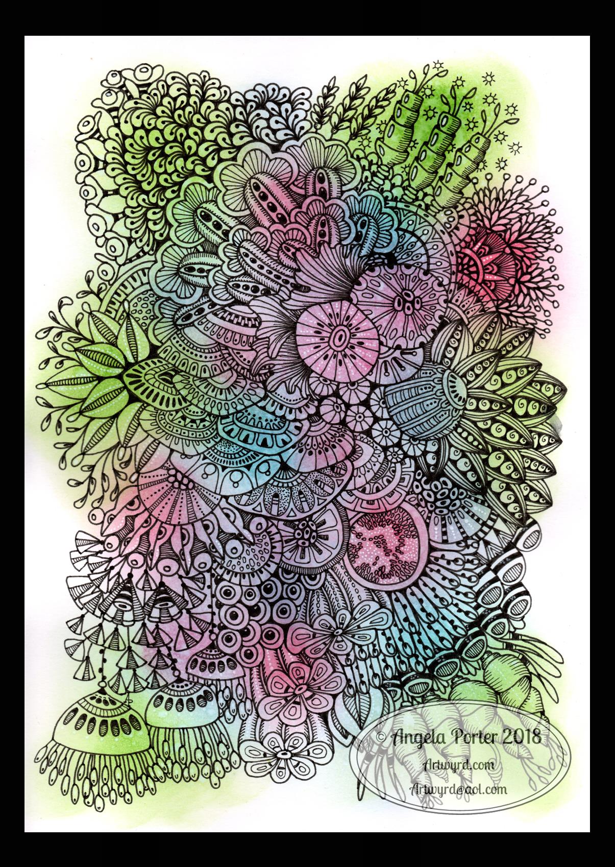
This is the fruit of my Sunday ‘labours’, and I’m quite pleased with it, truth to be told. Now that’s not something I say about all my works. However I am, quite pleased with it.

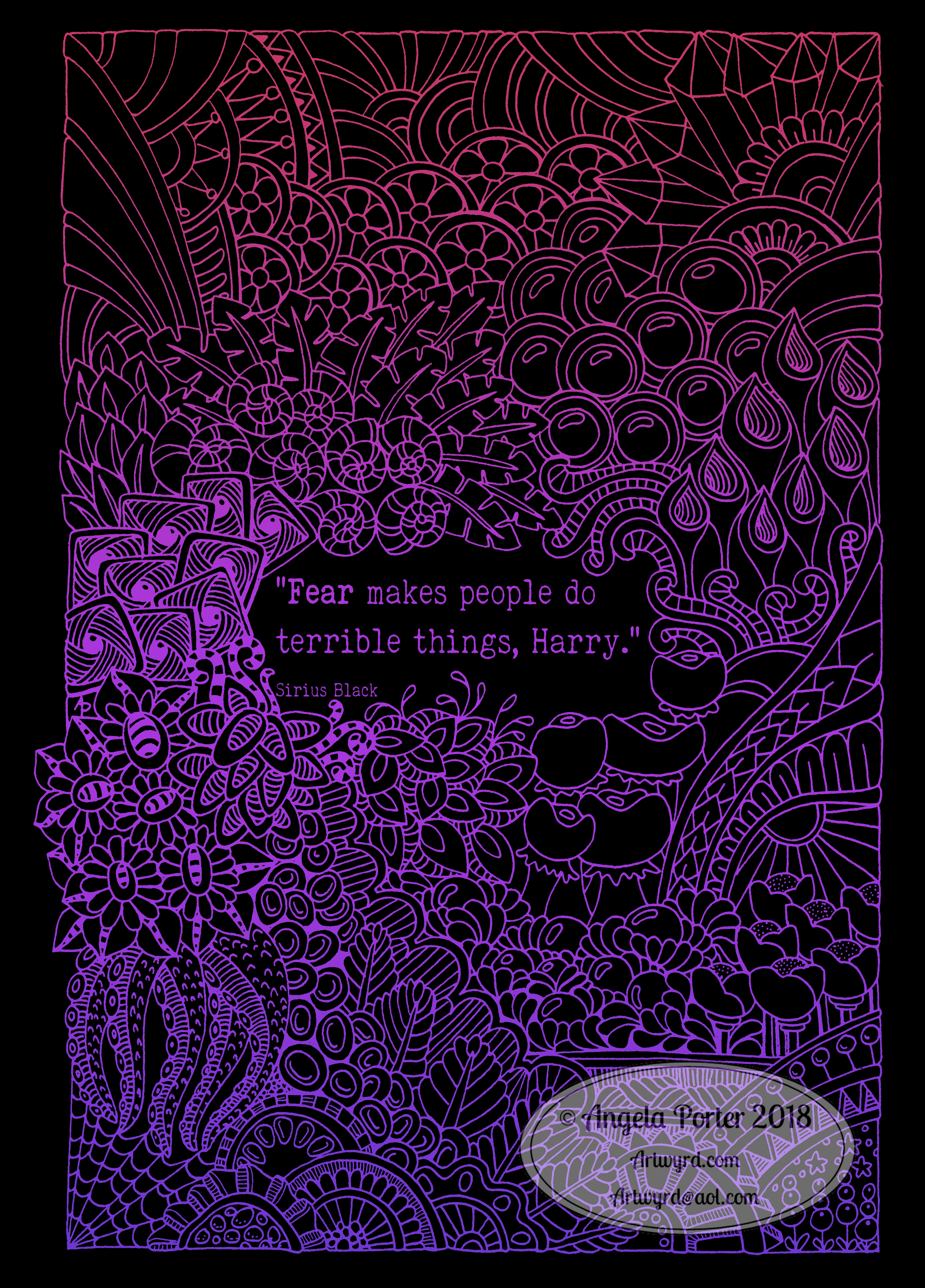
I’ve been playing around with hand lettering and design for a while now. From placing the words on curvy lines to straight lines. Trying having the word(s) sit above the drawing with white space above and using them to split the drawing, as in this case.

I’ve used simple hand lettering, like here, and a bit more ornate.

It has been a bit of an adventure, with some successes, some not quite so. With this one, though, I think I’ve found my kind of ‘style’ for it. I like the way the flowery ‘poles’ join the top and bottom part of the design. I really like the jewel-rich tones of reds and blues that I’ve used.

If there’s one thing I wanted to do, and forgot about until now, it was to use a metallic gold pen to add dots to the centres of the circles in the bushes at the bottom. Also, maybe tiny gold dots to the centres of those little purple flowers. It’s that inner raven that loves sparkle having an influence yet again.

I like my quirky hand lettering. It may not be the best, it may not be the most precise or even. If I wanted that, then using something like Publisher or the text tool in Autodesk Sketchbook would or could work. Or I could select and move individual words, or even letters around, in Sketchbook. That, however, would remove the imprecision that gives the art a ‘human’ touch.

To create this, I used a Pentel Energel 0.5 pen to draw the design and do the hand lettering. My Copic Ciao’s were used to colour the image in, and I added white dots with white Sakura pens – Souffle and Gelly Roll 08, both of which worked well over the Copics.

I enjoyed using the Energel pen. The line is consistent in width and intensity, and my heavy hand doesn’t wreck the tip within a short space of time. I also tried out a Uniball Eye Needle point 05 pen for some of the fine details, but it didn’t seem to like writing over the paper that had been coloured with the Copics. It does, however, write smoothly on plain paper, whether that’s Bristol board or Heavy weight cartridge paper. The solvents in the Copics changes the surface structure of the paper; the Uniball Eye didn’t write smoothly on it, and it also bled into the paper, which it doesn’t do on un-Copic-coloured Bristol board.
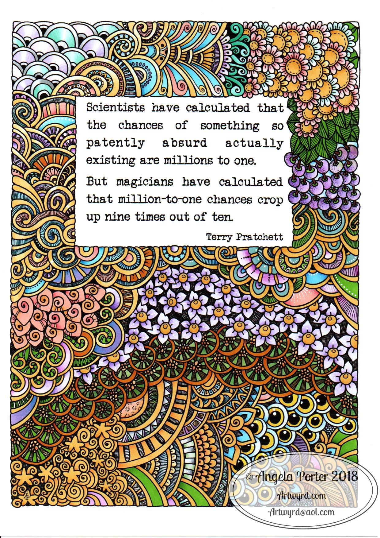