Lettering Practice – 29 May 2022

Finishing my work quota for the day deserves a treat, and that involved some hand lettering practice and exploration. So, these two pages from my A4 lettering sketchbook have been worked on over the past couple of evenings.

I still haven’t found a way of lettering that resonates with me, though both of these pages resonate with me more than other lettering work I’ve done. I really want to combine lettering and my love of patterns and abstract design. Working out how to do that in a way that feels right and makes my heart smile, is proving to be a difficult task!

I think, however, that I may be circling in on some ways of achieving this. One style that may bear fruit I stumbled upon several days ago and I blogged about it then (Hand Lettering and Entangled Art). Thoughts and quotes and words in shapes with entangled, zentangle inspired, patterns connecting them and creating a background pattern. I’m still not sure about this particular mode of expression. But I’ll work with it and see where it leads me in time.

Another way of lettering I stumbled upon was in lettering an alphabet in the style of “Hand-lettered capital I”. That was the inspiration for the image on the left above.

Last weekend, I bumbled my way through “Choose to Shine”, and the abstract patterns in the background gave me an idea to try out. Which I did in the right-hand image above.

There’s a fair amount for me to think about with these experiments. I’ve finally found a way to make use of Gelly Roll Moonlight pens – both for drawing patterns in letters, but also as patterns that flow over or behind letters – as in Shine and Because in the right-hand image. I also used the Moonlight pens, along with some Zig Writers and some vintage coloured gel pens in the left-hand image and the “A Curious Pattern” and “Never give up” designs in the right-hand image.

It’s so unusual for me to draw in colour. I usually stick to black ink for drawing, but suddenly I may have found a way for colour to appear in my whimsical and entangled worlds.

At the moment, though, I’m still not at all sure about this. My head hurts (another migraine feels like it’s on the way) and I’m not able to think clearly or write all that coherently, or so it seems to me.

One last thought to share. For both of these pages, the only thing I may have looked back on was my own work. I didn’t look in books or at work online for inspiration, I only used my lettering sketchbook and my love of abstract patterns. Learning not to compare my work to others, trusting myself that what I produce is good enough because it is an expression of myself, is not an easy thing to do. But I’m working on it and here it may have paid off with examples of lettering by me that I kind of like.

Typographic Mushrooms

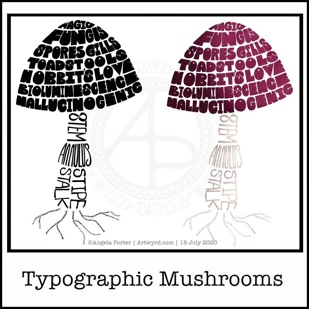
Just a little something I wanted to try out – using hand-drawn typography to create illustrations. I chose a mushroom, for no other reason than I like mushrooms.

It’s more about practising the hand-drawn typography or hand lettering than anything else.

What I realised, when I completed the black and white version, is that I could’ve varied the weight of the letters to produce highlights. That’s for another day, I think.

I also had to try adding colour, and in that way adding highlight and shadow.

I like both versions, but I think I like the coloured one a bit more.

I mentioned I’m following the Sarah King Domestika course – Hand-Drawn Typographic Portraits. I have started work on my first portrait, but it’s going to take me a while to do. In the meantime, little projects, like the mushroom, will give me plenty of practice as well as a chance to work out my process and way of working, as well as how I’d like to use it so it adds a note of harmony to my artistic song.

I started with a pencil sketch of the mushroom. Then, I added the words in rough with pencil. I scanned the sketch into Autodesk Sketchbook Pro. I then used my Microsoft Surface Slim Pen, to hand-draw the typography. Even though I’m using digital media. Autodesk Sketchbook Pro is a lot like working on paper, but it streamlines the process and allows me to skip a lot of the tedious steps. It also lets me take a black and white drawing and add colour quite easily.

I’ve done this while I’m waiting for a migraine-type headache to subside enough that I can return to bed and sleep the dregs of it away. I’m nearly at that point now as I’m beginning to feel tired and sleepy. So, I’ll get the rest of the social media postings done, and then crawl back into bed to sleep.

More Watercolour Practice!

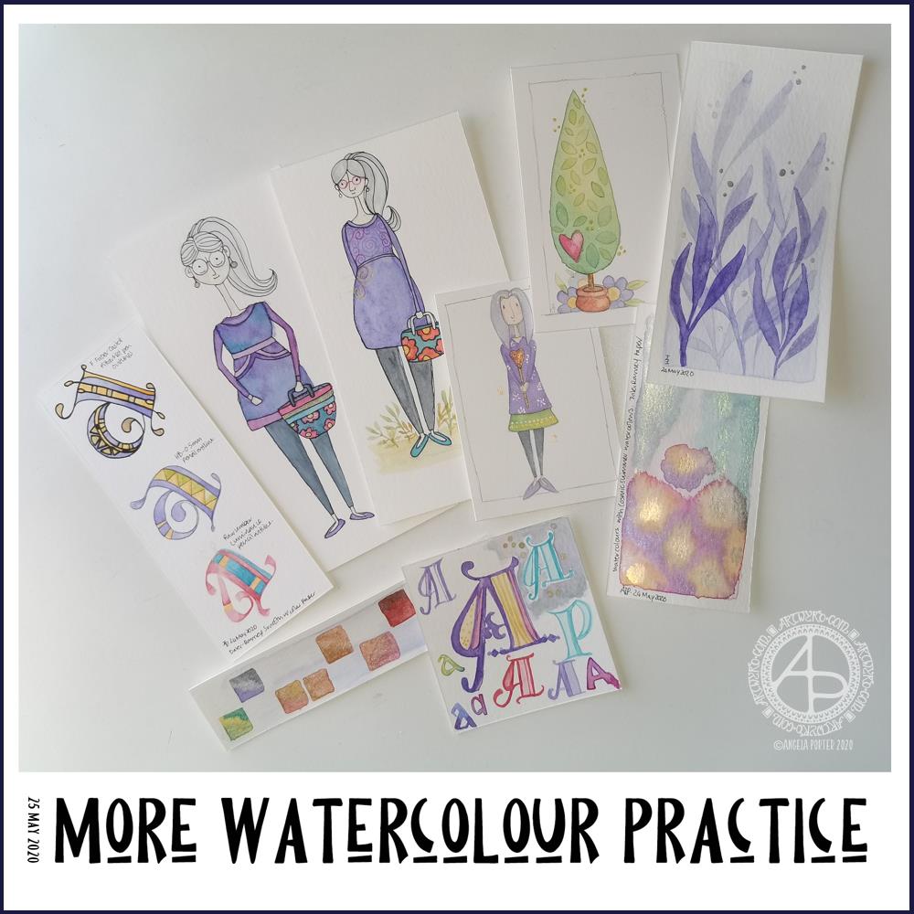
Over the past couple of days I’ve been playing around with watercolours. Apart from fun, it’s trying to work out how I can get them to work for me, and here you can see some of my experiments.

As well as continuing with the Domestika course, I found a book on my Kindle called “The Art of Creating Watercolor : Inspiration & Techniques for Imaginative Drawing and Painting” by Danielle Donaldson.

I’d forgotten I’d bought this, but on rediscovering it and looking at it I found it inspired me, particularly when it comes to drawing people.

What was reassuring, is that Danielle Donaldson is someone else who likes to work on a small scale! She also uses a very fin (0.3mm) pencil to draw with, but also to add line and pattern to her drawings instead of pen. I wanted to try that out.

I also really like the whimsical nature of her art, and her people inspired me to have a go. The three people in the collection of images above are inspired by her work, one more than the others. The one that is most directly like Danielle’s work is the person to the right of the trio. I used a pencil to draw the design as well as outline it after it was painted.

With the other two, I used a very fine Pitt Artist pen to outline them once the paint was dry.

Looking at them all together, I quite like the softer quality of the pencil line.

Oh, these trio are also my way of developing a version of myself. Unfortunately I look pregnant in the middle one (I’m not!), though I rather like my hair in this one – I wish my own hair was as thick and long! I really need to work on feet and foot positions.

Watercolours have vexed me, and continue to do so though I will persevere with them. Drawing people has vexed me for longer!

I started a course on Domestika – The Art of Sketching: Transform Your Doodles into Art by Mattias Adolfsson, Illustrator. But kind of let it fall by the wayside when the practice exercise was about drawing people, particularly myself. I baulked, big time. Perhaps I’ll now continue with the course, now I’ve found a style that makes sense to me, and I can work on developing my own.

I’m not entirely sure that watercolour will be the best medium for me to use…I’ll try others, including digital, to see what I can get to work for me and is in my style.

I also spent sometime experimenting with monograms and botanical themes. I really like the blue foliage, and the cute tree too.

Yesterday my art and other stuff was put on hold for much of the day; I woke with a migraine and couldn’t do much until painkillers had kicked in and I could sleep away the remnants of it. Once I woke, that’s when I found the book and did some art inspired by it.

I slept quite well last night, and woke just fine and dandy today.

All these bits of art will find my way into the journal I’m making, including notes and reflections on them.

If you want to know what a man’s like…

Angela Porter 14 July 2018 Sirius Black Quote 1

One of my most favourite quotes of all, from one of my most favourite book characters.

I printed the words out using Publisher, and then I added the design around them by hand, using a Sakura Pigma Micron PN pen.

I have scanned the finished image in, created a transparent background, and filled the background with a rainbow gradient for now. It’s going to be a long term project to colour it in as I’d like it, though I’m not sure how that is going to be. Having said that, a rainbow gradient may be the most appropriate colour scheme of all for this.

I think I need to learn a lot more about typography and setting out words in a quote, however. That will come with time should I choose to continue to use fonts and computers to generate the wordage for an illustrated quote.

As always, I’d be interested in hearing your thoughts, suggestions, advice and so on.

Definitely got some #weekendvibes going on here!