Abstract Botanical 19 September 2018

Angela Porter 19 September 2018

It’s a lovely, sunny late summer morning here in the UK and it’s been a perfect time to finish this design off.

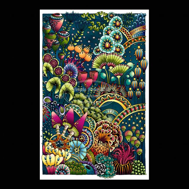
Yes, it’s another abstract, zentangly, entangled botanical design, which seems to be my signature style of art, though I do dabble in other styles, as you know, particularly my kind of dangle designs.

This one, like many of my previous ones, was completed in these stages:

  1. Draw the black and white line art on Rhodia dot grid paper using a black 08 Sakura Pigma Micron pen.
  2. Scan the drawing into GiMP. Use tools to remove the dot grid and remove the noise. Save with a transparent background.
  3. Import the image into Autodesk Sketchbook Pro. Any edits to lines can be made here using a pen ‘brush’ that mimics the texture of the Micron pen on the dot grid paper. Then layers are used to create the background, add colour to the design before adding texture and highlights.

It takes a day or more to create a piece of art like this. The drawing of the design alone can take anywhere from 2 to 10 hours, depending on the intricacy and size. This one was A4 in size and isn’t very detailed; I let the colour and texture add details to the design in this instance. I want the colours to shine. The colouring etc. has taken a few hours to do.

It takes me at least as long to create a piece of digital mixed media art as it does to draw and colour the design using traditional methods such as Chameleon markers or Inktense pencils.

What I love about working digitally is the ability to change the colours I use for the elements, and then being able to add texture and highlights/shadows. I can see where I need to go back to the image and add or deepen shadows to increase the sense of depth in the design. A drop shadow on the background isn’t really needed as I think the background is like a sunset sky or alien sea.

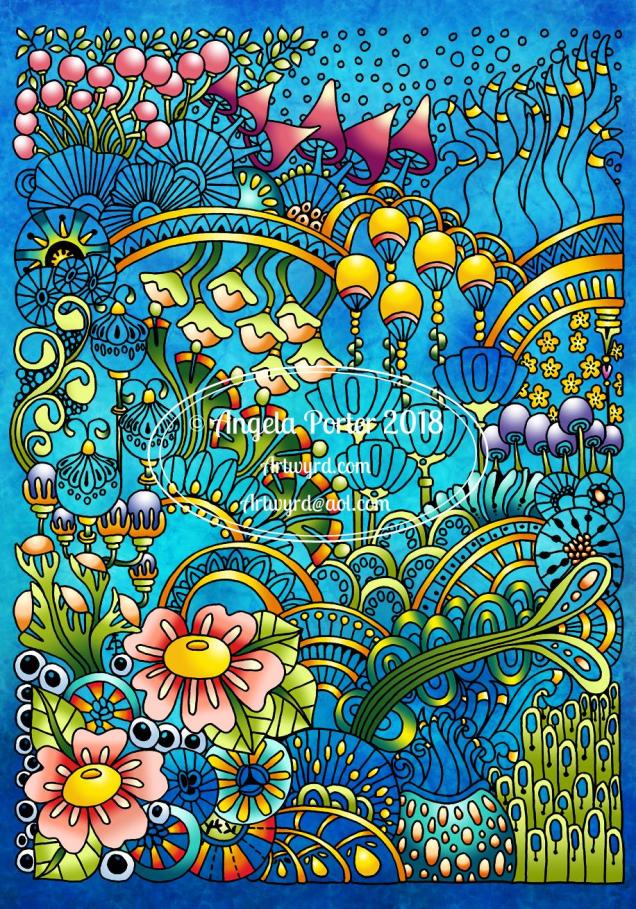
The other thing about digital work, is the ability to use the black and white outline to re-work the design using a different colour palette, different textures. I also have the option to print the design out and colour using other media, such as marker pens, perhaps changing the size of the image so that I can create, say, a greetings card or note card, or even a page for my BuJo.

I spent some time on Monday playing with Repper Pro and had some fun creating repeating patterns using the last couple of abstract botanical images. Just from a couple of artworks, I have more than a hundred seamless tiles for patterns; it’s just sorting through them and working out which are the best. I may post some of the best ones later today or tomorrow, and maybe create some based on today’s art above too.

I actually think some of the tiles would, with a border, make amazing patterns for square cushions/pillows worked in tapestry, canvaswork, cross-stitch or similar. You can decide for yourselves when I post them.

Work in Progress Wednesday

Angela Porter 9 September 2019 02 coloured small1

This was drawn on paper with Sakura Pigma Micron pens, scanned in and is in the process of being digitally coloured in Autodesk Sketchbook Pro. I’m using my Surface Studio and a Surface Pen, both from Microsoft.

The background may go a little darker on this one, but I’ll decide on that when I’ve completed colouring the design elements in.

It’s also work in progress Wednesday over on the Angela Porter’s Coloring Book Fans facebook group. We’d love to see your colouring works in progress of pages from my coloring books. Why  not pop along and join in? You’d be very welcome there.

Peace

Angela Porter Peace 10 Sept 2018Drawn using a Microsoft Surface Pen on a Microsoft Surface Studio screen in Autodesk Sketchbook Pro.

It’s been a couple of weeks since I last hand-lettered and patterned a word, and this morning it seemed really appropriate to do so.

Yes, hand-lettered, in a digital environment. Working with the Surface Pen on the screen of a Surface Studio is just like working with pen on paper in terms of physically hand-lettering and drawing the patterns.

The ability to work in layers, add effects to layers and use gradients to colour the background is a bit different to working in traditional media.

I do like doing these words; they’re fun to do! Also, a nice way to spend a few hours of a Monday morning.

Abstract Botanical 9 September 2018

Angela Porter 9 September 2018

This one has taken many hours to do, and I’m not quite happy with the background colour/texture, but I need a break from it.

I drew the black and white line art on paper with Sakura Pigma Micron pens, scanned it in, created a transparent background and then coloured it digitally.

I used Autodesk Sketchbook Pro with a Microsoft Surface Pen on my Microsoft Surface Studio.

Fun to do. A nice way to spend time, jut playing. And it’s unusual for me to colour in one of my black and white pieces of line art.

#wednesdaywisdom

Angela Porter 5 September 2018 small watermarked

Another Goethe quote today, this time hand-lettered.

The design was drawn using Sakura Pigma Micron pens, and then scanned in and the black and white line drawing altered to this.

Monday musings

Angela Porter 28 August 2018

It’s been a little while since I’ve done an illustrated quote. Today, I was drawn to one by Johann Wolfgang von Goethe, and even though it was written over 200 years ago, it still has relevance in our time.

I printed the words out and then used Ohto Graphic Liner pens to draw the illustration around it. After scanning the image in, I used Autodesk Sketchbook Pro to alter the colour and add my watermark.

A nice way to spend a damp, sometimes drizzly Monday morning here in the UK. The schools return, the teachers at least for their day of training/preparation for the return of their students in the coming day(s), the interminable meetings where so much information is passed on it’s hard to retain it, let along digest it!

I do not miss this one bit. I loved teaching – the actual teaching, helping pupils to grow and develop, not only as little scientists but also as human beings and in confidence and self-belief.

I do not miss the huge number of meetings, the constant change, the challenges of behaviour/attitudes that changes in society have wreaked, the homogenization of teaching strategies…and so much more.

I’m feeling grateful this day that I get to do what I love, to make a new career from it, to continue to help people through my colouring books, and in other ways too.

I was once ignorant of the fact that I could do something else with my life, I thought I’d be a teacher until I reached retirement age, and that I would struggle more and more with my mental health and emotional health over time. I was also ignorant of the fact I had depression, anxiety and more – willfully ignoring the signs, denying that it was a problem, that I was just tired, or it was the result of a verbal attack or poor behaviour or even a physical threat at the end of my time teaching.

I was ignorant as I chose to ignore the facts of what was happening to my mind and emotions.

It must have been a terrible thing for those who truly knew me (not many, one maybe, thanks to the carefully crafted mask of happiness and jollity that I wore all my life when with people, very different behind closed doors with no one around to observe) to see how I was plummeting downward, to have me dismiss their observations with the excuse ‘I’m just tired’ or ‘I’ve had a tough day’ or ‘So and so did such and such yet again today and it got to me. I’ll be fine after a good night’s sleep’.

Eventually I had no choice but to get help, to have months and months away from teaching so that I could recover just enough to return and last another eight months.

I know now my ignorance of my own well being wasn’t out of innocence about mental health issues; instead it was borne out of the messages I had as I grew up from the mother, from society, that to have depression, to be anxious, was a shameful, weak thing and there was something wrong with you if this was you.

I stigmatized myself, and prevented myself from getting the help I needed for a long time.

I was ignorant as I willfully ignored the facts, the evidence that was right in front of me, staring back at me whenever I looked in the mirror. It wasn’t innocence. I knew about mental illness, mental ill-health, depression, anxiety, but I refused to consider that was what was wrong with me.

Ignorance, ignoring the facts, the knowledge or applying it as it didn’t suit what I wanted to believe.

To give myself a bit of a softer time, I’d never known anything but depression and anxiety, ever that I can recall. So, to me, the worsening state of my mental/emotional health was just me being worn out by the day, the week, the term (semester) or academic year.

It took a very skillful and understanding GP to help me see that I needed help, and I took it, and still am with my weekly therapy sessions.

That’s a personal example of why I don’t see innocence and ignorance as the same thing with reference to the quote.

Bookmarks

Angela Porter 25 August 2018

I’ve been playing around with a different kind of material and techniques and created these bookmarks. I’ve had a bit of fun doing them, something different, the same kind of drawings but different techniques.

I’ve used parchment paper and various ball tools to draw the images and Tombow Dual Brush markers to colour them.

I like the one on the left a lot. Surprisingly, the more muted, pastel tones really appeal to me.

I do have other bits and bobs of parchment here that I’ve tried things out on, and there’s some skills to develop for sure; but it’s a nice way of working, to draw in white on white then add texture and colour. I don’t think the textures show well on the photos though.

A nice way to spend a Bank Holiday Saturday – being quietly creative and learning new stuff at the same time.


Dangle Day

Angela Porter 24 August 2018

It’s Friday so it’s time for one of my occasional dangle designs.

This one involves elements from my latest bits and bobs of abstract botanical art.

Want to learn how to draw your own dangles? Just follow this link for my upcoming book  ‘A Dangle A Day’ to preorder.

It’s furbaby friday over on the Angela Porter’s Coloring Book Fans facebook group – join to share pictures of your furbabies! You’ll be most welcome there.

It’s always furbaby friday in the Happy Tails facebook group. If you love animals, this is a lovely group for you to join.

Abstract Botanical 22 August 2018

Angela Porter 22 August 2018

Another day, another drawing/artwork/illustration/design. This one is only a little one; it’s approximately A5 in size.

I used some new watercolour paper from Canson – Moulin du Roy. It’s smooth, slightly off-white, pure cotton mould made and seems to work nicely with Intense pencils and a waterbrush.

I’m waiting for some metallic paints to arrive so I can add some highlights to this – there are places where a dot of gold will really work nicely, but not too many places methinks.

Also, I chose just seven colours to be my palette – sherbert lemon, apple green, iron green, lagoon, violet, red-violet and sienna gold. I thought that a smaller number of colours could result in a more cohesive feel to the design, and I think that it may have done so!

For this one, I drew the design first in pen then added colour.

When I draw first I do tend to fill the space with drawings. When I add colour shapes first I end up with more white space and a more random ‘edge’ to the design.

Why that is, I don’t know, other than it may have something to do with me filling spaces in with pen and ink habitually.

A habit I need to modify I think.

All the same, it’s nice to do little designs. I already have another drawn out waiting for colour!

Perfectly Imperfect and an Abstract Botanical 21 August 2018

Angela Porter 21 August 2018

My latest design. It took nearly 2 days work to complete, though I may add some metallic highlights here.

I used Inktense pencils and blocks with water brushes, Uniball Unipin pens and Daler-Rowney Aquafine smooth watercolour paper.

Black line definitely keeps my need for that high contrast work happy, but the ability to add layers of colour or create gradations in colour with the Inktense also keeps me happy. Together, they work for me.

I did start off the central area with shapes of colour, but then I started to draw in the designs around the edge and then add colour. Both ways work for me for sure. Also, there’s a kind of randomness to the colour and some over-spill outside the lines, and that is something I’m learning to live with and like.

Perfectly imperfect.

Just like me. Just like us all. We are all perfectly imperfect and that is OK. In fact, it’s more than ok, it’s just perfect and I think we should all embrace it. The imperfections are what contribute to our uniqueness, our individuality as much as anything else (perhaps even more). Society sends a message we all need to be perfect as people with perfect lives and perfect homes and perfect bodies and perfect smiles, hair and so on.

The reality is, however, that we aren’t.

We are all imperfect. Life is imperfect. Nature is imperfect.

But all is perfectly imperfect.

And that is good. It is. At any moment in our lives we are all doing the best we can.  Sometimes things work out perfectly. Sometimes they go wrong. The balance of it all is that it is all perfectly imperfect.

My artwork is perfectly imperfect. I do my best with digital art, but I’m not really happy with what I do often. I learn each time I do some, and move forward, improving. The same is true when I use traditional media.

The same is true of life. Of my life. Of all our lives, our perfectly imperfect lives from which we can learn and grow as people.