Dangle Day Friday!

May Dangle Design © Angela Porter 2019

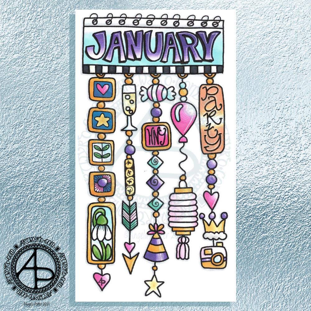
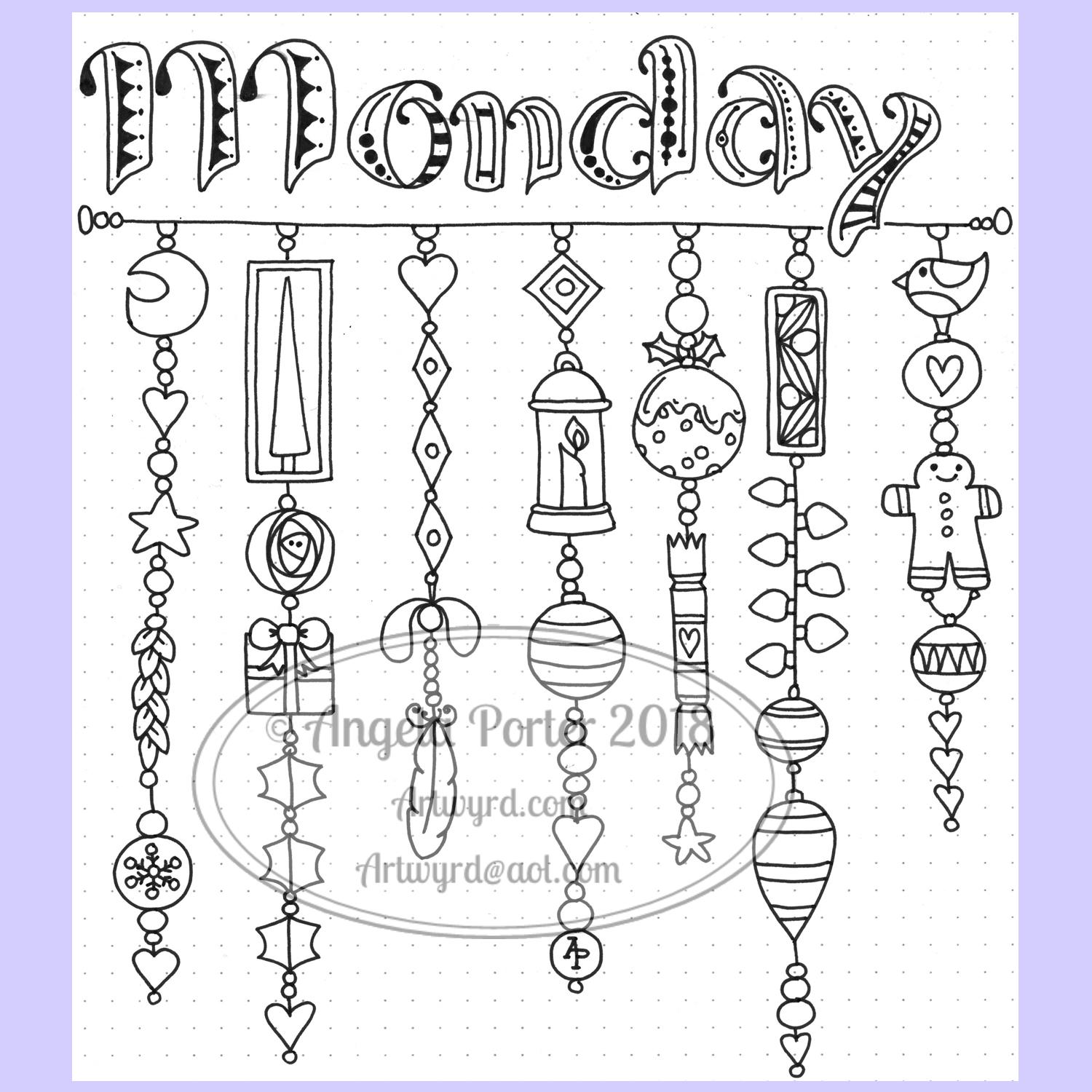
It’s Friday so it’s dangle day! Today I’ve chosen to share with you my May dangle design from my book ‘A Dangle A Day

I’ve used the line-art design and just recoloured it. Different colours give a different ‘feel’ to the dangle design!

The design itself is made up of simple, repeating motifs added in chains of charms. Simple, cute, charming, whimsical and pretty too, even if I say so myself.

This would be lovely as the monthly cover page in a BuJo (bullet journal), planner, journal, diary.

A different sentiment could be used in the banner to make it a perfect greeting card or note card.

One of the dangles would look rather cute as a bookmark; it’s easy to lengthen the designs.

Yesterday

I took a little trip out on my own yesterday. It’s one of my goals as I progress along my healing journey from CPTSD to get out and about more. I chose to go somewhere familiar to me, the little town of Glastonbury in Somerset.

I was able to wander around shops, but when it came for lunch I totally balked at going into any cafe at all. Issues surrounding my body size rose up and I just couldn’t go into them.

So I went home.

The whole trip exhausted me. More of an emotional exhaustion though from being brave and keeping it together and interacting with people in shops.

When I got home I had something to eat, which then resulted in an upset stomach/digestive system.

I then went to bed and slept.

I’m still exhausted today.

But I did it. I went somewhere a bit further afield (a round trip of nearly 180 miles is a little further afield to me!) by myself.

I’m surprised at how much the trip has exhausted me given I went somewhere I know, that is familiar, and I used to feel quite comfortable there.

All the same, it’s highlighted some issues I have with how I view myself.

Don’t get my wrong, I am overweight, but my mind seems to think I’m the size of a small elephant and I won’t fit anywhere. I have no idea of my body size other than the size of clothes I wear, which tend to be larger than I need as I think I’m larger than I am.

Is this body dysmorphia? I don’t know.

So, when a cafe or shop is busy I tend to walk away fearing there’ll be nowhere I can fit into, as well as me being overwhelmed in crowds and crowded places.

The complex layers of how CPTSD affects my daily life and activities a lot of people take for granted. It also shows some more of the barriers I need to overcome in order to finally live the kind of life I’d like to, one that isn’t quite as limited by CPTSD as it has been through most of my life.

May – entangled hand lettering

May ©Angela Porter 2019 Artwyrd.com

BuJo Cover for May

This morning, I’ve spent a pleasant four hours or so drawing this A5 design for the month of May.

It combines some hand lettering along with my signature style of entangled art. I’ve included plenty of floral motifs as here in the Northern Hemisphere the world is filled with flowers, especially on the trees.

Of course I’ve included more abstract motifs that are inspired by seedpods and patterns found in nature and architecture and so on.

I drew the design on white Bristol Board by Winsor and Newton. My pens of choice today were Tombow Fudenosuke, Sakura Pigma Sensei 04 and 0.1 Unball Unipin. Also, I’ve used some digital wizardry to add coloured paper as the background, along with my watermarks.

This would be lovely in a BuJo I think. I think it would be lovely in a planner, a journal or diary.

It’s perfect for colouring, as long as you’d be happy to colour across sections that have fine lines in them.

I think if I was more confident with metallic inks and either dip nib pens or fine brushes I’d’ve liked to do the lettering in metallic gold or copper. Of course, I could’ve done the lettering, scanned, laser printed it and then added the patterns around the lettering. I didn’t think of that until now though! Duh!

I’m fairly happy with adding ‘auras’ around the lettering to separate it from the entangled design around/below it.

I’m not sure I’m happy with the design spilling out over the edge as it has done; it doesn’t feel balanced to me, but other than that I’m quite happy with the design. Of course I could edit the image to even up the edges, but it is what it is for now.

Post EMDR

EMDR was quite gentle yesterday but lots of body work occurring. During EMDR stored trauma is released through pains and other sensations in the body. Yesterday I had eyes that hurt, part of my head, my throat, my thumbs and wrists. I had a lot of pain where I broke my leg when I was six. Lots of prickling as well as electric shocks in various parts of my body.

I actually felt quite upbeat, if a little tired, when I left the session. But by late evening I was really tired and feeling a bit teary and lonely.

I’m tired today. I didn’t sleep too well last night. I had hoped to go out for the day today, but I really wanted to stay home and draw and I think I’ll be back in bed before too much longer. I really am tired.

One thing that I was asked about, without me mentioning it first, was what I was going to do about getting out and about a bit more! I’m sure my therapist must read my blog. Just joking, I know she doesn’t!

I need to make a list of places I’d like to visit. Familiar places to revisit to ease me back into getting out and about by myself. Then ones not so familiar that could involve some time away from home too.

I will be going out later this week. I have something to do this evening and tomorrow, however. Another reason I am having a quiet day today. I’m not just tired; I know that I’m also emotionally fragile still.

I am determined to heal as much as I can from the CPTSD and to do the things I’d like to do that the inner critic sabotages way too often.

April Dangle Design

April Dangle Design by Angela Porter 2019

I had a lovely time this morning looking at Arts and Crafts Movement, Rennie Mackintosh and Art Nouveau designs. I’ve always love these styles of art with their organic lines and stylised motifs and it’s certainly influenced my style of art in some little way.

I got inspired as I looked at these styles and decided to use them as a start for my April BuJo page design, which you can see above.

The had lettering is a little heavy handed where the squares are concerned, but over all I’m fairly happy with it.

There’s definitely a touch of the Rennie Mackintosh’s there with the organic motifs and lines contrasted with the graphic squares and diamonds.

I chose warm and sunny yellows with light, fresh greens as they are so dominant in nature this early on in Spring.

A quick sketch on Rhodia Dot Grid paper followed by a scan and I inked it using some of my brushes in Autodesk Sketchbook Pro. Of course I wielded my Microsoft Surface Pen with some happiness on the screen of my Microsoft Surface Studio.

A simple but, I think, and elegant design. One which would look fab for any month in a BuJo (bullet journal), planner, diary, journal or even in a scrapbook. Of course it would make a lovely greetings or note card too. I’m sure there are many more instances of where this design would work beautifully.

Want to know more about creating your own dangle designs? My tutorial book ‘A Dangle A Day’ is now published.

‘Amazing’ – Hand Lettering

© Angela Porter 2019

My morning warm up art session today was this little bit of hand lettering. I had a completely different idea in mind when I started this off but, as often happens, the creative energy flowed in a different direction.

I had wanted to do a monogram, perhaps with a dangle or maybe one set into a pattern border as a drop capital to a quote.

As I worked on first the pencil outline of the A, and then inking it in using fine and extra fine fountain pens filled with black ink, the lines that flowed out dictated the form of the letter rather than me consciously trying to force it into what I thought I wanted to create.

I think I’ve over patterned the inner space of the monogram, or not used the right kind of patterns there. However, it’ll do.

I wanted to use some birdwing copper FW Pearlescent ink from Daler-Rowney to add metallic highlights with a dip pen. I soon found out that dip pens and parchment paper that has been coloured with black ink don’t work well together. So, I ended up with the copper highlights at the bottom of the letters that fade up naturally. Adding dots of metallic colour to the monogram was easier on the unworked parchment. Over the black ink dots it wasn’t so easy. I’m also not sure that the ‘string of beads’ in the monogram actually works but I know it’s missing something. I need some time to reflect on this. As I do about adding any more copper highlights to it. I may yet decide to add some dangles to the word.

On the whole, I’m quite happy with how this turned out. I could add ‘You are’ in small letters above the letters. Either way, I think this would make a lovely notecard. I also think it could be used in a bujo, planner, journal, scrapbook or as framed art. I think I need to review the card making and mixed media techniques I once knew and have sidelined to focus on other aspects of art and adapt them to my current needs/ideas.

A Dangle A Day

Today’s the day! A Dangle A Day is published in the US. Thursday is the day for the UK. It’s my very first tutorial book and the reviews I’ve seen so far are lovely!

Well over 100 dangle designs in the book with step by step instructions for each. Simple steps leading to even quite complex designs. Whimsical, cute charms. Funky monogram dangles. Plenty for each season and most occasions. I’ve also written encouraging words as everyone can draw dangles and they are perfectly imperfect which is what makes them personal and unique!

I’d love to see what dangles you create and how you use them – in your bujo, planner, journal, diary, scrapbook, or as greeting cards, note cards, book marks, gift bags, envelopes, framed art, or any other way you can think of! Tag me on twitter, instagram or facebook!

Naturally, I have a stinking, streaming cold and I feel rough as anything. I don’t think I’ll get much in the way of art done today. Coughing, sneezing, runny eyes and a thumping headache don’t do much for focus.

Hello January! A Dangle Design

©Angela Porter 2019

What a bright, sunshiny morning it is here in South Wales in the UK. The first sunshine of the new calendar!

I’ve been up for around 3 hours and have had a fairly artsy time.

My first job was to print out the lineart for this dangle design, which is one of many in my book ‘A Dangle A Day’ which is due for release on 8 January 2019 – just a week away!

In the book, I take you through how to draw this design, one step at a time. Not only this design, but well over 100 more – designs for all seasons and many, many celebrations and occasions.

This design I drew in Autodesk Sketchbook Pro using a Microsoft Surface Pen and Microsoft Surface Book. For the book, I coloured it digitally. Today, I printed out my black and white lineart and then coloured it using Chameleon Color Tones and Color Tops marker pens. I also added some details to some elements of the design using a 08 Uniball Unipin pen and a white Sakura Gelly Roll Pen.

Yesterday, I said I need to to spelunking through my stash of mixed media and cardmaking supplies to find forgotten supplies I could use to embellish my designs.

This dangle design would make a lovely monthly cover page for a BuJo (bullet journal), planner, diary or journal. It would also make a pretty greetings card or notecard to drop a line to a friend wishing them a wonderful January. Change the words and colours to suit the occasion or recipient! It would also be a lovely, whimsical, cute design for a winter party invitation.

I realised then that my old watermark wouldn’t do for this year. So I hand lettered a new one. I made my symbol, the one I hide away in my artwork, part of the design, along with a little intricate but simple geometric pattern around it. A little touch of the uncials for my blog address, along with a typed copyright statement and it’s done and saved! I may end up changing it a little, or having variations on the theme, as time goes on. But I’m fairly happy with it.

So, I’ve already had a productive morning! It may be a Bank Holiday in the UK, but I really do need to focus on those templates that need colouring for Entangled Forests…and I may venture forth into the peopley world later on today, maybe.

Lots of K’s…

©Angela Porter 2018

I woke way too early this morning after not getting to sleep until around 3am.

© Angela Porter 2018

On looking at the monogram K I posted earlier with slightly rested eyes and mind, I’ve decided to leave it as it is. For now at least. I may try to add a dangle design to it in the coming days.

So, I thought I’d post my page of various hand lettered styles of the letter K. I used a 0.4 Sakura Pigma Sensei pen to draw them. No pencil lines were used for any of these letters, just the dot grid to help me keep things vaguely organised and vertical where they need to be.

I like the 0.4 Pigma Sensei pens. You may notice that I do tend to vacillate in my choices of pens – I just like to change things around from time to time! The Pigma Sensei 0.4 has a solid plastic tip, a bit like the Pigma PN pens. That means it’s not quite so easy for heavy handed me to wreck the nib as quickly as I do on the Sakura Microns or Uniball Unipins or Faber-Castell Pitt artist pens or the Copic Multiliners.

That doesn’t mean I’ve managed to use them until the ink runs out – the nib gets wrecked long before then – but they do seem to last longer.

I’ve spent the 3 hours or so that I’ve been up adding patterns/motifs to my lovely new A4 Leuchtturm dot grid ‘Master’ notebook. It’s a rather comforting activity for me. I don’t know how many times I’ve tried to do this in various formats in order to create my own reference book of patterns/designs/motifs and so on. However, realising that my use of a bullet journal is working for me on a more or less daily basis, at least as far as organising myself and making notes ot what to do, what’s been done and so on, I wanted to use a very, very basic form for this visual reference for me.

The A4 notebook will also take up a lot less space than the ring binder I’m currently using. It is a bit cumbersome working in the hardback notebook compared to loose leaf paper, but it should help to keep things all in one place. It’s the method of tracking collections in a index in bullet journal fashion that will make it most useful for me.

So, this morning I’ve started to add my small collection of medieval motifs inspired by jewellery and floor tiles.

I suspect I’ll be having a bit of a quietish day today. I’m practically nodding off here as I type! Maybe a short nap later will help me a bit – but not too long otherwise I’ll be up at stupid o’clock once again!

Hand lettering practice

©Angela Porter 2018

Today has been a bit of a busy day. I woke still drained from yesterday’s EMDR therapy session. No EMDR though as I was just too emotional and ‘raw’ to go through it, so it was a lot of talking around how one trigger event had caused several trauma ‘streams’ to rise and flood and confluence. I was stuck at that confluence where white water rapids had formed and I was being buffeted about in the eddies and currents and waves.

So, it was self-care last night when I got home, which involved a bag of chips from a local chippy, with curry sauce, Harry Potter and the Goblet of Fire and starting to crochet an amigurumi ‘dumpling cat’ from a new book that was delivered yesterday. Then, there was the journal writing before I went to bed.

This morning I had to be up early to go give an anti-stigma talk to a group of police officers. That drained me emotionally once again. However, it was a good thing to do as they all found my talk really interesting and useful. My Time To Change Wales champions hat was polished up a little bit once again.

I came home and finally had some breakfast and ended up in bed to sleep. That’s one of my coping strategies when I’m so emotionally drained. I still feel dazed and dazzled by it all, but am on a bit of a more even keel now.

I didn’t want to let the day pass without doing something with pen and paper or screen. Hand lettering seems to be my thing at the moment so I thought I’d have a go at hand lettering some of the days of the week.

For reference I used the Lombardic Capitals set in ‘Decorated Lettering’ by Jan Pickett. 

They appeal to me partly because the space inside the letters lends itself so much to adding patterns, but because of their oldy-worldy nature. I love Anglo-Saxon, Celtic and Medieval illuminated manuscripts and this style of lettering, in a slightly more modern form, appeals to me.

I discovered it’s a lot easier to form the letters when you draw them big – hence why their size increased from Monday to Wednesday.

Dot grid paper is a godsend as it helps with the consistency of size of the letters, though I suspect that as I become more comfortable with my skills that I may experiment more with that.

A nice way to spend an hour or so this afternoon, and I have the rest of the days to look forward to doing, along with adding patterns to the open letters.

Mind you, the letters without patterns would look lovely just coloured with colour  gradients, and I’d love to add metallic highlights/accents too.

First, I need to get a bit more proficient at hand lettering and working on plain paper.

Of course, I can always scan my lettering in and remove the background and dotgrid so I can print it out on paper suitable for a colouring medium such as watercolours and metallic paints.

Cheating? No. I don’t think so. I would’ve already done the work in the first place. Printing and colouring is, to me, perfectly acceptable.

But that’s for another day. For now, I had to get myself sorted to pop out for the evening.

I’m also musing about adding some dangles to the letters – dangles with charms that are reminiscent of medieval ornament or jewellery, for example.

Monday – a dangle design

©Angela Porter 2018

A quiet start to Monday morning here with a spot of hand lettering and dangle drawing.

This is my first draft of a design, which is a bit wobbly in places and there are some ink smudges too.

I pencilled in the basic shapes of the letters, inked in the outlines and then added the inner decoration.

The dangles were drawn with pen directly on paper. The use of dot grid paper helps to keep things vaguely level usually, but this morning that’s not quite gone to plan. Of course as it’s December I’ve gone with December themed charms and a Moon for Moonday Monday!

I have a few tasks to do and then I may just re-draw this, or at least colour it in. Colour makes all the difference.

This could be a bit of a big dangle design to use in a BuJo, but just the word with one dangle to the left would make a charming header with dangle for a day. The beauty of dangles is that you can just add to them as you go through the day. If the charms are small enough you could even add ones that will go with your BuJo entries – event, note, task and so on.

I think that would work well for a big and busy day.

A Dangle A Day is released on 8th January 2019.

©Angela Porter 2018

I did go away and create this sample BuJo page showing the kind of thing I meant above. The hand lettering has worked out a lot better. I also like the blue gradient I’ve used to colour the letters with. A grey shadow was added to the left and bottom of the letters too. I also like the cute little date box. The ornate ends on the bar through it give it a ‘feel’ that goes with the lettering.

I did have fun doing this. It’s maybe not something I’d do everyday in my BuJo. My BuJo is very much a working one, with lots of mistakes and rubbishy writing going on as I scribble down things. However, I do enjoy hand lettering, especially more so as I’m beginning to accept that I have to accept my own way of forming letters is perfectly acceptable and that I can work with that.

I have to remember that others don’t see my hand lettering (or art) as I do. They see it with fresh eyes, without the close up work that goes into it, without the small flaws that I see and are magnified by my inner critic into hideous blemishes and fatal errors in the work.

I can quieten the crtiic when it comes to my drawings/art, mostly. Except on any bad days I have in terms of my mental and emotional health. Because hand lettering is something that is a new focus for me, the inner critic feels it’s empowered to be hypercritical of anything I do. It’s only by doing, by doing what I can not to ignore the critic, but to check what it’s telling me as being valid or invalid and learning what I can from the valid points to improve in the future.

Christmas Dangle Design

©Angela Porter
Design from ‘A Dangle A Day’, authored and illustrated by Angela Porter

It’s Friday so it’s #dangleday. Today, I wanted to share a Christmas Dangle with you from my book ‘A Dangle A Day’. In the book I show how this design was drawn, step by step.

When I created this design, I first drew it in pencil on dot grid paper. The next step for me was to scan it in to the computer and then re-draw it step-by-step, saving each step as I went. For the book, the final step was to colour the design and then write the instructions to go with the images. My tools for this were a Microsoft Surface Book, a Microsoft Surface Pen and Autodesk Sketchbook Pro.

I wanted to include as many Christmas-themed charms to create the dangles as I could and still keep the design balanced. I also kept the length of the dangles uneven. The waviness in the ends of the dangles echoes the waviness of the fairy lights above the hand lettered word ‘Christmas’.

What I did this morning was to print the black and white line art design on an A4 sheet of paper. Then I used Chameleon Duo Tones and Color Tops markers to colour it in.

These pens make it easy to create gradations of colour, such as on the hand lettering. These gradations add ‘dimension’ to the charms and dangles. I keep the darker shades to the left and bottom of the designs so that there’s a consistency across the whole image. I also used a pale grey marker to add drop shadows to the left and bottom of the design elements; again this helps to add dimension to the design.

Finally, I added some highlights with a white Sakura Gelly Roll pen. I also added some sparkles around the fairy lights and individual stars with a gold glitter Uniball Signo gel pen. After all, it wouldn’t be Christmas without some sparkle!

Used individually with a monogram or Christmassy image the dangles would make lovely book marks. Printed at A5 in size, the design would make a fabulous BuJo page for the big day itself. It would also make a lovely design for greetings cards or note cards.

Of course, it would be easy to change the word at the top to, perhaps, Winter or Yule and use fewer dangles to suit the length of the word. Personally, I like to use an odd number of dangles wherever possible – it gives a more balanced design.