Just because – Autumnal Dangle design mail art

Just because - Autumn dangle design greeting card © Angela Porter | Artwyrd.com
Just because – Autumnal Dangle Design mail art © Angela Porter | Artwyrd.com

Making coloured backgrounds.

Yesterday evening I had a pleasant hour or so using Distress Oxide and Distress inks to make some backgrounds for future card projects.

I used a soft rubber Brayer roller to add distress oxides to a small Gelli Plate. I then spritzed the Gelli plate with water containing either pearl, copper or gold Perfect Pearls before lifting the print with some Claire Fontaine Mixed Media paper. The water in the spray reacts with the inks to give an oxidised look. The Perfect Pearls in the spray add some subtle shimmer to the finished background.

Once the Distress Oxide background layers were dry, I used a rectangular die to cut a section from them.

To create backgrounds with Distress Inks, I used a mini foam blending tool to cover the card with colour. I then sprayed the card with some water containing pearl, copper or gold Perfect Pearls. Again, the water reacts with the Distress Inks, but this time creating small watermarks. The Perfect Pearls again add shimmer.
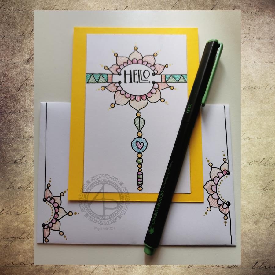
Making the card.

I chose a background coloured with Wild Honey, Tea Dye, Old Linen and Walnut Stain Distress Inks which were then spritzed with pearl Perfect Pearls infused water.

I wanted to create a dangle design card. From experience, I know that drawing on backgrounds with added Perfect pearls that my fine-liner Uniball Unipin pens can become clogged by the tiny flakes of mica that comprise Perfect Pearls.

So, I tried using a Uniball Vision Elite rollerball pen. The ink in it is supposed to be water-resistant, tamper-proof, fade-proof. It’s also very black, which suits me just fine.

 I was surprised at how well the pen wrote on the background – not just because of the Perfect Pearls and Distress Ink, but also because the mixed media paper is lightly textured. 

Once I’d completed the design, I used a needle=tip Pentel Energel Liquid Ink Gel pen to add smaller details.

While the plain black line on the coloured background looked OK, I thought it needed some colour to help lift it from the background.

I launched myself into using Copic markers, using somewhat darker colours than I usually would. That meant it wasn’t until I was adding some colour to the ribbon banner that I discovered that the Copic reacts with the inks in the pens and smears them. I was so disappointed in myself for not checking the pens were Copic safe. Oh well, you live and learn!

Rather than start again, I carried on with the card. I wanted to add some clear embossing powder to help the colours of the Copic markers stand out even more. So, I used a Versamark pen to colour over the designs, and then I sprinkled on the clear Wow Embossing Powder. I used a heat tool to melt the Embossing powder and achieve a glossy, dimensional finish on the dangle design.

The final step was to adhere the dangle design to a card blank, after adding some gold dots with a Uniball Signo glitter gel pen.

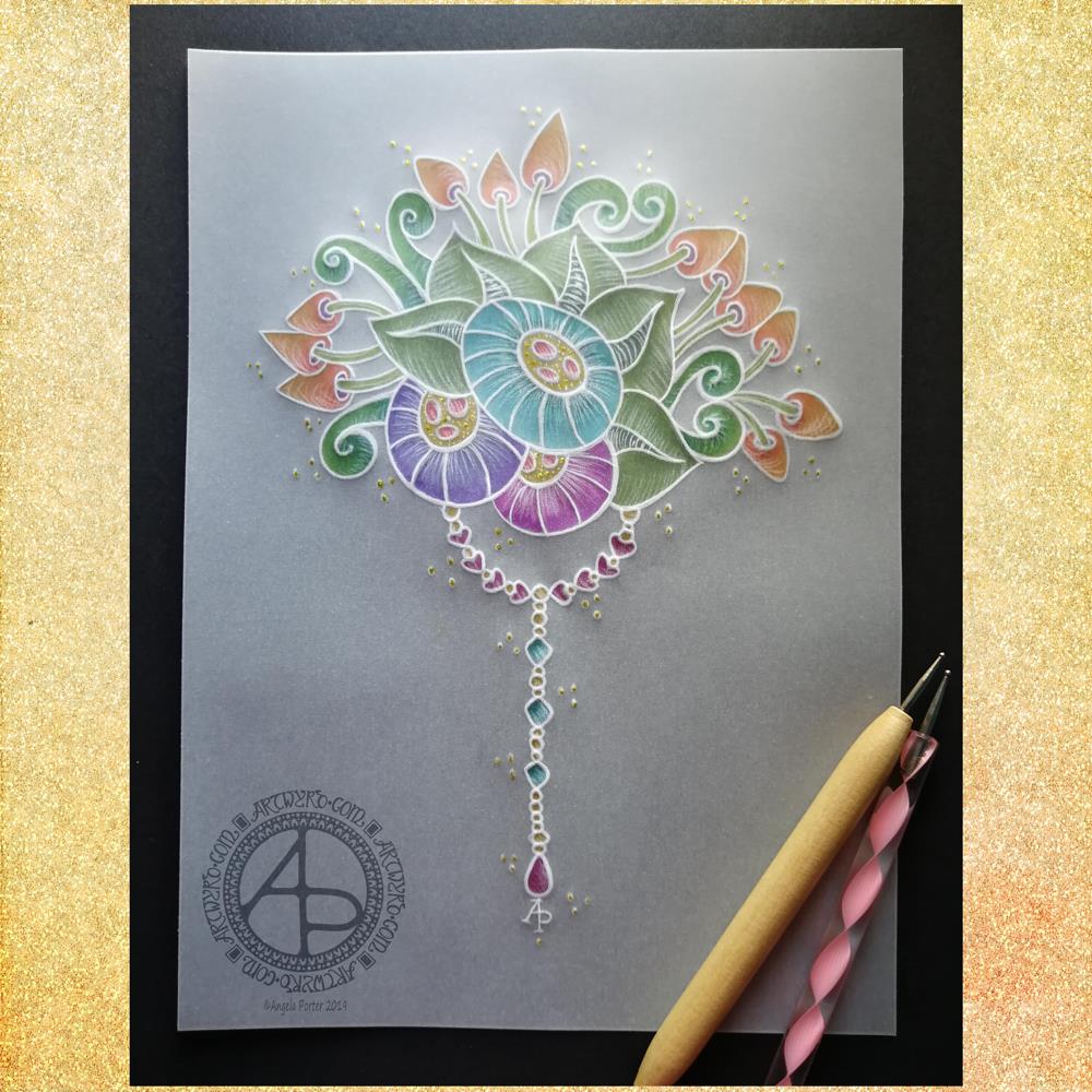
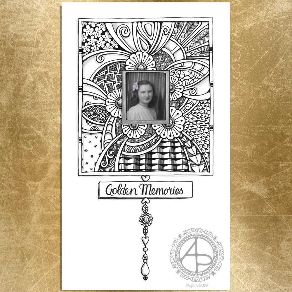
Fancy having a go at drawing your own dangle designs and not sure where to start? Well, you could start with my book “A Dangle A Day” where I lead you through the process. I have over 100 designs in the book where I take you step by step through drawing them. I have also included ideas for where you can use them including as cards, bookmarks, in BuJos, journals, scrapbooks and more.

Making the envelope.

I used the pre-made envelope that came with the card blank. I decided to keep the envelope white and add a border using some of the motifs from the dangle design.

I did use the Uniball Vision Elite gel pen and Pentel needlepoint pen to draw the design. This time, I coloured the design with some Mitsubishi Uni coloured pencils. 

The low quality of the paper envelope wasn’t conducive to really amazing colouring, but it worked well enough.

Reflecting on the card and envelope.

I could’ve kicked myself for not testing the pens to see if they were Copic friendly. I don’t think I could send this card to anyone as it just isn’t up to scratch. I need to remember this in future projects.

Also, the Versamark pen smeared the ink a little too, but nowhere as much as the Copics did.

I used much darker Copic colours than I usually would without thinking that heat embossing them would intensify the colours even more. The colours aren’t as dark as in the photo, but they are still darker than I would like.

The coloured pencils colouring worked much better and perhaps I would’ve been better off using them on the card panel. Again, something to remember for the future.

I also noticed that the anti-static powder I used before using the Versamark and embossing powder has either removed or covered the Perfect pearls. I used the anti-static powder so prevent the embossing powder sticking to places it didn’t belong. This is always a possibility, especially when using Distress Inks to colour the background.

In hindsight, I may have been better drawing, colouring and heat embossing the design before colouring the background. However, I do like to have pre-coloured backgrounds to use for arty projects.

So, Angela, how are you? 

I’m OK, still tired from a busy few days at the weekend and start of the week. I also have a flare-up of an ovarian cyst which is rather painful and achy. I’m feeling content and optimistic otherwise, though still tired even though I slept well last night. The exhaustion that comes with interacting with people, therapy and not enough me-time can linger for a good while — the joys of having CPTSD and being an introvert.

Yesterday, I was fatigued, and the flare-up ramped up in intensity as the day progressed. I wasn’t in the right place to create art or focus on work. I needed to practice self-care.

I chose to do some crochet after hearing about Crochyay, the online presence of a young woman called Olivia who makes flowers and leaves them with a little message tag for people to find and keep – random acts of kindness. She uses crochet to help manage her anxiety and depression as well.

I thought it was a beautiful idea and I thought flowers or little amigurumi hearts or similar would be lovely to make. Small, quick to finish projects that I feel I could manage. I’ve lost the oompf to do larger crochet projects such as shawls and blankets, but some little ones would be lovely to do. 

I do find crochet and other crafts quite soothing and calming. I also feel I’m doing something, and they can stop me from just sleeping my day away. Little projects like flowers are fab for me when the thought of anything bigger fills me with procrastination and disinterest. Also, I find it much more motivating to do projects for other people than for myself, even if I don’t know those people.

So I managed to make quite a few flowers yesterday. I now need to make leaves and assemble them into little posies. Then, there are tags to make.

I’m also looking forward to making the tags as I can draw and decorate them too! So, little projects in their own right.

Finally, I’ll need to overcome my self-consciousness and anxiety about leaving them for people to find them.

Hello – A dangle design card with coordinating envelope.

Hell - A Dangle Design card with coordinating envelope © Angela Porter | Artwyrd.com
Hell – A Dangle Design card with coordinating envelope © Angela Porter | Artwyrd.com

Yesterday I decided to make a second card with a coordinating envelope. I wanted to try out using the Chameleon fine-liners to add colour in the form of lines and cross-hatching. Finally, I added some gold dots to the points of the petals on the flower design.

To draw the design and execute the hand-lettering, I used a Uniball Unipin pen. I then used various pairs of Chameleon fineliners to add the colour.

I prefer this way of adding colour with the Chameleon fine-liners, though I’m not entirely happy about it either. Looking at it now, in the clear light of dawn, I think I could have added a flat colour below the coloured lines. I may go and add that colour in a little while. After all, it’s just a card, an experiment, and if I mess it up, I can always make another one! A lesson learned, an experience gained is worth the few pennies worth of materials and the time it took just as long as I remember the lesson in the future.

I’m also not happy with my hand-lettering; I like the idea of the letter layout, but it’s not centred between the arcs.

I do like the ‘banner’ I’ve used to enclose the hand-lettering. However, there’s something about the rectangular ribbons and the patterns within that I don’t particularly like. I’ll work out what it is in time.

For now, I’ll try adding flat colour to the coloured sections to see how that works out and not worry about messing up the card. I’ll use it as a learning experience.

And that reminds me, I’ve still not set up my One Note journal for my private critiques and what kinds of methods and techniques I use in my art.

Materials

A piece of yellow card cut to 4″ x 11″, scored and folded in half to make a top-fold card measuring 4″ x 5½”.

A piece of white card approx. 4″ x 5″ for the top layer.

A We R Memory Keepers Envelope Punch board and an piece of paper measuring 7⅞” x 7⅞” or a blank envelope that will fit a 4″ x 5½” card.

A pencil and ruler for the guide-lines and a good eraser to remove them.

A black fineliner pen for drawing and hand-lettering; I used a Uniball Unipin pen.

Pens to colour the design; I used Chameleon fineliner pens.

A gold gel pen for the dot embellishments; I used a Uniball Signo gold gel pen.

If you’d like to learn more about dangle designs or are looking for some more inspiration for them and how they can be used in cards, BuJos, scrapbooks, bookmarks, journals, and more then my book ‘A Dangle A Day’ is a good place to start. It takes you through how to draw monograms and dangle designs for all kinds of occasions around the year in simple steps.

‘F’ Dangle Design

'F' Dangle Design ©Angela Porter | Artwyrd.com
‘F’ Dangle Design ©Angela Porter | Artwyrd.com

Friday is dangle day!

Today I thought I’d create a monogram dangle design for ‘F’ with some cute fish, as well as a couple of shells. Of course a whimsical crown with golden foliage tops the design off just nicely!

Fish means a water theme, so I used blues, and blue-greens quite liberally. However, golds and shades of red and magenta really give a tropical feel to the jolly little fish.

Fairly simple gradient colouring this week. No drop shadows, other than the one around the whole design.

Looking at it now, I think the monogram might benefit from a drop shadow or two. However, it’ll do just fine as it is I think.

It would be lovely on a card for someone with the initial F, especially if they love fish or fishing. Of course the colours can be adjusted accordingly, as can the particular kind of fish. I’m particularly fond of cute, whimsical, happy little fish.

It could happily find a place in a BuJo, scrapbook, planner, journal or diary. Making the monogram narrower and the dangles longer, it would make a lovely bookmark too, I think.

Just a little mention here about my book “A Dangle A Day”. It’s a dangle design tutorial book, Angela -style dangles that is. Lots of monograms as well as dangle designs for use around the year. It’s a good place for beginners, but is also full of ideas for the more experienced among you. And, of course, I add a new dangle design on this blog most Fridays which you can use for inspiration.
I’d love to see what you create! Tag me on social media!

Congratulations – A Dangle Design

Congratulations Dangle Design ©Angela Porter | Artwyrd.com

Friday means it’s dangle day!

Congratulations to you all as you’ve made it through another week and the weekend is upon us!

I made it a cute and simple design today. Easy motifs to draw. Simple hand lettering. Even the colouring is simple as I used flat colours with the only gradient being behind the sentiment.

My first step is to write the sentiment; I use this as the anchor for the rest of the design. I just used simple letters today; I made them all the same height. Actually, this is my favourite way of lettering sentiments; I think it looks quite cute and whimsical.

Also, I used squared paper as a guide for my design. It helps to keep my lettering on the level (and the letters the same height in this case). It also helps to keep the dangles vertical and the design symmetrical.

My sketch was really basic. I used concentric semi-circles for the leafy bush the flowers are growing out of. I used circles for the flower placement. I drew really sketchy butterflies. I drew lines for the dangles and placed the main motifs on them.

Once I was happy with the sketch, I inked it in using a digital brush pen in Autodesk Sketchbook Pro. Varying pressure on the pen varies the line width. I think it adds a bit more human character to the drawing, and a bit more interest.

During the inking phase, I refined my sketch – adding petals to the flowers, detail to the leaves and groups of beads to complete the dangle.

Once I was happy with the inked design, it was time to add colour.

I chose fairly pastel colours with a summery feel for the design. Also, I used the same colours above and below the sentiment to give a more coherent design. I did add two extra colours to the dangles to give some more variety in the beads that join the dangles.

My final task was to add a bit of colour behind the dangle design. This is a simple gradient from a pale yellow, to aqua to blue.

I didn’t add any drop shadows this week – I wanted to keep the design simple.

And it really is simple to draw, honestly! Have a go! I’d love to see what you create using this as inspiration, be it a card, BuJo page, journal page, in a scrapbook, diary or any other way you can think of to use dangles. Post on my facebook page or tag me on Instagram!

Just a little reminder that I have a book called ‘A Dangle A Day‘ if you’d like to find out a little more about drawing and using dangle designs.

Sending Love – A Dangle Design

Sending Love - A Dangle Design ©Angela Porter | Artwyrd.com
Sending Love – A Dangle Design ©Angela Porter | Artwyrd.com

For today’s whimsical and cute dangle design, I used one of the designs from my tutorial book “A Dangle A Day”, altered the hand lettered sentiment and changed the colour scheme.

I used just five colour schemes in the design itself – blues, yellow-orange, pinks, peachy-orange and yellow-greens. I used a blue and green from the design to create the background colour gradient.

By using the same colour gradients throughout the design it brings the design together.

I added a simple drop shadow to the whole design to give it a little dimension. I could have added drop shadows to the lettering and the flowers in the rectangular charm, but I chose to keep it quite simple today.

I think this would make a lovely note card or greetings card. I also think, perhaps with a different sentiment, make a lovely page for a BuJo, journal, diary, planner, and it would be lovely as part of the design of a scrapbook page.

How would you use a design like this?

I drew, handlettered and coloured the design digitally using my Microsoft Surface Pen on the screen of my Microsoft Surface Studio as if I was working with pens on paper. My preferred art software is Autodesk Sketchbook Pro.

So Angela, how are you today?

I’m content with that background level of anxiety. I feel motivated to work even though I’m really tired again. This time it was from a late night conversation with a friend in need. I can nap later if I need to. The tiredness is actually giving me a headache.

My Nikita Gill books of poetry arrived yesterday and I spent some time reading one, “Wild Embers” from cover to cover.

I cried at some poems as they really touched something inside me, when she describes in words things I’m only beginning to recognise within me.

With other poems it was like a light bulb came on as understanding was ignited within me.

Yet others highlighted the difference between how girls and women are viewed to boys and men, and treated differently, and brought up to believe different things about themselves.

You can tell in her writing she has survived some serious trauma; she writes not just from her heart and soul, but from experience.

I can recommend her work to anyone who has experienced abuse, trauma and who, like me, struggles to describe what is emerging from the Pandora’s box of the past as the healing progresses.

It helps to show I am not alone. It helps to show other survivors of abuse that they are not alone.

I felt alone as I had no one to turn to when I needed someone most. I withdrew within myself, isolating myself, being lonely even when surrounded by a loud, extrovert-filled family. Desperate to join in, to be part of it, but scared to be noticed as that left me open to being the one who was made fun of, blamed for anything and everything. It was horrible to be ignored too when I’d spoken; that happened often. I never learned to speak up for myself, to ask for help, to say what I needed. I suffered long in silence.

I make no apologies for speaking up now. For talking about what happened to me, not in any great detail as I don’t have that myself.

I make no apologies for trying to raise awareness about the damage that emotional neglect does, how worthless being ignored and uncared for made me feel, and has made and does make others feel. How it grinds a person down day after day after day…

I make no apologies for doing what I can to help others to not minimise the effect these things have had on them. To stop telling themselves, like I did, that I was weak, an attention seeker, a whiner, a whinger, a liar when I was in need of help or support.

Someone made me believe that was what I was as children are not born believing that of themselves.

I make no apologies for writing about these things if it helps people understand that someone made them believe these things about themselves and they can unlearn them and replace them with more positive beliefs.

A thought just came to me then. As I teacher I focused on teaching students with additional learning needs. My first focus was to build their self-esteem and self-belief, always. I was shocked at how little so many of them thought of themselves and I found that incredibly sad.

I could see that in them and I could see how I helped them believe in themselves more, one tiny step at a time.

I can see now how I knew I too felt the same way about myself but believed myself too damaged to be healed or not worth thinking better of myself.

Now, with the help of EMDR, I am changing those beliefs about myself little by little.

That inner critic is mostly silent these days, I think. I still suspect it is still creating a very quiet susurrus deep in the depths of my conscious mind. However, it’s malignant murmuration becomes louder when I’m overly tired, emotionally drained, or my anxiety is increased by some trigger.

However, I have to say it’s power over me seems to have diminished.

That’s not to say I’m healed enough yet. I still have those negative beliefs about myself – ugly, unloveable, self-loathing of myself and my body – and of course there’s the inability to feel safe a lot of the time, sometimes even in my own home.

Of course there may be other things that arise during EMDR.

However I do think I have made a lot of progress over the years. Slow and steady for sure, but progress all the same.

Anyway, back to Nikita Gill.

I can recommend her work to those who are friends, partners, family members of those who have been abused to help to understand what someone is going through.

I can recommend her work to all, for her words are thought provoking in a gentle but descriptive manner.

I think I may be lending this book to my therapist…that’s how valuable I think it is.

July 2019 Dangle Design

July 2019 Dangle Design © Angela Porter | Artwyrd.com

July Dangle Design

July is nearly upon us. It seems hardly anytime at all since June started! So, close to the eve of a new month it’s time for a dangle design.

This month I wanted to do a floral wreath with a little hand lettering. As I live in the Northern Hemisphere July means summer. So, my charms are a glowing sun, an ice cream cornet, and a tiny feather. I chose colours that remind me of summer too.

Now, for those of you in the Southern Hemisphere where winter has begun, feel free to substitute different charms – perhaps a snowflake instead of a sun and a steaming mug of hot chocolate instead of the ice cream cornet. Of course, a more wintry colour palette would be lovely.

I designed this to be A5 in size so that it would fit nicely in a BuJo, but equally it would look lovely in any planner, journal, diary or scrapbook. Of course the sentiment could be changed too.

I don’t know if you’ve noticed, but the wreath has a seven-fold symmetry. Well, July is the seventh month after all!

If you’d like to learn more about how I design and draw dangle designs, along with plenty of designs to use or adapt, then my book “A Dangle A Day” is a good place to look.

I did create this dangle design digitally, using my trifecta of Autodesk Sketchbook Pro, Microsoft Surface Pen and Microsoft Surface Studio. It would be quite easy to draw with pen on paper and then use any media you like to add colour.

So Angela, how are you today?

I’m feeling quite content today within myself. I seem to have rested quite well. My digestive system still doesn’t feel quite right, but it’s certainly a lot better than post-EMDR on Monday.

In my blog yesterday, I wrote about my CPTSD and the prejudices I seem to face for having therapy. I’m amazed at how that post garnered a lot of interest on twitter; a lot of interest for a tweet by me that is, the most I’ve ever had.

I was humbled by this, but the best thing for me was someone letting me know my blog post had helped them.

That’s why I write about my CPTSD, mental health and emotional health. It’s not for attention (I don’t deal well with being shown attention of any kind – all part of the CPTSD). I share my story and journey so that it may help others.

It took me nearly 50 years of life to work out that I had a problem, and a couple longer to work out that it wasn’t just anxiety and depression, that it was something more, that it was CPTSD.

This is a label I needed to have. As I learn more about CPTSD it helps me accept that I am stuck in the past; not in terms of reliving memories and events over and over, but in the way I behave, feel, react to life.

Being traumatised means continuing to organise your life as if the trauma were still going on – unchanged and immutable – as every new encounter or event is contaminated by the past.

After trauma … the survivor’s energy now becomes focused on suppressing inner chaos, at the expense of spontaneous involvement in their lives. These attempts to maintain control over unbearable physiological reactions can result in a whole range of physical symptoms including fibromyalgia, chronic fatigue and other autoimmune diseases.

“The Body Keeps the Score” Bessel Van Der Kolk

Today, as I read a little of “The Body Keeps the Score” this quote really struck me.

If I think back to the weeks, months and years before my first bout of serious anxiety and depression, I can see how I was trying to control the inner chaos during my daily life. I struggled every single day with exhaustion, fear, fighting back the tears and wanting to hide away or run away. I also hoped I would die in my sleep so I didn’t have to continue with this.

I certainly had physical symptoms of illnesses for which there were no physical causes – upset stomach, losing my voice, problems with my lungs, outbreaks of weird spots on my skin. I’ve also developed a couple of chronic illnesses along the way too.

I don’t lose my voice anymore, but I certainly still get a dodgy digestive system and asthma attacks when the lightly napping anxiety monster is provoked and awakens. Oh, and I still get weird flare-ups of skin problems.

It’s taking me quite a while to read this book. I lost my ability to read during my first big ‘breakdown’; I still have problems retaining what I read. Sometimes I even have trouble making sense of what I’m reading. I used to be an avid reader. I miss that. However, I am aware that my ability to read is returning… slowly. In the meantime, audiobooks are a great source of pleasure for me.

Summer Solstice Dangle Design

Summer Solstice Dangle Design © Angela Porter 2019 Artwyrd.com

It is the Summer Solstice here in the Northern Hemisphere, the longest day of the year and from here on in the days will slowly get shorter. Still, it’s lovely to have daylight well into the evening with the sky still being fairly light at 10pm or so.

Yesterday evening I had a bit of an idea to try creating a dangle design on parchment, and this is the result. I needed a bit of a break from digital art after the hours and hours spent on my most recent mandala.

Parchment craft, or Pergamano, is an old craft and a lot of the work done, while beautiful, is really not my style. So I thought I’d try my style of art with it.

I used some ball tools to emboss the parchment with my design and then to add some shading. I drew the design directly onto the parchment with the embossing tools.

I started with the stylised flowers and worked out from there. Once I was happy with my design, I added a simple dangle consisting of round, heart-shaped and diamond shaped beads with a tear-drop bead to add some weight to the dangle.

I then added colour with some Kuretake Zig Writer pens on the reverse of the design. I chose colours that remind me of summer – the mature greens of summer foliage along with the bright colours of tropical flowers. I thought these would work well for the Solstice. Of course the hearts needed to be pink and I added some teal-blue to the small diamond beads for a bit of variety.

On top of the dots around the design I added tiny dots of gold glittery loveliness using a Uniball Signo glitter gel pen. I also added some tiny dots in the centres of the stylised flowers.

To give an idea of the size of this design, the black paper behind the parchment is A4 (approx US letter) in size.

Adhering the parchment to the black paper was a problem as glue shows through, so I had to use some tiny dots where the white lines were thick enough to disguise the glue.

I really think that the white lines of the parchment create something that is equally as lovely and maybe a bit more delicate than my usual black line art.

The uses of this design are many – greeting cards, note cards, framed artwork or used in Bullet Journals, journals, planners, scrapbooks, and more. In fact, I may replicate the design for my July cover spread in my BuJo.

If you’d like to learn more about drawing your own dangle designs, then my book “A Dangle A Day” is, perhaps, a good place to start.

So, Angela, how are you feeling today?

I’m feeling quite content today. Tired still, but content.

It seems the anti-stigma talk for Time to Change Wales and the anxiety I had around doing it on Wednesday has taken it’s toll on me just a bit. I do know, however, that I will recover in the fullness of time for sure.

This is part of the emotional/mental weather that is part of life. Beneath this weather is a calmer, more content Angela. I find this version of me from time to time; indeed I’m content in myself on many more days than I am discontented. Even with the bout of anxiety on Wednesday there was still a sense of being content.

It’s a strange thing to feel both at the same time. A bit like feeling the firm ground beneath my feet as a wild wind is buffeting me and trying to blow me down. I can feel that firm footing even when my emotions are a bit on the wild and windy side.

That’s progress on my journey to recover from CPTSD. Even more progress that I can recognise and describe this feeling.

This realisation makes me smile.

It’s progress, but it’s not where I want to be. I want to be able to go out and about without being scared of my own shadow. To be able to travel to unfamiliar places and actually get out of my car when I don’t have an appointment of some kind. To be able to go into an unfamiliar cafe or eatery when I’m by myself when I’m hungry and thirsty. To not go into full flight mode when something small has spooked me. To not be startled by loud noises. I want to be able to reach out to people without fear of rejection or to allow people into my home. To have all kinds of relationships with healthy boundaries where my needs and boundaries are respected by myself. To be able to go shopping without being overwhelmed by the choices available so I end up leaving without getting anything that’s needed.

These are but a few of ways that CPTSD affects my life and that I’d like to change through the healing journey I’m undertaking with the help of EMDR and therapy.

I’ve never been anything other than this permanently scared, extremely self-conscious person. Different events and places result in different levels of fear/anxiety in me. Even sat here, at my familiar desk, I feel anxious about writing about it.

The progress is that I recognise it now. I have identified it. Although it’s still there, it’s slowly being dis-empowered. Slowly means it’s being done properly and that I have time for the new level of anxiety or the increased self-awareness has time to become familiar to me before the next step forward is made. Familiar means it’s the more healed me. Healing bit by bit.

Golden memories – a dangle design

Golden memories dangle design ©Angela Porter 2019 Artwyrd.com

As it’s Friday it’s time for a dangle design, and here it is. All in monochrome, well nearly. I added some subtle colour to the photograph.

If you’d like some ideas and step by step instructions on drawing your own dangle designs then my book “A Dangle A Day” is a good place to start. Just saying like.

I decided to use one of the images from the ‘Photobooth’ collection in the Idea-ology range by Tim Holtz. I thought that around it it would be nice to create an entangled frame, and to add a simple dangle design to this frame.

With the vintage nature of the photo I thought that the hand lettered sentiment of ‘golden memories’ would be a good one to add.

In keeping with the vintage design I thought a monochrome colour scheme would be appropriate. Mind you, a color palette of subtle vintage colours would work quite nicely too. It would be nice if I’d changed the colours from greys and blacks to sepia tones.

I drew the design and did the hand lettering with Unipin pens on Winsor and Newton Bristol board. I then cleaned up the scanned image, and added the subtle colours to the photo, using Autodesk Sketchbook Pro, Microsoft Surface Pen and Microsoft Surface Studio. I also added some subtle grey shadows to the design.

This would look absolutely charming framed, a lovely way to display cherished photo-booth images. I drew this image on a sheet of A4 paper (approx. letter size).

However, this would work on a smaller scale for a scrapbook, journal or even a BuJo. It would also make a lovely greeting card or note card for someone too.

It’s also an idea that can easily be altered for a more masculine tone, perfect for father’s day or a male birthday.

June dangle design

June Dangle Design © Angela Porter 2019 - Artwyrd.com
June Dangle Design © Angela Porter 2019 – Artwyrd.com

It’s dangle day Friday!

Elsewhere on the interwebs it’s #furbabyfriday, but here, in the tiny corner of the web that is Artwyrd.com it’s dangle day.

It’s getting close to the end of May, so I thought today I’d create a dangle design for June. This would work really well as the monthly cover page for a BuJo or in a scrapbook, journal, planner, diary, greeting card, or anything else you can image it being used.

I did sketch this out in pencil on paper, but then I re-drew, hand lettered and coloured digitally using my usual trifecta of Microsoft Surface Pen, Microsoft Surface Studio and Autodesk Sketchbook Pro.

On Wednesday I had a trip to Hereford for a meeting in the evening. On the way I stopped at my most favourite Romanesque church in Kilpeck to do some drawing. I included some patterns based on this visit in the charms and also the border under the plant pots.

As the Summer Solstice occurs in June, I wanted to include a lovely golden Sun, as well as plenty of golden tones. Also, the clear blues of summer skies and the aquas of sea and lake were a must as well. Cacti, succulents and flowering plants reside in the simple plant pots, with simple monograms on each pot. Of course I have beads and a heart as part of the design too.

I added a textured background upon which I layered a drop shadow for the dangle design.

So many ways that this design could be coloured. I’m quite happy with my design. I’m certainly happy with the line art, but I’m really not confident about my choices of colours. I do feel I’m struggling with colour at the moment.

A Dangle A Day” is my tutorial book that shows you how, step by step, to create dangle designs.

My CPTSD healing journey

Wednesday I was surprisingly content and managed to stop at Kilepeck Church, just outside Hereford. I usually visit the church once a year to soak up the awe and wonder and joy I feel looking at the Romanesque sculpture of this tiny three celled church.

I had my Dingbats quadrille A5 notebook with me, which is my current sketchbook. I spent a happy or or so inside the church taking my time to look at patterns and textures and to deconstruct then reconstruct them in thumbnail sketches.

It was really quiet and serene there; just what I needed.

Also, I’d packed up a light meal in a cool bag so I could have a late tea before going on to my meeting in the evening. I thought this was wise as the problems I have eating out when on my own could preclude me getting something to eat/drink. I found somewhere quiet with lovely views to park up and enjoy my light meal and some more quiet time.

My evening was long and I didn’t return home until nearly midnight. The stress being around people I don’t know also took its toll on me. So yesterday I was wiped out yet again.

I had to find my strength to get out to go and vote in the EU elections and to do some shopping, but this absolutely drained me.

When I’m this tired it is all too easy for me to be emotionally fragile and for this to impact on my mental health.

I caught myself having thoughts that were very unkind and hateful towards myself at times yesterday.

I’m still tired today, but feeling a bit more emotionally resilient. I’ve found the confidence to create art, something I didn’t have yesterday.

The ripples from EMDR and other stuff over the past couple of weeks still have energy, sometimes they’re more like storm waves. Storms pass. Waters calm eventually, with ripples that are easy to ride.

I think I’ve had a couple of storm waves approaching the size of tsunamis in the past couple of weeks and they’ve really drained me.

However, it’s all part of the healing journey. After all, I am a lot better now than I was a few weeks ago, a few months ago, a year ago, a few years ago …

Hello Friday – a dangle design

Hello Friday - a dangle design © Angela Porter 2019 Artwyrd.com
Hello Friday – a dangle design © Angela Porter 2019 Artwyrd.com

A cute, whimsical dangle design today to say hello Friday, the gateway to the weekend.

Sunshine and grey clouds fill the skies today in the Valleys of South Wales, so if it rains there’s a good chance of rainbows. That’s why I chose a rainbow and sun design to hang the dangles from today. I love rainbows!

A bit of hand lettering in the ribbon banner to proclaim Friday is welcomed. Hearts feature simply because I like hearts and i used little gold beads as spacers.

I also included a bluebell. The hedgerows, shady spaces and woodlands are coloured blue at the moment with all the bluebells that are still flowering. It’s a beautiful thing to see, and every year I’m always wowed by their appearance.

Behind I’ve put pale blue and a little drop shadow so the dangle designs appears to float a little.

A lovely little design that would look rather pretty in a BuJo, planner, journal, diary, scrapbook, greeting card, notecard…the list is as endless as your imagination or needs!

I did draw and hand letter this one using digital media – Microsoft Surface Pen, Microsoft Surface Studio and Autodesk Sketchbook Pro. However, it’s a cute and simple design that would be easy to draw on dot grid paper for sure.

Just a little reminder that my book ‘A Dangle A Day’ is available from various outlets. It’s my tutorial book that takes you step by step through creating your own dangle designs.

A year has passed me by …

A year ago today I picked up Binky, my then brand new Smartfortwo SmartCar. Just five days before that I said goodbye to my furbaby companion of just over sixteen years – Cuffs the whoosh kittencat.

A year. One whole year. We have so many days in our lives that mark the end of one cycle of time and the start of another.

I still have and greatly enjoy driving Binky.

I still miss Cuffs. I’m still not ready to have another cat yet, for lots of complex reasons, a lot to do with me becoming so attached to my furbaby companion that I’d not do the exploring and travelling that I want to be able to do as I progress in my CPTSD healing journey.