Entangled Monograms – C, D and E

Entangled Monograms C, D and E ©Angela Porter 2019 - Artwyrd.com
Entangled Monograms C, D and E ©Angela Porter 2019 – Artwyrd.com

Arty things

Another lovely day or so spent hand lettering and drawing the etntangled designs around the monograms.

I used Tombow Fudenosuke, Uniball Unipin and Sakura Pigma Sensei pens on 15cm x 15cm pieces of Winsor and Newton Bristol Board.

The Tombow Fudenosuke pens are giving me a much thicker line than I’d usually use, along with variable line width too. I must admit I rather like the bolder lines as they really define the designs. What do you think about my use of bolder line?

I have scanned these, and yesterday’s A and B monograms, so I can add colour digitally, should I choose to do so. At the moment I’m really just enjoying the graphic quality of the black and white line art.

Therapy day

Today is EMDR therapy day for me. My appointment is mid-afternoon and it’s been almost a fortnight since my last one as there’s been a Bank Holiday in between.

I must say that I’ve had quite a contented fortnight. The last session was rather disturbing and distressing and though I was absolutely exhausted emotionally, mentally and physically after it for the rest of the day and part of the next, I think I found my balance much quicker than I expected.

I’ve had my moments, hours, mind you. Often when I’m tired and need a nap. So, I take a nap if I can. That’s one of the fab things about being a self-employed/freelancing artist/illustrator/author. It’s a lot easier to do self-care things when self-care is needed. If I need a nap, I can often take a nap. If I need a day or three to recover from EMDR I can take that time, or at least break the time up so I have chunks of self-care in amongst the work I need to do to fulfil contracts.

I really am grateful for this flexibility, a flexibility that is in sharp contrast with the very structured, timetabled, hamster-wheel existence of my life as a teacher.

Flexibility and freedom – a double edged sword

It’s really difficult for me to make full use of the flexibility and freedom I have. I often have an urge to go out somewhere, but I can never decide on where to go, or when to go, or whether I should even bother going as really, what do I want to go there for. Telling myself it’s to sketch, draw, photograph, gain inspiration, for the experience, because I like to walk when I do go and walk, because being in nature is good for my emotional and mental wellbeing, or just because I CAN just doesn’t cut it with the problems that arise from the CPTSD, especially anxiety and social anxiety that forms part of the experience of being a survivor of trauma.

Sometimes I manage to sneak up on myself and surprise myself and get out and about and visit somewhere either familiar or new to me.

More often than not the inner critic manages to talk me out of it.

I think I need to make a list of places close to me, and a bit further away, that I’d like to visit. A list that contains both familiar and unfamiliar places.

Familiar places are less stressful for me to visit on my own. Knowing my way around, knowing where I can enjoy lunch or tea, knowing where I can park my car and knowing I can find my way back to the car, and so on and so forth makes it a much easier experience for me.

Going somewhere unfamiliar increases stress for me as simple things like going into an unfamiliar cafe for some tea or lunch causes me huge anxiety when I’m by myself. The worry about not being able to find my way back to my car is another added source of anxiety too. Even going into unfamiliar shops, cathedrals, museums and so on provokes anxiety in me.

It’s that old fear from being a bullied, abused child that rises up where I worry if I’ll get hurtful comments from people, if I’ll make a fool of myself in some way and people will laugh, if they’ll pass comment about my choice of food or tea.

None of these things have happened to me as an adult, yet the anxiety that lurks within me rises up and tells me again and again that these things may happen. The voice of my anxiety, of my inner critic, can paralyse me or cause me to flee back home without even getting out of my car, that’s if I even manage to drive to where I’d like to go.

If I have company I’m really brave. I’m often the first to enter a cafe or similar and ask for a table and so on. I’m the one who will bravely explore a new cathedral or museum or place quite eagerly.

On my own though, the inner critic is way too strong as I feel vulnerable. As vulnerable as I did when I was a child and all the way through my adult life.

I can overcome this vulnerability, the anxiety, if there is a purpose to my trip, such as giving an anti-stigma talk for Time to Change Wales. I do it because I don’t want to let others down (as well as because I believe in the mission of Time to Change Wales).

Part of my anxiety is that I never, or rarely, ask anyone to go out with me (not go out in a romantic sense, just go out as in a jolly day out visiting somewhere of mutual interest and enjoying pleasant company). The fear of rejection is still too huge. I’m also very much aware that people I’d call friends and family are busy with their own family and work and so on, and I never, ever, want to become a burden to anyone.

That’s something that I learned early in my life – not to bother anyone with my needs or problems or issues. It’s something as an adult I’ve not gotten over yet.

I also am aware that there are trips I need to make solo. I like to sit and draw and write in places I visit. I can lose myself in this for a long time, I can take as much time as I need to look at . If I’m with someone I don’t want to spoil their day by indulging myself in such an activity. If I’m by myself I don’t have to worry about them not enjoying themselves as much as they could, so I tend to put my needs completely to one side to make sure they’re happy.

Being a people pleaser is part of the CPTSD. It’s what I did to try to gain approval of people who would never approve of anything I did or said or how I looked. Rejection, ridicule, being put down was par for the course no matter what I did. That didn’t stop me trying to please others, to make sure they were happy as if they were happy then perhaps I’d have an easier time of it and wouldn’t be pushed away yet again.

CPTSD sure messes a person up.

I know that there are plenty of people who experience anxiety who are able to do these simple, everyday, taken for granted things like going into a cafe for a cup of tea. They’re able to overcome that anxiety and don’t buy into it’s messages.

I’ve not learned to overcome it or have disempowered the inner critic enough that I can do these simple everyday things, well not yet. I think the critic has a way to go to be disempowered first.

Still, there are days when I’ll be able to sneak up on myself and head out and actually visit places, sketchbook and visual BuJo in my bag, and take that time and will wonder at how I don’t do things like that more often as it’s really not that bad.

I hope those days will eventually outweigh the days where the inner critic wins out.

Until that days comes I just need to be kind to myself and not beat myself up about giving in to the inner critic once again and remind myself a day will soon come where through sneakery or just disempowering the inner critic enough that I can go out.

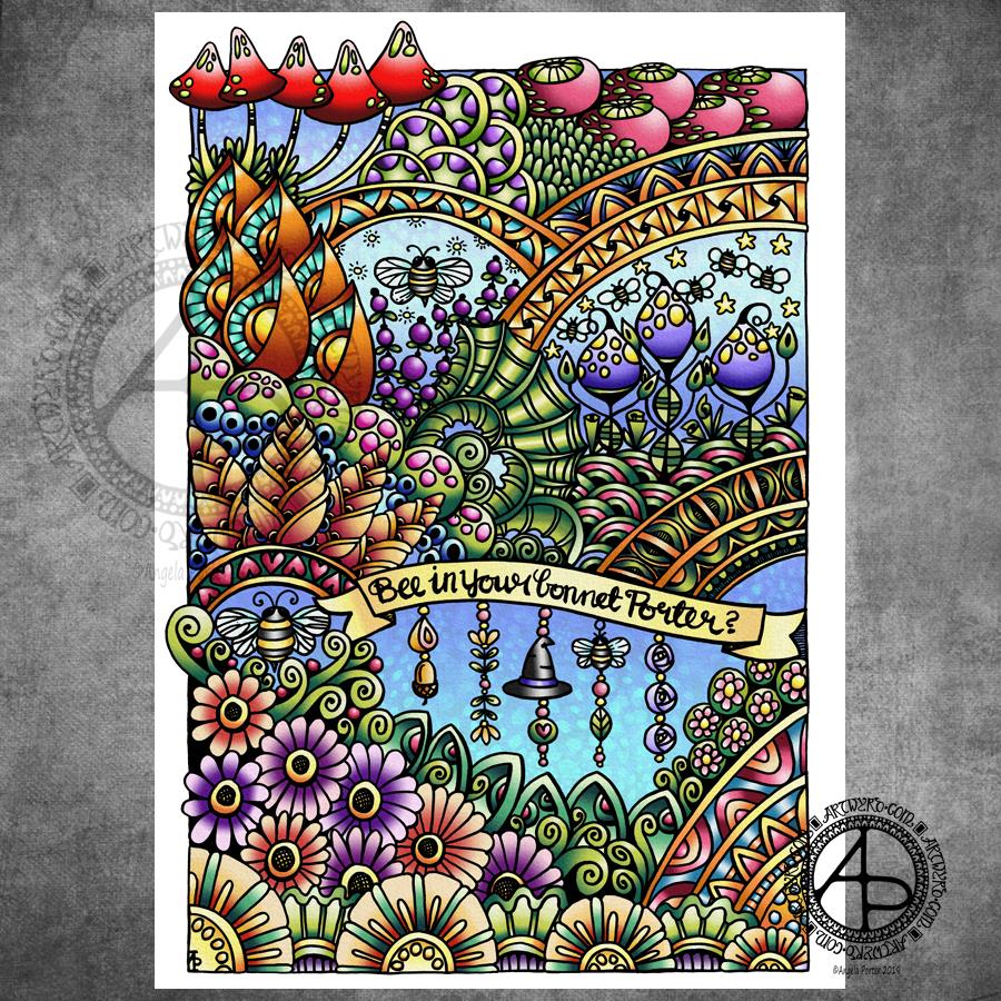
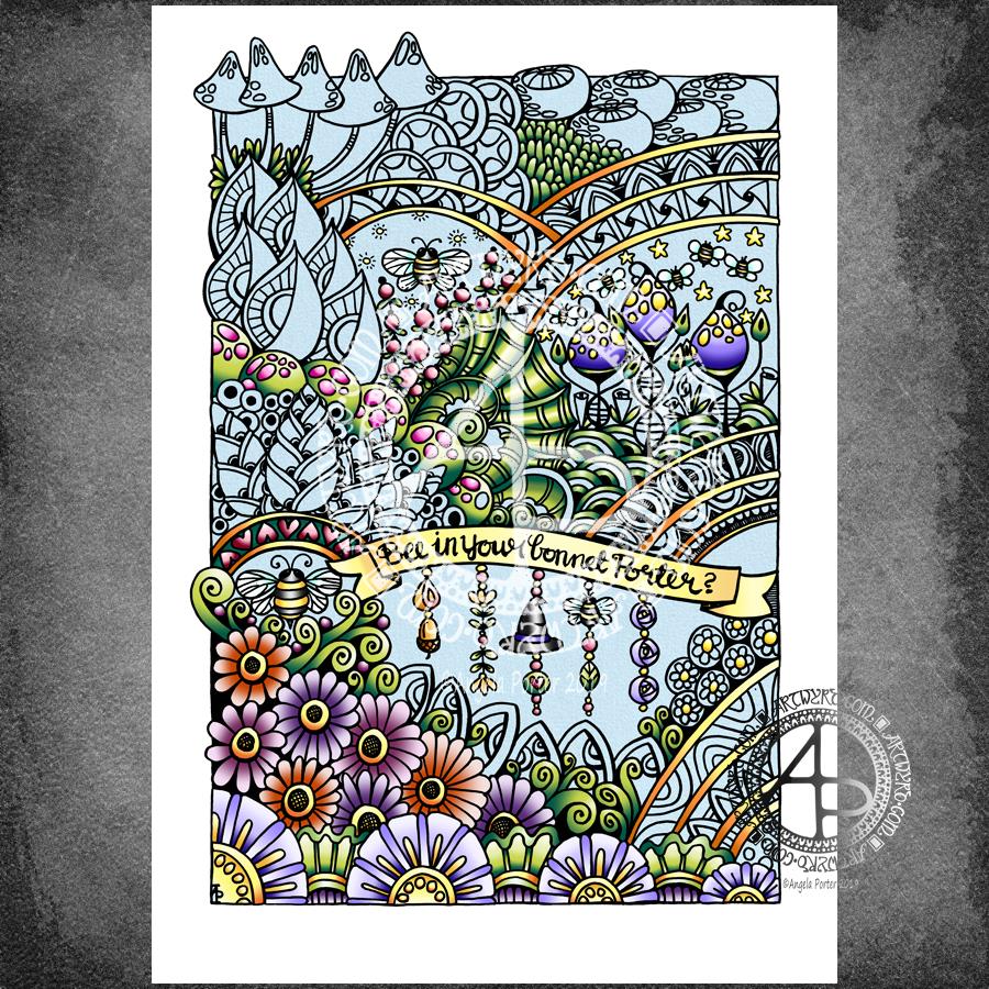
Bee in your bonnet Porter?

Bee in your bonnet Porter? ©Angela Porter 2019 - Artwyrd.com
Bee in your bonnet Porter? ©Angela Porter 2019 – Artwyrd.com

All done and coloured now, but o,h, WordPress, why do you change the colours on my images?

The colours are a lot more vibrant in my non-uploaded file. But I’m sure you get the idea.

Anyways, I drew the image with Tombow Fudenosuke pens on Winsor and Newton Bristol Board. After scanning the drawing, I used my favourite digital tools – Autodesk Sketchbook Pro, Microsoft Surface Pen, Microsoft Surface Studio – to add colour and texture (and watermarks) to the image.

The original drawing was a little less that A4 (US letter-ish) in size.

I’m quite happy with this. I’m also really happy I’ve managed to incorporate some dangle designs into my art. Something I’m going to continue to do now. I think they work really well with hand lettered banners and probably really well with arches too. Hmm, perhaps dangling from the edges of large fungi too… I know I’ll work it out!

Fancy trying your hand at dangle designs? Well, I have a tutorial book that takes you through monogram and dangle designs. It’s called A Dangle A Day.

Dangle Design – Bee in your bonnet Porter?

Bee in your bonnet Porter? Dangle Design WIP © Angela Porter 2019 - Artwyrd.com
Bee in your bonnet Porter? Dangle Design WIP © Angela Porter 2019 – Artwyrd.com

Yup, I still have a bee, or several, in my bonnet about copyright infringement. However, I thought the bees needed a garden to fly around in and do what bees do best! Better they’re out pollinating and making honey than rattling around inside my bonnet that’s for sure.

So, I drew them a garden to live in and hung my bonnet in a dangle design I’ve incorporated into the design, along with a bit of hand lettering.

I drew the design on Winsor and Newton Bristol board using Tombow Fudenosuke pens, and a pencil from time to time.

When I was happy with the drawing, I scanned it into the ‘puter and started to add colour.

As you can see, this is very much a work in progress and I may very well change the colours in places as work continues. Yet again, the colours look very different in WordPress than they do on my ‘puter. What’s going on WordPress???

Friday is Dangle Day. In my book ‘A Dangle A Day’, I take you step by step through drawing charming, cute, whimsical dangle designs and monograms. The designs aren’t as complex as this one, though the dangles in this design are simple enough themselves. Dangles are fun to draw and a great way to add embellishment to all kinds of projects – greeting cards, note cards, bookmarks, BuJo (Bullet Journal) pages and spreads, journals, planners, diaries, and anything else you could possibly think of using them! They really are simple to draw, one step at a time, and it’s colour that brings them to life for sure!

Fly Away 2019 – re-imagined entangled dragonfly drawing

Fly Away © Angela Porter 2019 - Artwyrd.com - all rights reserved.
Fly Away © Angela Porter 2019 – Artwyrd.com – all rights reserved.

It’s been an *interesting* couple of days to say the least, and the root cause of the *interesting times* was the discovery of my dragonfly drawing entitled ‘Fly Away’ from back in 2012 (which you can see in my deviantART account).

I re-imagined it digitally, using my Microsoft Surface Studio and Surface Pen along with Autodesk Sketchbook Pro. It’s obviously hand drawn – I left lots of little imperfections in the drawing, including wobbly lines in places. I wanted it to have the human touch, not the slick perfection that can result from digital art. It took me around 12 hours or so to re-draw. That’s more than one day’s work.

Complaints, complaints and a heartwarming tale

I sent a message to the owners of the ‘Dragonfly Lovers’ facebook page explaining that they were using my artwork without my permission, effectively stealing my work for their own profit. Surprisingly I’ve not had a reply. My messages on their page have been deleted and I’ve been blocked too.

I have also submitted an official complaint of infringement of copyright/intellectual property to teespring.com, which is the website where they are selling merchandise with my dragonfly art on.

In the midst of this, with family and friends seeing what was going on and getting a good sense of righteous indignation, a woman from Texas sent me a message saying she’d seen the comments on the facebook page mentioned above and she’d decided to approach me directly. She was going to buy the dragonfly art from that page for her daughter’s birthday party. Instead, she asked if I would sell her a print so she’s supporting the artist who created the art.

I was touched. When people approach me I always try to help. Sometimes I waive my fees, such as when someone wants permission to use a design of mine to cover up a mastectomy scar.

Anyways, back to the tale. I told the texas lady that I’d have to re-draw the image as the original had been sold years ago via Etsy and I didn’t have a high resolution image of it.

More about the drawing

So, I got to drawing it again. The image above is the result of some 12 hours work.

I used a low resolution image of the original artwork as a guide and I worked digitally. I was quite keen to do this. I wanted to try out my new skills with brushes that change width with pressure, as well as showcase how my skills have developed in the 7 years since the original was drawn.

The drawing is NOT an exact copy at all. The dragonfly itself is pretty much similar, but the flowers are different as are the spirally branches in the background. I also added tiny seed pods and flourishes to add interest.

I let the varying line weight add depth and dimension to the elements of the image. Overall, I think it’s a more balanced design. Some of the branches look a little ‘flat’ and maybe would benefit from some grey shadows. But it’s good enough I think.

Did something good come from this debacle?

The intellectual property thieves did something good – they spurred me into action in terms of reworking an old image, using my new skills, the way my art has developed.

I also now have a very high resolution image which will print beautifully on many products – it’s up in my RedBubble Shop!

They’ve also made me realise that if my art is good enough for them to steal and use to profit from then my art must be good enough for me to sell.

My problem is promoting myself and getting word out there that I have stuff available to buy with my art on it, officially! I’ve given myself permission to put my artwork on products to sell.

A never ending battle…

I know I’m never going to stop the thieves. There are always unscrupulous people out there, willing to use anything or anyone for their own profit. But when I find them I will challenge them. What they are doing is wrong – WRONG I tell you!

The only way to defeat them in some ways is not to join them, it’s not to let it all slide, but it’s to offer my art with really good quality images on good quality products at a reasonable price.

It’s also getting the word out that this kind of thing is unacceptable, and to challenge the myth that just because an image is on the internet it’s free for anyone to use, even to make money for themselves.

So, from now on, I will be adding more prominent watermarks to my art and making sure it’s at a low resolution that will not print well. I’ll do what I can to make it more difficult for them to steal, to remove my signature or symbol and watermarks and so on.

I also have a plan to add a notice to my art warning people that it is copyrighted and it’s use without permission is illegal. Well, not quite those words, but that kind of meaning.

The easiest way to stop the unscrupulous out there would be to stop sharing my art. However, there’s been people saying they hope it doesn’t stop me as they like to see what I’m up to…so I’m going to have to learn how to protect my images, my art more and more. And if I find someone using my artwork for their own gain without my permission then I will do what I can to stop them.

Entangled garden

Entangled Garden ©Angela Porter 2019 - Artwyrd.com
Entangled Garden ©Angela Porter 2019 – Artwyrd.com

Drawn with a Tombow Fudenosuke (hard) pen on A4 11¾” x 8¼” Winsor and Newton Bristol Board.

I worked on this one over three days, both to get used to working with the Fudenosuke pen but also for some self-soothing self-care.

It does need some colour and I think I may try a more vintage/distressed/grungy color palette with it, once I get round to adding color.

At the moment, my focus is on colouring the sample colored templates for my latest book for Dover Publications Creative Haven Series –Entangled Christmas.

I’m feeling more content today and less exhausted too, which is a good thing after this weeks rather intense EMDR session.

Dangle Design

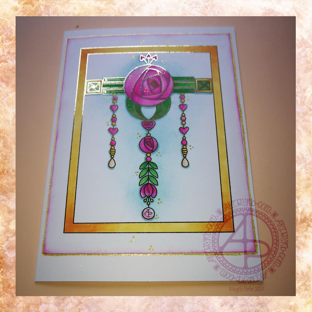
Dangle design 5 Apr 2019 © Angela Porter

It’s Friday and that means it’s dangle day!

Given my experiments with thermal foiling this week, today’s dangle had to be foiled, in gold this time.

As I enjoyed creating a dangle design inspired by Art Nouveau last week I thought I’d like to do that again this week, and this is the result.

I drew the design digitally, using my usual tools of choice viz. Autodesk Sketchbook Pro, Microsoft Surface Pen and Microsoft Surface Studio.

I coloured the design in using Chameleon Markers. Then I added the blue background with Distress Inks, followed by a pink edge to the card. Not sure pink was the right choice, but it’s ok I suppose.

I mounted the design on an A5 card blank and drew a glittery gold line around it with a Uniball Signo gel pen. I also added some small groups of glittery gold drops to the design.

Overall, I’m quite pleased with this one. I like the combination of the more geometric designs with the more organic motifs.

I didn’t add any hand lettering or a sentiment so it makes it perfect for any occasion or as a note card. It would also make a fantastic page design for a BuJo (bullet journal) or as part of a scrapbook, journal, diary or notebook spread.

If you’d like to try your hand at creating your own dangle design but don’t think you could, well you could find my book ‘A Dangle A Day’ helpful. Not only are well over 100 different monograms and dangle designs included that you can use, but help and advice is given for creating your own, as well as plenty of words of encouragement. I’d love to see your dangle designs too.

I really needed some quiet, creative time this morning. Some time without any pressure on me in terms of requirements from publishers and others. Dangle designs are simple to draw, and there is a soothing quality in simplicity. Colouring is also a very soothing activity and the magic of hot foiling always makes me smile.

I’m feeling a bit below par in terms of my mental and emotional wellbeing. I have a stinking headache, which isn’t helping, and I’m feeling exhausted again. That’s all to do with emotional exhaustion.

Fortunately, I can take time today to just do what I need to do in terms of self-care. I managed to get three and a half out of the four edits for my next coloring book done. I have until Monday to get the other half finished, so that’s definitely do-able, either later today when the headache subsides or tomorrow.

My emotional and mental sea has some smooth waves on it, not stormy, not choppy, just swells that come and go. I may be in a bit of a trough at the moment, but I’ll soon be heading back up to the crest of the gentle swells.

Entangled garden scene

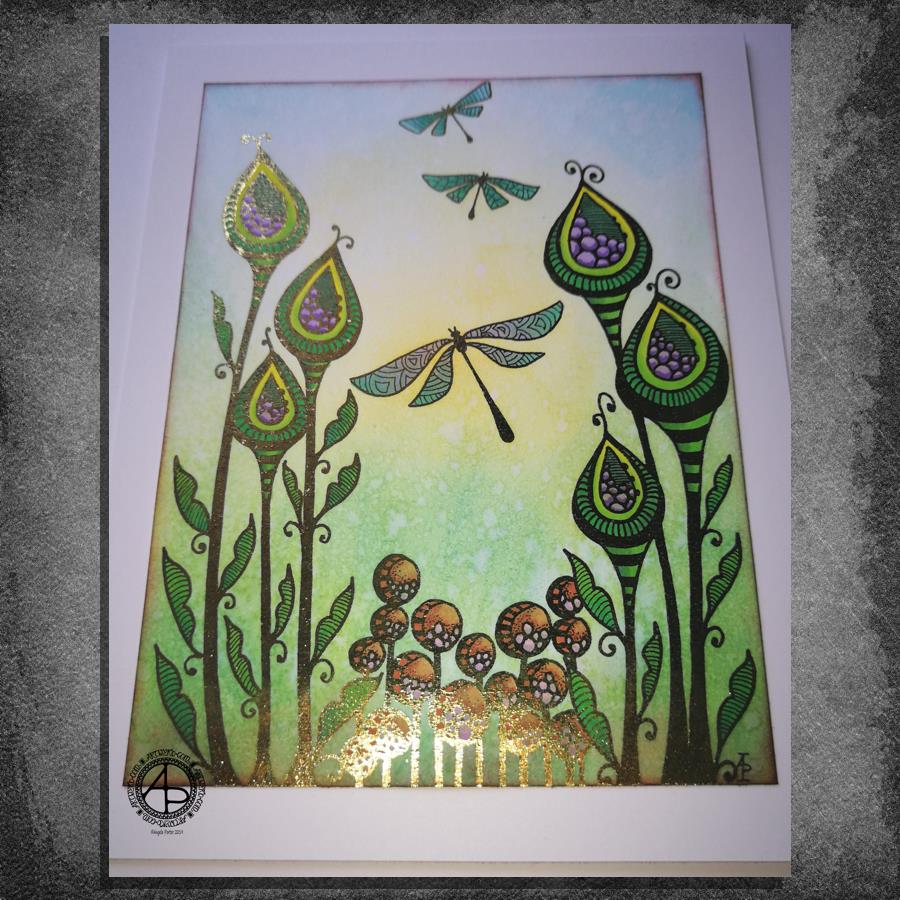
Entangled Garden Scene © Angela Porter 2019

This took me a bit longer than I expected this morning. I did, however, enjoy creating this card.

First, I drew the design out on a piece of paper that is 10cm x 14cm using various sizes of Uniball Unipin pens.

I copied the image using my Brother Laser printer. I didn’t scan it in at this time, but will do later on. All I needed was a copy to play around with.

The next step involved the use of Chameleon Duo Tone and Color Top markers to colour the design elements in. Even though some areas were quite small, I still managed to get bits of shading there.

Once the colouring with the Chameleon markers was done it was time to hot foil the design, and you can see where the gold foil catches the light in places as I took the photo. A friend of mine saw some of my foiling yesterday in person and she was said she was wowed by it. She thought it was good in the photos, but the photos really don’t do it justice at all.

After foiling, it was time to colour the background. I used a selection of Distress Inks, starting with mustard seed in the centre to give a subtle glow, then tumbled glass, crushed olive, peeled paint, pine needles and evergreen bough. I used a piece of cut and dry foam and a very light touch to add the colour.

I was worried that the Distress Inks may muddy up the colouring done with the Chameleon markers. Yes, they subtly changed the colours in some places, but I was careful to choose colours that wouldn’t make mud. Also, so little Distress Ink is added it barely alters the colours.

I can tell you I was well relieved by that!

Distress Inks are water reactive, so I gave the image a light spray of water knowing that only the Distress Inks would be affected. After a short while I dabbed the water off with a piece of paper towel. This lifted some of the colour leaving a subtle background texture.

As this point, after letting the paper dry completely, I could’ve added more Distress ink. Instead, I decided to use aged mahogany, again on a small piece of cut and dry foam, to edge the paper, to give it a border, and also to add a darker layer at the bottom of the design to ‘ground’ the image.

When I can find my Wink of Stella pen from Kuretake I’ll add some very subtle shimmer to the dragonflies, maybe to the seeds in the seedpods too. I also think some gold dots in small clusters would enhance the background.

I also need to think about adding a bit more shading to the bottoms of the laves to give a more dimensional look to them I think. I could definitely do the same to the dragonflies’ wings too.

Those are simple and quite minor changes that will make a difference I think. It’s only as I’m looking at the finished image now that I can see how those things would help. I often don’t think to step back and give myself time to look at the image with fresh and kindly critical eyes, seeing what I could do to improve my work.

In hindsight, the dragonflies may have worked well as black silhouettes in the design, which would then become totally covered in foil. Or just outlines that would be foiled. That’s something for me to try another time and see if I like that idea more.

I think you can tell I’m really enjoying this branch of my artistic journey. I’ve concentrated a lot on digital art of late. I’m not going to abandon my digital art journey at all; I can do things digitally that I can’t with traditional media.

However, it is showing me that working with traditional media is also a pleasurable and successful activity for me to do.

What am I going to do with this? I don’t know. Part of me wants to add it to my BuJo. Another part wants to mount it on a blank greeting card to send to a friend. Another part of me wants to put it into a reference sketchbook or folder for inspiration in the future.

More Foiling experiments

More foiling experiments ©Angela Porter 2019

The death of a laminator…

Another useless photograph, but I think you get some idea of how the foiling appears.

I’ve had a bit of a nightmare with the laminator. This morning it decided to terminally ‘eat’ a ‘foiling sandwich’ and there is no way I can get it out. I tried to put an A4 sheet through the laminator which meant that the folded ‘carrier’ paper had the fold to the side, not going through the laminator first. I think that’s what caused it all to get caught and stuck.

Lesson learned? Hopefully. I think I’m going to have to work on images that are A5 (UK) in size or less. Which is fine now I’m sure about that. However, I really was hoping to foil one of my A4 monogram images.

Ho hum. I shall purchase another laminator later today so I can continue working on it. The instructions with the foil say any home laminating machine will work with this particular foil.

About the foiled works…

Here’s what I’ve discovered so far.

Foiling works best on smooth paper, such as the heavyweight ‘premium’ paper I use in my printer. I do want to try Bristol Board as that is smooth and a bit more weighty again and stands up well to quite a few media.

Coloured cardstock, such as the dark blue example to the bottom left, doesn’t work quite so well as it’s not all that smooth. The foiling ends up a bit uneven and has a kind of ‘brushed’ look to it.

The copper foil I’ve used is amazing! It is like an interference ink or paint in that it’s colour changes from coppery-red to gold as it catches the light in different ways. I’m in love with this one for sure. It looks fab with turquoise blues and greens, a lot like the colours of verdigris.

I tried colouring the top left, top middle and bottom right images with Distress Inks after foiling. This worked brilliantly! It needs to be added after foiling; a little wipe with a dry paper towel removes any excess ink from the foil.

I’m not sure if you can see it, but the centre of the two mandalas at the top left and middle have some colour added to them. I used Staedtler Fineliners for the blue one and Zig Clean Colour Real Brush pens for the orange one.

The mandala at the top right I coloured using Chameleon markers and pencils after I’d foiled it. Not my best choice of colours, in my opinion, but it was an experiment. The alcohol inks stained the foil where I couldn’t keep the nib in the tiny spaces. The mandala was designed to be printed on A4 paper so the gaps weren’t quite so tiny, but I printed them at 4″ x 4″ just to try the foiling out.

I need to draw at sizes that it’s possible to foil successfully without killing a laminator off quickly in the future, and that means A5 or less in size. Unless I decide to ’tile’ the image in some way.

Future experiments in foiling…

There are some different papers I want to try. Bristol Board from either Frisk, Daler-Rowney or Winsor and Newton in particular. Strathmore is textured and I suspect it won’t work well, it’ll be more like the coloured card stock.

Coloured, heavyweight paper is a definite, particularly black I think. Just for the line art in foiling.

Hot-pressed, smooth watercolour paper may be worth a try, along with the smoother side of Claire-Fontaine or Daler-Rowney mixed media paper.

Different papers mean I can used different coloring media in different ways.

What else I have learned and what else I need to think about.

I really, really like digital colouring and I’m rather rusty with different traditional media.

I also need to think about what I can do with foiling and any market that I can create for myself with my art.

I’m really not at all good at promoting myself or my art and pricing work is so very difficult for me to do. It really is. I have a bit of a break in contracts at the moment (apart from editing some templates this week) and it’s something I really do need to turn my attention to. I create so much, but do so little with it.

Experiments in foiling

Foiling experiments © Angela Porter 2019

Hot foiling

I’ve had some fun today with thermal foiling. I’ve been waiting for an Amazon Basics laminator to arrive, which was the one that seemed to be the most recommended out of simple laminators. I’ve had the foil for quite a while.

For thermal foiling, the images need to be printed with a laser printer. The laminator then heats up the laser toner which becomes sticky and the foil sticks to it as you run the layers through the laminator. A quick cool down, peel the foil away and the black lines are left with foil covering them!

I played around with adding the foil first then adding colour, and coloring first before foiling. I also tried out alcohol markers, coloured pencils and Tombow Dual Brush markers both before and after foiling. They all worked well either way, though the alcohol markers do colour the foil, so for alcohol markers it may be best to colour first.

I then had to try them out on images and I chose to use two of my cute kittie designs. I coloured them with Copic markers before foiling. The one of the left has been foiled with gold, the one on the right with silver.

I mounted the designs on 4″ x 4″ square kraft card card blanks. To be honest, I could’ve done with printing these out a bit bigger as the lines were very bitty as they were so thin. Something I have to keep in mind when printing out future work. I think I’m going to have to design them to the size they’ll be printed at to make sure the lines are as thick as I’d like them.

I’m not a photographer. No matter what advice I’m given and follow I still don’t manage to get a good image. The gold shows up well and there are hints of silver visible on the right hand one, but I think you’ll get the idea.

I’m rather pleased with them and the sparkly, shininess keeps my inner raven quite happy.

I also now have a new tool in my creative tool box, one that I will use fairly often I think.

Emotional and mental wellbeing…

For the first time in ages it seems I feel awake and not needing to go back to bed for a nap in the afternoon. The emotional exhaustion of the recent EMDR, therapy sessions and Time to Change Wales anti-stigma talks is beginning to wear off. Mind you, that may change tomorrow as I have EMDR then rather than today just for this week. All the same, it’s nice to feel content and quite creative.

I’ve started a little book that I’ve titled ‘When it’s dark, look for stars’. It’s an A6 (UK size) sketchbook, and inside I am going to use Distress inks and other media to colour the pages and then add all shiny, metallic hand lettering and images and patterns with quotes and helpful words of advice, reminders for me on my darker days that I am not what the inner critic wants me to believe I am. Of course, my cute, foiled kitty and raven with rainbow and stars is definitely going to make it into the book.

I’m open to suggestions of what I could add to my little book, be it quotes, or kind words, or ideas for self-care. I’d also like to know if you’d like to see glimpses of it from time to time.

New coloring template in the facebook group

A new month means a new coloring template is available for members of the Angela Porter’s Coloring Book Fans facebook group.

This month, I’ve designed a mandala with some of the motifs I’ve been using in my more abstract works lately.

If you fancy printing and coloring a mandala designed by myself, pop over to the group, join and you’ll find the new template and quite a few others there available exclusively to members. Terms and conditions apply.

If you do join in, I’d love to see your finished coloration!

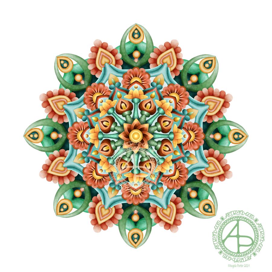
Mandala in succulent colors – version 2

Mandala in Succulent Colors © Angela Porter 2019

Yesterday, I had an urge to try colouring my latest mandala design but without black lines, just pure color. This is the result. I’m actually quite pleased with it, and I’ve surprised myself too, in a nice way. I’m quite eager to do more art like this as time goes on.

I chose a similar color palette to the one from yesterday, similar but not the same. I also edited the shapes and lines as I felt I needed to as the design grew out from the centre.

The color palette was of just six colours – two greens, one aqua, two orangey colours and one yellow, all muted, subdued colours. I think I could’ve done with one more colour, or used the darker version of the aqua as the background in the inner and middle ‘circles’ of the design. Of course, I can try that out without ruining this version. That’s the beauty of digital art.

I would never have done this using traditional media. My skills with colours are relatively limited in the physical realms.

The world of digital art is opening up new ways for me to express my creativity, that’s for sure. The skills required are different but equally as complex as traditional media in my opinion.

There’s also a lot of learning and exploring for me to do to get the style of coloring right for ME. The advantage of digital work is that you can try and try again until you get it how you want it to be without having to start over from the beginning. Some see that as ‘cheating’ or ‘making it easy’. I see it as learning and growing and developing in real time. Digital art is very forgiving, but that doesn’t mean it’s any easier. Far from it in my opinion.

I know my limitations with paints, markers, pencils and so on. I’m kind of competent with markers and pencils I suppose. Working digitally, however, allows me to really work at making sure I get the finish I want in each section of the design, with or without my characteristic black lines. I can try things out and adjust to get them just as I wish them to be.

Each time I do something different like this I learn. With this mandala it’s the use of high contrast to gain the depth and dimension I like, and it’s working out how to get that with the various types of brushes and effects that are available to me.

It’s a huge thing for me to use my line art as just a guide and to lose the lines to create a design such as this. It involves learning how to make the different sections separate from each other using shadow/light as well as color, something I’ve rarely done in my artistic journey.

This is definitely something I’m going to do more of in the future and develop my skills in creating art in this way too. It’s taking me a long while to get my head around it all, but little by little my digital art is developing I think, and I’ll find my own voice with it for sure, or maybe another voice.

I used my usual trifecta of Autodesk Sketchbook Pro, Microsoft Surface Pen and Microsoft Surface Studio.