This morning, the rain has finally stopped once again, albeit for a short while no doubt. Blue skies and sunlight shine betwixt the broken clouds. Yesterday and last night the rain was relentless, including high winds at times, thanks to Storm Jorge.
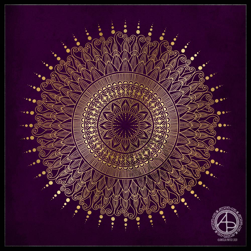
I thought I’d do a golden mandala this morning, while I come around. A simple line-art drawing.
This is a drawing I did late last night as I settled down to sleep. It feels quite disjointed in places, which was how my mind felt in it’s state of tiredness. Even though I was tired, I wasn’t ready to sleep.
I thought I’d work with it, adding a background and colour to it. I wonder if adding colour will resolve the disjointed areas as it breathes life into the design.
I’ve only taken a short time this morning to ad some colour. I do have to do other things today. The colour certainly helps to lift it from the background, as well as adding dimension to the design.
I’ve chosen fairly dusky, dusty, pastel colours which seem to glow against the darker background. The pinks remind me of faded Victorian velvets.
I drew the design traditionally, using a Tombow Fudenosuke pen and ClaireFontaine dot grid paper. The flexible nib of the fudenosuke pen results in lines of varying thicknesses, and a drawing that reminds me of linocuts or woodcuts.
After scanning the drawing, I removed the dot grids and cleaned up the drawing digitally before adding a background.
I felt this needed quote to go with it, and this one spoke to me today. For the typography, I used Affinity Publisher. The rest of the digital work is being done in Autodesk Sketchbook Pro, using a Surface Pen and Surface Studio from Microsoft.
My art is always ‘pretty’, it’s how I express myself artistically. Some of my inspiration for patterns and motifs comes from things that other smay not consider ‘pretty’, such as rust, run down old industrial machines, ruined buildings.
My art does, I think, speak of who I am. It shows what I’m interested in, what patterns, motifs, shapes, textures, colours, and so on that I find aesthetically pleasing. It also shows, to those who look and think a bit deeper, what things interest me, from prehistoric art to Romanesque architecture to La Tene and Celtic art to Illuminated Manuscripts to flora, foliage, fungi, and lichen to fossils and shells to nature in general, and more besides.
I work very intuitively. It’s when I think too hard about what I want to do that things go to wrack and ruin.
By letting my intuition flow, then drawings have a way of coming together in a way that expresses how I’m feeling and what is fascinating me or soothing me at that time.
This drawing is an example of how my feelings come out. It’s only now I can recognise how disjointed I was feeling within myself last night, how I was out of sorts. I think that’s why the art jars with me today as that feeling has now passed by, like clouds in the wind. It’s a drawing that shows the weather my emotions were experiencing yesterday, weather that just happened and has no real source for it.
Today, I’ve been drawing little flower motifs and borders to go along with a lovely quote about flowers and hope.
The line art was drawn using Tombow Fudenosuke pens on ClaireFontaine dot grid paper. Colour, typography and background texture have been added digitally using Autodesk Sketchbook Pro, Microsoft Surface Pen and Microsoft Surface Studio.
Flowers are some of my favourite things to draw, whether they be highly stylised or more realistic.
My snowdrops and crocus have the feel of being wood cut or lino cut and printed, that kind of vintage feel. The flexible nibs on the Fudenosuke pens help me achieve this look. Also, the fairly simple colouring and addition of texture help too.
I’ve left the colouring as is, maybe for now. However, I now have these motifs ready to use in other projects, as they occur to me. Colour certainly helps to lift them off the background and bring them to life.
I wanted a circular frame in which to put quotes. So, I started by drawing some pencil guidelines for the circle and the outer borders on some dot grid paper.
I used 08 and 02 Uniball Unipin pens to draw the circle of flowers and foliage. Then, to start filling the space around the flowers with entangled designs.
It’s very much a work in progress. Part of me thinks I could’ve left an empty border around the circular flower and foliage arrangement to separate it from the background. The other part of me likes it as it is.
I want to try to get a balance of less detailed areas with the more densely detailed sections so that there’s space for the eye to rest.
I also suspect I’ll be adding colour or, at the very least, shadow and highlights to the design to bring it to life.
I finished this artwork off this morning, finding a perfect quote about shadow, this week’s prompt for #inktober52.
Border design drawn using Unipin pens on dot grid paper. Typography was done using Affinity Publisher. Colour, background and composition were achieved in Autodesk Sketchbook Pro using a Surface Pen and Surface Studio by Microsoft.
I’ve enjoyed creating this sketchbook sampler page. I drew the designs with a mixture of Uniball Unipin pens, Faber-Castell Pitt Artist pens, a medium nib Schaeffer fountain pen, and an extra-fine nib Faber Castell fountain pen. I used dot grid paper from Claire Fontaine.
After scanning the page in, I removed the dot grid and added a grungy paper background. I then decided I’d like to add some colour and shadow/light to the designs. To do this, I used a messy chalk brush, so my colouring isn’t as precise as I usually like it. However, it’s loosened up my expectations of myself as I went with it.
Pastel colours were my palette of choice as I like the way they seem to almost glow against the grungy kraft background. I also like the way they help to enhance the 3-D appearance of the designs. I do enjoy playing with shadow and light.
Some of the designs are examples of my organic, entangled style of drawing. Others are repeating, geometric zentangle-style patterns. And then there’s some inspired by Medieval illuminated manuscripts.
I also enjoy working within a clear border. I like the sense of structure it brings to my work. It also satisfies some kind of aesthetic need within me. Every now and then I try work without a border, but the artwork I produce just never feels quite right to me. So, it’s time for me to accept the need for borders is part of my artistic voice.
There is a purpose for me creating these borders. I’m building up a library of them that I can use to embellish quotes and other projects.
Some of these borders would look fab as greeting cards note cards, bookmarks, and to use in other paper craft projects. They’d also work well as embellishments for BuJo, planner, diary, scrapbook and journal pages.
Others would be a great foundation for dangle designs (my book “A Dangle A Day” is a good place to start drawing dangle designs).
What I do know, is that I find drawing soothing and relaxing. So, I’m going to be spending the rest of my Sunday drawing more borders.
I’ve created a simple bit of line art to celebrate the day, and it’s available exclusively to members of the Angela Porter’s Coloring Book Fans facebook group. It’s free to join and I have a number of templates that are exclusive and free to members of the group.
I love to see how people use colour to bring my drawings to life. I provide the bones, the colorists add the flesh in the form of colour.
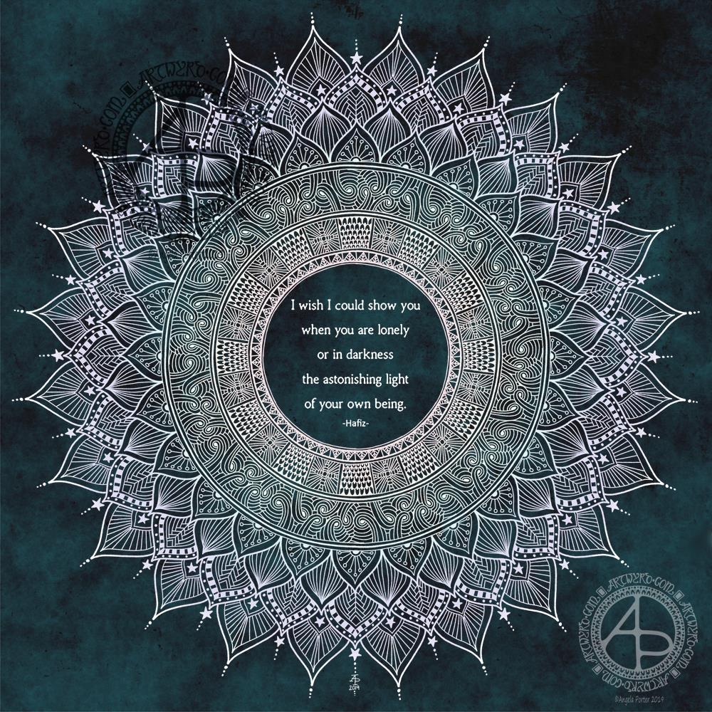
Another mandala today, this time with my favourite Hafiz quote in the centre.
I wanted a mandala that seemed to be almost glowing for this quote. Also, I added a very subtle rainbow colouring to it too. I’m quite happy with this mandala, though some darker shading behind some of the parts, along with some subtle highlights, would’ve helped with the dimensionality of the design.
I didn’t hand-letter the quote; instead I used a clear and simple pair of fonts. I do want to learn how to create circles of typography; I think the quotes would then be more sympathetic to the circular geometry of mandalas. I’ll need a bit of time to play around in Affinity Publisher and Affinity Designer to see if I can achieve this. Mind you, I do need to practice my hand lettering a lot more too.
All the same, I’m still happy with this design. The lettering will do – for now.
I always enjoy drawing mandalas, and it’s nice to revisit the line-art style of mandalas with lots of intricate patterns in them once again. They are so delicate, airy, lacy in feel compared to my more arty, abstract, coloured mandalas. They’re also a lot quicker to create!
Pen drawing with digital shading and texture added.
I’m quite happy with this one, though I messed up a bit with the twiddly swirly foliage. I also can see how I could’ve had the flowers growing out of some of these curly bits. However, if I ever choose to rework this drawing I can do so at another time.
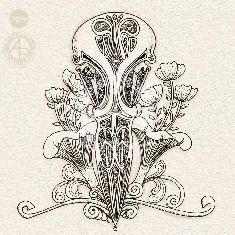
This one is much more stylised than yesterday’s drawing of a chameleon skull. I like how I’ve used a combination of patterns and stippling to add shadow and depth to the skull. I also like how I’ve kept the rest of the design fairly simple in contrast.
I decided not to add colour to this, for now.
Tools used:
To draw the design I used Sakura Micron and Uniball Unipin pens on an 8″ x 8″ piece of Claire Fontaine Paint On multi techniques paper.
For the digital texture and shading I used Autodesk Sketchbook Pro along with a Microsoft Surface Pen and Surface Studio.
I went with one of my favourite things to draw – fungi, in this case poisonous ones. I also added a few seeds, foliage and petals.
Drawn with Sakura Pigma Micron 05 and Uniball Unipin 0.2 pens on Daler-Rowney mixed media paper. I used cool grey Copic markers to add shading.
Oh, I cut the paper to 4″ x 4″ in the hope it would make relatively short projects for me; this took nearly 2 hours to draw/shade!
I’m not happy with some of the textural/shading black lines, especially on the underside of the turny-uppy ‘shrooms. This drawing really does, I think, need more colour!
I thought I’d try to stick to the original precepts of Inktober and work in black ink only, but then added shading with copics, and then feel colour is needed!
It’s a good start, and is helping me get back into the flow of drawing again.
I’ll be working on Day 2 – Tranquil, later on today, and I think I may create a mandala for that. Tempted with working digitally, but may do one on paper with pen … we’ll see on that one I think.