Yesterday’s coloring template for the Angela Porter’s Coloring Book Fans facebook group all coloured and shaded. I used Chameleon alcohol markers to add the colour and some shading. I also used a graphite pencil and a tortillon to darken the shading and add shadow to the lighter areas. It’s turned out OK.
A mandala in my entangled assemblage style. I really enjoyed drawing this, not least because I proved to myself I can transfer this way of drawing to digital art.
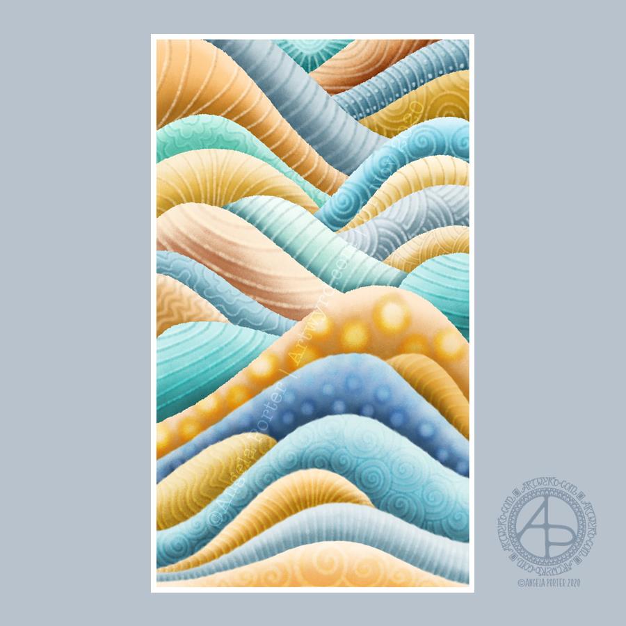
Unusually, there’s not a single botanical element in this artwork. Not one leaf, not one flower, nor any seed pods. It’s purely abstract.
I think I may have used up too much of my time this morning (a deadline is about to go whoosh past me), but it has given me ideas for some of the remaining templates I need to complete.
This was a lovely way to spend the first three hours or so of Sunday morning. Abstract digital painting. Chilled out music playing on Spotify. A slow sunrise behind the grey, rain-dropping clouds.
Again, the pattern was inspired by rocks and geology. Some of the patterns I’ve added remind me of rocks and shells, others are a bit too geometric.
It’s always nice to play around with pattern, texture and colour. And when I limit my palette to just a couple of colour families I get much better results. Today, I used the B and YR Copic colour families from the Copic palette included with Autodesk Sketchbook Pro.
While not reminiscent of rocks, the colours remind me of sea and sand. This year, I’ve not been able to get to the coast, other than once way back in February. The colour choice is a subconscious desire for the sea and shore, a liminal place, a boundary between one element and another.
The coast is a place where I feel my whole body exhale and relax. Sadly, it’s not possible to visit at this time, maybe not for a long while. However, the pandemic won’t last forever and the coastline will still be there.
Anyways, creating this artwork was a lovely way of spending some time on a Sunday morning. I can see where I’ve been clumsy with the patterns, making the layers look flatter than I wanted them to.
It was drawn on marker paper using Unipin pens. Shadows were added using cool grey Copic markers. Next, it was scanned in and a kraft paper background added. Finally, highlights were added digitally to help bring out some sense of dimensionality.
I like the way the highlights and shadows work. However, in future I need to add the shadows digitally along with the highlights.
It’s a very typically “Angela” style of art – intricate, detailed, and full of botanical motifs, arches and geometric patterns that I enjoy using so much. I even managed to leave some areas that are not so busy with line and pattern!
So, it’s on to the next one, once I’ve designed the coloring template for Template Thursday!
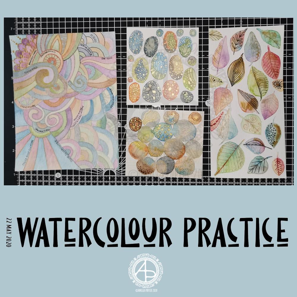
Yesterday was another day where I got lost in watercolour practice – unintentionally! I had planned to do some editing of drawings for ‘Entangled Gardens’. However, time ran away with me.
Panel 1
The first panel I completed was the one with leaves on. They do have plenty of gold metallic/iridescent watercolour paint along with traditional paint, though it doesn’t show up in the photo.
I tried different ways of adding details to the leaves – Faber-Castell Pitt Artist Pen (F) and metallic watercolour and brush. I find the black pen either too black or I used too thick a point. The metallics in a red-copper, gold and grey-black were more sympathetic to the colours of the leaves, in my opinion.
Panel 2
The next panel I created is the one at middle bottom. I made circles of watercolour and let them touch while wet so there was some flow of colour from one to another. After they’d dried I used a fine brush and both watercolours and metallic watercolours to add line and pattern to it.
I enjoyed making this one very much. I used some quite earthy colours that are unusual for me. The line and pattern added a lot of interest, though I did wonder if I’d covered up too much of the underlying watercolours.
Looking at this with fresh eyes today, I think it shows through just fine. I want to try using metallic paints that are complementary to the main colours in the watercolour to see how that works out.
Panel 3
This is the one at the middle top. I created ovals of watercolour, again using unusually muted, earthy tones.
Once they’d dried I used some Caran D’Ache Luminance coloured pencils, well sharpened, to add patterns to each oval. I used the variation in colour/tone to help me add the patterns, as well as to choose the colours of pencils I used on each oval.
Finally, I used a yellow-green metallic/iridescent watercolour paint to fill in some of the patterned areas.
I enjoyed making this panel too. Again, I thought when I finished it that the pencil lines were a bit thick. However, after a night’s sleep and with fresh eyes I can see that it’s worked out well. I think that using coloured fineliner pens may work out better than coloured pencils – something I’ll try another time.
Panel 4
The last panel I created yesterday was the fourth panel. I used a different kind of watercolour paper, by Tim Holtz. The paint just dried so quickly on it I couldn’t really drop colours in, though the paints would re-wet and I could blend colours that way. I didn’t really enjoy using this paper.
Anyway, I thought I’d make a typically ‘Angela’ entangled style painting. I did use a raw umber Caran D’Ache Luminance pencil to draw the design on the paper. This was such a pale colour it disappeared into the watercolour sections. Again, I used uncharacteristically earthy, muted colours.
The final panel was nice enough, however, it was lacking in pattern and interest. So, I decided to use it to experiment with different ways of adding outlines and pattern to the various sections. I also noted on the panel what method I’d used next to each one.
The metallic paints and pens worked nicely and were practically or totally opaque. I prefer using a pen rather than a brush, though I’d not be averse to adding line and pattern using a fine brush and watercolour.
The gold and silver Uniball Signo glitter pens worked really nicely, and because the glitter is suspended in a transparent ink, there’s interesting effect where the watercolour shows through. I actually really like this a lot.
I couldn’t find a gold Sakura Gelly Roll pen, so I used a silver one instead. This, surprisingly, wasn’t as shiny as the Signo silver pen, but it worked just as well in terms of opacity.
I tried two white gel pens – a Uniball Signo and Sakura Gelly Roll. Both seemed to be fairly opaque, the Sakura being very slightly more so.
Finally, I dug out some really fine black pens – 005 and 01 OHTO Graphic Liners and a 01 Sakura Pigma Micron. These worked much nicer than the thicker pen I’d used on the leaf panel.
Of course, I left some areas of the panel without any lines added for comparison.
Of all the pens I tried, I like the metallic and glitter gel pens the best for this.
On reflection…
I’ve found I really like to work on a smaller scale. I feel like I’m creating small ‘treasures’ full of interest and fascination. I’m happier working smaller and more detailed than I am working on a larger scale.
I want to try coloured fineliner pens to draw patterns on watercolours.
Another experiment will be for me to use metallic and plain acrylic and other inks to draw with. I do have a glass pen that will work nicely with indian ink and writing ink. I’ll have to dig some dip-nib pens out to try with the metallic acrylic paints as well as a brush. I think that ball tools could be used to dot spots of ink onto the work rather than a brush; something else to try.
I also need to find a way of leaving a border on the page! When I draw a colouring template or other piece of lineart, I start by drawing a pencil line to demarcate the area I want to draw in, leaving a border around the line. I need to do the same for watercolour panels, either using a pencil or masking or washi tape.
Something else I’ve worked out is that I tend to use too much water when I paint, and I need to experiment with using less and trying dropping colours in when the area is at different levels of dryness.
Lots of things to try and consider.
Doodling? Really?
I see a lot of people calling the addition of line, texture and pattern as part of an artwork ‘doodling’. I don’t like doodling being used in that way.
Here are the definitions for ‘doodle’ from Dictionary.com
verb (used with or without object), doo·dled, doo·dling. *to draw or scribble idly: He doodled during the whole lecture. *to waste (time) in aimless or foolish activity. noun *a design, figure, or the like, made by idle scribbling.
When I add line or pattern to my drawing, it’s not an idle or unconscious activity. I deliberately choose what patterns and textures I want to use and where to place them. The process of adding the lines, patterns and textures may be a more mindful process if the pattern is familiar to me.
The lines, textures and patterns are used to add interest to elements of the overall design. But they are not meaningless, as implied in the words scribble and doodle, and they are anything but idle or mindless scribbles. There is purpose in them, and this is why the use of the word ‘doodle’ irks me!
What am I going to do with the panels?
The leafy panel I created to add to a tag to put in my journal. The other panels will also live in my journal, even the one with annotations, possibly with a pocket behind it for my notes and reflections!
This morning, I thought I’d play around with some digital art, and this is the result.
I drew the motif on the left entirely in grey-scale. I then went to create the background before adding colour to the grey-scale design. I had a chance to play with different types of layers, brushes and effects too.
I got to the point where the design was enough as it was and I knew some words were needed. So, I chose two important messages for people during the coronavirus crisis.
Today, I started to create with just the idea of trying out greyscale and adding colour, with no idea where it would lead me. I’m quite pleased with the result, though I may have been heavy handed with the contrast and not lightened it where highlights would be needed.
The background I am pleased with. It has that grungy, distressed feel to it, yet the colours and nice and ‘clean’. I’ll definitely be doing more backgrounds like this one. In fact, I think I’ll spend some time today doing just that! I can never have enough backgrounds to draw upon – figuratively and literally! It’ll be a nice way to spend some time on what is a somewhat overcast and cooler day today.
Digital art resources : Autodesk Sketchbook Pro, Microsoft Surface Studio, Microsoft Surface Slim Pen.
I finished this artwork off this morning, finding a perfect quote about shadow, this week’s prompt for #inktober52.
Border design drawn using Unipin pens on dot grid paper. Typography was done using Affinity Publisher. Colour, background and composition were achieved in Autodesk Sketchbook Pro using a Surface Pen and Surface Studio by Microsoft.
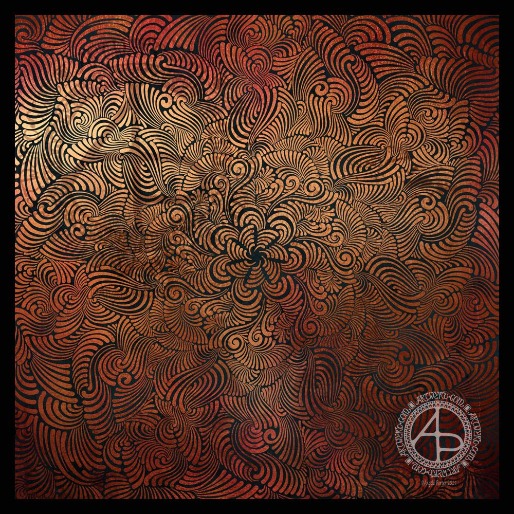
Seven plane symmetry, using a flexible nib pen to carve through black to reveal the design in copper. Done digitally using Autodesk Sketchbook Pro, Microsoft Surface Pen and Surface Studio.
I really have been enjoying creating this kind of design lately and I make no apologies for showing so many that seem to be similar. I find creating these so soothing and calming.
Here, I wanted to see how a metallic background texture would work, and it does really well, just not on WordPress and how the website shows images. The colours never seem to be as vibrant as they do elsewhere.
What I love about this process is that I have no idea of what the end product will be. It’s all about being in the flow, working intuitively, and trusting my skills and creativity.
Often, I’m so zoomed in to the section I’m drawing I’m not aware of how the overall design is looking and working. That means I really do have to trust my instincts, and trust that it will all fit together to create a satisfying end result, and I am happy with it.
A bit of a calming time was needed this morning before attending to my business of the day. I thought a mandala in blues, greens and purples would hit the mark.
I enjoy using a flexible ink pen ‘brush’ to achieve the varying line widths. This allows me to build up abstract patterns and textures quite nicely I think. I have a way to go to find my ‘voice’ with this style of art. The more I do, the more will become clear to me I’m sure.
I’m not sure that the design flows as much as in yesterday’s mandala. I wonder if that’s because I only put one rather geometric series of rings in the centre of the design.
So, Angela, how are you feeling today?
I had a tough EMDR session yesterday. Today, I feel content and upbeat but I’m realising just how tired I am mentally, despite 10 hours sleep. Yesterday’s session had a lot of body processing going on. That means stored trauma is processed via physical sensations. Yesterday those included electric shocks in my leg/foot, side, arm, pains like hooks in my shoulders, a blunt pushing/stabbing force from my stomach up towards my heart, pain in my eye. Those are just a few I remember. The pain/sensations weren’t more than I could bear, though some came close to it!
30 or 40 minutes of this is enough in a session I find, and that little amount of time out of my day is worth it for the long term benefits it brings of helping me recover from CPTSD. The tiredness I feel will pass in a day or so.
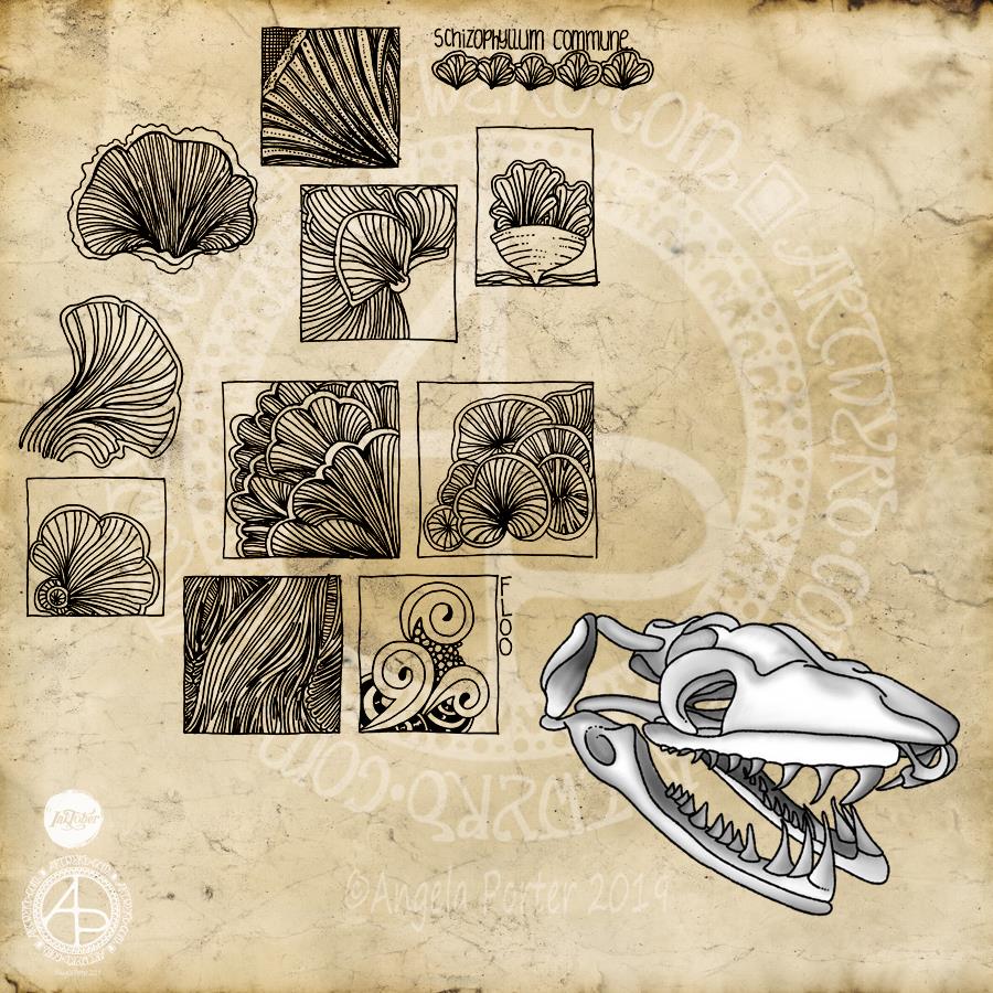
I’m a day late posting this Inktober drawing. My plans for yesterday went somewhat awry as I went to help out a friend in need. So, no beating myself up for the tardiness!
The prompts of the day were a snake skull, the Schizophyllum commune fungus and the Floo tangle pattern (from Instagrammers @book_polygamist, @nyan_sun and @havepen_willdraw respectively).
I started with the fungus as I really wasn’t really enthused by snake skulls. The caps and gills of the Schizophyllum c. formed lovely shapes and lines, and so I focused on areas of them to do some small drawings using a Sakura Pigma Sensei 04 pen on dotgrid paper. All I wanted to do was capture the flow of the lines and the interesting shapes and patterns too. I wanted to keep it simple, so no shading or highlights – just pure pattern.
As I was drawing the squares filled with line and pattern I was reminded of how I used to create sketchbooks while doing my AS and A level Art exams around 15 or so years ago. I used to colour the pages or use interesting paper to draw on and collect the patterns and shapes that really interested me. I often focused on small areas of the object of interest and drew the details in squares and rectangles. I added an example of the Floo tangle pattern to a rectangle, just to make sure I’d included that challenge for the day.
So, it was a natural segue for me to add the grungy, vintage paper to the background as I turned Inktober Day 12 into more of a sketchbook page.
I was also reminded of how I used to use charcoal and white pastel or chalk to draw on coloured papers, and I thought I’d do that with the skull, but with my signature black outlines. I drew this digitally, and mimicked the process of laying down charcoal and chalk and blending the colours. I think I’ve managed to do that quite successfully digitally, though, yet again, I could have done with a bit more contrast in places.
So, rather than an illustration that combines all three prompts for the day, I’ve ended up with an interesting melange of images.
If I were to spend more time on this page, I’d add some highlights/shadows and maybe colour to some of the drawings of fungi. I’d also overlay some dot grid paper to the background. I’d also add some hand-lettered information and commentary on the drawings.
However, if I did that it would eat into my time to take on Day 13 of Inktober today, as well as get some work done for commissions/contracts.