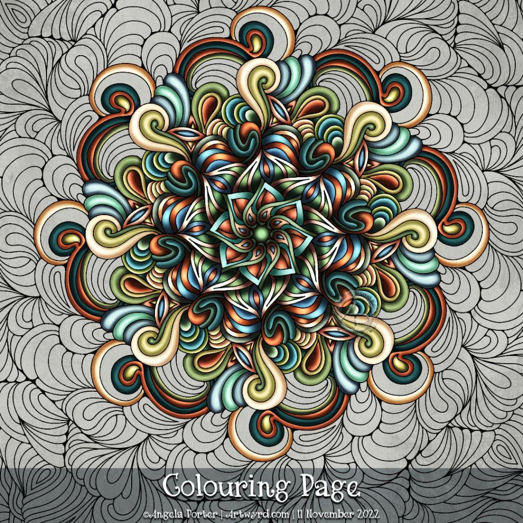
Colouring page for 11 Nov 2022

Usually, I gift a colouring page to Angela Porter’s Coloring Book Fans Facebook Group on a Thursday. This week, it’s been delayed by a day, but I do hope it’s been worth the wait.

This week, it’s a flowy, swirly, abstract mandala. There is a lot of potential for playing with contrast to bring out depth, dimension, volume, layers … There’s no right or wrong way to add colour, the only essential is to enjoy! Oh, and find calm and relaxation as you do so too.

I used a limited colour palette for mine. Though I’d started off thinking I wanted to keep the colours pretty much flat, like in Arts and Crafts or Art Nouveau, but it didn’t end up that way. The colours are, however, inspired by some work in these movements, just given a slightly more modern and ‘Angela’ feel to them.
Template Thursday!

Ooh, I do love a mandala! And a flowery one is just the ticket for this week. Things botanical have been a bit of a theme for me this week, so it’s natural they’d find their way into this week’s colouring page/template for the Angela Porter’s Coloring Book Fans facebook group.

I kept to a fairly limited palette this week, and that really does help me produce coloured art I feel happy with. And this colour palette does make me smile.

Template Thursyay!

It’s Thursday, so it’s time for another coloring template / coloring page for the members of the Angela Porter’s Coloring Book Fans facebook group.

This week it’s a cute, whimsical and silly Doodleworlds design. Oddly, there’s not a skull in sight! Still, it’s a lovely mood booster, and I need that at the moment.

There’s also a new color palette challenge for August in the group – bright, cheerful and tropical colours. I used the palette to partially add colour to the template.

The template was drawn on A4 Canson Imagine mixed media paper. I added the colour digitally using Clip Studio Paint.

I’m looking forward to seeing how the template is coloured by group members, even using a limited color palette. It’s always great to see how people approach the template differently.

Abstract Entangled Art | 31 July 21

This is, I think, finished.

It certainly was a task and I needed to persevere at the beginning. I was really hesitant about adding colour and seriously disliking the colour as I started to add it. The more I did, the more comfortable I became with adding colour.

I think what helped with the colours was the use of a limited colour palette. Indigo, prussian blue, gold ochre, burnt sienna and bronze green made the basic palette up. Mixing the colours gave me plenty of variation in colours and tones while at the same time keeping a coherence.

I started adding shading with a biro. As this drawing was a testing ground for various ideas, I used a cool grey Pitt Artist pen to add the rest of the shadows. I found the result pleasing, particularly after adding colour. A darker grey may have worked more to my tastes of high contrast, but this is a starting point.

Indeed, I rather like the combination of biro and pitt pens. I did end up adding some cross hatching to some areas to intensify the dark areas betwixt the elements of the design. That darkness helped to lift the colours somewhat.

To add highlights, a white Sakura Soufflé pen was used. I also had a hankering to add some metallic highlights too, so a gold metallic Gelly Roll came in useful.

Using flat colour washes and letting the grey shadows add volume seems to have worked well enough. I may, later, try out some coloured pencils to add more shadowing. But not until after breakfast!

Friday Flip-through

Friday seems the perfect day to have a look back on the week’s sketchbook art. A vlog seems the perfect way to do that.

I also start to add colour to the latest drawing using a limited colour palette of Ecoline brush pen colours – gold ochre, burnt sienna, indigo and prussian blue. Another colour (or two) may be added to the limited palette. I’ll see how I get along.

This particular drawing is being used as a place to test out ideas concerning adding shadow and highlight, simple colour washes, and anything else that springs to mind. It may never been completed, but that’s not the point! Experimentation and experience are the points of this particular exercise.

Sunday Morning Art

This was a lovely way to spend the first three hours or so of Sunday morning. Abstract digital painting. Chilled out music playing on Spotify. A slow sunrise behind the grey, rain-dropping clouds.

Again, the pattern was inspired by rocks and geology. Some of the patterns I’ve added remind me of rocks and shells, others are a bit too geometric.

It’s always nice to play around with pattern, texture and colour. And when I limit my palette to just a couple of colour families I get much better results. Today, I used the B and YR Copic colour families from the Copic palette included with Autodesk Sketchbook Pro.

While not reminiscent of rocks, the colours remind me of sea and sand. This year, I’ve not been able to get to the coast, other than once way back in February. The colour choice is a subconscious desire for the sea and shore, a liminal place, a boundary between one element and another.

The coast is a place where I feel my whole body exhale and relax. Sadly, it’s not possible to visit at this time, maybe not for a long while. However, the pandemic won’t last forever and the coastline will still be there.

Anyways, creating this artwork was a lovely way of spending some time on a Sunday morning. I can see where I’ve been clumsy with the patterns, making the layers look flatter than I wanted them to.