I spent some time drawing this design yesterday (around 4 hours) and didn’t finish it. This morning I woke up wondering if I could tuck a letter away in the design, making it part of the design rather than putting the design around the letter, kind of.
So, I looked at the small-ish space I had left to the right of the design and managed to, rather clumsily, tuck a capital A in amongst the design.
The A is a bit more obvious than I’d wanted, but I worked with what I’d already done to see how it could work, or how I’d mess it up and learn from it.
Yes, I know, another A. There are letters of the alphabet I’ve never either done as a monogram or used in a design of some kind.
I quite like the idea of adding letters as part of the design, either as one occurrence of the letter or by creating a motif of some kind that contains the letter which can then be repeated as part of the overall design.
My mind is ticking over on this one…I definitely need at least one more, if not several more, cuppas before I get my head around my own idea!
I’m positive that this idea is not likely to be unique in the realms of creativity, but it is a new idea for me. Now all I have to do is to follow through with it and see where it leads.
The original drawing is approx 6″ x 6″ (15.5cm x 15.5cm) in size. I used Tombow Fudenosuke, Sakura Pigma Sensei 04, Unball Unipin 0.1 and Pentel Sign pens to draw the design on Daler Rowney Simply… Sketch extra white paper. The paper isn’t as smooth as I usually like and it tends to ‘grab’ pencil lines, even in soft 2B, but it did the job.
Digitally all I did was to clean up the image and create a transparent background and then add a coloured, textured watercolour paper as a background to the drawing before adding my watermarks.
I do want to do some shading on this drawing, but I also have hankering to draw a mandala. Which will win out with me?
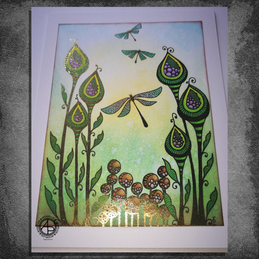
This took me a bit longer than I expected this morning. I did, however, enjoy creating this card.
First, I drew the design out on a piece of paper that is 10cm x 14cm using various sizes of Uniball Unipin pens.
I copied the image using my Brother Laser printer. I didn’t scan it in at this time, but will do later on. All I needed was a copy to play around with.
The next step involved the use of Chameleon Duo Tone and Color Top markers to colour the design elements in. Even though some areas were quite small, I still managed to get bits of shading there.
Once the colouring with the Chameleon markers was done it was time to hot foil the design, and you can see where the gold foil catches the light in places as I took the photo. A friend of mine saw some of my foiling yesterday in person and she was said she was wowed by it. She thought it was good in the photos, but the photos really don’t do it justice at all.
After foiling, it was time to colour the background. I used a selection of Distress Inks, starting with mustard seed in the centre to give a subtle glow, then tumbled glass, crushed olive, peeled paint, pine needles and evergreen bough. I used a piece of cut and dry foam and a very light touch to add the colour.
I was worried that the Distress Inks may muddy up the colouring done with the Chameleon markers. Yes, they subtly changed the colours in some places, but I was careful to choose colours that wouldn’t make mud. Also, so little Distress Ink is added it barely alters the colours.
I can tell you I was well relieved by that!
Distress Inks are water reactive, so I gave the image a light spray of water knowing that only the Distress Inks would be affected. After a short while I dabbed the water off with a piece of paper towel. This lifted some of the colour leaving a subtle background texture.
As this point, after letting the paper dry completely, I could’ve added more Distress ink. Instead, I decided to use aged mahogany, again on a small piece of cut and dry foam, to edge the paper, to give it a border, and also to add a darker layer at the bottom of the design to ‘ground’ the image.
When I can find my Wink of Stella pen from Kuretake I’ll add some very subtle shimmer to the dragonflies, maybe to the seeds in the seedpods too. I also think some gold dots in small clusters would enhance the background.
I also need to think about adding a bit more shading to the bottoms of the laves to give a more dimensional look to them I think. I could definitely do the same to the dragonflies’ wings too.
Those are simple and quite minor changes that will make a difference I think. It’s only as I’m looking at the finished image now that I can see how those things would help. I often don’t think to step back and give myself time to look at the image with fresh and kindly critical eyes, seeing what I could do to improve my work.
In hindsight, the dragonflies may have worked well as black silhouettes in the design, which would then become totally covered in foil. Or just outlines that would be foiled. That’s something for me to try another time and see if I like that idea more.
I think you can tell I’m really enjoying this branch of my artistic journey. I’ve concentrated a lot on digital art of late. I’m not going to abandon my digital art journey at all; I can do things digitally that I can’t with traditional media.
However, it is showing me that working with traditional media is also a pleasurable and successful activity for me to do.
What am I going to do with this? I don’t know. Part of me wants to add it to my BuJo. Another part wants to mount it on a blank greeting card to send to a friend. Another part of me wants to put it into a reference sketchbook or folder for inspiration in the future.
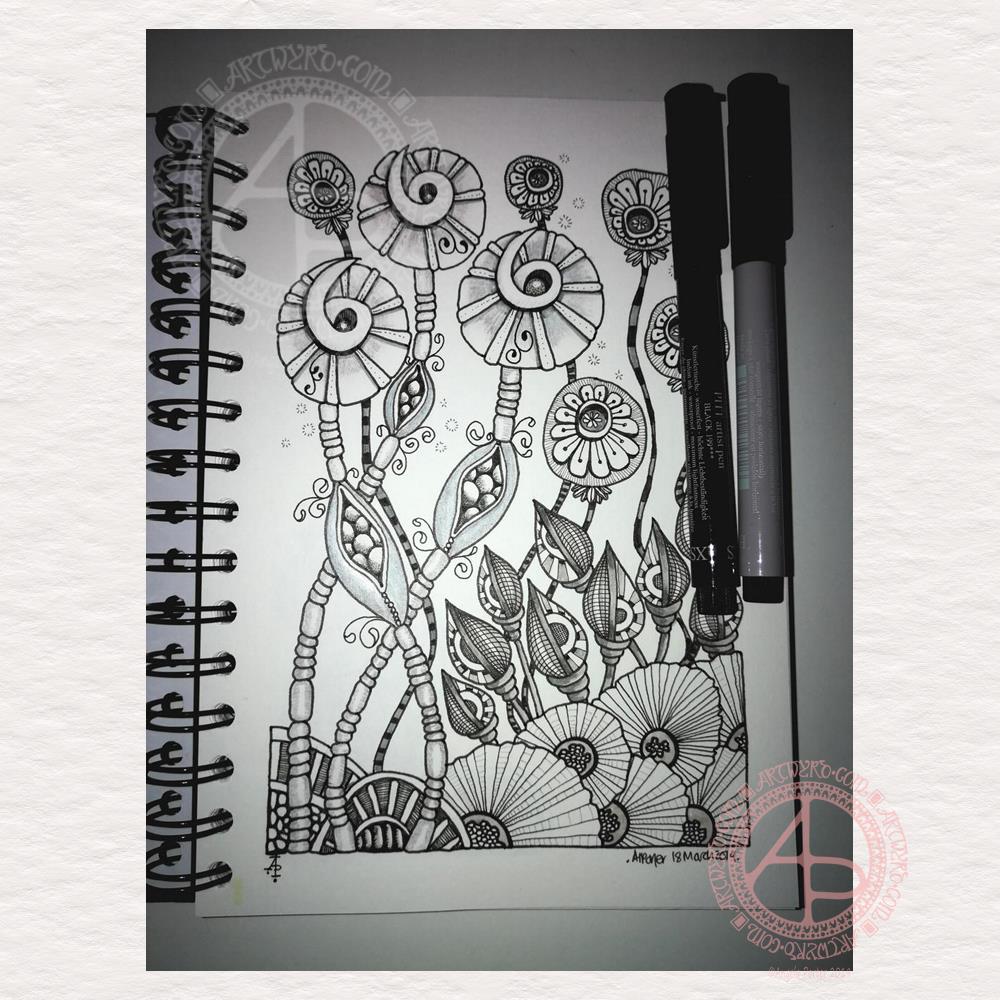
Yesterday turned out to be a different day than I expected.
The anti-stigma talks I was booked in to do didn’t happen. No one knew about them. So, I drove to some services not far away for a wee, tea, something to nibble and time out to relax and draw.
Then, I wended my way to Neath for lunch in forty-six, a cafe in Queen Street that I love for it’s quirkiness. I finished the drawing over lunch, and the result is above. I used various Pitt Artists pens from Faber-Castell, grey Uniball Unipin pens, and some coloured pencils. I wanted to work in monochrome, but I also wanted to experiment with scanning a monochrome drawing in and adding colour to it digitally. I tried that last night, but my mood plummeted and well, I abandoned the idea for now.
EMDR therapy followed lunch and then a drive back home.
I thought the therapy was quite gentle this week, though there was lots and lots going on in my body. We haven’t quite finished processing the memory I’m working on at the moment. Maybe next week will see it finished. I felt tired and a bit spaced out when I left EMDR, but positive and hopeful on the way home.
However, when I got home, after preparing a vegetable stew and putting it on to cook, my emotions crashed in on me.
I was so disheartened with myself, my art, my life. I felt so sad, so tearful. I was so tired too. Emotionally tired, mentally tired.
I didn’t know why I was bothering to do art, to draw coloring books, to write words, to speak up about mental health and my journey to achieve some measure of healing from CPTSD. I felt so lonely, so alone. I didn’t believe my own story, that I was making everything up as an excuse for being overweight, for being a failure, for being useless at everything I do.
I’ve not felt this disheartened for many weeks, time. The suddenness surprised me. No warning. No gradual decline that I could pick up on and work towards halting it.
I ended up going to bed early to escape these thoughts and feelings.
I woke up this morning feeling a bit better but with a horrible, horrible headache behind my eyes. I feel the pressure to complete the book I’m working on before the end of this month, but I’m not sure I’m in the right place to continue with it.
I suspect EMDR has shaken some stuff loose… and I need to give it time and space to be processed and released. I’ll have to see how I go with drawing later on, when the headache tablets kick in, to see if I can do anything today.
I need to tell myself I have time to complete the requisite number of illustrations, plus a couple extra so choices can be made. That it may be better to take a day to find my balance again.
I finally managed to finish coloring this design in yesterday. I’m quite pleased with it. I’m more pleased with the lessons I learned on using different kinds of brushes as well as the need to use higher contrasts in tones. But that is something I can practice on later along
My focus in the next fortnight has to be the book I need to finish by the end of the month. I will get it done.
I’m still feeling very, very tired emotionally and mentally today. I do intend to get at least one coloring template done today. If I can get one done an day, two on some days, I’ll have the book all done before the deadline.
One a day is more than achievable, and allows me some days for self-care, something that I realise is important on days like today. It’s going to take me a while to recover from all the therapy and anti-stigma talks of the past week. As the adrenaline and other stress chemicals leave my body, the exhaustion settles in more and more for a while.
I know I will be just fine and dandy. I just need to take it as easy as I can and take time for myself too.
I can do that.
One or two templates a day is absolutely do-able, even on days where I feel as I do today. When the template’s done, I can then take the selfcare time and not feel guilty about it.
This morning, I wanted to do a small drawing (the bristol board is approx. 10cm x 21cm) and try not to get overly fussy and trying to fill every space in. I used fountain pens to draw the line work, and I’m using Autodesk Sketchbook Pro, a Microsoft Surface Pen and a Microsoft Surface Studio to add colour to the design.
I’ve often said it on the Angela Porter’s Coloring Book Fans facebook group that the members work some fantastic magic in using colour to bring my drawings to life. And they do.
So, I’m working a little of my own magic here!
I don’t often colour my own art in – time constraints can limit me in this. Also, I love drawing so much and it takes me a lot less time to draw a design than it does to colour it. I can safely say I’m quite prolific when it comes to drawing, not so when it comes to colouring.
I’m also colouring this relatively small and less detailed design to fathom out the mysteries of the synthetic brush setting. I think I may be getting the hang of it and how I can make it work for me.
I actually like the less than perfect finish I’ve achieved, which has surprised me for sure. I actually really like the slightly battered feel to the orange pods in the artwork.
I’m usually obsessed with perfectly smooth colour gradients, whether achieved by digital tools or by more traditional methods of blending (whether working with traditional or digital media).
A good friend of mine (yes, you know who you are if you read this) did tell me when I bought my first Microsoft Surface a couple of years ago that it would open ways for me to create art and develop my artistic skills. It certainly has, and continues, to do that for sure.
I am aware that it’s quite a slow process where I’m concerned. Yes, I could go and watch and read tutorials on how to use the various brushes and settings.
I’ve tried that. The information given totally overwhelms me.
Being easily overwhelmed by information or sensations is something that is part of my cPTSD. If I get too overwhelmed, I tend to either walk away, end up in a panic or become fearful to face something again.
However, I do get a sense of satisfaction out of working out or discovering something for myself, when I actually need that something. Once I’ve become confident and comfortable with a particular skill, I’m then ready to discover more add more skills to my personal skill/tool box.
I never stop learning, discovering, and finding new ways to express myself creatively. I may no longer try to use a huge range of different media – my default these days is definitely digital. I don’t think there’s anything wrong in that. No doubt I will dabble with new kinds of media or creative skills from time to time (such as my toe-dipping into paper quilling; it’s not at all my kind of thing, but I had to try it to find out).
I still love drawing with pen on paper, but being able to scan that in and add colour digitally means I can make the best of both worlds. I can also keep all the little imperfections and smudges that result from drawing with pen and ink on paper, that add that more human touch to them, if I wish. Or I can draw digitally, keeping things clean and a bit more perfect. Either way works for me.
And so I finally overcome my own personal stigma concerning digital art vs traditional.
Therapy day!
It’s Monday so it’s EMDR day for me. I have no idea what the session will bring for me.
What I can say, though, is that though last week’s session was rather emotional and distressing, I seemed to recover quite quickly from it. By Wednesday I’d returned to a state of some contentment and that has mostly stayed with me since then.
I do know I have a busy week with anti-stigma talks for Time to Change Wales being given tomorrow, Wednesday and Thursday, and then a double talk next Monday. As well as working on templates for the newest coloring book for Dover Publications Inc, I need to make sure I have time to look after myself and not avoid the feelings I may have after EMDR today.
I also know I have a busy week with other commitments too…
At least there’s some sunshine today, even though there are some big, puffy, grey and white clouds mostly covering the sky. There’s plenty of breaks in the clouds.
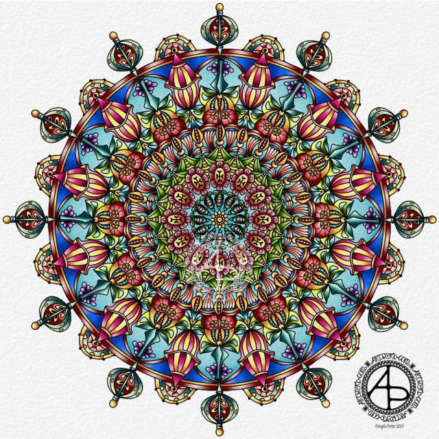
I worked on this mandala over a couple of days. it has a whole range of new motifs in it and is rather organic in nature, with plenty of pods and seeds included. I’m quite happy with it. I think there’s a kind of flow of design and the colours are vibrant enough to please me.
I really wasn’t at all sure about my colour choices as I added colour to the mandala. The beauty of digital art is that it’s much easier to change the colour, which I did do in just a couple of sections. The colour changes means I’m a lot happier with it.
It has no name as I’m not very good at thinking up names for my artwork. Perhaps I should just find some kind of quirky way of lettering or numbering the designs in future.
Drawn and coloured using Autodesk Sketchbook Pro, Microsoft Surface Pen and Microsoft Surface Studio.
Mental Wellbeing
Today I’m feeling really tired and I don’t feel I have many words at the moment – despite what my blog may suggest.
My fingers, hands and wrists are also rather achy which is making typing or drawing (either digitally or traditionally) rather painful. I don’t know what’s caused that. Yesterday I did do a lot of drawing with pencil on paper – sketches for my new book – and a lot of digital art too. No more than I often do though.
I suspect a bit of self-care is needed. I am feeling a bit low. Tiredness doesn’t help, but I’ve slept really well the last couple of days.
Maybe it’s the grey, wet, windy day.
Maybe it’s just emotional weather with no real cause.
Maybe it’s the start of the buildup to EMDR on Monday.
I just know that like the weather my mood will change and brighten.
This became yesterday’s self-care drawing. When I’m not feeling all that right my default setting is this kind of drawing. It really does help soothe my unbalanced mental and emotional health. Thank goodness that today I’m feeling a lot more myself, whatever that means. In this context I think it means more emotionally calm and kind of content and a less worrisome and fretting mind. My background anxiety levels are still a tad elevated, but not as bad as they were over the weekend and through to yesterday.
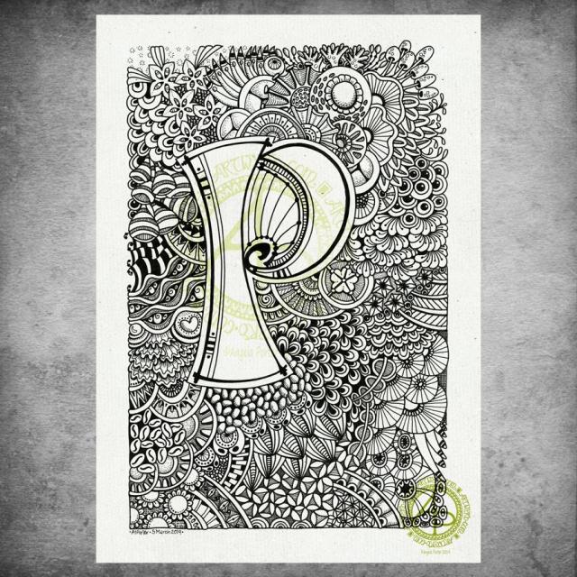
I hand lettered the monogram on an A4 sheet of Daler-Rowney Bristol Board using Uniball Unipin pens. I then just let my pens draw some new and old favourite motifs and patterns to create this abstract, entangled art.
Yes, the P is a bit off-centre, but I didn’t measure it out! I just drew it. I didn’t plan on doing the entangled drawing stuff. I was just going to spend sometime with hand lettering…just goes to show that instinctively I knew what I needed yesterday to help soothe me. I could lose myself in the flow and give my mind and emotions a bit of a break.
It took me several hours to complete, and this morning I scanned it in, added a background texture and the watermarks with digital wizardry.
My only consideration for it at the moment is whether to leave it as is (black and white), to add shading in greys, or whether to add colour. I’m also quite tempted to add some gold to the monogram, just in places. I could print it out and try that on a copy before I commit myself to altering the original.
Today I do need to settle to inking in some sketches for the next coloring book. Maybe do some more sketches as well.
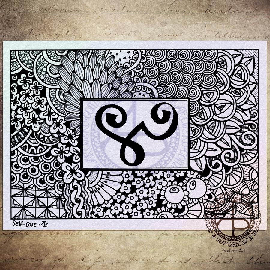
I drew this one with Uniball Unipin pens using both black and dark grey pens, though the difference betwixt them hasn’t shown up all that well in the scan and the digital wizardry that followed to add colour, texture and watermarks!
The glyph in the box is the Zibu symbol for ‘self-care’. Most appropriate for me today as I’m reeling more than a tad from yesterday’s EMDR session. I keep thinking I’m ok, then I get overwhelmed by a wave of sadness, despair and such like. The wave eventually passes and I feel ok, but a tad light headed. Then, the wave returns …
I had some appointments this morning and after a quick lunch I thought I’d draw something small and found this blank postcard template in my pile of stuff, with the symbol already drawn upon it.
I’m not entirely sure I’ve done a good job with this one. The overall design has a feeling that it is disjointed, that the parts of it don’t flow from one to another at all easily. It feels stilted and stiff.
Perhaps that is just how I’m feeling at the moment and I’m just projecting it onto my artwork.
As I said the EMDR yesterday had me reeling both yesterday and today. My therapist took up the role of ‘blind therapist’ where I chose a memory that is too difficult for me to speak about, and we just went with the emotions, feelings and thoughts about myself as the EMDR session progressed.
There were some observations made yesterday that were quite upsetting, okay very upsetting to me. They’re not something I can talk about at the moment.
Even though it’s upsetting, I still think progress is being made. That is all that really matters at the moment, I think.
This morning I started my day with some warm-up drawing. I drew this one with Sakura Pigma Micron pens on Daler-Rowney Bristol Board that measures approx. 7cm x 30cm. I added the coloured background digitally, along with the watermarks.
You may be curious why I use a square of coloured and textured paper behind my art work. Well, for Instagram, a square image fits perfectly without being cropped weirdly, and as many of my pieces of art are not square…well, you get the idea! So, for consistency across my social media, I use the same image.
I enjoyed drawing ths one. There’s some new patterns and motifs in it. I spent yesterday looking at ‘Art Forms in Nature’ by Ernst Haeckel for inspiration to add new patterns and motifs to my visual reference book. This little A5 dot grid notebook from Claire Fontaine is becoming rather useful. I add my favourite patterns, new patterns, motifs, doodles to it as I need to. I make use of the idea of ‘threading’ used in Bullet Journals to help link sections together.
What a brilliant idea ‘threading’ is. I used to get so frustrated with either folders with drawings in or having sections scattered in a book with a clumsy index to help find them. Now, I just follow the page numbers to direct me to where the particular collection continues. The index then lists just the first occurrence of that particular collection. My collections include abstract botanicals, foliage, floral, fungi, trees, feathers, crystals, Christmas, favourite patterns, dangles and charms.
I’m sure that when I start a new book, there’ll be a way to thread to the new book!
Why am I doing this? Well, as well as keeping track of patterns and motifs I like and organising them roughly into collections it’s also a source book of inspiration for art when I feel I’m lacking in inspiration or I feel my work is getting more than a bit samey.
It’s also something that is part of my self-care on days where it’s too much of a challenge to do something completely new and different. Sometimes this means adding familiar patterns and motifs. At other times it means researching new ones.
Yesterday I was really tired and feeling quite low after a very tiring day on Saturday followed by a poor nights sleep. Last night my sleep was even worse. I woke from disturbing dreams with my mind busy, busy, busy. Not sure why this is, or why I just feel more anxious than usual. There’s no reason at all for me to feel this way. Just some stormy emotional weather in advance of EMDR today and starting to process something new to EMDR but old to me. The CPTSD recovery journey continues…
I stumbled across this quote from Albert Einstein yesterday. It sums up how I feel about my art and how I create art. I work very intuitively, generally. I choose one place to start, with one motif and I just let everything else flow from that point. If I am thinking about what I’m doing, I’m not aware of those thoughts. In this way, drawing is, for me, a rather mindful activity where I can lose myself in the flow.
My art tends to go wrong if I over-think or try to over-plan it, as I’ve found out recently as I did the first sketches for the coloring book I’m working on.
For this drawing, I printed out the quote and borders on an A4 sheet of Bristol Board. I then used various sizes of Uniball Unipin pens to draw the designs in. If you’re interested, I started at the top left corner of the quote box and it is from this point that the rest of the design flowed out from, sort of.
I’m actually quite pleased with this one. I actually like use of thicker lines to delineate the individual motifs and to give a more structured, layered feel.
I also dug into my visual reference libraries to revisit patterns and motifs I’ve not used in a while, as well as using some of my most favourite ones.
I like the stark, graphic nature of the pure black and white, but I may very well add colour to this one in a way similar to yesterday’s quote. I haven’t finished colouring that one yet, but it is something I will return to later today, though I may not finish it today.