I finished this artwork off this morning, finding a perfect quote about shadow, this week’s prompt for #inktober52.
Border design drawn using Unipin pens on dot grid paper. Typography was done using Affinity Publisher. Colour, background and composition were achieved in Autodesk Sketchbook Pro using a Surface Pen and Surface Studio by Microsoft.
I’ve had a busy day learning new things to do with video and so on. The concentration has taxed my brain just a bit, and I needed some time in an arty happy place.
My first task was to find a quote that appealed to me today. This one is quite apt I think, for many reasons. I’m not entirely sure my typography is right for the quote, but it will do for now.
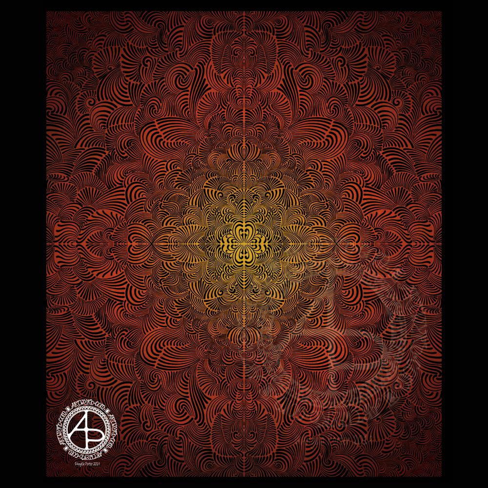
I then knew I wanted to do a mandala as a background. I find this style of mandala very soothing to draw, and soothing was just what I needed today.
Once I’d finished the mandala, I added colour in greens and teal. Calming, soothing, balancing colours for today. Colours of calm contentment, which is just how I feel at the moment. Also hopeful colours. That green reminds me a lot like the first leaves showing themselves at the tail end of winter, spreading hope that the warmer, lighter days will soon be here.
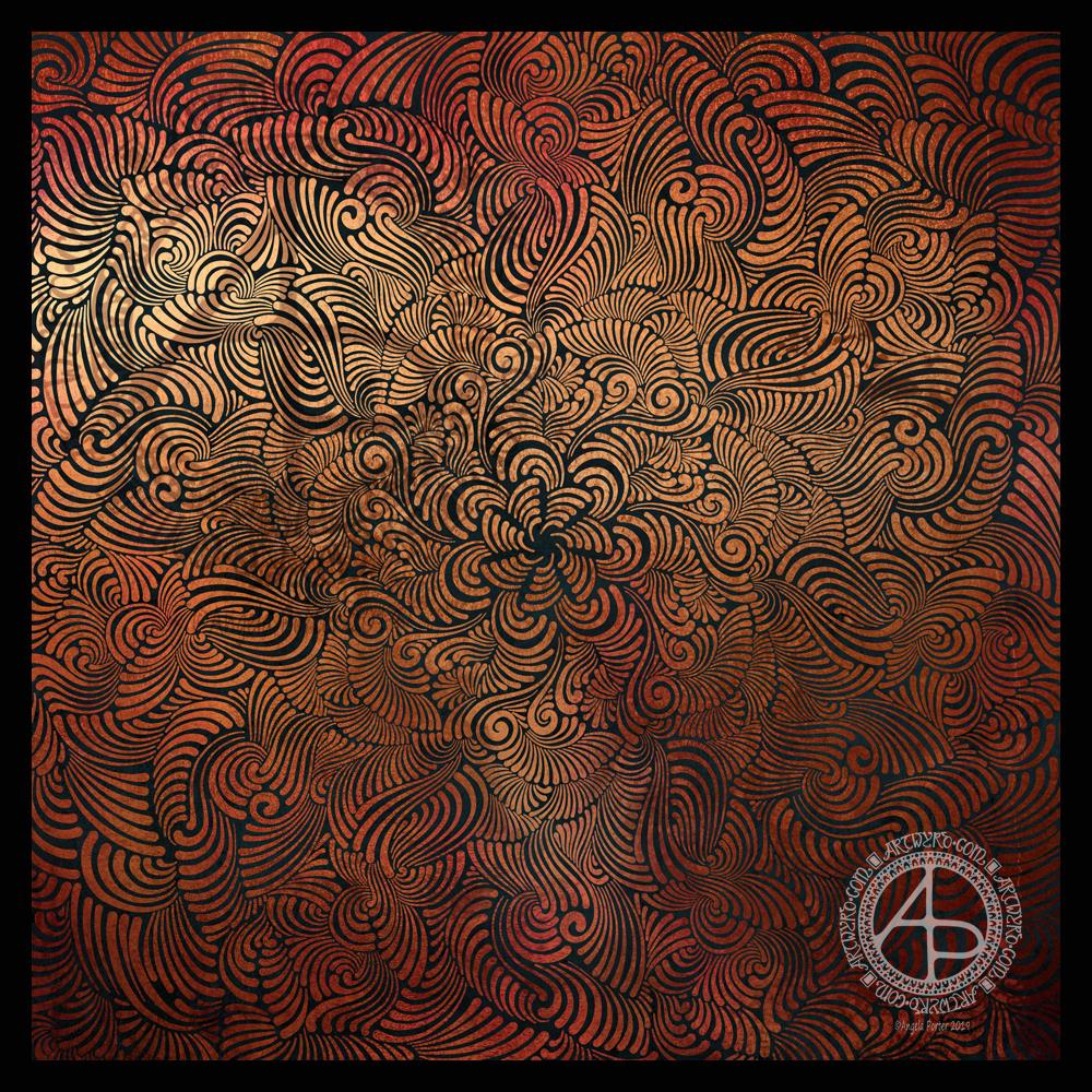
Seven plane symmetry, using a flexible nib pen to carve through black to reveal the design in copper. Done digitally using Autodesk Sketchbook Pro, Microsoft Surface Pen and Surface Studio.
I really have been enjoying creating this kind of design lately and I make no apologies for showing so many that seem to be similar. I find creating these so soothing and calming.
Here, I wanted to see how a metallic background texture would work, and it does really well, just not on WordPress and how the website shows images. The colours never seem to be as vibrant as they do elsewhere.
What I love about this process is that I have no idea of what the end product will be. It’s all about being in the flow, working intuitively, and trusting my skills and creativity.
Often, I’m so zoomed in to the section I’m drawing I’m not aware of how the overall design is looking and working. That means I really do have to trust my instincts, and trust that it will all fit together to create a satisfying end result, and I am happy with it.
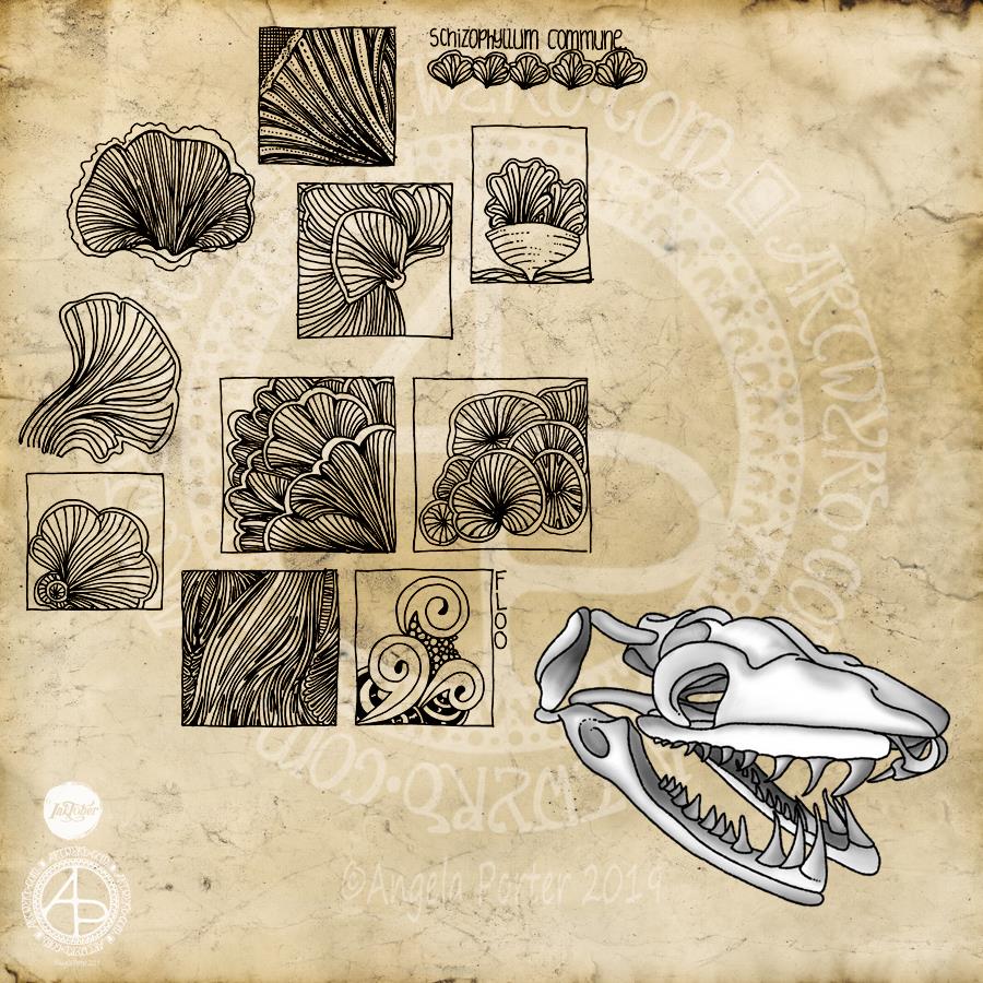
I’m a day late posting this Inktober drawing. My plans for yesterday went somewhat awry as I went to help out a friend in need. So, no beating myself up for the tardiness!
The prompts of the day were a snake skull, the Schizophyllum commune fungus and the Floo tangle pattern (from Instagrammers @book_polygamist, @nyan_sun and @havepen_willdraw respectively).
I started with the fungus as I really wasn’t really enthused by snake skulls. The caps and gills of the Schizophyllum c. formed lovely shapes and lines, and so I focused on areas of them to do some small drawings using a Sakura Pigma Sensei 04 pen on dotgrid paper. All I wanted to do was capture the flow of the lines and the interesting shapes and patterns too. I wanted to keep it simple, so no shading or highlights – just pure pattern.
As I was drawing the squares filled with line and pattern I was reminded of how I used to create sketchbooks while doing my AS and A level Art exams around 15 or so years ago. I used to colour the pages or use interesting paper to draw on and collect the patterns and shapes that really interested me. I often focused on small areas of the object of interest and drew the details in squares and rectangles. I added an example of the Floo tangle pattern to a rectangle, just to make sure I’d included that challenge for the day.
So, it was a natural segue for me to add the grungy, vintage paper to the background as I turned Inktober Day 12 into more of a sketchbook page.
I was also reminded of how I used to use charcoal and white pastel or chalk to draw on coloured papers, and I thought I’d do that with the skull, but with my signature black outlines. I drew this digitally, and mimicked the process of laying down charcoal and chalk and blending the colours. I think I’ve managed to do that quite successfully digitally, though, yet again, I could have done with a bit more contrast in places.
So, rather than an illustration that combines all three prompts for the day, I’ve ended up with an interesting melange of images.
If I were to spend more time on this page, I’d add some highlights/shadows and maybe colour to some of the drawings of fungi. I’d also overlay some dot grid paper to the background. I’d also add some hand-lettered information and commentary on the drawings.
However, if I did that it would eat into my time to take on Day 13 of Inktober today, as well as get some work done for commissions/contracts.
Another day, another Inktober drawing – this time a gecko skull along with stinkhorn fungi.
No colouring, no shading, just pen work this time.
I love the skull and the leaves and spirals around it. I’m not so fussed on my fungi. The only thing I would change about the skull is the pattern around the eyeballs; the chequerboard and dots is just a tad too heavy handed.
I’m starting to struggle adding the fungi to the skulls; my drawings are all becoming more than a bit ‘samey’.
Digital art using Autodesk Sketchbook Pro and a Surface Pen and Surface Studio by Microsoft.
I’m using Inktober 2019 prompt lists from @book_polygamist and @nyan_sun on Instagram.
I’ve worked on this design over the past three days. I wanted to do another version of this particular quote in my more characteristic pen and ink, intricate, entangled style of art.
I used various pens to draw this on recycled copy paper (I know, but it’s preserved for posterity as a digital file now). The quote and the boundary lines were printed out on a laser printer. I could have hand lettered it, but I wanted a typewritten look for the quote.
I did add colour and texture to the background using Autodesk Sketchbook Pro along with a Microsoft Surface Pen and Microsoft Surface Studio, but the drawing was all done traditionally with various black pens.
This is so characteristic of my work from quite a few years ago, before I worked on colouring books. I think last week’s stresses and strains – EMDR, Time to Talk Day – had me wanting to escape into the familiar, the comforting, the easy (for me at least) which is why I defaulted to this style of art.
I do have to push myself out of this very comfortable art zone to work on templates for my next coloring book, one which could have an added bit of stress for me concerning its theme. I’m determined to do it though!
It’s taken me until today to fully recover from all of last week’s emotionally tiring events, just in time for my weekly EMDR session! So, I plan to get some drawings done for the book this morning before I head to Neath in what looks like it’s going to be a sunny late winter day. I also really need to get a brisk walk in nature in today. My fragile state has had me remaining in the safety of my home or car. Today, I feel the need to move my body a bit more.
What a troublesome letter J is! Well, as far as creating a monogram. Early sketches showed me that if I add too much fanciness outside of the letter, the letter gets lost in the embellishments! So, here are a few that I’m vaguely pleased with.
I used Daler Rowney Marker Paper to draw these letters on, with a mixture of black pens. I used Copic Markers to colour some of the letters. Others I used to experiment with Tombow Dual brush pens and a blender pen. Chameleon Color Tones pencils were used on a couple more.
The Copics work really well on the marker paper – no surprises there!
The Tombows tend to cause the pen I use to draw the designs with – Uniball Unipin and Sakura Pigma Sensei pens – to smear. I keep forgetting the Tombows do that. So, I tried drawing a J with the Tombow Dual Brush pen and then add the lines and patterns after it had dried. That worked. But white space needs to be created outside of the letter, and again, if I got too intricate, entangled, ornate with the embellishments I would’ve lost the letter. Or perhaps not if it was only the letter that was coloured in.
I was surprised at how easily colour from the Chameleon Color Tones coloured pencils laid down on the marker paper. Surprised because I’d forgotten how nice it is to colour on the marker paper! I did need a good layer of padding paper beneath the 70g/m² or 48lb marker paper.
I foresee similar problems with the letters I, L, and S. Not sure about the other letters I’ve not tried this kind of decorating with yet. Time will show!
What I can see here is that the style of embellishment I’ve used, while not always successful, such as the heart and arrow one (where did that idea come from? Sheesh!), it is different to the previous letters I’ve played around with. That is all down to the shape of the letter and the edges I have to play around with, while keeping clarity of the letter too.
What to do today? Well, I do have the 2019 template to colour for the colour explosion over on the Angela Porter’s Coloring Book Fans facebook group set to run through New Year’s Day. I’m also aware that I haven’t done a cutely whimsical cat monogram dangle design for a few weeks. I also have three templates to colour for ‘Entangled Forests’ so that book can be put to rest ready for publication, before I start on the next one.
I had some fun with this one. Lots of zentangle-y patterns in a zentangle style ‘string’. I eventually worked out how to get a better ‘separation’ of the areas that worked aesthetically for me (and was more my kind of style). I added a quote and some darker shades of the same colours in the background it was all done.
I am enjoying my current phase of just creating for the sake of creating, especially adding quotes in very simple hand-lettering. I expect there’s going to be quite a few more created as time goes on.
Oh, the holes are in the top as I took the sheet out of my A5 discbound sketchbook; I’ve coloured most of the pages with distress ink in various ways. Should I wish to frame or reproduce this, I can easily remove that area of the page.
I also quite like having the empty space above the quote and design. My art can become very, very busy and intricate, but this seems to bring some balance to the overall design.
This little pattern was created using Inktense pencils from Derwent, and a Pitt Artist Pen from Faber-Castell. Oh, I also used a Kuretake Zig water-brush to blend out the Inktense pigment.
I started by using washi tape to mark out a rectangle to work in. The washi tape did remove some of the paper to the left hand side, but as this is more of a sketchbook experiment, I’m not too bothered.
Next, I drew in the pattern of arches using a deep rose Inktense pencil and used a just damp water-brush to activate and move the Inktense colour.
Once I had the pattern of loops, and loops within loops, I added more colours to the pattern.
The colours will lie over others as a glaze, but once the wet Inktense pigments have dried, they are permanent. That makes them an excellent medium to create such a colourful pattern.
Finally, as this is an experiment, I used the Pitt Artist Pen to add black lines and details to part of the design to see what difference this makes.
I like the loops of pure colour, but there is something about black outlines and patterns that makes me feel something is finished, complete, defined. I do like how the loops without black outlines seem to recede into the background.
I may add some gold and white details to this design as well later on today, as well as resisting the temptation to add black line details to all of the loops. It would be a nice way to keep the #weekendvibes going!
It’s also supply saturday over on the facebook group called Angela Porter’s Coloring Book Fans. There’s a lovely group of people over there and they will make you most welcome if you visit and join!


 This little pattern was created using Inktense pencils from Derwent, and a Pitt Artist Pen from Faber-Castell. Oh, I also used a Kuretake Zig water-brush to blend out the Inktense pigment.
