I’ve had a busy couple of days this week. This busy-ness has meant I’ve not been able to do as much drawing as I’d like. So, it’s taken nearly 4 days for me to complete this drawing.
I included, unusually, some hand lettering, and a lot of the patterns have been influenced by images of cells and other things under the microscope. That’s the scientist in me creeping out!
It really needs shading and/or colour to bring it to life. So, I’ll add it to the pile that need the same!
The design is nearly A4 in size (approx. letter size in the US). I drew it with Tombow Fudenosuke, Uniball Unipin and Sakura Pigma Sensei pens on bristol board from Seawhite.
Just a little reminder, but I did an interview for Tony Eames of nfreads.com. You can read it by clicking here.
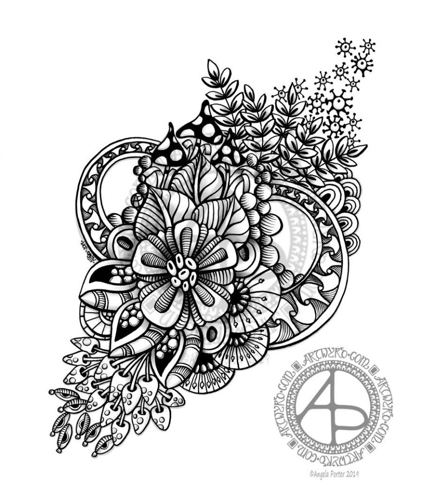
I spent some time drawing this design yesterday (around 4 hours) and didn’t finish it. This morning I woke up wondering if I could tuck a letter away in the design, making it part of the design rather than putting the design around the letter, kind of.
So, I looked at the small-ish space I had left to the right of the design and managed to, rather clumsily, tuck a capital A in amongst the design.
The A is a bit more obvious than I’d wanted, but I worked with what I’d already done to see how it could work, or how I’d mess it up and learn from it.
Yes, I know, another A. There are letters of the alphabet I’ve never either done as a monogram or used in a design of some kind.
I quite like the idea of adding letters as part of the design, either as one occurrence of the letter or by creating a motif of some kind that contains the letter which can then be repeated as part of the overall design.
My mind is ticking over on this one…I definitely need at least one more, if not several more, cuppas before I get my head around my own idea!
I’m positive that this idea is not likely to be unique in the realms of creativity, but it is a new idea for me. Now all I have to do is to follow through with it and see where it leads.
The original drawing is approx 6″ x 6″ (15.5cm x 15.5cm) in size. I used Tombow Fudenosuke, Sakura Pigma Sensei 04, Unball Unipin 0.1 and Pentel Sign pens to draw the design on Daler Rowney Simply… Sketch extra white paper. The paper isn’t as smooth as I usually like and it tends to ‘grab’ pencil lines, even in soft 2B, but it did the job.
Digitally all I did was to clean up the image and create a transparent background and then add a coloured, textured watercolour paper as a background to the drawing before adding my watermarks.
I do want to do some shading on this drawing, but I also have hankering to draw a mandala. Which will win out with me?
This morning, I thought I’d start my day by colouring in yesterday’s shaded, abstract floral design. And this is the result.
I didn’t remove the shading, but added simple gradient colours above it so that the shading would add to the depth and dimension.
Although this image, thanks to whatever WordPress does to the colour of images when uploaded, doesn’t show this, it actually works really well.
Yes, I know. It’s taken me a couple or three years to get around to working out I can underlay shadows and used colour over the top to add depth and dimension. However, I’ve said it before, I learn tricks at my own pace and when they are relevant to me or when I’m ready to try them out.
I may try this design again, but with more vintage-y colours. Maybe. It’s all learning for me that’s for sure!
The design was drawn with Tombow Fudenosuke and Sakura Pigma Sensei pens. Shading and colour was added digitally using Autodesk Sketchbook Pro, Microsoft Surface Pen and Microsoft Studio.
I started drawing this one fairly late last night and completed it just now. The tools I used were a soft Fudenosuke pen by Tombow, a 0.4 Sakura Pigma Sensei pen on white mixed media paper from Claire Fontaine.
I then scanned the drawing into the Surface Studio and used Autodesk Pro and a Surface Pen to clean up the image and then add a few details and some shading to it.
The original drawing is approx. 5″ x 6″ in size.
I’m quite pleased with this one as it’s not my usual ‘lets see how much space we can fill with line and pattern’ kind of drawing. The design has a kind of leaf shape to it in outline, and I’ve let white space exist in the design, which is really unusual for me.
Working in monotone is also unusual for me, but the grey shading certainly adds depth and dimension to the design, brings it to life.
I also have some brushes in Autodesk Sketchbook Pro that I can use to mimic graphite pencil shading, which I did here.
I started with the flower motif in the middle and let the design flow out from that point. Of course my design motifs had to include foliage, seedpods and some abstract/geometrical patterns too. Oh and some fungi/mushrooms too. And orbs/spheres.
I really like my circular arches of a pattern inspired by Early Celtic/La Tene art. The shading really helped to define this pattern.
I’m going to make this one available for purchase from my RedBubble shop.
Still emotionally exhausted…
I slept so much yesterday and last night. I’m still emotionally exhausted after my trip out on Thursday. I’m still finding it hard to believe how much something so simple exhausted me so much in terms of emotion particularly. I didn’t think I was any more anxious than usual, or stressed than usual. Seems I was oblivious to my own body.
I do feel a bit better today, but I could just curl up and sleep again now and I’ve only been awake for 4 hours.
I won’t go to sleep this afternoon though. I’m going to keep myself awake somehow. Maybe with art. Maybe with some books I bought on Thursday. Maybe with crochet. Maybe with all of them, but not at the same time!
Even though I’m exhausted I do feel quite content within myself. However, even though it’s a lovely sunny day, if rather windy, here in Welsh Wales, I don’t think I’ll venture out into the realms of peopledom. It’s another Bank Holiday weekend here in the UK so the world tends to be more people-y than usual. I think that could overwhelm me again and I’m better off just remaining where I feel safe and calm.
The more aware I am of my emotions and my self, the more aware I am of how much CPTSD has affected me, of how it limits my life, and of how much work I still have to do. Mind you, that self awareness is showing me as well the progress I have made and how I make decisions based around self care too. Like today, knowing the world is too people-y and somethings can be left until the world is a little less people-y.
It’s a new month so that means a new coloring template is available to members of the Angela Porter’s Coloring Book Fans facebook group, and this is the template! I thought I’d add some colour to it before I head out for the rest of the day.
I drew the template with Fudenosuke pens from Tombow on Bristol Board from Winsor and Newton. The paper is A4 in size (that’s approx. US letter size).
I’ve started coloring it digitally (Autodesk Sketchbook Pro, Microsoft Surface Pen, Microsoft Surface Studio), as that’s what I’m enjoying at the moment.
This month I’ve gone for my signature entangled style of art, but using the Fudenosuke pens, which I’m really enjoying using, gives varying linewidths and heavier lines and a more graphic feel to the art.
It’s free to join the group, there are some terms and conditions attached to the template use. If you’d like to download and colour the image then pop along to the group and you’d be made most welcome!
I’d also love to see how you colour this template. Yes, really, I would!
This morning, I’ve spent a pleasant four hours or so drawing this A5 design for the month of May.
It combines some hand lettering along with my signature style of entangled art. I’ve included plenty of floral motifs as here in the Northern Hemisphere the world is filled with flowers, especially on the trees.
Of course I’ve included more abstract motifs that are inspired by seedpods and patterns found in nature and architecture and so on.
I drew the design on white Bristol Board by Winsor and Newton. My pens of choice today were Tombow Fudenosuke, Sakura Pigma Sensei 04 and 0.1 Unball Unipin. Also, I’ve used some digital wizardry to add coloured paper as the background, along with my watermarks.
This would be lovely in a BuJo I think. I think it would be lovely in a planner, a journal or diary.
It’s perfect for colouring, as long as you’d be happy to colour across sections that have fine lines in them.
I think if I was more confident with metallic inks and either dip nib pens or fine brushes I’d’ve liked to do the lettering in metallic gold or copper. Of course, I could’ve done the lettering, scanned, laser printed it and then added the patterns around the lettering. I didn’t think of that until now though! Duh!
I’m fairly happy with adding ‘auras’ around the lettering to separate it from the entangled design around/below it.
I’m not sure I’m happy with the design spilling out over the edge as it has done; it doesn’t feel balanced to me, but other than that I’m quite happy with the design. Of course I could edit the image to even up the edges, but it is what it is for now.
Post EMDR
EMDR was quite gentle yesterday but lots of body work occurring. During EMDR stored trauma is released through pains and other sensations in the body. Yesterday I had eyes that hurt, part of my head, my throat, my thumbs and wrists. I had a lot of pain where I broke my leg when I was six. Lots of prickling as well as electric shocks in various parts of my body.
I actually felt quite upbeat, if a little tired, when I left the session. But by late evening I was really tired and feeling a bit teary and lonely.
I’m tired today. I didn’t sleep too well last night. I had hoped to go out for the day today, but I really wanted to stay home and draw and I think I’ll be back in bed before too much longer. I really am tired.
One thing that I was asked about, without me mentioning it first, was what I was going to do about getting out and about a bit more! I’m sure my therapist must read my blog. Just joking, I know she doesn’t!
I need to make a list of places I’d like to visit. Familiar places to revisit to ease me back into getting out and about by myself. Then ones not so familiar that could involve some time away from home too.
I will be going out later this week. I have something to do this evening and tomorrow, however. Another reason I am having a quiet day today. I’m not just tired; I know that I’m also emotionally fragile still.
I am determined to heal as much as I can from the CPTSD and to do the things I’d like to do that the inner critic sabotages way too often.
One of the things that is really nice about being between contracts is the opportunity to create art just for the fun of creating art and not having to stay within the limits of the contract. Not that drawing to fulfil contracts isn’t fun, it is. It’s just that I have to work within the remit of the contract.
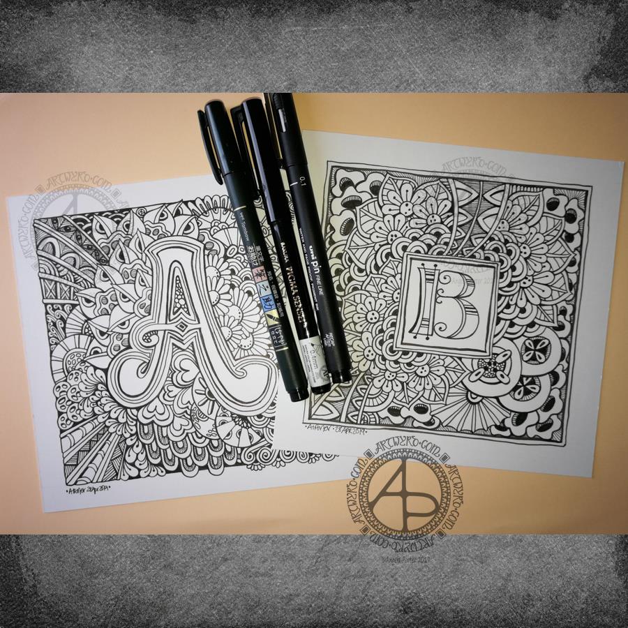
Yesterday evening and this morning I’ve been having a contented time creating some entangled monograms. I’ve cut some Winsor and Newton Bristol Board down to approx 15cm x 15cm (approx 5.75″ x 5.75″).
I penciled in some guidelines for the edges of the artwork and for the position of the monogram.
First job was to hand letter the monogram. I did start with pencil guidelines for each letter, then used a hard Tombow Fudenosuke pen to ink them in.
Then, the real fun begins, which is the entangling of the space around the monogram. I used the Fudenosuke pen along with a Sakura Pigma Sensei 04 and Uniball Unipin 0.2 and 0.1 pens.
All done in plain black and white, with just the weight and concentration of lines adding depth and dimension to the finished design.
I do want to add colour to these at some point. I love pure black and white artwork, but colour can bring them to life as well. Digital colouring is my favourite way of adding colour these days, but I may print copies out on to marker friendly paper and then use Chameleon Duotones and Color Tops to add colour. I’ll see how I feel about that.
As is my wont, I had no preconceptions of how the entangling would unfold. I just let it flow. Some of my favourite motifs and patterns have been used. I did refer to my visual BuJo for ideas/inspiration from time to time too.
Visual BuJo
Yes, a visual BuJo (bullet journal). Or, rather, it’s a collection of motifs and patterns that are being organised using ideas from the Bullet Journal system of keeping a journal. It works for me. I have a way to help me find continuations of collections, or to start a new one, and not worry about a collection being on consecutive pages.
My visual BuJo is an A5 sized, dot grid notebook from Claire Fontaine. It’s a soft back one so isn’t quite as weighty as Leuchtturms and the like. It is also a little less bulky in size, which helps when I want to travel light on a day out.
Mind you, when fill this present visual BuJo I may use a Leuchtturm for my next one. We’ll see…
It is also something that encourages me to seek out new patterns and motifs to add to it, as if I didn’t have enough already! Doing this is a good way to just practice my drawing skills and observation skills, as well as analysing a motif or pattern, breaking it down into simple shapes and steps to draw a stylised version.
I do tend to favour more stylised motifs and patterns in my art, that’s for sure.
So, I now no longer feel the need to try new ideas out for keeping my reference material, constantly redrawing them again and again. The visual BuJo is working for me for sure.
When I’m having a tough time emotionally/mentally with my CPTSD and/or EMDR it can be soothing, comforting for me to use the familiar, and of course I can still do that. I just don’t need to spend a lot of time drawing and redrawing and redrawing again the same things in my search for a perfect record keeping system for patterns and motifs.
The BuJo inspired system may not be perfect, but it works for me.
One other positive that has come from me using a BuJo is that I’ve had to learn to let mistakes go and just leave them in the notebook. The mistakes are what I need to make in order to understand how to draw a pattern or motif. Sometimes, though, a new pattern or motif arises from the mistakes.
Something else I’m starting to do is to make notes alongside the patterns with where to start, the order in which to draw the parts of the pattern or motif, and ideas for varying it.
I thought I’d share another sneaky peek of one of the four that I’ve coloured for the book.
Unusually, I’ve drawn people in a couple of templates. Drawing people is not one of my better skills to say the least. So here’s part of the angel I’ve drawn, set in an entangled, festive landscape, and a starry sky, of course!
I’ve used my signature jewel-bright colours, of course.
And, because it’s me, I’ve coloured the templates digitally, my tools being Autodesk Sketchbook Pro, Microsoft Surface Pen and Microsoft Surface Studio.
It’s nice to just colour, though keeping to a Christmassy colour scheme can be a little frustrating at times especially as here in the UK we’re enjoying an unseasonably rather warm Easter Bank Holiday weekend!
Entangled Christmas is one of the adult coloring books in the Creative Haven range from Dover Publications.
I recommend the article. It’s simple and clear and the quote above makes it very plain and clear that just because something is on the internet doesn’t mean it has no copyright. That includes Pinterest.
The only things that have no copyright are things that are in the public domain and/or declared copyright free.
Public domain is NOT the same as the internet. Public domain is another way of saying the images or content are without copyright or the originators of the images or content have waived their right to copyright.
Reputable websites, companies, people will give the source of an image, credit the artist/creator with it and won’t remove any signatures, copyright statements, watermarks or change the website address.
Reputable companies and people are proud to name the artists/creatives whose work they are placing on product or showcasing. They approach the owners of the work for permission to use the work, seeking a license and are willing to pay for this.
Disreputable companies make no effort to find out who the original creator was, even though it’s easy to drag and drop an image into the search bar of google images to find websites where the artwork has been shown. Yes, it might take a little effort to find the artist/creative, but not as much effort and time as it’s taken the artist/creative to create their work.
Disreputable companies and people usually remove any references to the original artist/creative and make no mention of who they are. They don’t sing their praises.
Disreputable companies and people make no effort to contact the original artist/creative in order to gain permission to use the work.
Now, we artists and creatives are more than happy for our work to be shared with proper credit being given and links back to the original source of the work. It’s always nice when people share our work as it shows it’s liked and appreciated and we’ve made someone happy for a while. It’s even nicer when someone leaves a comment; that always lifts the heart. Of course, it’s even nicer when someone wants to purchase our work.
It doesn’t take much to see if companies are proud of their artists or hiding that information. If they hide that information or don’t bother to find it then you can bet your bottom dollar (or any other currency of choice) that they aren’t working with the artist who created the work.
Many artists have their own shops online where you can buy original artwork, prints or products with their art on. I have anEtsy shop (though it’s been very much neglected lately) and a shop at RedBubble.
It is through these official outlets that you can purchase high quality products with really good resolution artwork prints on at affordable prices, and by doing so you can be sure the artist themselves is getting some monetary return for their efforts.
Of course, it can be hard to do this if you don’t know the name of the artist and you’ve seen their art on a facebook shop or similar. But use the drag and drop trick into google images to do what you can to find who they are. It takes a short amount of time for sure.
If we all did this these companies that use copyrighted work without permission (a licence) would soon have no one buying from them and they’d not profit from someone else’s hard work and creativity without even mentioning the original artist/creative.
It would be lovely if this blog post was shared far and wide (properly credited of course) to try to get people to understand what copyright and the internet is all about and how important it is to creatives who make their living through their creativity.
I’m going to make the black and white version of this artwork available as a coloring template for the members of the Angela Porter’s Coloring Book Fans facebook group. It’s free to join, and I try to add one template for members to colour each month. Some months, like this one, I add more.
It would be lovely if people would colour the template and share, properly credited, to try to get the message out.
About my illustration of the day
I must admit I didn’t handletter this quote, I used Microsoft Publisher to set the quote on the page and then printed it out on Winsor and Newton Bristol Board.
I then set about adding some artwork around the quote using a soft Tombow Fudenosuke pen. This has resulted in much bolder pen lines as well as variable width lines in my drawing. The motifs are also a little bigger than I’d usually draw.
I like the more graphic nature of my penwork; it gives it a bit of the feel of being linocut. It also adds plenty of depth and dimension to the artwork.
I will be colouring this one myself. Not quite sure if I’ll do it digitally or whether I’ll use my Chameleon markers. I need a break for some tea first.
It’s been an *interesting* couple of days to say the least, and the root cause of the *interesting times* was the discovery of my dragonfly drawing entitled ‘Fly Away’ from back in 2012 (which you can see in my deviantART account).
I re-imagined it digitally, using my Microsoft Surface Studio and Surface Pen along with Autodesk Sketchbook Pro. It’s obviously hand drawn – I left lots of little imperfections in the drawing, including wobbly lines in places. I wanted it to have the human touch, not the slick perfection that can result from digital art. It took me around 12 hours or so to re-draw. That’s more than one day’s work.
Complaints, complaints and a heartwarming tale
I sent a message to the owners of the ‘Dragonfly Lovers’ facebook page explaining that they were using my artwork without my permission, effectively stealing my work for their own profit. Surprisingly I’ve not had a reply. My messages on their page have been deleted and I’ve been blocked too.
I have also submitted an official complaint of infringement of copyright/intellectual property to teespring.com, which is the website where they are selling merchandise with my dragonfly art on.
In the midst of this, with family and friends seeing what was going on and getting a good sense of righteous indignation, a woman from Texas sent me a message saying she’d seen the comments on the facebook page mentioned above and she’d decided to approach me directly. She was going to buy the dragonfly art from that page for her daughter’s birthday party. Instead, she asked if I would sell her a print so she’s supporting the artist who created the art.
I was touched. When people approach me I always try to help. Sometimes I waive my fees, such as when someone wants permission to use a design of mine to cover up a mastectomy scar.
Anyways, back to the tale. I told the texas lady that I’d have to re-draw the image as the original had been sold years ago via Etsy and I didn’t have a high resolution image of it.
More about the drawing
So, I got to drawing it again. The image above is the result of some 12 hours work.
I used a low resolution image of the original artwork as a guide and I worked digitally. I was quite keen to do this. I wanted to try out my new skills with brushes that change width with pressure, as well as showcase how my skills have developed in the 7 years since the original was drawn.
The drawing is NOT an exact copy at all. The dragonfly itself is pretty much similar, but the flowers are different as are the spirally branches in the background. I also added tiny seed pods and flourishes to add interest.
I let the varying line weight add depth and dimension to the elements of the image. Overall, I think it’s a more balanced design. Some of the branches look a little ‘flat’ and maybe would benefit from some grey shadows. But it’s good enough I think.
Did something good come from this debacle?
The intellectual property thieves did something good – they spurred me into action in terms of reworking an old image, using my new skills, the way my art has developed.
I also now have a very high resolution image which will print beautifully on many products – it’s up in my RedBubble Shop!
They’ve also made me realise that if my art is good enough for them to steal and use to profit from then my art must be good enough for me to sell.
My problem is promoting myself and getting word out there that I have stuff available to buy with my art on it, officially! I’ve given myself permission to put my artwork on products to sell.
A never ending battle…
I know I’m never going to stop the thieves. There are always unscrupulous people out there, willing to use anything or anyone for their own profit. But when I find them I will challenge them. What they are doing is wrong – WRONG I tell you!
The only way to defeat them in some ways is not to join them, it’s not to let it all slide, but it’s to offer my art with really good quality images on good quality products at a reasonable price.
It’s also getting the word out that this kind of thing is unacceptable, and to challenge the myth that just because an image is on the internet it’s free for anyone to use, even to make money for themselves.
So, from now on, I will be adding more prominent watermarks to my art and making sure it’s at a low resolution that will not print well. I’ll do what I can to make it more difficult for them to steal, to remove my signature or symbol and watermarks and so on.
I also have a plan to add a notice to my art warning people that it is copyrighted and it’s use without permission is illegal. Well, not quite those words, but that kind of meaning.
The easiest way to stop the unscrupulous out there would be to stop sharing my art. However, there’s been people saying they hope it doesn’t stop me as they like to see what I’m up to…so I’m going to have to learn how to protect my images, my art more and more. And if I find someone using my artwork for their own gain without my permission then I will do what I can to stop them.