Hand Lettering Ideas

Today’s blog post is a different kind of one from me, and it’s a sheet that’s full of hand-lettering ideas. Ideas I can use in my BuJo or in illustrated quotes, greetings cards, note cards, dangle designs, monograms, and so on.

Earlier today – around 5 hours ago by my time here in the UK. I started to watch a video on YouTube by AmandaRachLee and I liked some of her ideas there.

So, I thought I’d create a reference sheet of ideas for hand-lettering to add to my arty reference folder/visual dictionary. This sheet is the result. I’ve numbered the ideas/variations that refer to the notes below.

I’m going to start, however, with the last examples first! I realised when I finished the sheet that I hadn’t included examples of my basic hand lettering.

42 – My lower case hand lettering showing how I like to make all the letters the same height. This gives a cute, whimsical feel to the lettering.
43 – My upper case hand lettering.
44 – Variations on how I sometimes form some of the letters, whether I do that as a conscious choice or not.
45 – My lower case cursive script. My cursive is my least favourite of my writing types.

All of the other examples on this sheet are based on this hand lettering.

What I’m coming to understand is that my hand lettering is uniquely me. I don’t want it to be like other peoples, though I do want to be able to vary the style to meet different needs. That means I need a bank of ideas of how I can do this to refer to.

So, onto notes about the ideas.

  1. Draw the letters with a broad pen. I used a Crayola Supertip pen. Next, I added thick black lines to the left and bottom areas of the letter to create a shadow.Look carefully at where the black lines have been added so you can see where the bottom and left areas of the letters are. My preference for shadows is always to the left and bottom; you could choose a different combination, such as to the right and top.
  2. This time I added lines to the left and bottom of the letter mirroring the shape of the letter. Look carefully at how this is done in the centre of these letters.
  3. I drew lines from the corners that extend to the left and angling downwards to create a box around the letter and coloured them in black. This gives a very heavy, graphic box-shadow to the letter.
  4. This shows how the lines form a box-shadow around a letter. Leaving the areas uncoloured gives a ‘lighter’ feel to the letter.
  5. I used a black pen to outline the letter. This really defines the letter. It also allows you to smooth out any imperfections in the letter drawn with the broad pen.
  6. This is just like version 2, but the  shadow lines have been doubled up. If you spread the letters out more you could add more repeats of the shadow lines.
  7. A variation on the box shadow where diagonal lines have been drawn without an outline for the box. This gives a lighter feel to the shadow. It’s not at all fussed on it, but I included it as it may be appropriate to use at some point.
  8. A box-shadow where lines are used to fill in the outline.
  9. Seriously heavy drop shadows here. You can even draw them without outlining the letters and let the negative space form the letters, as in the ABC example. You can also see how lines were drawn to form the box-shadows here.
  10. Choose a point above or below the letters. Draw lines to this point from the corners of the letters. It gives a great sense of dimension.
  11. I drew the letters with a broad pen. Then, I added black lines within the letter re-writing it. 
  12. Instead of solid black lines I used dashes and dots inside these letters. The dashed lines give a feeling of the letter having been ‘stitched’ onto the pate
  13. White lines instead of black, with the E having the white lines added as highlights to give the letter a sense of dimension. This would be increased somewhat if black lines were added to the left and bottom of the letter.
  14. White inside black; the inner lines really show up. White highlights on a black letter gives a sense of dimension.
  15. Black solid lines, dashed and dotted lines within the letters, as well as partial lines as highlights.
  16. More rounded letters with a shadow and highlights. These have a fun almost comic feel to them.
  17. Write the letters using a broad pen. Use a fine pen to draw a line around the shape formed by the word. This line could be in any colour you choose.
  18. Outline the letters in black gives a bolder feel to the lettering.
  19. Doubling or tripling up on the outline gives a different feel. There’s also opportunity to colour between the outlines or to add patterns there, or shadows.
  20. An example of cursive faux-brushpen hand lettering. This time, the outline has had a shadow added to it.
  21. Here, the letters have had a black outline added. Look at how the lines help to give the illusion of dimension to the letters.
  22. Draw outline letters then use a broad pen to write the letters again, but offset them.
  23. The outlines have been filled in. I prefer this one as it gives clarity.
  24. Instead of a solid outline usde a dashed line.
  25. Fake brush pen lettering. Write in cursive. Then, add an extra line where the downstrokes of the letters would be.
  26. You can leave the spaces in the fake brush pen lettering blank, or colour it, or fill it with black or even a pattern such as horizontal lines.
  27. Fake brush pen lettering doesn’t have to be cursive! Just thicken the downstrokes of any letter you write.
  28. Combining drop shadows with various ways of filling in the outline letters.
  29. Colouring in the outlines and adding lines, both solid, dotted and dashed gives different ‘feels’ to the letters.
  30. Add a bold box-shadow to the letter gives a great deal of weight to it.
  31. Drawing a smaller version of the letter inside it and adding texture again gives a different feel to the letter.
  32. Outline letters are perfect for adding colour or, in this case, patterns. The patterns can be simple lines to more complex ones. They can be dots, stars, hearts, leaves, flowers, anything that makes your creative heart sing! Shadows help add variety to the letters too and here you can see how the shadows ‘lift’ the letters.
  33. Serifs are the little lines placed at the end of lines forming the letters. The simplest way to achieve this is to hand-letter your simplest letters and then add lines. Using a broad coloured pen to write over these letters add interest.
  34. Serifed letters can have their downstrokes thickened too. The serifs can become triangular in shape too. Adding a drop shadow helps to lift the letter.
  35. Adding white dots inside the letters adds a different feel to the letters – much more whimsical and less serious than serif letters can be.
  36. You can add serifs to outline letters. This allows patterns to be added. I particularly like the F in this word.
  37. Hollow letters are perfect for adding colour and here are some simple examples of how to do that. Putting the darkest colour at the bottom adds weight and the letter feels more ‘stable’. 
  38. Ombre colour fills from bottom to top and also from one side to another. You could also do them diagonally.
  39. Sunburst lines have been added to the word. You could also add them all around the letter to make it feel like it’s popping or exploding.
  40. Wiggle lines added to make the word appear wiggly!
  41. Big, bold block letters with circles inside create a marquee letter.
  42. A bold, black letter with white lines drawn across give a different kind of graphic feel.
  43. Curlicues can be added to the letters at the start and end of words. They can also be added to letters with tails or the crossing of a t. 

That’s a lot of words! Believe it or not, it’s a lot easier to do hand lettering than to explain how to do it.

Of course, I could start a YouTube channel myself and show how I do this … I’m thinking about that. Either way, I hope my reference sheet and words give you some inspiration. I think I’ve managed to cram a lot into an A4 sheet of dot grid paper!

Would you like to see more like this? Let me know!

Dangle Day Friday

Angela Porter Dangle Day 14 September 2018

Here’s two dangle designs for dangle day Friday. Simple designs, perfect for getting into the weekend vibe.

These are both experiments where I’ve worked on vellum/parchment, the kind that is used for Pergamano.

The one on the left – the monogram A – is nowhere near as garish in colour in real-life; I really don’t know what the scanner has done to the colours. I drew the design with a metallic gold Sakura Gellyroll pen. I then used Tombow Dual brush pens to colour the design on the reverse. I used shades of yellow, orange, red and magenta, but the scanner seems to have removed much of the red. I also managed to smudge the colours too. I don’t think I’ll be using Tombows on Vellum again.

I do like the gold linework and I think I’ll draw this design out again and colour on the reverse with coloured pencils, like in the dangle design on the right.

You may recognise the design on the right as last weeks dangle design. I traced that design onto vellum using a white Uniball Signo pen. I altered some of the details and the style of lettering.

Next, I did a little bit of ‘whitework’ on the reverse. This gave the highlights on the design that help to give the illusion of dimension as well as some texture. I let the design rest under a heavy book for an hour or so.

Finally, I used my Chameleon coloured pencils to colour the design in, again doing this on the reverse.

I like the colours on this one. The vellum mutes the colours somewhat, but it also softens any imperfections in the colouring.

I’m not sure about the white lines though. I need to try this one with some coloured paper underneath to help the lines stand out a bit more. I’ll post an image of it if it works.

I’d like to draw this design in gold and see how that looks. I may try black too. As well as using coloured pencils, I want to try using Copic  or Chameleon markers to colour the designs in, to see how they work on vellum.

These certainly were experiments, which I’ve learned from. Not only that, I’ve got some ideas to try out the next time I use vellum. I’m trusting I’ll find the combination of line colour and colouring medium that works for me and my style of working.

What would I do with these designs? Well, they would both work really well as spreads in Bujos, planners, journals and scrapbooks. I also think the monogram would make a lovely bookmark. They’d both make nice greetings cards or notecards. I’m sure there’s lots of other things they could be used for, such as framed pictures.

If you have any suggestions for how they could be used, leave a comment.

Peace

Angela Porter Peace 10 Sept 2018
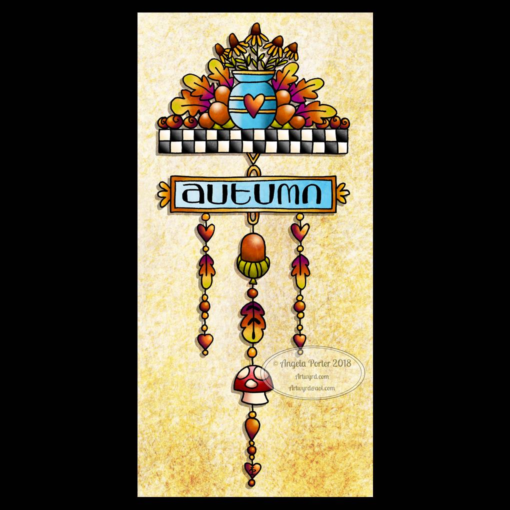
Drawn using a Microsoft Surface Pen on a Microsoft Surface Studio screen in Autodesk Sketchbook Pro.
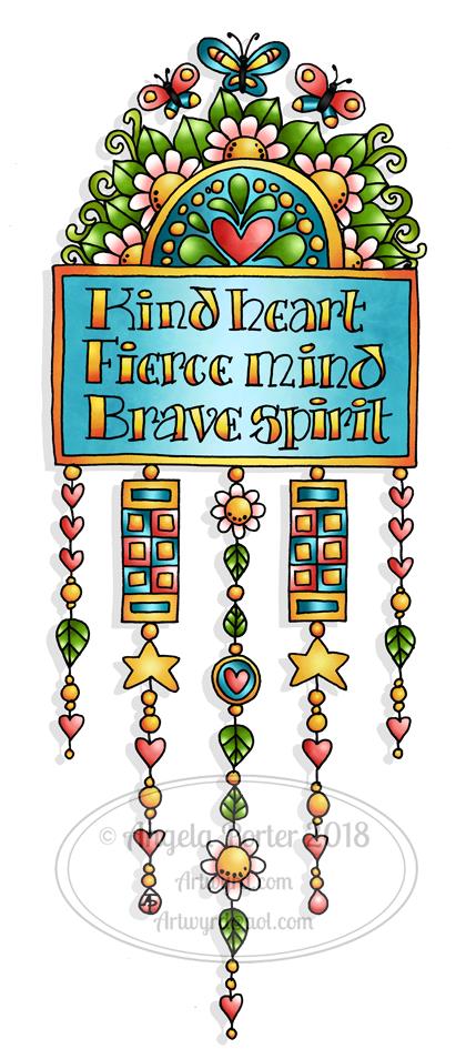
It’s been a couple of weeks since I last hand-lettered and patterned a word, and this morning it seemed really appropriate to do so.

Yes, hand-lettered, in a digital environment. Working with the Surface Pen on the screen of a Surface Studio is just like working with pen on paper in terms of physically hand-lettering and drawing the patterns.

The ability to work in layers, add effects to layers and use gradients to colour the background is a bit different to working in traditional media.

I do like doing these words; they’re fun to do! Also, a nice way to spend a few hours of a Monday morning.

Dangle Day Friday

Angela Porter September 2018 coloured

Friday is dangle day!

We’re a week into September and autumn is nearly here in the Northern hemisphere, so I thought my dangle design should be one for this season. I think this would be a lovely BuJo page to separate the autumn months. I also think it would make a pretty notecard or greetings card. The hand lettering could be changed for another sentiment and it would be suitable for an autumn celebration. Alternatively, it would look great framed and hung as part of a quartet of designs that cover the four seasons; now there’s a project for me to do!

I drew the design on squared paper using Sakura pigma micron pens.

Then, I scanned the image in, used GiMP to remove the squares and create a transparent background

Next, I used Autodesk Sketchbook Pro to colour the image, create the textured background and add a shadow to the design.

I’ve said it before, and I’ll say it again, I love autumn! I love the way the world changes in terms of colours over the space of a few weeks, and the colours can be absolutely glorious.

I don’t know how the long, very hot and dry summer in here in the UK will affect autumn this year.

If you would like to design some dangles and not quite sure how, then my upcoming book A Dangle A Day (available for pre-order) will lead you through the steps as well as giving you plenty of ideas for dangle design.

Friday freebie

Just a reminder that today is the last day for you to enter any of my giveaways, the prizes being signed copies of Eerily Entangled Art, my latest book in Dover’s Creative Haven series of coloring books.

See my previous blog post for details on how to enter.  I’ll be drawing the winners at random tomorrow evening, UK time.

Furbaby Friday

Over on the Angela Porter’s Coloring Book Fans facebook group, it’s furbaby friday.

Of course, it’s Furbaby Everyday over on the Happy Tails Animal Group facebook group.

Both groups would love to see your pictures of your furbabies, as would I.

#wednesdaywisdom

Angela Porter 5 September 2018 small watermarked

Another Goethe quote today, this time hand-lettered.

The design was drawn using Sakura Pigma Micron pens, and then scanned in and the black and white line drawing altered to this.

WIP Wednesday – 15 August 2018

Angela Porter 15 August 2018 WIP 02

Another bit of hand lettering or hand writing along with my particular style of entangled design.

This is very much a work in progress. I’m just laying down the ‘skeleton’ of the design before I add colour and pattern. you can see the dotgrid ‘paper’ I use as a guide for the size of the elements of the design.

Not sure I’m at all happy with the writing, but I do like the bit of wisdom for a Wednesday.

All drawn using a Surface Pen on my Surface Studio in Autodesk Sketchbook.

Love – 14 August 2018

Angela Porter Love 14 August 2018

Another day, another word in the same kind of style as yesterdays. It’s fun doing these for sure! And it’s giving my hand-lettering and writing skills on a digital platform a bit of a workout.

That’s appropriate as it’s World Calligraphy Day today!

There is a difference between hand-lettering and calligraphy.

  • Hand lettering is about drawing the letters, which are often decorative.
  • Calligraphy is about writing the letters.

Both require discipline and control. However, there is a little less control over the letters formed when writing calligraphically than there is in deliberately drawing letters.

To create my word ‘love’, I first wrote the word using a digital brush. Yes, that’s right, I wrote the word! I didn’t pencil out the letters first. Then, I got to doing the colour and pattern ‘thing’.

Not sure if it counts as calligraphy, but I still think it’s a fairly pretty example of a nicely written word. I hope any calligraphers will forgive me and recognise that I’ve entered into the spirit of the day!

Joy – hand lettering

Angela Porter Joy 13 August 2018

I did hand-letter this one, though I did do it digitally using a Surface Pen on my new Surface Studio.

I love my Surface Book, which was a joy to use most of the time. However I was beginning to become a little frustrated with turning the screen around and losing the use of the keyboard and not being able to see the whole image I was working on at the actual size it would be printed.

So, as I officially take my teacher’s pension early today as I reach the illustrious age of 55, I decided to invest some of the lump sum in a shiny new Surface Studio for my business of art, illustration and writing.

The Surface Studio isn’t without it’s frustrations, not least of which were the hours and hours it took to download and install all the upgrades for Windows and the Surface system, and then installing the software I used (not done all of it quite yet).

I did get a Surface Dial with the Surface Studio, and it works interestingly with the free Autodesk Sketchbook, but it doesn’t work at all with the Autodesk Sketchbook Pro version, which is the one I prefer, perhaps because I’m familiar with it and find it easier to access the functions I make use of.

These are minor things, the Surface Studio is a joy to use (though I do need to remember to change the tip on the surface pen to one that glides more easily on the screen!)

So, it seemed appropriate that today, the day I turn 55 and become a semi-pensioner, that I hand letter the word Joy, in my own inimitable style.

I actually quite like the neon colours on the black background. I have a feeling I’ll be doing more like this now my mind has worked out that I can do stuff like this digitally.

Will I be turning my back on more traditional art? Not at all! If anything, I treat digital art as if it is traditional art – the pen means I draw like I would on paper.  All it means is I have access to tools that make some styles a little easier, the ability to use colours and textures that would be difficult for me in traditional media possible, and the ability to edit without frustrating use of white inks a dream!

Don’t forget, I do tend to work directly in ink on paper, often with no pencil lines at all.

Joy is also an appropriate word as I share my artwork because I share my joy in creating it with others, and I trust that viewing it (and hopefully my witterings like this one) joy for you.

What doesn’t bring me joy is when I find my artwork is shared or used without my permission, particularly when people use it to make money for themselves without any regard for the creator of the work. I try to protect my work by watermarking it, signing it, sharing at a low resolution, but still I find people steal my work.

That is not joy. Not joyful at all.

It is stealing too. I don’t know where people get the idea that artwork shared by artists on the interwebs means the artists give up their copyrights.

We DO NOT give up our copyrights in any way.

I sometimes create ‘freebies’, but even then there are limits to how they can be used – personal use, not for resale either coloured or uncoloured, not for inclusion in publications, and so on.

People who steal work like this, and let me be clear it is stealing, make me feel very un-joyful and on the point of removing all my accounts where I share art so people can view it and enjoy it, sometimes even buy it, or prints of it or products with it on, but not to steal it and use it without my permission.

I’m sure those of you who read this will agree with me on this and don’t need to read it, but if my words reach just one person who takes the work of others for their own personal gain in someway, without asking permission of the artist, without even crediting them or providing a link back to where they got it from, stop to think about the harm and upset they are causing to those of us who want to share our joy in our vocation with others, then my words will have done some good. Pricked a conscience or two maybe.

Perhaps then the days of me getting upset and writing emails that go unanswered to websites where I find my artwork offered to others will stop, and there will be more joy.

I can hope this will happen.

Returning to the theme of joy rather than not-joy, I do hope you find my little artwork of today brings you some joy too. Do let me know if you’d like to see more like this, or if you have suggestions of words that you’d like to see in this kind of style!

Finally, do have a joyful day yourselves. Do something that brings you peace and joy, be it art, coloring, baking, reading, dancing, playing music, a sunset walk in nature … whatever it may be, do something joyful every day.

#dangleday

Angela Porter 13 July 2018

I declare today, Friday, to be #dangleday! And to celebrate, here’s a dangle design, which includes a hand-lettered quote.

Want to draw your own dangle designs? Need a bit of inspiration or advice? Then my book “A Dangle A Day” is available to pre-order from Quarto.

I drew this one on paper with a Sakura Pigma Micron PN pen, scanned it in and then edited and coloured digitally using Autodesk Sketchbook Pro, which is now totally free! My Microsoft Surface Book and Pen were used to do this.

I’d include this in my bullet journal (BUJO) as a really cute quote page.

It would look lovely as part of an art-journal page too, though cutting out all the fiddly bits could be a bit challenging, though re-drawing them would be easy enough I’m sure.

I do have some ideas about dangle designs and art journals and other stuff that’s running around my head, but they’ve not really become solid enough that I can bring them into practice…yet.

If I made the dangles a bit longer, then this would make a really nice bookmark. It would also work quite nicely as a tall and thin greetings card, I think. Especially as the quote could easily be changed for something different.

Over on the Angela Porter’s Coloring Book Fans facebook group, it’s #furbabyfriday. I’m looking forward to seeing them all! Why not pop over and say hello?

Kindness is the light that…

Angela Porter 11 July 2018

Uniball eye pens on heavyweight cartridge paper (acid free). Coloured using Chameleon Color Tones marker pens.

Today is #wipwednesday over on #angelaporterscoloringbookfans facebook group.

Eerie Entangled Art, Entangled Butterflies and A Dangle A Day are new books from me that are available to pre-order now.