Hand Lettering Ideas

Today’s blog post is a different kind of one from me, and it’s a sheet that’s full of hand-lettering ideas. Ideas I can use in my BuJo or in illustrated quotes, greetings cards, note cards, dangle designs, monograms, and so on.

Earlier today – around 5 hours ago by my time here in the UK. I started to watch a video on YouTube by AmandaRachLee and I liked some of her ideas there.

So, I thought I’d create a reference sheet of ideas for hand-lettering to add to my arty reference folder/visual dictionary. This sheet is the result. I’ve numbered the ideas/variations that refer to the notes below.

I’m going to start, however, with the last examples first! I realised when I finished the sheet that I hadn’t included examples of my basic hand lettering.

42 – My lower case hand lettering showing how I like to make all the letters the same height. This gives a cute, whimsical feel to the lettering.
43 – My upper case hand lettering.
44 – Variations on how I sometimes form some of the letters, whether I do that as a conscious choice or not.
45 – My lower case cursive script. My cursive is my least favourite of my writing types.

All of the other examples on this sheet are based on this hand lettering.

What I’m coming to understand is that my hand lettering is uniquely me. I don’t want it to be like other peoples, though I do want to be able to vary the style to meet different needs. That means I need a bank of ideas of how I can do this to refer to.

So, onto notes about the ideas.

  1. Draw the letters with a broad pen. I used a Crayola Supertip pen. Next, I added thick black lines to the left and bottom areas of the letter to create a shadow.Look carefully at where the black lines have been added so you can see where the bottom and left areas of the letters are. My preference for shadows is always to the left and bottom; you could choose a different combination, such as to the right and top.
  2. This time I added lines to the left and bottom of the letter mirroring the shape of the letter. Look carefully at how this is done in the centre of these letters.
  3. I drew lines from the corners that extend to the left and angling downwards to create a box around the letter and coloured them in black. This gives a very heavy, graphic box-shadow to the letter.
  4. This shows how the lines form a box-shadow around a letter. Leaving the areas uncoloured gives a ‘lighter’ feel to the letter.
  5. I used a black pen to outline the letter. This really defines the letter. It also allows you to smooth out any imperfections in the letter drawn with the broad pen.
  6. This is just like version 2, but the  shadow lines have been doubled up. If you spread the letters out more you could add more repeats of the shadow lines.
  7. A variation on the box shadow where diagonal lines have been drawn without an outline for the box. This gives a lighter feel to the shadow. It’s not at all fussed on it, but I included it as it may be appropriate to use at some point.
  8. A box-shadow where lines are used to fill in the outline.
  9. Seriously heavy drop shadows here. You can even draw them without outlining the letters and let the negative space form the letters, as in the ABC example. You can also see how lines were drawn to form the box-shadows here.
  10. Choose a point above or below the letters. Draw lines to this point from the corners of the letters. It gives a great sense of dimension.
  11. I drew the letters with a broad pen. Then, I added black lines within the letter re-writing it. 
  12. Instead of solid black lines I used dashes and dots inside these letters. The dashed lines give a feeling of the letter having been ‘stitched’ onto the pate
  13. White lines instead of black, with the E having the white lines added as highlights to give the letter a sense of dimension. This would be increased somewhat if black lines were added to the left and bottom of the letter.
  14. White inside black; the inner lines really show up. White highlights on a black letter gives a sense of dimension.
  15. Black solid lines, dashed and dotted lines within the letters, as well as partial lines as highlights.
  16. More rounded letters with a shadow and highlights. These have a fun almost comic feel to them.
  17. Write the letters using a broad pen. Use a fine pen to draw a line around the shape formed by the word. This line could be in any colour you choose.
  18. Outline the letters in black gives a bolder feel to the lettering.
  19. Doubling or tripling up on the outline gives a different feel. There’s also opportunity to colour between the outlines or to add patterns there, or shadows.
  20. An example of cursive faux-brushpen hand lettering. This time, the outline has had a shadow added to it.
  21. Here, the letters have had a black outline added. Look at how the lines help to give the illusion of dimension to the letters.
  22. Draw outline letters then use a broad pen to write the letters again, but offset them.
  23. The outlines have been filled in. I prefer this one as it gives clarity.
  24. Instead of a solid outline usde a dashed line.
  25. Fake brush pen lettering. Write in cursive. Then, add an extra line where the downstrokes of the letters would be.
  26. You can leave the spaces in the fake brush pen lettering blank, or colour it, or fill it with black or even a pattern such as horizontal lines.
  27. Fake brush pen lettering doesn’t have to be cursive! Just thicken the downstrokes of any letter you write.
  28. Combining drop shadows with various ways of filling in the outline letters.
  29. Colouring in the outlines and adding lines, both solid, dotted and dashed gives different ‘feels’ to the letters.
  30. Add a bold box-shadow to the letter gives a great deal of weight to it.
  31. Drawing a smaller version of the letter inside it and adding texture again gives a different feel to the letter.
  32. Outline letters are perfect for adding colour or, in this case, patterns. The patterns can be simple lines to more complex ones. They can be dots, stars, hearts, leaves, flowers, anything that makes your creative heart sing! Shadows help add variety to the letters too and here you can see how the shadows ‘lift’ the letters.
  33. Serifs are the little lines placed at the end of lines forming the letters. The simplest way to achieve this is to hand-letter your simplest letters and then add lines. Using a broad coloured pen to write over these letters add interest.
  34. Serifed letters can have their downstrokes thickened too. The serifs can become triangular in shape too. Adding a drop shadow helps to lift the letter.
  35. Adding white dots inside the letters adds a different feel to the letters – much more whimsical and less serious than serif letters can be.
  36. You can add serifs to outline letters. This allows patterns to be added. I particularly like the F in this word.
  37. Hollow letters are perfect for adding colour and here are some simple examples of how to do that. Putting the darkest colour at the bottom adds weight and the letter feels more ‘stable’. 
  38. Ombre colour fills from bottom to top and also from one side to another. You could also do them diagonally.
  39. Sunburst lines have been added to the word. You could also add them all around the letter to make it feel like it’s popping or exploding.
  40. Wiggle lines added to make the word appear wiggly!
  41. Big, bold block letters with circles inside create a marquee letter.
  42. A bold, black letter with white lines drawn across give a different kind of graphic feel.
  43. Curlicues can be added to the letters at the start and end of words. They can also be added to letters with tails or the crossing of a t. 

That’s a lot of words! Believe it or not, it’s a lot easier to do hand lettering than to explain how to do it.

Of course, I could start a YouTube channel myself and show how I do this … I’m thinking about that. Either way, I hope my reference sheet and words give you some inspiration. I think I’ve managed to cram a lot into an A4 sheet of dot grid paper!

Would you like to see more like this? Let me know!

BuJo for June 2018 and a reflection on May 2018

Angela Porter Bujo June 2018 CoverAngela Porter Bujo June 2018 MonthlyOverviewAngela Porter Bujo June 2018 Mood Habit TrackerIt’s that time again – starting to fill in my bullet journal (BuJo) pages for the upcoming month of June.

I’ve set up part of my bullet journal for June. I decided to go with daises again.  They’re such happy little flowers, bright spots in the green grass. They remind me of innocence and hope. Pale pink, green and flashes of gold will be the colours I use, where I use them, for this month.

May has been a very stressful, upsetting and emotional month, and my bullet journaling, along with lots of other things, went out of the window.

My little smartcar, Smartoo Deetoo, broke down. I had the stress/anxiety/panic of a very long time for the car and I to be recovered and taken home, and then organising recovery of the car to the Mercedes dealership in Cardiff for repairs. Eventually it was diagnosed with a terminally broken gearbox.

Instead of paying to have it replaced, I decided to buy a brand new Smartcar fortwo, which then had the added stress/worry/anxiety/panic of applying for finance.

Very quickly though, Binky was with me – my third Smartcar. Binky is fantastic and I can’t be happier with it.

Just after I signed all the paper work for Binky, I went to check on my cat who had been poorly for a day or two and who had rallied round that morning. I found he’d gone seriously downhill, so to the emergency vets we went.

After a night at the vets, test results and observations of my beautiful boy Cuffs, the diagnosis was brain cancer, so I had to make the decision to let him go, and went to say goodbye to him.

Cuffs was amazing. I had 16 years companionship with him.  He was with me for some of the best and the worst times of my recent life. He always greeted me when I came home and he often tried to stop me leaving for work, especially when teaching had become so very, very hard for me when my mental health was plummeting downwards.

There’s just too much to say about him here. To say I’ve been upset would be a gross understatement. I’ve grieved for him, and it’s knocked me not just for six but for 6 million I think.

I’m beginning to feel better, I still have moments when I miss the purrfurball, when a lumpy bit of the duvet will make my heart leap that he’s under it, only to remember he’s not and to feel that disappointment and sadness.

I am feeling better and getting back into my creative stride.

I’m working on the illustrations for Entangled Butterflies.

I will be working on the June colouring template for the members of the Angela Porter’s Coloring Book Fans facebook group later today.


WIP Wednesday

Angela Porter Wednesday 11 April 2018 This is my current work in progress, with a little bit of wisdom thrown in.
I planned the lettering out on Rhodia dot grid paper before scanning it in. I then re-drew the letters digitally.

I did a blog post with tips for hand lettering  yesterday, but there’s also some in my upcoming book A Dangle A Day, available for pre-order.

The patterns around the quote were also drawn digitally, using my faithful Microsoft Surface pen, along with my Microsoft Surface Book and Autodesk Sketchbook Pro.

I’ve started to add colour, though there’s quite a lot to do, including adding textures. It’s a pleasant way to spend time.

What I’m quite pleased with is the stone background behind the letters.  It’s not perfect, but I got my head around how I could achieve this.  Working in layers means I can do things I can’t do with traditional media, try as I might, but it involves working out how I can use layers to do different things as well as becoming aware of what I could use layers for.

Yes, I could watch and read tutorials, but there’s something satisfying about working out for yourself how to do things, and creating things in your own way.  That’s the sheer bloody-minded independence I have at times.

Perhaps I could learn quicker with tutorials, but I also know I can become quickly overloaded with information and instructions and ideas (something that frustrates me as before my two episodes of severe depression and anxiety I had no trouble at all…) so bit by bit I discover what I need to be able to do at any one time. Then practice using it until it’s easy to do and natural.

I do love how I can flip-flop between traditional media and digital work, as well as combining the two, whether it be a sketch that is then worked on digitally or using traditional media backgrounds to draw upon digitally. It also takes me a little bit out of my ‘comfort zone’ too, but in an enjoyable way.

It’s Dangle Day!

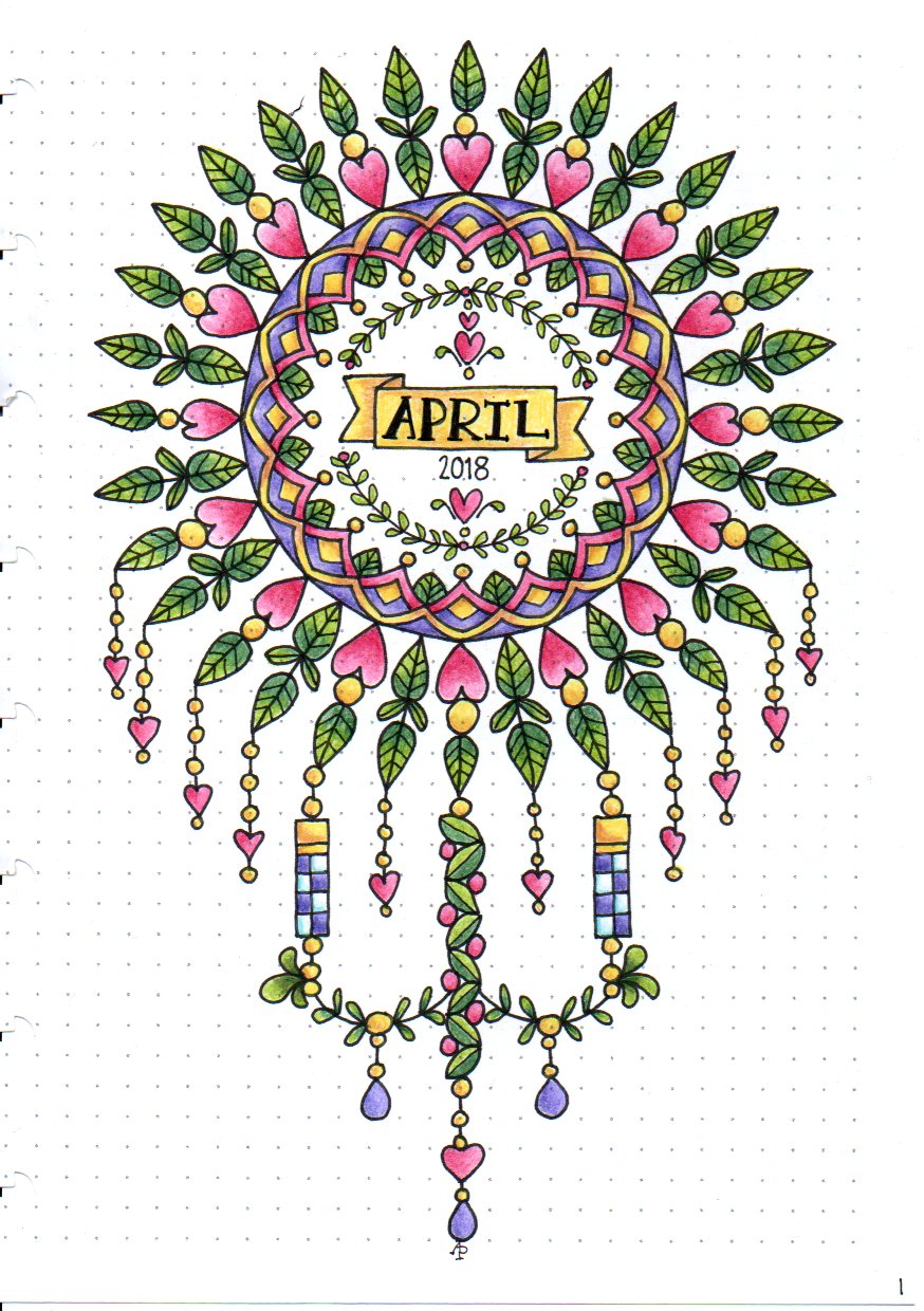
Angela Porter April Bujo 2018

This is my Dangle Day dangle design – for the cover of my April 2018 section in my disc-bound BuJo (bullet journal).

Yes, that’s right, a disc-bound BuJo.

I love my Leuchtturm 1917 journal, however I wanted my collections all in one place, and wanted memories together, more like a traditional journal, and my planning pages and trackers all in another place.

I also realised that a lot of my collections are references for art projects and I didn’t want to have to either hunt through a pile of BuJos to find the collection I wanted, or to have to redraw them every time I started a new BuJo.

So, the light came on and I realised a disc-bound (or ring bound) journal may be the way for me to go, as it doesn’t just offer the flexibility of design/layout/space that comes with bullet journalling, but it also allows me the flexibility to organise things as I need them, as well as to archive the planners and memories and so on as I need to.

I also get to use the paper that I need to use for different purposes as well…

I had some of the Arc by M journals lurking around my home, so I re-purposed one of them for this, along with some bigger discs so I can get more pages in the BuJo.

I am notorious for flipping back and forth between ways of journaling.  This could be the solution to that.

As to the April design, I drew it with Copic Multiliner SP pens and coloured it with Faber-Castell Polychromos and Caran D’Ache Luminance pencils, using a Derwent Blender pencil to smooth the transition between colours.

Don’t forget, you can pre-order my upcoming book, A Dangle A Day, which is all about drawing dangles, such as the ones dangling from the mandala.

Derwent Procolour Pencils and some cute bugs

IMG_20180321_120333

Today, I wandered into my local stationers – Churchill’s – and found some items for my stationery stash.  Included were some coloured pencils from Derwent that are new to me.

They’re called Procolour and I picked up a tin of 24 of them. and you can see how much I paid on the tin, though they are available for less on Amazon.

cof

I tried them out in my Leuchtturm 1917 Dotted BuJo on some cute bugs I’d drawn earlier today (yes, another collection is being assembled in my BuJo).  You can see the colouring at the top of the page, though I adjusted the brightness and contrast a tad.

The blurb on the tin says

Derwent Procolour pencils are the perfect combination of a strong point and smooth lay-down, with a texture that has the covering power of wax yet glides like an oil.  The richly pigmented pencils maintain a sharp point for detailed drawing; while minimal chipping and dusting keeps your work clean and smudge free. Suitable for a wide range of drawing techniques, available in a carefully selected range of 72 rich and vibrant colours.

I didn’t choose the best paper to test them on, though they’re more like to be used in my BuJo than anywhere else, but the colours are vibrant, even on the creamy coloured Leuchtturm paper.

They do lay down well, with a gentle pressure, and they layer nicely.

What I do like is that they have quite a wide ‘barrel’, which makes it a lot more comfortable to hold than other coloured pencils; my old, slightly arthriticy fingers don’t like narrow barrels when I need to press hard.  That’s why I tend towards water-based media or digital media these days; they keep my fingers happy and working.

The colour palette of the 24 set is actually nicely chosen, with plenty of my favourite colours.

I am very tempted to get the full set of 72, but I think I’ll wait for a little while.


Spring Equinox 2018

sdr

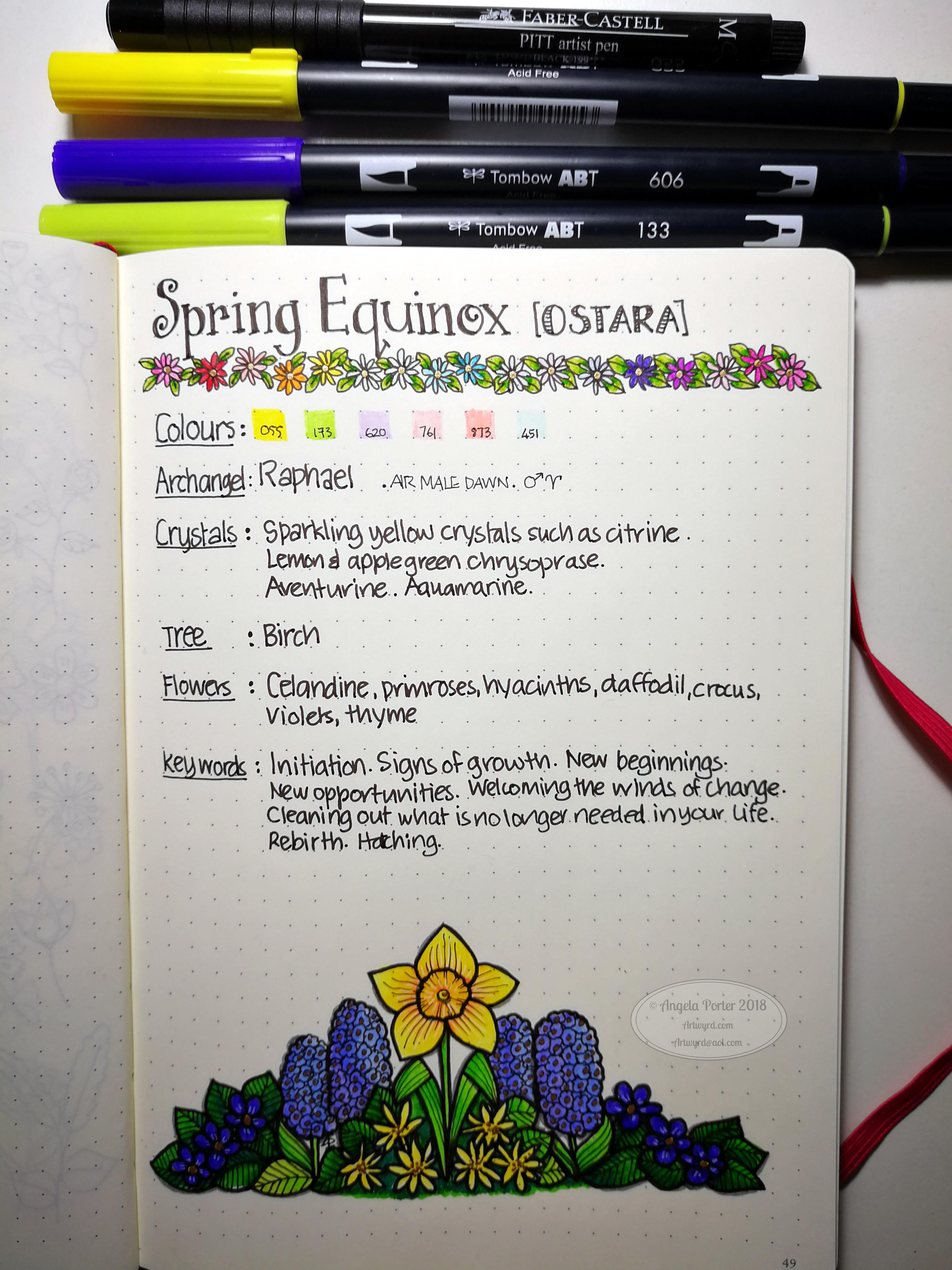
Yesterday was the Spring Equinox in the Northern Hemisphere.  The first day of spring, astronomically speaking.  I decided I’d do a little BuJo page about the equinox, and after spelunking through my memory, books and the world weird web, I pulled together some ideas about it, as well as a little illustration.

For the first time I can remember, I sketched out the flowers and leaves in pencil before colouring the shapes in.  Then I added outlines and details to the colour.  I think I got a bit heavy handed with the outlines, but it’s all learning for me, expanding my artistic ‘tool-box’.

BuJos and Tombows


Bujo01

Tombow Dual Brush Pens

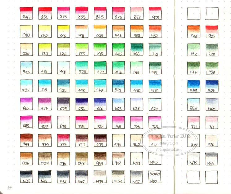
Today, I recieved a full set of the Tombow ABT Dual Brush pens and I’ve managed to swatch them out in my BuJo.

So far, so good.  They ‘stick’ a bit more to the paper in my Leuchtturm 1917 dot grid BuJo than the Zig Art and Graphic Twin pens or my Zig Clean Color Real Brush Pens, but I like the colour palette.  I’m sure I will get a lot of use out of them for sure.

BuJo

Talking of my BuJo, I’m going to bravely share some of the ‘spreads’ I’ve done and share some of my thoughts on BuJo and how it’s working for me so far.

Bujo02 There’s a lot of stuff out there about bullet journaling, and a good place to start is bulletjournal.com, the website of Ryder Carroll, credited with starting the bullet journal system.

What attracted me to this system is it’s total flexibility and how you’re encouraged to make it work for you.

Rather than planning my day out, other than appointments or important dates, I use mine more as a journal where I record what I have done that day.

I find lists of things to-do can be counter productive for me; if I don’t tick things off I can be very hard on myself.  However, by recording what I have done, that just feels far more positive to me.

So, I do have a couple of ‘trackers’ in my BuJo for things I would like to do on a daily basis.

Notice I wrote ‘I’d like to do’, not ‘I must’.  That takes a lot of pressure off me, as well as the guilt I can have if I don’t get done what I thought I could get done in a day.  I’m far more ‘productive’ if I just get along with things.  I’m lucky to have the luxury of doing this as I’m self-employed, as well as being an arty, creative person.

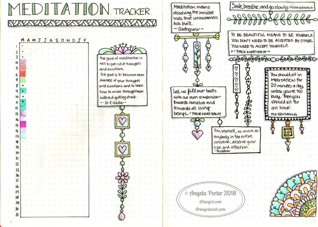
So, here are my trackers, as they appear in my BuJo:

Bujo03

Bujo04

Bujo07

I’ve noticed I have some colouring to do on some of them.  I decided I’d like my trackers to span a whole year, which seems to be working fine for me now. I also wanted to add some of my favourite quotes to remind me of why I want to keep track of these things and their importance to me.

I decided to add the quotes in boxes, and connect them with strings of little ‘doodles’ called dangles (the book I’m working on – A Dangle A Day – is spilling over into other areas of my creative life!) I like how they’re not all symmetrical in shape and arrangement.

I like how I can use my BuJo for daily practices of all kinds of things from drawing to hand lettering.  I can keep lists and notes on things that grab my attention.  I keep pages where I write down notes and ideas; not to-do lists, just notes to myself, or things I need to ask others about.

I have sections with botanical doodles/sketches, a list of sizes of picture frames and mats, the size of card blanks.  I have examples of hand lettering alphabets, with notes about them.  I have dangle directories too, a result of my work on A Dangle A Day.

The index is invaluable in helping me keep track of the collections, especially when they occur over multiple pages with other stuff in between.

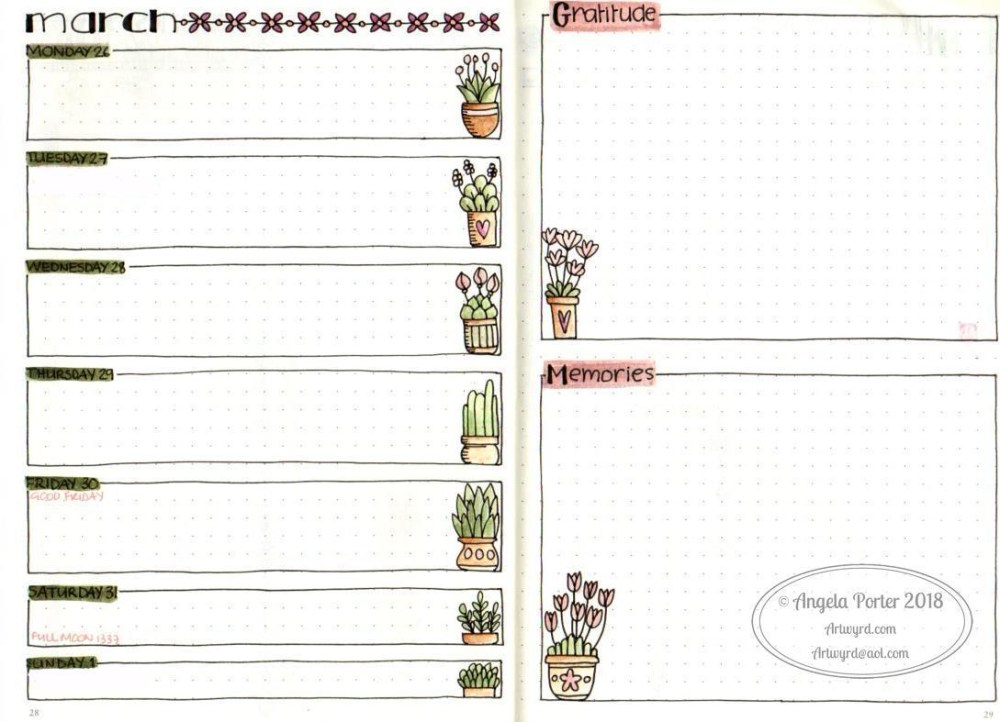
Of course,  I also have weekly ‘diary’ pages, and I’ve been trying out different formats for them, including these:

Bujo05


Bujo06

I’ve changed my monthly view for April, and here it is:

Bujo08

The one for march didn’t have any room to write appointments or events in.  This one certainly does.  Not sure what I’m going to put on the right hand page yet, though I couldn’t resist drawing part of a mandala there.

I’ve found it is easy to get lost in bullet journaling; especially the creative parts. That’s fine when it doesn’t take me away from things that must be done, such as doing books. But it’s a different way of practicing drawing, hand lettering, organising thoughts/interests/memories/ideas and so on rather than in multiple books (journal, diary, sketchbook, note book) – they can all go in one book.

If you’d like to see any of these, let me know and I may share some, or little tutorials on how I draw stuff.

The flexibility and the ability to change what doesn’t work easily is the biggest draw, as well as the ‘permission’ to do what you need to do, what is right for you.  There’s no shoulds or shouldn’ts about it.

The other thing is not to get hung up on perfection.  I get things wrong in it all the time, or don’t like what I’ve done.  These can be ‘fixed’ by the use of correction tape or sticking a new piece of paper over the mistake if it’s a biggie. I just have to remind myself it’s a work in progress, it’s hand-made (well the content is if not the notebook itself), and it will help me, I hope, to accept that something is ‘good enough’ without it having to be perfect in all ways.

I already really dislike the heading for my Mood Tracker, but it’ll do for now.  I may change it with paper and sticky stuff.  Or I’ll just leave it so I can see how my hand lettering progresses over time.


A Dangle A Day

As it’s WIP Wednesday, I thought I’d share the cover of my current work in progress – A Dangle A Day.  It’s all about drawing dangles and stuff the Angela Porter way. I’m doing all the illustrations plus the writing too!  It’s not a colouring book, it’s a tutorial book. There’s going to be a little bit in it about BuJos (bullet journals) too!

It’s available for pre-order now on Amazon; release date is 6 Sept 2018.