One of the nice things about being between contracts is being able to indulge myself in art. It’s also a chance for me to do ‘comfort art’, art that is in a familiar style that I don’t often do.
This is an example of ‘comfort art’. Art that is soothing to do, is intuitive and surprising in how it turns out. I start with pen and paper (dot grid in this case), and just start with a single motif. I then let the design grow from that point, organically and intuitively.
There are always sticking points where I want to give up as it doesn’t look right, or I’m not happy with what I’ve just drawn. However, I’ve learned to persevere past these points and the end design is usually one I’m happy enough with.
There were many sticking points in this one, some of which I thought were going to be shatter points.
Although I’ve deemed this illustration ‘done’, as I reflect on it now, I can see places where some added line texture would help the design be less homogeneous in places and would add some contrast.
Also, some shadows would help add dimension to the illustration. Having said that, colour would really bring the drawing to life too.
For now, though, this design is finished. Whether I work some more on it remains to be seen.
I used Uniball Unipin pens to draw this design, along with ClaireFontaine Sketch dotgrid paper. The only things I did digitally were to scan the design in, remove the dots of the dot grid, and add the background colour and texture and watermarks.
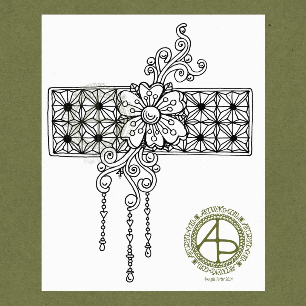
I woke this morning, refreshed after a long, deep sleep, and wanted to draw something relatively simple, something I could work on in the future.
I used a Uniball Vision Elite pen on a sheet of dot grid paper from Claire Fontaine. If you zoom in, you can still see the dots of the dot grid.
I had no idea of what I was going to draw. All I knew was I wanted to draw, and I wanted to start with a flower. Which I did.
I then started to grow the design by adding the swirls. Those swirls had shapes in them perfect to add some round seeds.
Next, I thought a rectangular background panel, filled with a geometric design, would be a good counterpoint to the more organic flower and swirls. So, I did draw in a pencil grid to use as a guide for my inked lines.
After adding a narrow border to the panel, I decided to add some simple dangles to the lower swirls. I thought the design needed to be lengthened a little.
When I’d finished the dangles, I knew the design was complete. I felt no need to add anything more to it, despite having a lot of white space! So, I scanned it in and prepared it for posting to social media.
I’d like to work this one with some colour to the flower and swirls, maybe the dangles too. The geometric pattern I’d like to add shading to bring out a more dimensional appearance to it. I may add that shading as shades of grey, or maybe as lines.
If you’d like more ideas about drawing dangles, then my book “A Dangle A Day” is a good place to start.
That’s where I have to leave it for now as I have a busy day away from home today.
Today’s mandala is another white on red one. Drawn digitally using Autodesk Sketchbook Pro.
I really am enjoying white on darker coloured backgrounds, particularly red at this time for some reason. The white gives a lacy, delicate feel to the design. It also gives the illusion of the white pushing the darkness away in the background, making the red appear to start to glow. I like that metaphor, very much.
I’m aching today. Yesterday I tumbled down the stairs, clonking my elbow, butt and bending my left foot under itself. My foot is very painful and stiff today. I can stand and limp around on it so it’s not broken, just soft tissue damage. That’s the second time in a couple of weeks that I’ve fallen over and hurt my foot; last time, it was my right foot that was hurt. My hands and fingers are also sore from reaching out to try to stop my fall. That hasn’t stopped me doing some art, though. I don’t think I’ll be going out and about today either. I’ll be trying to keep my foot up! Bit of a shame, really, as it’s a lovely, sunny day outside.
I’ve always been such a clumsy person; I can trip over thin air. However, it’s been many, many years since I fell down the stairs. The last time must’ve been nearly 20 years ago. That time I pulled some ligaments behind my knee. That made it difficult for me to climb to the Cerrig Duon stone circle and standing stone on the edge of the Afon Tawe. I also had to cross the river by stepping over the natural, uneven stones in the river channel.
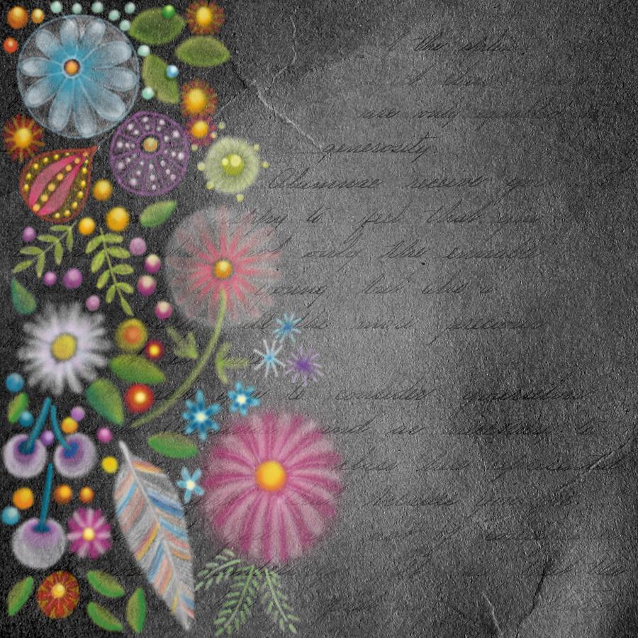
Yesterday afternoon, I arrived home from EMDR therapy feeling very emotionally drained, fragile and vulnerable. Creating art is one of my self-soothing activities, particularly mandalas.
I’d downloaded a pile of new backgrounds in the past couple of days and wanted to make use of a chalkboard background. It was so dark I knew I needed to make the mandala full of light and colour.
This was a somewhat symbolic choice as my long journey to recovery from CPTSD has been about bringing light into the dark places of my trauma damaged psyche. EMDR has helped me turn the dark into light in terms of my mental and emotional health.
I really enjoyed creating this mandala. Usually, I work with black on white; here I started with colour – the abstract ‘flower’ ring close to the centre. I wanted the colours to glow against the darkness, so I chose lighter shades of aqua and violet. I even added some glowing golden seeds or pollen grains, which is also metaphoric for the personal growth I’m going through in my healing journey.
I then used a white, chalky pen ‘brush’ to draw patterns inside this ring and around it. I decided the white was too plain, so, to break up the white, I blended soft colours into it.
Finally, I added the ring of mushrooms. These had to be my favourite colour – purple. I added some dots to the mushroom caps in lime-green, which is kind of a complementary colour to purple. My last step was to add the stylised foliage behind the mystic mushrooms.
This mandala really helped to soothe me, and it was a pleasure to create. It gave me a break from Inktober and other work that’s ongoing too.
Talking of Inktober, I will be getting Day 29 done later today; I have some things that need doing first.
Oh, the mandala was created digitally using Autodesk Sketchbook Pro and a Microsoft Surface Pen on the screen of a Microsoft Surface Studio (the digital analogues of pen and paper).
I’ve spent an hour or so creating this small design; the paper is 4″ (10cm) square. It’s been an enjoyable time. I needed to spend some time warming up my pen skills before returning to drawing the October colouring template for the Angela Porter’s Coloring Book Fans facebook group.
My first step was to use a Tombow fudenosuke pen to hand letter ‘believe’. I wanted to make sure that the word stood out from the rest of the design, so I used a Faber-Castell Pitt Artist Pen to draw two ‘auras’ around the word.
The rest of the design flowed onto the page, starting with the flowers to the top right of the word. I used a variety of nib thicknesses in the drawing. I used quite a few of my favourite patterns and motifs in this design; this makes the drawing quite soothing for me as I don’t really have to think and concentrate on constructing the design elements.
Once I was happy with the design, I decided to add some shadows with some grey-coloured pencils. I’m not satisfied with this at all. The pencil ‘leads’ were too hard to get a soft line. In future I need to remember to use a 2B or softer graphite pencil and some kind of blending tool.
I am happy with the design though, apart from the bit I let spill out to the edge of the paper. I also need to note that I’m happy with my hand lettering here too! Using fudenosuke pens with flexible tips for drawing has allowed me to develop the pressure control I need to complete the brush lettering. The brush nibs on the pens are quite small, so the contrast betwixt thick down-strokes and thin upstrokes isn’t as noticeable as with a broader nib, but all the same, I’m still quite happy with it.
I have no idea what I’m going to do with this little panel. It could become the top layer of a greeting card, or frame it and hang it. Perhaps I may add it to my BuJo. It could, of course, end up amongst the piles of artwork I have stored away.
Why did I choose the word ‘believe’?
It’s something that I’m working on – believing in myself. Believing that I deserve better in life than what I grew up with and unconsciously seek to replicate to try to get a different outcome (one of the features of CPTSD). I am beginning to believe that I can turn the negative beliefs I was taught as a child into positive beliefs about myself.
Part of this is believing in my art, believing in my self-expression and not looking to others for approval and validation of what I’ve created. I want to believe that it’s enough to create art that makes me smile, and hopefully other people too. There are plenty of artists in the world who make social statements, political statements and thought-provoking images with their art. I’m not one of them. I just want to add some prettiness and smiles to the world.
Sometimes, part of my art may have quotes that are thought-provoking in them, but the art is, I think, pretty.
To believe that I am the opposite of what I was brought up to believe myself to be (which wasn’t very nice).
There’s so much more I could add here, but I’d need to explain it, and I’m not up to doing that in public. Maybe in the future I will, once I’ve overcome those negative beliefs about myself.
So, Angela, how are you feeling today?
I believe I’m feeling quite content, though that tiredness has sneaked up on me once again. However, there is that contentment there, and that’s a good thing.
I believe I’m feeling quite content, though that tiredness has sneaked up on me once again. However, there is that contentment there and that’s a good thing.
It’s the first day of astronomical Autumn in the Northern Hemisphere – Spring for those of you in the Southern Hemisphere.
The signs of autumn are all around me. leaves are starting to don their fiery autumn hues. Shiny-red rowan and hawthorn berries festoon the branches. Shiny purple-black bramble-fruits mask the sharp thorns on their canes. Nuts of all kinds are changing from green to brown – a veritable feast for all kinds of critters. Bunches of sycamore helicopters and ash keys can be seen peeking out from the dark-green-tinged-with-brown leaves. Fluffy seed-heads of clematis coat the hedgerows like some kind of Hallowe’en web-like decoration.
It is my favourite season of the year. I love the colours. I am fascinated with how nature reveals it’s underlying architecture as the foliage falls, creating piles of colourful, crunch leaves that remind me of glowing embers.
Nature really does prepare for the long winter sleep by donning her party clothes for a final blaze of glory , a memory that will stay with us throughout the cold, dark Winter months to remind us that she merely slumbers and will reawaken in the Spring.
So, given my current fascination with freeform crochet, I have created some seed pods; at least that’s what I had in mind as I created these forms.
I do want to add some beads to them; I can’t resist adding some sparkle!
Of course, seed pods are quite apt for the season the world is entering; they are in abundance. I do love seed pods; they feature in my artwork quite a lot. So, it’s quite natural that I’d want to try to recreate some of my weirder ones in crochet.
This kind of crochet is turning out to be a bit easier to do than I thought it would. I do have a lot to explore and discover and a lot more confidence to gain, but I think I’m making a good start. I do need to learn some more textural stitches as well how to create spirals just to start.
To give you an idea of size, the largest seedpod is approx. 12″ in length. I used a 3.50mm hook with DK yarn. I will make some more pods in four-ply yarn with finer hooks. They should work out smaller.
I suspect that on my travels I may come across some interesting yarns with various textures and finishes that I can use to add some interest. However, for now I will just focus on how I can achieve the shapes and curves that I’d like to form seedpods.
Don’t tell me it’s all about maths – I’m absolutely a nightmare at maths. I have to figure it all out my way.
Now, if anyone should ever like to create seed pods or anything else I create, I will try to work out a written pattern. But just not yet. I’m still working this all out myself!
This image is in the vein of experiments in digital art. It reminds me very much of chalk/soft pastels, a traditional medium I did experiment with many, many years ago. However, I abandoned it as I didn’t like the feel of the soft pastels nor the messiness of them.
Using a kind of digital version of them means no mess!
I like this pot potpourri of motifs quite a lot. The softness of the lines and translucency of the colours appeals to me. I also like the way the colours glow against the black background. Surprisingly, the simplicity of the motifs appeals to me as well, giving a folk art kind of vibe to this work. Overall this design has an ethereal, ghostly, perhaps even magical feel to it.
My usual style of art is quite intricate and detailed, so this is definitely a departure from this. It’s certainly a style I want to experiment with more.
As it’s digital art, I used Autodesk Sketchbook Pro along with a Microsoft Surface Pen and Microsoft Surface Studio.
Easy listening playlist on Spotify, creating art. What a lovely way to spend a Saturday morning!
I’ve been working at this monogram now for several days. It is coming along.
It really feels like a an embroidery sampler where the learning embroiderer would try out different patterns and shapes and still create something beautiful.
For me, the sampler is more about out different ideas as they come to me and increasing my knowledge and understanding of the digital art tools available to me in Autodesk Sketchbook Pro.
Of course being able to draw directly on the screen of my Microsoft Surface Studio with a Surface Pen makes creating digital art a dream for me; it’s like working with pens and pencils and so on on paper. However, I’m able to do things I don’t think I’d ever be able to do with traditional media.
I still love working with pen on paper; I currently have one drawing on the go and I may convert it into a digital artwork when it’s done.
Exploring the realms of digital art has opened doors to me that have expanded my creativity in ways I never could have imaged previously.
Yes, I learn by doing myself rather than following tutorials. My experience of watching tutorials is that I end up more confused than I started.
Don’t get me wrong, the ones I watched were excellent. However, they are by people who really know the software and what everything does, and they speak to people who have some idea of it all.
Besides, I want to do art my way, and these artists tend to show how they do things and that often doesn’t make any sense to me.
I’m grateful they share, and one day I may watch some more, but for now the exploration in my own realms of creativity is what is best for me.
As I look at my sampler monogram, I can see how I’m developing my own digital art voice in terms of techniques and effects that suit my style of rather intricate, abstract art based on patterns, curves, swirls and arches, along with a lot of motifs based on nature.
The plain curves in this monogram are adding some much needed scaffolding or girders to support and separate the patterns. Some of the fancily patterned curves are getting lost in the crazy intricacy of adjoining sections.
There are no individual sections that I really don’t like. However, some combinations of sections don’t seem to gel well, at least not to my eye.
What I do love is the layers of diversity of colour and pattern. Each glance reveals something new, whether it’s the way I’ve played with light and shadow, the way patterns look together, or the way colours I’d not normally put together seem to work together.
However, as this is turning out to be a sampler, then that’s fine. It’s all learning for me, and that’s good.
I’ve noticed I’ve not left any white space in this design, so far. I may do that in the area that is left to complete, just to contrast with the pattern-dense areas done so far.
It is a fascinating journey for me, and while this may not be an artwork that I’d offer for sale at redbubble.com or zippi, it’s something that is worth its weight in gold for me in terms of lessons learned and also gaining some confidence in my style of digital art.
I have, finally, finished this particular drawing. I managed to keep to my challenge of leaving some white space in the design. I did let the design spill over the pencil guidelines I’d drawn for the size of artwork. I then digitally trimmed it within those lines before applying the black and white borders. I do like to define the space within which my drawings and designs reside, that’s for sure. It’s like a window into my imagination, my mind, my intuitive creativity, how all the little things I have observed and imagine just blend and meld into a crazily layered, intricately pattern and yet flowing design that is always quite pretty.
You can’t have too much pretty patterns in this world I think.
I think it’s too detailed and fussy as a coloring template, though I may add some colour to it at some point in time. Before I think about doing that, though, I have an idea for another drawing with some hand lettering on it.
The drawing is a little less than A4 in size (US letter). It has been drawn with Tombow Fudenosuke and Uniball Unipin pens on Winsor and Newton Bristol Board.
My mental and emotional health
Monday I spent mostly in tears after the busy week and the emotional upsets of Sunday. In therapy we just talked about what happened and how I was feeling and thinking about myself and that I need to be a lot kinder to and caring of myself. It was also suggested I need to be a lot more accepting of where I am on my healing journey and not beat myself up for not being able to get out and about much by myself, even when I may want to.
I came home and slept until 2am, then went back to sleep a couple of hours later and slept through until mid morning yesterday, which was then followed by a very quiet day at home crocheting and drawing before yet another nap in the afternoon.
I slept for many hours last night too, and I’m still feeling exhausted. With exhaustion I am emotionally fragile and vulnerable too.
So, much of today will be spent quietly. I do have to head up to Hereford this evening, however. I’m debating whether to go a little early so I can spend a little time at Kilpeck church – my favourite church in the whole wide world. A tiny two celled Romanesque church, almost untouched by time. I’ll see how I feel as the day progresses and whether I manage to find a little oompf. After all, the church has been there for nearly one thousand years, I don’t think it’s going to go anywhere soon!
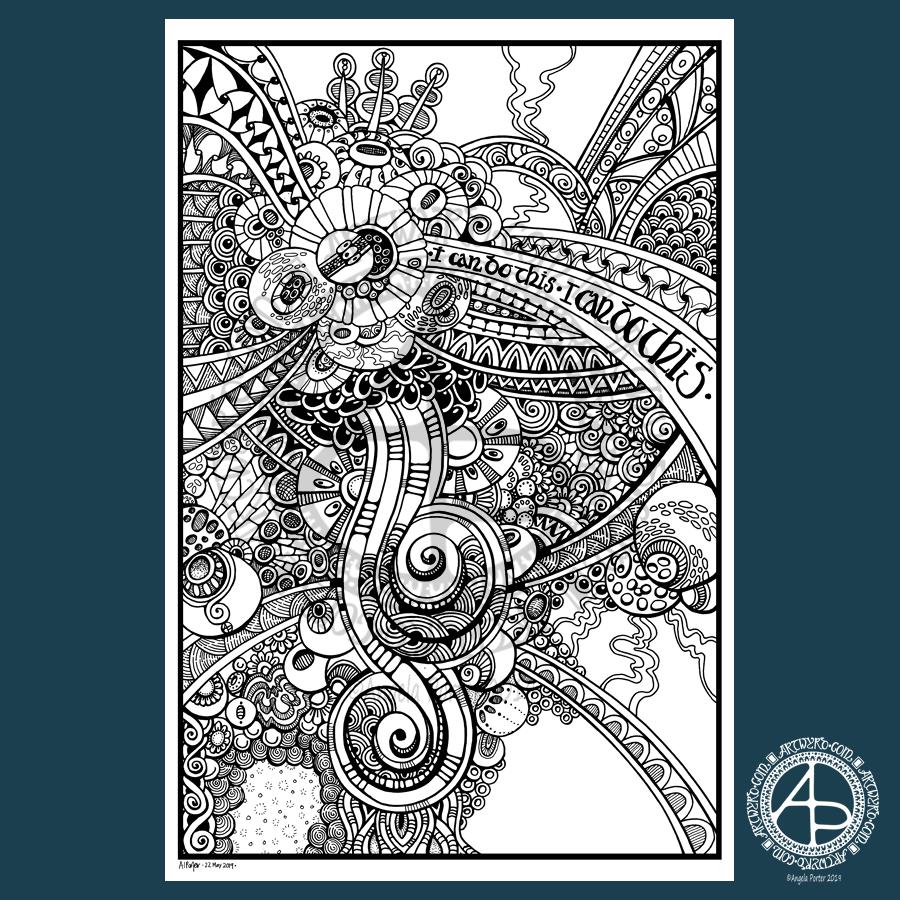
I’ve had a busy couple of days this week. This busy-ness has meant I’ve not been able to do as much drawing as I’d like. So, it’s taken nearly 4 days for me to complete this drawing.
I included, unusually, some hand lettering, and a lot of the patterns have been influenced by images of cells and other things under the microscope. That’s the scientist in me creeping out!
It really needs shading and/or colour to bring it to life. So, I’ll add it to the pile that need the same!
The design is nearly A4 in size (approx. letter size in the US). I drew it with Tombow Fudenosuke, Uniball Unipin and Sakura Pigma Sensei pens on bristol board from Seawhite.
Just a little reminder, but I did an interview for Tony Eames of nfreads.com. You can read it by clicking here.