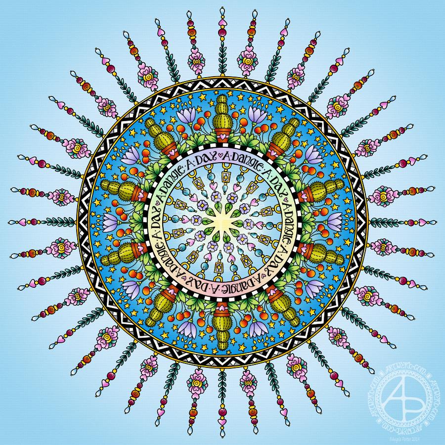
Today has been a funny kind of day. I have a stinking cold and I had an appointment late morning. When I came home this afternoon, I decided I’d do another mandala made up of dangle designs and design elements from my book ‘A Dangle A Day’.
I just let the design flow from the tip of my Microsoft Surface Pen and onto the virtual paper that is my Microsoft Surface Studio screen. As always, Autodesk Sketchbook Pro is the app that lets me draw and colour naturally on the Surface Studio screen.
I incorporated some of my favourite design elements – hearts, stars, sun, moon, flowers, leaves – into the mandala. A big mug of tea and a nicely sweet cake could be most welcome, though I’m not entirely sure the cold would let me enjoy them.
I also included some of those graphic black and white squares that I like so much, as well as a rainbow pattern of little arches. A morning sky and a night sky as backgrounds to the rings in the mandala completes this rather cutely whimsical mandala design.
Although I don’t show how to create dangle-dalas in the book, they are easy enough to do using dangles and design elements from the book.
It goes without saying that I’m all excited about my book being published tomorrow. I’m really hoping some of you will share your dangle designs with me – I really am curious and interested in how you use dangle designs!
A couple of days ago I was musing about using a photograph instead of a monogram in a dangle design. That idea stuck with me and so I set out to make a card.
I had seen somewhere the Photobooth Ephemera by Tim Holtz and I was able to source a set at a sensible price. This pack contains thirty strips of three passport-sized, vintage, copyright free photos. Perfect for me as I have very few photos and none are a small enough size to be used in this way. Also, the photos are printed on fairly sturdy card.
I first started by trimming the photo and then tracing around it on a sheet of thick white printer paper. It was then easy to draw pencil lines to give a border or two around the photo as well as a pencil guide line for a central dangle.
My next job was to draw the flowers at the top of the design. I started with the big central blue flower and worked my way out, adding leaves and swirls as I went. The design here is symmetrical, but not perfectly so. I had to add some butterflies to finish this part of the design off.
My next steps involved drawing the borders. I wanted a black and white chequerboard pattern around the photo. I also added a thinner border around it.
My next step was to create a ribbon for the hand lettered sentiment ‘Hello friend’. I drew a pencil box, added some pencil guidelines for the height of the letters, then wrote the greeting in pencil so I could get the placement of the letters good enough.
My next step was to ink in the letters using a black Sakura Pigma PN pen, which I used for the rest of the drawing. I wasn’t concerned about perfection here. I wanted a kind of cutely whimsical feel to the lettering. For some reason, I always think adding wonky and uneven serifs to the letters helps a little with this. The final job was to draw the ribbon box with the cute ends.
I then needed to decide on the charms I’d use to build the dangle. Hearts are a foregone conclusion. When I think of time I spend with friends, tea and cake are often involved, so adding a coffee/tea cup along with a cupcake (or fairy cake as we used to call them here in the UK) was perfect. I joined the charms with small beads and a circular charm containing another heart.
To colour the dangle design I used copic markers. I did use two shades of pink for the greeting and the cupcake case. Everywhere else I used just one flat colour.
I used a fine brush and some black ink to fill in the square at the centre of the design. Next, I trimmed the paper around the design. I then used a foam ink applicator with Vintage Photo Distress Ink to edge the paper. I always feel that edging paper in this way not only gives a little bit of a vintage feel to it, which is in keeping with the photo, but it also gives a finished edge to the paper.
To mount the photo here I used some adhesive foam squares. These lift the photo above the paper, adding a little bit of dimension to the card. The photo was a little bit smaller than the square I’d drawn and so the black background gave black border around the photo. I then used a golden yellow copic marker to colour some clear adhesive gems and I attached three of them to the photo, just to add a bit more sparkle.
I used Chameleon duotone pencils to add shadow to the design elements. I also used a dip pen and gold FW ink to add some little dots here and there around the design as well as on the photo. Not sure that on the photo was such a great idea though. But once the dots were there, they had to stay there. The gold dots, however, did match the gold gems I’d added to the photo.
The final step was to affix the design to a blank card. I didn’t think to cut my paper to the size of blank cards I had in my stash before I started to work on the dangle design. I found that my design was too long. So, I just took a piece of A4 bristol board, folded it in half along the short edge. I burnished the fold and then attached the dangle design to the paper using strong double sided sticky tape.
To add a bit more dimension to the card, I could’ve used foam squares or a piece of fun foam cut to a little smaller than the paper the design is on. Fun foam would support the paper better, especially as I had a relatively weighty photo adhered to the paper already.
Instead of foam, I could’ve cut a piece of metallic card a little bigger than the design to give a metallic edge to it.
I decided, though, that there was enough dimension on the card with the photo.
I also could have used a Wink of Stella brush pen or a Spectrum Noir sparkle pen to add some shimmer to the design elements, but I decided that the gold dots were enough. However, I may go back and add some to the butterfly wings; butterflies should always shimmer and shine wherever possible as far as I’m concerned!
The only other thing I’d need to do is to make a custom envelope to fit the card.
I enjoyed making the card. My card making skills aren’t brilliant, but I kept it fairly simple, as I did for the dangle design itself and the colouring.
Oh, the patterned background for the photo is one I created from one of my mandala designs using Repper Pro, just in case you were curious! I thought it’s vintage feel would go nicely with the card.
On the whole, I’m quite happy with this card. I had serious doubts that it wouldn’t work out. It has, better than I thought it would. I think I need to make more of these in the future!
Dangles can be turned into mandalas! And ‘dangle-dalas’ satisfy my love of symmetry in an unusual way.
In this one, I have two rings to which dangles are attached. In the centre ring, they point towards the centre of the mandala. On the outer ring, they point out into space.
Then, there’s two central rings. One, I coloured in a pastel rainbow and added ‘A Dangle A Day’ in my weird take on hand-lettered uncials. The lettering isn’t perfect, but then neither am I, and neither were celtic/anglo-saxon/medieval manuscripts.
Ok, the manuscripts are more perfect than my hand lettering, but it’ll do. It’s perfectly imperfect. That is an idea I’m becoming to embrace more and more easily as time goes on, and an idea that I encourage you to adopt in my book ‘A Dangle A Day’.
I used rather graphic black and white geometric designs to separate the three main rings of the design. This contrasts nicely with the brightly colourful design elements.
I felt the need to draw cacti, flowers and some weird seeds today, so that’s what I did. Of course it goes without saying that I’d have to include stars and hearts in my design! There’s some beads in there too, particularly those teardrop shaped ones that remind me so much of medieval jewellery.
Mind you, medieval in character this design is not. It is rather cute and whimsical, which is one of my signature styles – the other is intricacy.
For this design, I hand drew and coloured it digitally using a Microsoft Surface Pen on the screen of my Microsoft Surface Studio. As always, my chosen art software was Autodesk Sketchbook Pro.
Yes, I really do draw on my Surface Studio with the Surface Pen as if I’m drawing with, say, a fountain pen on paper. Colouring I often do as if I’m colouring with traditional media, though sometimes I do use gradient fills. It just depends on the feel I want in the final artwork.
Being able to work in layers means I can do things that would be very difficult or time-consuming working traditionally. It also means that I can play with colour combinations – I love colour, but I don’t always make good choices of colour palettes, see yesterday’s Q monograms for evidence of that!
Of course, there’s so much more to digital art than this, and I’ve not discovered everything yet. But over time my experience is that I discover, workout or learn how to do what I need to do at that time when I’m ready to do that.
While checking out the release date (which I’ve been getting a tad wrong, oops!) I noticed there were some reviews of the book. I’d like to say thank you to all the reviewers who wrote such lovely words about the book! It’s filled me with a bit more confidence and belief in myself as this is my very first art tutorial book.
There’s some hand lettering with the letter A. The letter A has dangles forming the inner part of the mandala. Then, the outer ring has simple and cutely whimsical doodle designs and yet another dangle forming it.
Of course, hearts and stars had to appear; they are my favourite design elements for many of my projects. I also like beads and gems too. Flowers and foliage are also favourite motifs, as are spirals.
I decided the ring of A’s need to be in a rainbow colour scheme and I chose a bright colour scheme for the design elements.
It looks complicated, but if you look at just one A and follow the dangle towards the centre and the design out to the outer rim you’ll see that it really isn’t all that complex.
Of course, drawing mandalas on paper can be time consuming. I usually draw mine digitally.
Autodesk Sketchbook Pro is now free and it’s my drawing software of choice. It has a symmetry tool that is really easy to use. You only draw one segment of the mandala which is then automatically repeated around the circle. I find Autodesk Sketchbook intuitive to use, and it’s easy to use almost straight away. It also has some rather sophisticated features on it and it does all that I need it to do, and more. I use a Microsoft Surface Pen along with Microsoft Surface Studio to draw and colour digitally, and they work wonderfully with Autodesk Sketchbook Pro.
I do colour my designs digitally. However, sometimes I will print out the black line art and then use traditional media (often Chameleon markers) to bring the line art to life with colour.
I do hope you will have a go at creating your own dangle designs. They look complicated, but they really aren’t! If you do have a go, then please share your designs with me on any of my social media homes – facebook, instagram, twitter or here!
Yesterday, I just felt the need to do a bit of an entangled drawing. So, I started with the lower case b and added designs around it.
Not at all sure this works. The letter just looks ‘plonked’ on top of the design rather than part of it.
I do like the entangled stuff though.
Always something to learn – that’s my piece of Wednesday Wisdom. If you don’t try something, you never know if you can either do it or if it’ll work out. This one isn’t one of my better lettering adventures, but, I can reflect on what I like and what I don’t like and then try again another time.
I’m not at all sure I can ‘fix’ this one, but I can try again.
For this one I used Daler Rowney Bristol Board along with 08 Unipin Uniball and 04 Sakura Pigma Sensei pens.
What a bright, sunshiny morning it is here in South Wales in the UK. The first sunshine of the new calendar!
I’ve been up for around 3 hours and have had a fairly artsy time.
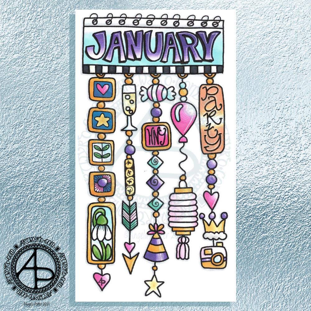
My first job was to print out the lineart for this dangle design, which is one of many in my book ‘A Dangle A Day’ which is due for release on 8 January 2019 – just a week away!
In the book, I take you through how to draw this design, one step at a time. Not only this design, but well over 100 more – designs for all seasons and many, many celebrations and occasions.
This design I drew in Autodesk Sketchbook Pro using a Microsoft Surface Pen and Microsoft Surface Book. For the book, I coloured it digitally. Today, I printed out my black and white lineart and then coloured it using Chameleon Color Tones and Color Tops marker pens. I also added some details to some elements of the design using a 08 Uniball Unipin pen and a white Sakura Gelly Roll Pen.
Yesterday, I said I need to to spelunking through my stash of mixed media and cardmaking supplies to find forgotten supplies I could use to embellish my designs.
This dangle design would make a lovely monthly cover page for a BuJo (bullet journal), planner, diary or journal. It would also make a pretty greetings card or notecard to drop a line to a friend wishing them a wonderful January. Change the words and colours to suit the occasion or recipient! It would also be a lovely, whimsical, cute design for a winter party invitation.
I realised then that my old watermark wouldn’t do for this year. So I hand lettered a new one. I made my symbol, the one I hide away in my artwork, part of the design, along with a little intricate but simple geometric pattern around it. A little touch of the uncials for my blog address, along with a typed copyright statement and it’s done and saved! I may end up changing it a little, or having variations on the theme, as time goes on. But I’m fairly happy with it.
So, I’ve already had a productive morning! It may be a Bank Holiday in the UK, but I really do need to focus on those templates that need colouring for Entangled Forests…and I may venture forth into the peopley world later on today, maybe.
I always have fun when drawing and creating, including this design. In it I’ve combined some of my entangled design elements along with winter/Christmas doodles.
To start, I hand lettered ‘Noel’ using a guide for the shape of the lettering I wanted. Then, I printed it out so I could add the black and white line art using a 0.8 Uniball Unipin pen.
Once that was done, the finished lineart was scanned back into the Microsoft Surface Studio, a transparent background created and some smudges cleaned up.
Finally, I could colour it. Today, I chose to use the color gradient tools, which does make the job of colouring a bit quicker, but it also results in a rather ‘shiny’ look too. Or perhaps that’s simply due to the colours I choose for the gradients.
I had fun adding the glowing stars and sparkles to this one, though I’m not sure I’ve got that right.A nice way to spend the morning and early afternoon as the weather has been wet and very windy at times here.
Wednesday is #wipwednesday around the interwebs and sometimes it manifests itself on this blog.
This is my current work in progress, well just a part of it. I drew the design using various pens on paper and then scanned it in. I’m part way through colouring the image. It’s going to take me many hours to finish it, but that won’t be today. I have appointments this afternoon.
I am coloring it digitally with the usual tools – Microsoft Surface Studio, Microsoft Surface Pen and Autodesk Sketchbook Pro. I’m trying to keep to a winter/yule/christmas kind of colour scheme. That means the purple coloured ‘berries’ may have to be changed, but that’s easy enough to alter when working digitally.
Yesterday I was shattered both from the trip to Worcester the day before and by giving and anti-stigma talk for Time To Change Wales. The talk left me very emotionally exhausted and I was good for nothing the rest of the day.
This morning when I thought of the prompt for yesterday – Chop – I just had this vision of a cute Viking kitten with a big axe (the chop!). It seemed quite natural I should turn that little image into a bit of a dangle design. I tried to draw a round shield beneath the Viking kittie, not sure that’s worked out at all. I like the way the ears poking out of the helmet have ended up looking like horns with some protection around the ears!
In keeping with the theme, I did a prickly looking-cat along with a bunch of cacti. Again another dangle design.
I drew these, with some rough pencil sketchlines, on Clairefaintaine Graf it dotgrid paper using Uniball Unipin pens.
I’ve not cleaned the images up or removed the dot grid. I’ve just left them black and white line art.
Of course, these are quite simple dangle designs in terms of the dangles used. If you’d like to learn more about dangle designs and get loads of ideas on how to draw your own and designs and dangles and charms you can use, you’ll find my book ‘A Dangle A Day’ most helpful. It’s available for preorder and is due out early in 2019.
I know that colour would bring them to life; maybe I’ll do that later on.
It’s not often I get ideas for funny cats to draw. Or funny critters and so on – ones that relate to a particular theme like these. They’re actually fun to draw, give me a smile. and perhaps it’s something I can work on developing as time goes on.
I think everyone knows I love cats and I still miss my companion of over 16 years – the white purrfurrball called Cuffs. I’m not ready to let another pusscat into my life for many reasons, but I do donate the money I would’ve spent on Cuffs’ food, kitty-litter, medication and regular vets bills to the Cats Protection League so that I help other kitties to be looked after until they find their forever homes. It’s the best I can do at this time.
Dear goodness, I’m crying about that now. I’m still emotionally tired out after yesterday and so today is likely to be a day of some self-care.
Bullet Journals
Earlier this week, I had Ryder Carroll’s book ‘The Bullet Journal Method’ – delivered to my Kindle on it’s release day. I’ve spent some time reading it and have found it a really interesting read so far, not just about bullet journalling.
As I’d started a new bullet journal at the weekend, I thought I’d try out some things, particularly the daily log and the system of symbols used for notes, events and tasks. It all finally makes sense to me, well the daily logs do and seem to be something that will be useful.
I’ve also worked out that dividing pages for the daily logs up into pretty sections and so on isn’t going to work well for me if I use a bullet journal as it’s meant to be used by me. The sections limit the space available for daily notes etc – Some days I need to jot down a lot, other days not so much.
I’m certainly still going to pretty up the Monthly logs and the future log for sure, as well as any collections I create. But the daily logs are going to be far more basic, though I suspect colour will become involved at some point!
I finally get the idea of ‘threading’ after seeing examples in the book.
I certainly can recommend this book (it’s available in other formats) – not just for people wanting to learn about bullet journalling for the first time, but for more seasoned/experience bullet journallers.
I can also see my viking kittie being redrawn in my bullet journal as a cute page I can look at to make me smile. The same for any other cute kitties I have – and I do have a few drawn already! Mind you, they’d be quite nice printed out, coloured and used as markers/inserts in the BuJo too. But I’d like them as greetings cards and notes cards.
Ooooh… I need to make some notes about these ideas in my BuJo!