Art Quote

Artwork (c) Angela Porter | Artwyrd.com

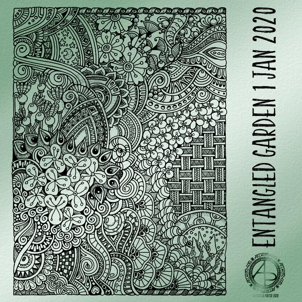
This is a drawing I did late last night as I settled down to sleep. It feels quite disjointed in places, which was how my mind felt in it’s state of tiredness. Even though I was tired, I wasn’t ready to sleep.

I thought I’d work with it, adding a background and colour to it. I wonder if adding colour will resolve the disjointed areas as it breathes life into the design.

I’ve only taken a short time this morning to ad some colour. I do have to do other things today. The colour certainly helps to lift it from the background, as well as adding dimension to the design.

I’ve chosen fairly dusky, dusty, pastel colours which seem to glow against the darker background. The pinks remind me of faded Victorian velvets.

I drew the design traditionally, using a Tombow Fudenosuke pen and ClaireFontaine dot grid paper. The flexible nib of the fudenosuke pen results in lines of varying thicknesses, and a drawing that reminds me of linocuts or woodcuts.

After scanning the drawing, I removed the dot grids and cleaned up the drawing digitally before adding a background.

I felt this needed quote to go with it, and this one spoke to me today. For the typography, I used Affinity Publisher. The rest of the digital work is being done in Autodesk Sketchbook Pro, using a Surface Pen and Surface Studio from Microsoft.

My art is always ‘pretty’, it’s how I express myself artistically. Some of my inspiration for patterns and motifs comes from things that other smay not consider ‘pretty’, such as rust, run down old industrial machines, ruined buildings.

My art does, I think, speak of who I am. It shows what I’m interested in, what patterns, motifs, shapes, textures, colours, and so on that I find aesthetically pleasing. It also shows, to those who look and think a bit deeper, what things interest me, from prehistoric art to Romanesque architecture to La Tene and Celtic art to Illuminated Manuscripts to flora, foliage, fungi, and lichen to fossils and shells to nature in general, and more besides.

I work very intuitively. It’s when I think too hard about what I want to do that things go to wrack and ruin.

By letting my intuition flow, then drawings have a way of coming together in a way that expresses how I’m feeling and what is fascinating me or soothing me at that time.

This drawing is an example of how my feelings come out. It’s only now I can recognise how disjointed I was feeling within myself last night, how I was out of sorts. I think that’s why the art jars with me today as that feeling has now passed by, like clouds in the wind. It’s a drawing that shows the weather my emotions were experiencing yesterday, weather that just happened and has no real source for it.

Hello February!

©Angela Porter | Artwyrd.com

A new month and a new coloring template, exclusive to members of the Angela Porter’s Coloring Book Fans facebook group. If you’d like to download and print this template for your personal use, then pop along to the group.

The days are slowly lengthening here in the Northern Hemisphere. The first signs of nature waking up can be seen in the form of snowdrops and crocuses. It can also be heard in the raucous and beautiful birdsong.

To the template. I drew this on Rhodia dot grid paper using a Sakura Pigma PN pen. For my partially coloured version, I added a coloured background and colour digitally.

Mandala – WIP

Mandala WIP ©Angela Porter | Artwyrd.com

This is the centre ring of a mandala I’m working on. I have no idea how the rest of it will turn out, but I’m quite happy with this first part, though I may add some bits and bobs to it, or maybe not.

I really do enjoy creating mandalas. The symmetry and rhythm of the designs that result appeal to heart and soul.

I love mandalas made out of geometric patterns, but I also like to create ones made from organic motifs and lines too. This mandala is likely to be one of the latter, though I suspect I’ll be trying out some more geometric patterns here and there through the design. Whether they remain in the finished piece is a different matter!

I’m working digitally using my preferred trifecta of Autodesk Sketchbook Pro, Microsoft Surface Pen and Microsoft Surface Studio.

As always, it’s a soothing process to create art. And I need some soothing today. A people-y evening last night has left me with an ‘introvert hangover’, and some quiet, self-care time is needed. Along with some painkillers to deal with the headache!

Entangled Frame – WIP

Entangled Frame WIP ©Angela Porter | Artwyrd.com

I wanted a circular frame in which to put quotes. So, I started by drawing some pencil guidelines for the circle and the outer borders on some dot grid paper.

I used 08 and 02 Uniball Unipin pens to draw the circle of flowers and foliage. Then, to start filling the space around the flowers with entangled designs.

It’s very much a work in progress. Part of me thinks I could’ve left an empty border around the circular flower and foliage arrangement to separate it from the background. The other part of me likes it as it is.

I want to try to get a balance of less detailed areas with the more densely detailed sections so that there’s space for the eye to rest.

I also suspect I’ll be adding colour or, at the very least, shadow and highlights to the design to bring it to life.

Art is love.

I love to draw and create. Creating art is also very much part of my self-care, self-compassion routine. This drawing was very much done for self-care after a couple of very ‘people-y’ days left me emotionally and mentally drained.

So, being creative is both a way of me expressing my love of creating art, sharing that love with people, and also showing myself self-compassion and self-care.

I always hope my art will warm people’s hearts, make them smile, bring a little bit of beauty into their lives and the world.

Entangled Garden 6 Jan 20

Entangled Garden 6 Jan 20 ©Angela Porter | Artwyrd.com

Another entangled garden drawing today. I used Uniball Unipin pens and ClaireFontaine dot grid paper to create the drawing. I’ve removed the dot grid and added a coloured background texture as well as the texts and watermarks using Autodesk Sketchbook Pro.

This was, as is usual, a relaxing, calming, soothing and intuitive process for me. I also made use of some of the flying seeds from the first #inktober52 prompt.

I started to add some colour, using a messy chalk brush in Autodesk Sketchbook Pro.

Entangled Garden drawing

©Angela Porter | Artwyrd.com

Today, I have another entangled drawing for you to enjoy. I worked on it over the past couple of days. I think it’s taken me around six or seven hours to complete.

Because of all the floral and botanical motifs I’ve called it an Entangled Garden. A garden that has grown from my intuition and imagination.

I’m enjoying drawing these kind of illustrations at the moment. I really do have a fondness for botanical motifs, but also for arches and patterns inspired by Romanesque and Gothic architecture. There’s also some influence from Zentangle patterns too.

I’ve not added any shading to increase depth and dimension. There are places in the design that could benefit from a hint of shadow. However, I’m happy with it as it is.

As a drawing, it is a bit too fussy with intricate details to work as a coloring page as far as traditional media are concerned. However, I do know some colourists who would love the challenge of colouring a design like this!

Having said that, this kind of design, with less details, would be perfect for my next coloring book which I do need to start work on soon. I need the cover done for the publishers by the end of this month. So, I can take inspiration from the drawings I’ve been doing recently, though I do have some other ideas rattling around my brainbox too.

I used Uniball Unipin pens, along with ClaireFontaine dot grid paper. The size of the drawing is approx. 7.5″ x 10″.

I added the background colour and texture digitally, after removing the dots from the dot grid paper.

Entangled flora

©Angela Porter | Artwyrd.com

One of the nice things about being between contracts is being able to indulge myself in art. It’s also a chance for me to do ‘comfort art’, art that is in a familiar style that I don’t often do.

This is an example of ‘comfort art’. Art that is soothing to do, is intuitive and surprising in how it turns out. I start with pen and paper (dot grid in this case), and just start with a single motif. I then let the design grow from that point, organically and intuitively.

There are always sticking points where I want to give up as it doesn’t look right, or I’m not happy with what I’ve just drawn. However, I’ve learned to persevere past these points and the end design is usually one I’m happy enough with.

There were many sticking points in this one, some of which I thought were going to be shatter points.

Although I’ve deemed this illustration ‘done’, as I reflect on it now, I can see places where some added line texture would help the design be less homogeneous in places and would add some contrast.

Also, some shadows would help add dimension to the illustration. Having said that, colour would really bring the drawing to life too.

For now, though, this design is finished. Whether I work some more on it remains to be seen.

I used Uniball Unipin pens to draw this design, along with ClaireFontaine Sketch dotgrid paper. The only things I did digitally were to scan the design in, remove the dots of the dot grid, and add the background colour and texture and watermarks.

Season’s Greetings Coloring Template

Season’s Greetings (c) Angela Porter | Artwyrd.com

I’ve created a third December colouring template for the members of Angela Porter’s Coloring Book Fans facebook group, and here’s my partly coloured version.

If you’d like to download and print the template to colour, then all you need to do is pop over to the group and join! It’s free!

I’m flagging at the moment. I didn’t sleep much last night; I’ve picked up some kind of stomach bug and so was back and forth the bathroom. My tummy is still not well today. I was, however, determined to get a seasonal greeting out to one and all.

Drawn with Faber Castell Pitt Artist pens. Typography and colouring done digitally.

Entangled 3 Dec 2019

Entangled 3 Dec 19 ©Angela Porter | Artwyrd.com

Two photos of the same drawing today.

I started by colouring a 6″ x 6″ piece of Strathmore Bristol paper with various shades of green Distress Ink (Peeled Paint, Shabby Shutters, Crushed Olive, Bundled Sage and Iced Spruce) and edged it with some Aged Mahogany.

Then, I drew the design using a metallic bronze Uniball Signo gel pen. Finally,I added some shading and depth with an olive green Chameleon Fineliner pen.

My photography skills aren’t good, which is why there’s two photos. The top one is a bit truer to and you can see the design more clearly on it. The bottom one shows the shiny bronze ink I used.

I think you’ll get the idea of what I’ve created.

It’s been a busy day here in the Angela studio/office. I’ve been focused on social media stuff for something I’m involved with at the moment. I had to get things done this morning and afternoon, so it wasn’t until quite late in the day I could turn my attention to art.

By then, I just wanted to draw something that was comforting, familiar, soothing. Which is why I ended up with another entangled design.

It did it’s job in soothing and calming me somewhat. Now, I can settle down, after I finish off a couple of things. I think time away from technology is required this evening.