New Distress Oxide Colours – I finally have them!

dav

I finally got my happy hands on the new Distress Oxide colours today!  I had enough time between appointments to have a quick play, so four sheets of mixed media paper, some circle and tag dies and my Sizzix Big Shot as well as 1″ and 3/4″ square paper punches this is what I’ve ended up with.

The colours are lovely, different, kind of, to the original Distress Inks, but lovely.

So, I now have a lot of bits to doodle and draw on!

Artwyrd at Etsy

Last night I bit the marker pen and uploaded two sets of small greetings cards to my Etsy shop, Artwyrd.

Each set has ten cards featuring a coloured flower/mandala design stored in a small, custom made box along with matching envelopes.

The flower/mandala designs I drew myself in Autodesk Sketchbook Pro on my Microsoft Surface book.  I printed out multiple copies of the designs and then used my Chameleon Markers and Copic Markers to colour them.  Distress Ink was used to add colour around the designs.

The next step was to create colour mats for the designs; I used my marker pens to colour some Centaura Pearl card.

Before mounting them on the 3″ x 3″ (7.5cm x 7.5cm) card blanks, I embellished the designs with dots of metallic and pearlescent acrylic paint, as well as adding coloured gems.

Of course the cards sparkle!

The boxes are made from cardstock with the lids decorated with designer series paper; the colour ways chosen are complementary to the colours of the cards. I also used Distress Inks to distress the edges and corners of the boxes.   I’ve yet to embellish the boxes.

These are my fifth and sixth attempts at making the boxes.  I had to purchasing a new paper cutter that’s more accurate than the one I had been using.  I had used a template for a box that would take ten 3″ x 3″ cards, but wasn’t big enough for the envelopes.  So, I also had to work out and adjust the measurements needed for the base and lid so that the envelopes would fit in the box!  Frustrating, especially as maths isn’t my strong point …but I got there in the end.

I do have a couple of jobs to do to the cards/boxes; the boxes need some embellishment, and I need to add makers labels to them too.

The boxes will be nice for other things once the cards are used up – the lids are a snug fit.

All of the designs I have stored and may, in the fullness of time, put them together as a pack of digi-stamps so people can use them to create their own cards!

Mixed media index cards – 5 June 2017; my own library of digital drawings

AngelaPorter_5June2017_MixedMediaIndexCard1

Mixed media index cards

Two index cards worked on over the last day or two.  The focal points are shells I drew, first on paper, then the image was worked on on my Surface book with Autodesk Sketchbook Pro and my Surface Pen,

I had to use scissors to cut out the shells (not my favourite task as I’m not good with scissors) after I’d coloured them using the Chameleon Color Tones and Color Tops marker pens.  I’m really pleased with the colouring.

Lots of different techniques/media were used on the index cards – stamping, stenciling, inktense pencils, distress inks and distress oxide inks, pebeo dyna paints, perfect pearls sprays, gesso, clear holographic embossing powder from WOW!

I’m happy with them, though I’m not sure they’re quite finished, especially the little one.

Digital drawing library

I’m beginning to build up a library of my own digital drawings – fungi, flowers, shells at the moment, oh and one angler fish skeleton that I’ve not used yet (but that’s an idea for later or tomorrow maybe).

I have to decide if I put these images together as packs of ‘digi-stamps’ for sale…I’m really pleased with my shells here, but the fungi have worked out fine too.  With my limited scissor skills, I’m keeping it in mind I need to keep the outlines relatively simple, but the inside of the design can be rather detailed, which is fun.

Mixed media index cards – 3 June 2016

AngelaPorter_3June2017_MixedMediaIndexCard1

Two more index card done!

I drew the fungi then coloured them with the Chameleon Color Tones and Color Tops pens.  Cogs have appeared in the background once again – gotta have a lil bit of steampunkishness!

I’ve used 3D Crystal Lacquer on the fungi caps and on the stars in the background.

I’m liking the slightly bigger format of the index cards compared to ATCs.

Mixed media index cards

AngelaPorter_1June2017_MixedMediaIndexCard3

I started these 5″x 6″ cards yesterday and finished them (I think) this morning.

The focal images I drew myself on watercolour card.  I used Caran D’Ache Supracolour watercolour pencils and a damp brush to colour them.  I was quite happy with the colouring; I do find pencils a lot easier to use than traditional watercolours.

Nex, I cut three of them out around their edges and used a black marker to colour the white edges (and disguise my poor cutting out skills).  I had to use a craft knife in a couple of places.  The other two I cut out as small panels.

The drawings are a little bare of detail, mabye, but I can go back and add detail once I’ve decided what I’d like to do.

I’m not all that happy about the torn paper behind the focal images; you try things out and learn, maybe.  The torn paper is Gelli printed tracing paper made using PaperArtsy Fresco paints.  I then ran them through my Sizzix Big Shot in various embossing folders, and on some the embossed images have had some metallic waxes gently brushed over them. I also added some Inktense to the papers to darken the edges and add shadows.

What I am really happy with are the index cards themselves.

I started by covering them with gesso.  Then, I used some foliage stamps from IndigoBlu with grey Archival Ink by Ranger to add patterns.  I really liked this, as the patterns were softer and already ‘ghostly’ in the background, a much better choice than black Archival.

My next step was to add colour using ink blending sponges and Distress Oxide inks, followed by a spray of Gold perfect pearls mixed with water.

This is where there was an unexpected effect – the wet Distress Oxides were repelled from the Archival ink.  I loved the result, as well as the way the colours mixed as they pooled around the stamped patterns.

Here’s a close up where you can see how the Archival Ink has repelled the Distress Oxide inks:

AngelaPorter_1June2017_MixedMediaIndexCard1

Then, I used Versamark Ink to stamp more foliage on some of the cards, and mini-mandala type patterns on others.  I then sprinked WOW Embossing powder (clear holographic) over the ink then melted it with a heat tool.  This added an extra layer of interest – a subtle layer as it can only be seen from certain angles.

I framed the cards using black Archival ink and a foam blending tool to give a distressed looking edge.

Then, it was just assembly of the focal points and so on, before sticking the index cards to some really thick card to get them nice and flat; the cards are so thin that they curl a lot when working on them, even with the layer of gesso to seal the card in.  Cosmic Shimmer’s Specialist Acrylic Glue worked beautifully for this.

I had intended to make more ACEO cards, but I drew the focal images a tad too big for that format, so thought I’d try out an index card instead.  I quite enjoyed working on the slightly larger scale.

Today’s Mandala

DotMandala_9May2017_AngelaPorter

I’ve spent much of the day working on this, and it’s been a pleasure to create as it has combined many of my favourite techniques.

First, I coloured the background with Distress Inks, starting at the centre with a pale pink, follwed by a pale blue, a sea green and finally a blue with a hint of green around the edge.

A light spray of water and a dry and the sheet was ready to have the black line design drawn on it, once I’d put a pencil grid down.

Next, the colours in the various sections were intensified using Zig Clean Colour Real Brush Markers from Kuretake, along with a brush and water to fade the colours out.

Finally, all the dots were addded using pearlescent/iridescent watercolour paints.

I’ve smudged some dots, others insisted in running into each other, but I’m fairly pleased with the outcome.  As I’ve already said, I really enjoyed doing this one.

More dottiness – in the form of mandalas!

DotMandala01_8May2017_AngelaPorter

Over the last couple or three days I’ve been playing with mandalas and dots, just purely for fun!

To create the mandala above, I used shimmery, iridescent watercolour paints on black card.  The photo really doesn’t capture the shimmery loveliness of the mandala.  The mandala measures approx. 8″ x 8″.

DotMandala05_8May2017_AngelaPorter

This next mandala, again 8″ x 8″,  was made using acrylic paints with green card as the substrate.  Once I thought the paints were dry, I tried adding some distress inks so that there were shades of green in the background.  However, not all of the dots were completely dry and some smeared.  Also, the ink coloured the white dots.  So, the lesson is to add the shading before doing the dotting!

DotMandala02_8May2017_AngelaPorter

These four small mandalas (approx. 4″x4″) I added shading using a damp paintbrush and Distress ink.  I thought I’d try drawing the design in ink in three of them then adding dots in white and copper to add more/different patterns as well a some shininess.

Oh, the mandala with the teal and red-brown dots had distress ink sponged in the centre. The white acrylic paint wasn’t stained by the ink.  These dots had a lot longer to dry than the previous mandala.

DotMandala03_8May2017_AngelaPorter

For this mandala (approx 8″ x 8″) I first applied some distress inks to white watercolour paper  Then I drew the mandala in black ink.  Finally, I added dots with gold acrylic paint.  You can still see the pencil construction lines as I want to give the gold paint plenty of time to dry before trying to erase the lines.

DotMandala04_8May2017_AngelaPorter

This final mandala, approx 6″ x 6″, was drawn using black ink on pink card.  Once the drawing was complete, distress inks were applied to give different shades of pink/purple.  Then dot patterns were applied using white acrylic paint and iridescent watercolour paints.

Never give up and Foamiran flowers

AngelaPorter28April2017_01

Back to playing with mixed media today, and this is the result…

It’s around 8″ x 6″ in size and 300lb Smooth watercolour paper by Daler-Rowney is the substrate.

First, I coloured the paper using Distress Oxide inks, with a light spray of gold mica mixture.

Once that had dried, I added the diamond motif and text to the background using texture paste through stencils.  Once the paste had dried, I used a rich gold System 3 acrylic paint from Daler-Rowney to paint the texture paste.

Yesterday, I had used embossing folders with my Big Shot from Sizzix to emboss coloured card which I then added metallic and iridescent colours to.  The dark red-brown layer of cogs is part of one of these papers. Behind it, there’s a piece of patterned paper.  Both have had their edges roughed up (distressed) and then inked using black Archival Ink from Ranger.

I next chose an ACEO or ATC card from my stash to act as a focal point.  I also firtled through my stash of steampunk diecuts to find some cogs and a clock dial to add to the background.

The diecuts were all made from kraft card and I used Distress inks to add the base colours of a rich blue, an intense blue-green and a red-brown before dry brushing metallic and iridescent acrylic paints from Liquitex over them to give the appearance of old metal.

Finally, I assembled everything together in an arrangement that pleased me.  I used a Payne’s Grey Inktense pencil and a water brush to add shadows, and finally a few sparkly gems (I can’t resist the use of sparkle!).

I thought I’d finished, however, the postman brought me a box that contained some Foamiran sheets I’d ordered a couple of days ago, and I just had to have a go at making some flowers.  You can see one of the flowers on the mixed media piece.

The flowers are quite easy to make.  I die cut flower shapes from the Foamiran.  I then used a couple of Faber-Castell Gelatos and a damp baby wipe to apply colour the the front and back of the flowers.

Next, I used my heat tool to warm the foam so it curled up a little and then shaped the petals before using hot glue to stick the layers together to make fluffy flowers.  Finally, I used an alcohol marker to colour some clear gems in so they complemented the flowers and attached to their centres.

I think I’m going to be making more of the flowers, they are easy to make, if a little fiddly given the current manicure I’m sporting.  Next time my nails are done, I’ll make sure they are kept fairly short!

Artistic journeys…

Mixed media

IMG_0650My previous blog post about a mixed media work in progress is still on hold, although I have added a crackle paint to it in places, which has added some texture to it.  I’m pleased with the result, but I still am not sure what else to do to complete it.

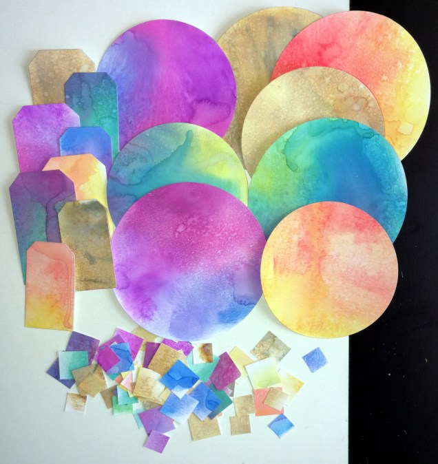
I have completed a very textured background for some mixed media work; you can see it above.  What I’m going to do with it I’m not quite sure, but I’m sure it will all come together at the right time.

Abstract Line Art

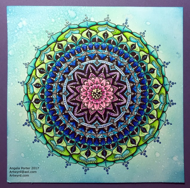
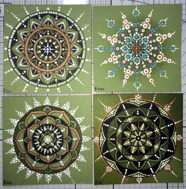
I’ve been drawing more ‘Doodle Worlds’ images from time to time and now need to gather them together to see if there’s enough for another ‘book’ for the Colorist app.

IMG_0646

IMG_0648

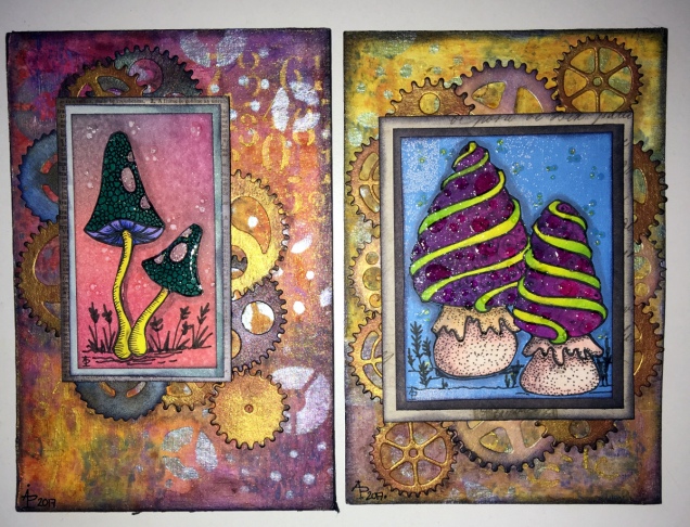
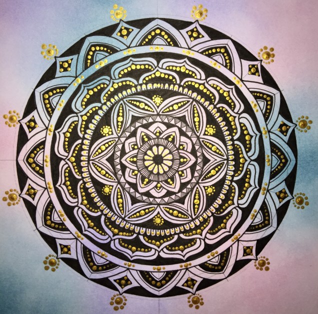
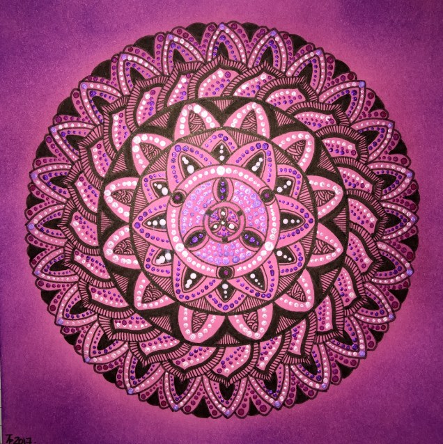
I also turned my attention to colour and pattern and the two images above are the results of around three to four days work.

I used A4 300g/m² smooth watercolour paper and applied distress inks to create the coloured areas.  I wanted to create the illusion of shadow and light in these areas.  Next, I used various drawing pens to add the patterns.  On the green piece, I’ve added copper and gold coloured metallic highlights.  The pink one isn’t quite finished yet.

Sketchbooks and my artistic journey

IMG_0649

As the days are becoming lighter and warmer, my thoughts are going to getting out to visit places and to do some sketching/drawing (intense anxiety and intense self-consciousness allowing).

With this in mind, I’ve prepared pages in an A5 and an A4 sketchbook.  I’ve used Distress and Distress Oxide Inks.

The image above shows the first page in my A4 sketchbook, a page full of daisies, worked using different media, trying out different styles and degrees of detail.

I like to work on a coloured background, I don’t know why, I just do.  I think it may be that I like to add shadows and highlights to create and image from the colour on the page.

I’ve not done much in the way of sketchbook work for a long while, but the need to revisit and to continue to explore different ways of expressing myself artistically has surfaced.  I think this is a much over-due response to the surfeit of work on colouring books in the past three or so years, as well as the struggle I’ve had with my mental health.

My energy, when mentally able, has been focused on completing the work I was contracted for with various publishers.  I enjoyed the work, the subject matter pushed my boundaries in the subjects I tackled.  I’m so grateful for that work as well as it allowed me to make changes in my working life that helps me to take care of my mental health.  It was/is also an activity that helps me manage my mood.  I lose myself in drawing/creating, finding myself ‘in the flow’ where my mind stills, or, rather, where I no longer pay attention to the inner critic.

However, the colouring book work was the focus of my artistic energies for much of that time, and I had little energy left to explore other areas of artistic expression.  I didn’t mind that at all, as I’ve said, I enjoyed all the work I did, and I will continue to create templates.  However, that is not all I want to do or to create.

I now have time to revisit ways of artistic expression I put to one side in my focus on the work for publishers, and I have the chance to see how my skills and expression have developed/changed.  I also get the chance to explore and discover new ways of expressing myself, using new media.

In this way I can continue to discover, practice and refine my artistic voice and vocabulary.  I still feel like a toddler in the world of art.  I wonder if I’ll ever progress from that state.

The biggest obstacle to me doing this is the lack of belief and confidence I have in myself and my artistic abilities.  I also have a problem in deciding on what to draw.  Then, there’s also the issue of finding themes/styles/media to explore that will challenge me just enough that I feel I can make a good attempt at them and gain confidence in them, but not so much that it overwhelms me and I fail before even trying.

The most important thing for me, however, is to enjoy my artistic journey, no matter where it leads me.  The pleasure and peace I get from creating will be something that will serve me extremely well throughout the rest of my days on this planet.


Poppy capsules mixed media

IMG_0622

I’ve decided to do my best to be brave and confident and use my own drawings and designs in my mixed media work.  The poppy seed heads and the ‘zentangle’ patterns are drawn by myself.

The inchie with the quote on – creative journey – is milky as the Glossy Accents on the tile hasn’t dried yet, but it will dry clear and glossy.

Here’s a list of the media I used:

  • Papers – 300gsm watercolour paper, cream paper for pencil and pastel work, marker paper, kraft card, mixed media paper
  • Paints – Paperartsy Fresco paints, Liquitex copper paint, Cosmic Shimmer copper iridescent watercolour paint
  • Pens and pencils – Faber-Castell Pitt artist pens, Derwent Inktense
  • Leafy and flower stencils
  • Sizzix Big Shot and dies for cutting some of the gears and an embossing folder to add texture to one of the background papers
  • Metal gears and keys
  • Glossy Accents
  • Cosmic Shimmer acrylic glue
  • Archival Ink in black and sepia
  • Distress inks
  • Spray bottles – one filled with plain water, the other filled with water and copper Perfect Pearl
  • Gems
  • Wow Holographic Sparkle embossing powder and a Versamark pen
  • Cut and dry foam
  • Various brushes