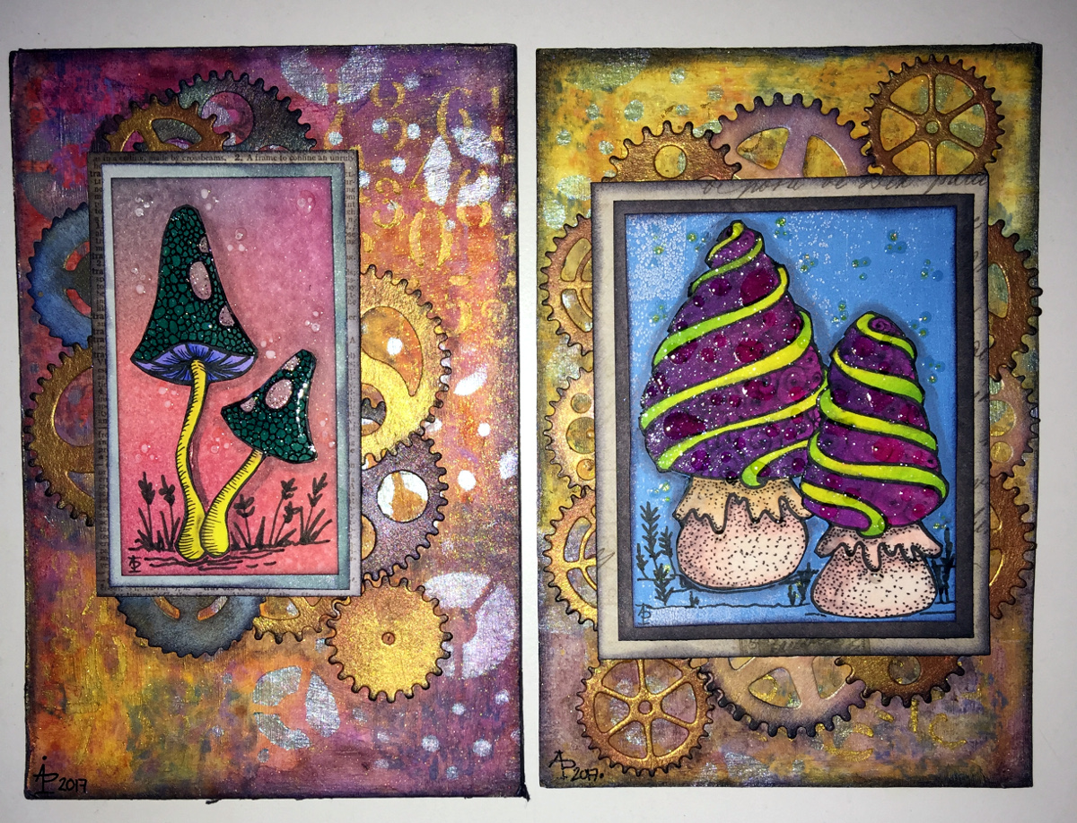
This was a lot of fun to do earlier today. Before I filmed my process and thoughts, I made some collage papers using Paper Artsy Fresco paints, which are chalky, soft acrylic paints. I remembered I had some in my stash after watching a video about collaging by Art With Em. I suspect I have other acrylic paints somewhere, but the Paper Artsy paints were the ones I liked – they dry quickly, the opaque ones act like a coloured gesso, and they have nice flat, ‘soft’ surfaces which you can write/draw on.
Next, I made some A6 (approx 4″ x 6″) background panels. I added colour with Distress Inks and used a stencil to add some background patterns.
Creating a collage ‘cluster’ was my next step. So, as well as using a torn piece of one of the Paper Artsy papers, I used some digital papers and a quote I’d printed.
The quote didn’t stand out on the damask patterned paper, so I used some Inca Gold Alchemy Was from Imagination crafts to add a sheer layer of gold. When the light hits the gold just right, that’s what you see. Otherwise, the pattern is partly hidden by a dull, gold-brown. I quite like the ghostly look of the print on the paper this way.
As I put this three-layer ‘cluster’ onto the background, I didn’t like the blue-green against the yellow-green of the background panel. So, I used the Inca Gold Alchemy Wax to colour the area behind the panel. And that felt so much better!
Next, I drew some Zentangle style patterns above and below this central collage cluster. To do this, I used olive green and rusty brown Arteza Inkonic fineliners. With the leaves on the Fleavy pattern, I used a damp brush to kind of fill them in with some of the colour. Then, I wanted to bleach out parts of the panels with water splatters. A paper towel picked up the water with some of the ink – pen and Distress- and I ended up with a ghostly kind of pattern. I did the same with the rusty patterns, one of which is the Zentangle pattern Tripoli.
I wanted to add some Peeled Paint and Shabby Shutters Distress Ink to replace some that had been lifted off. Then, to finish it off, I splattered little drops of gold watercolour .
This is so different for me, yet I like it. I know that I’m in my early days exploring and experimenting with this kind of technique. One thing I really do want to do is practice, practice, practice and develop a hand lettering style that will work well with this.


