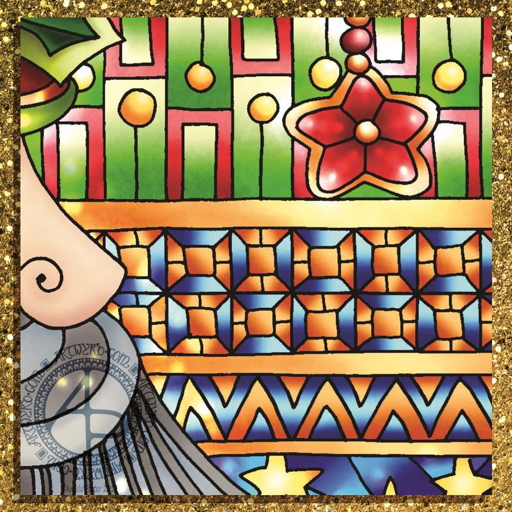
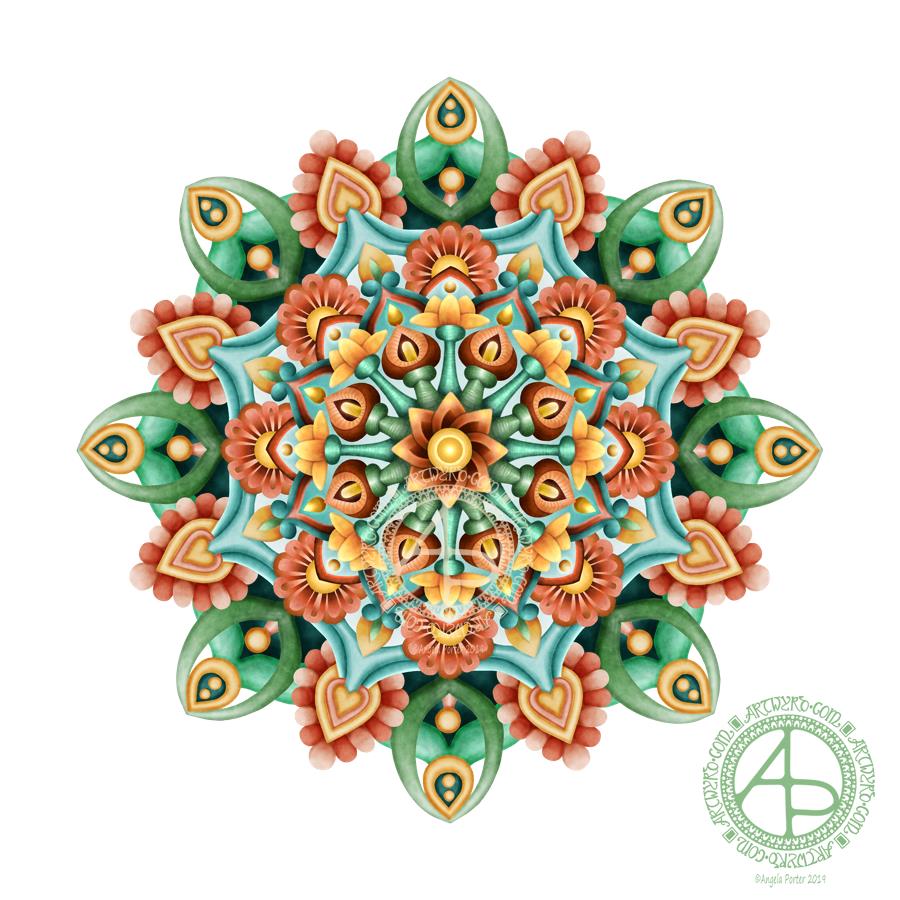
Today, I’ve settled down to colour the templates for my latest book for the Creative Haven series published by Dover Publications Inc. And here’s a sneaky peeky teaser of the image I’ve just finished colouring not many minutes ago.
If you do a search on Amazon you’ll find out the theme of the book, but can you guess what the theme of this template is?
I’m feeling better emotionally, but I’m still very, very tired today. Processing emotional trauma through EMDR is surprisingly exhausting. After a lot of emotional distress yesterday, I’m feeling content at the moment.
Coloring and art-ing is usually soothing for me, and I have to say I enjoyed colouring this template in. I am going to have a bit of a break before I tackle the next one.
Drawn and coloured digitally using Autodesk Sketchbook Pro with a Microsoft Surface Pen with a Surface Studio.
Today’s been a tough day emotionally for me. Monday is, usually, EMDR day, and today’s was really emotionally upsetting. The memory I’m using led to quite a few insights that caused some distress, which was at a 7 out of 10 at the start and went up to 10 at the end of the session. This happens. I have a lot to think about and process before my next session in a fortnight.
I’m absolutely exhausted. I did have a sleep when I got home, but I’m still exhausted.
I’ve tried to sit and draw and I’m not able to work in a manner that is satisfactory to me. So, I thought I’d set up a colour palette in Autodesk Sketchbook Pro and colour the drawing from yesterday. Well, more like start to colour it.
Oddly, I’ve gone for rather muted, vintage colours in this one. Perhaps a reflection of how I feel. Or, maybe it goes with the lino cut ‘feel’ of this particular drawing with the strong, black lines.
Tomorrow, I hopefully start to colour in some of the templates for my next coloring book. My editor and her team at Dover Publications Inc have chosen their favourites. I do intend to give you some sneak peeks as the coloring progresses.
My tools for drawing this image were a Tombow Fudenosuke pen and a pencil. To colour it I’m using Autodesk Sketchbook Pro and Microsoft’s Surface Pen and Surface Studio.
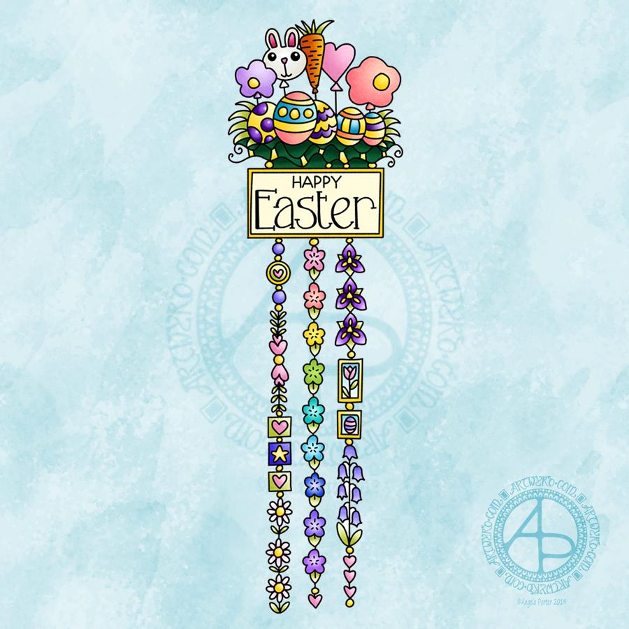
This cutely whimsical dangle design is from my tutorial book ‘A Dangle A Day’, which has the step-by-step instructions for drawing this design. They really are simple to draw, and the hand lettering is based on your own writing style too.
For this design, I chose spring-time colours, more pastel than bright. Of course Easter eggs and a bunny balloon had to feature, along with all the lovely spring flowers and a sprinkling of hearts. I even snuck a star in, hearts and stars being some of my favourite motifs to include.
This design would make a really cute greetings card or notecard. The dangles can easily be drawn shorter. It would also make a lovely bookmark. As a BuJo page, planner page or an element on a scrapbook page it would be lovely.
Using Nuvo drops or Ranger’s Stickles or similar to make dots where the beads are as well as a sprinkling of them around the top of the design would add some lovely dimension and sparkle for sure.
I do hope you give drawing dangle designs a go. They are so much fun and a lot easier to do than you think they are. They can also be used in many, many ways, especially when it comes to sharing love with others at different times and events throughout the years of our lives.
About the drawing…
When it came to designing the dangle designs and monograms for A Dangle A Day, I started off by sketching the idea out on dot grid paper using either a pencil or a pen. I could then adjust the lines and draw guidelines in to help me with the design quite easily.
When I was happy with the sketch, I scanned it in and then re-drew it in a digital form. For drawing digitally I use a Microsoft surface pen directly on the screen of a Microsoft surface book or surface studio. This is like drawing with pen or pencil on paper, or even painting or colouring.
So, although my designs were created in a digital environment, they were still very much drawn by hand.
I used very little in the way of smoothing lines – only enough to remove the wobbliness that comes from the great sensitivity of the pen and screen position sensoring stuff, and never used the predictive line tools available in Autodesk Sketchbook Pro. I worked out how to set up pens that would leave a line texture similar to the pens I like to use to draw on paper with. I determined I wouldn’t make everything perfect, that there would be that perfectly imperfect human touch to everything that I created. I also made sure I included examples of dangles drawn and coloured on paper and turned into cards, bookmarks and BuJo pages too.
Working digitally to draw and then colour the designs allowed me to edit, erase, adjust and keep the image free of smudges and blots that would require re-drawing. It also made it a lot easier to make the edits my lovely editors suggested to improve the work.
It certainly saved a lot of time scanning image after image in – something I find extremely tedious.
Although I may have used digital tools to draw with, the techniques I used were the same as if I’d drawn on paper with pen and then coloured with various traditional media.
I also have to say that the year to year and a half ago when I was colouring these I was only just starting to explore the realms of digital colouring and I hadn’t quite worked out exactly how I’d like to do it. They worked out good enough, but now I think I’d approach it a bit differently.
I had such a lot of fun creating the dangle designs season by season, month by month, celebration by celebration and I hope you have the same amount of fun doing this too.
Creating this mandala has had me smiling. Gentle smiles on my face and in my heart. There’s something about the graphic black and white, the grey foliage in the background and the mystical, magical moonlight illuminating the design. I look at it and I feel a sense of achievement and satisfaction with this one. It’s not perfect. There’s things I want to do with it, and working digitally allows me to do that. However, for now, it’s more than good enough. I need more tea and a bit of a break from it.
I have to say that it looks really nice in just black and white. but, the simple gradient background really sets the atmosphere for the design. I did use a gradient fill tool to create the coloured background, but I do want to go back and create one that I can have a bit more control over for sure, maybe using watercolour brushes to do that, and adding spots of glow too.
I’m really pleased with the lighter foliage in the background, adding depth and dimension to the design, adding interest. It’s delicate and ephemeral, misty too.
I want to try not letting the background colour the motifs. That’ll involve me adding white to the white spaces. For some reason I created them with transparent ink.! No great problem to go back and sort that out though.
I also want to try working on a landscape that isn’t a mandala, using the same kind of style of drawing and adding magical, mystical coloured backgrounds.
But overall, I’m pleased with this and I’m pleased with the progress I seem to be making in both digital art and in developing my art ‘voice’.
There’s been quite a few pieces of art I’ve created that have made me smile recently – many of my mandalas and entangled drawings, my cute kitty ‘cartoons’ spring to mind, especially one I did of the pink anti-stigma badger as a Jedi knight!
I can honestly say that this mandala, and my previous one, have made me smile more than most.
A black and white mandala today. No colour. No shading. Just black and white and varying line width.
I set up one of my pen brushes in Autodesk Sketchbook Pro to vary it’s width with pressure. I’ve only ever used brushes where I’ve had their thickness set at one size as that has usually been my style of drawing in both traditional and digital media.
My favourite pens to draw with on paper are Sakura Pigma Micron, Sakura Pigma Sensei, Uniball Unipin, fountain pens, or technical drawing pens from Rotring or Staedtler. So, it was natural for me to set the digital pen brushes to mimic them and the lines they leave on paper – which are usually rather uniform in thickness, but with a bit of feathering around the edges.
I’ve never had much success or satisfaction in using dip pens or brush pens with drawing. No matter how much I practiced I never got a result I thought was good enough. The only dip pen I like to use is a glass dip pen as it has a very uniform line and writes smoothly too.
Late last night, I thought it was time that I experimented with a pen brush where I could vary the thickness with the pressure of my Microsoft Surface Pen on the screen of my Microsoft Surface Book.
I did set the pen to have a sharp edge and to vary in size from 1px to 9px with pressure, Then off I went with the intention to draw a mandala.
It took me a few attempts to work out how the new kind of pen brush worked for me. It also reminded me of lino prints, so I wanted to get that kind of graphic quality into my drawing.
I like it just as it is. I may try adding colour, even if it’s a subtle background colour, at some point. But I do like it.
What I particularly like is that the brush pen made it possible for me to draw lines that started fine and became thick in a gradual way and with a neat edge, something I struggle with when using my favoured pens or brush pens or flexible nibs.
I feel that this experiment has taken my drawing to a bit of a different level.
What I think I need to consider in future is adding elements of the design in shades of grey to create depth and dimension to the image. Perhaps even using different colours to draw such designs on a coloured background.
I also need to use this pen on drawings other than mandalas, such as the fantasy garden type design I did the other day ago.
I also think playing a little with the pressure sensitivity settings is on the cards, until I get it just right for me!
My mental and emotional wellbeing
I’m feeling more resilient today and I have a soft smile on my lips and in my heart.
The feeling of satisfaction with the mandala, and also completing the edits of the templates for the new book has contributed to this, along with a goodly amount of rest.
Days like this are nice for me. Days where I’m content. Days where my emotional and mental wellbeing are ‘good enough’. And they are today.
I may not feel brave enough to go out into the busy and people-y world today. If I can find a crochet pattern for a pretty shawl I may head out later to get some yarn with which to create that. I’ve almost successfully finished a crochet shopping/market bag for a friend and that has given me the confidence to try a different project. I love pashminas at all times of year. So I’d love to successfully crochet a pashmina/shawl for myself in yarn that changes from one colour to another perhaps. First to find the pattern.
Yes, the success with something I’ve struggled with – two failed attempts at a bag for myself had me feeling really useless, but the perseverance and success has lifted me. In fact, there’s been a lot of perseverance this week, what with EMDR and foiling and now the different kind of pen brush for digital drawing.
I need to make notes of this in my ‘When it’s dark, look for stars’ book as a reminder that things can be surprisingly good and I do do good stuff on my darker days. In fact, I need to start to add patterns/designs around the quotes and so on in this little book, and colour some more pages with Distress and Distress Oxide Inks for future use.
My biggest problem at the moment is feeling overwhelmed with all the ideas I have that involve drawing, foiling, creating digital stamps, a mandala coloring book, another tutorial book, designs for RedBubble, and more. This is part and parcel of cPTSD. So much I could do that it overwhelms so much that I can think and organise myself at all…
Despite that, it’s still a day where I feel what I’ve done recently is good enough, at the least it’s good enough. And for me to recognise and accept that is quite a step forward.
Here’s to getting a ‘good enough’ life and opinion of myself through EMDR and recovery from CPTSD!
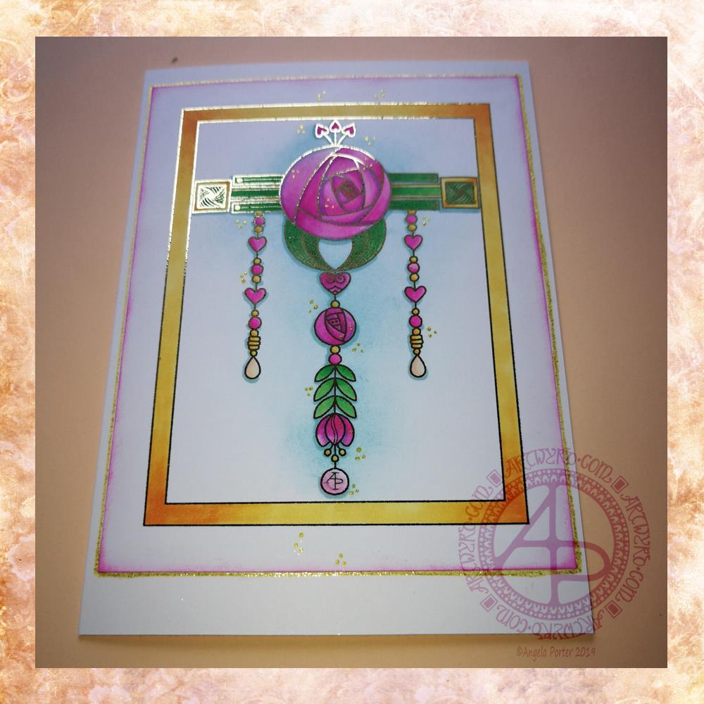
Given my experiments with thermal foiling this week, today’s dangle had to be foiled, in gold this time.
As I enjoyed creating a dangle design inspired by Art Nouveau last week I thought I’d like to do that again this week, and this is the result.
I drew the design digitally, using my usual tools of choice viz. Autodesk Sketchbook Pro, Microsoft Surface Pen and Microsoft Surface Studio.
I coloured the design in using Chameleon Markers. Then I added the blue background with Distress Inks, followed by a pink edge to the card. Not sure pink was the right choice, but it’s ok I suppose.
I mounted the design on an A5 card blank and drew a glittery gold line around it with a Uniball Signo gel pen. I also added some small groups of glittery gold drops to the design.
Overall, I’m quite pleased with this one. I like the combination of the more geometric designs with the more organic motifs.
I didn’t add any hand lettering or a sentiment so it makes it perfect for any occasion or as a note card. It would also make a fantastic page design for a BuJo (bullet journal) or as part of a scrapbook, journal, diary or notebook spread.
If you’d like to try your hand at creating your own dangle design but don’t think you could, well you could find my book ‘A Dangle A Day’ helpful. Not only are well over 100 different monograms and dangle designs included that you can use, but help and advice is given for creating your own, as well as plenty of words of encouragement. I’d love to see your dangle designs too.
I really needed some quiet, creative time this morning. Some time without any pressure on me in terms of requirements from publishers and others. Dangle designs are simple to draw, and there is a soothing quality in simplicity. Colouring is also a very soothing activity and the magic of hot foiling always makes me smile.
I’m feeling a bit below par in terms of my mental and emotional wellbeing. I have a stinking headache, which isn’t helping, and I’m feeling exhausted again. That’s all to do with emotional exhaustion.
Fortunately, I can take time today to just do what I need to do in terms of self-care. I managed to get three and a half out of the four edits for my next coloring book done. I have until Monday to get the other half finished, so that’s definitely do-able, either later today when the headache subsides or tomorrow.
My emotional and mental sea has some smooth waves on it, not stormy, not choppy, just swells that come and go. I may be in a bit of a trough at the moment, but I’ll soon be heading back up to the crest of the gentle swells.
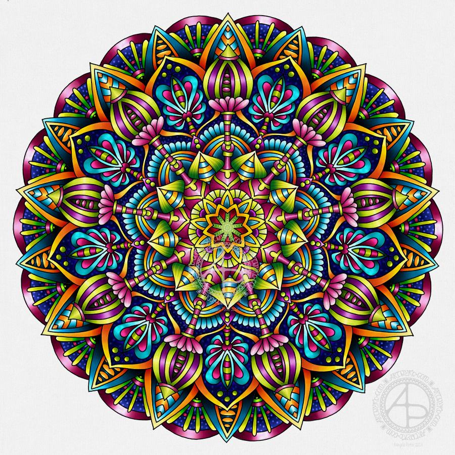
Yesterday, I had an urge to try colouring my latest mandala design but without black lines, just pure color. This is the result. I’m actually quite pleased with it, and I’ve surprised myself too, in a nice way. I’m quite eager to do more art like this as time goes on.
I chose a similar color palette to the one from yesterday, similar but not the same. I also edited the shapes and lines as I felt I needed to as the design grew out from the centre.
The color palette was of just six colours – two greens, one aqua, two orangey colours and one yellow, all muted, subdued colours. I think I could’ve done with one more colour, or used the darker version of the aqua as the background in the inner and middle ‘circles’ of the design. Of course, I can try that out without ruining this version. That’s the beauty of digital art.
I would never have done this using traditional media. My skills with colours are relatively limited in the physical realms.
The world of digital art is opening up new ways for me to express my creativity, that’s for sure. The skills required are different but equally as complex as traditional media in my opinion.
There’s also a lot of learning and exploring for me to do to get the style of coloring right for ME. The advantage of digital work is that you can try and try again until you get it how you want it to be without having to start over from the beginning. Some see that as ‘cheating’ or ‘making it easy’. I see it as learning and growing and developing in real time. Digital art is very forgiving, but that doesn’t mean it’s any easier. Far from it in my opinion.
I know my limitations with paints, markers, pencils and so on. I’m kind of competent with markers and pencils I suppose. Working digitally, however, allows me to really work at making sure I get the finish I want in each section of the design, with or without my characteristic black lines. I can try things out and adjust to get them just as I wish them to be.
Each time I do something different like this I learn. With this mandala it’s the use of high contrast to gain the depth and dimension I like, and it’s working out how to get that with the various types of brushes and effects that are available to me.
It’s a huge thing for me to use my line art as just a guide and to lose the lines to create a design such as this. It involves learning how to make the different sections separate from each other using shadow/light as well as color, something I’ve rarely done in my artistic journey.
This is definitely something I’m going to do more of in the future and develop my skills in creating art in this way too. It’s taking me a long while to get my head around it all, but little by little my digital art is developing I think, and I’ll find my own voice with it for sure, or maybe another voice.
I used my usual trifecta of Autodesk Sketchbook Pro, Microsoft Surface Pen and Microsoft Surface Studio.
I do struggle with colour schemes at times. I either go crazy overboard with bright, vibrant, rainbow colours or monochrome. For this one, I took the colours from some images of succulents and used small colour palette of just five basic colours, with varying tones of those colours to achieve the depth I like in my artwork.
The colour palette is also a bit different for me, much more muted, subdued. That may reflect my current emotional and mental weather. I’m not as gloomy as I have been over the past few weeks, but it certainly isn’t as bright and sunny as it can be.
I always find creating soothing to my mind and emotions. It’s my main self-care activity. It’s not the only one, but it’s the main one. Others include crochet/knitting, reading, napping. I’d like to add going for a walk to that list, but on days like today that can be difficult for me to do. Weekends tend to be more peopley than I can cope with even on the best of my days.
I have invited my sister over for a meal this evening. However, I’m not up to facing the craziness of a Saturday supermarket to do the shopping, so I’ll take her out for a meal instead. That would do me some good too, a change of scene and someone else cooking for me. It will also allow me to conserve what energy I have at the moment. I’m so tired all the time after a few very draining weeks through EMDR and Time to Change Wales anti-stigma talks.
I had a lovely time this morning looking at Arts and Crafts Movement, Rennie Mackintosh and Art Nouveau designs. I’ve always love these styles of art with their organic lines and stylised motifs and it’s certainly influenced my style of art in some little way.
I got inspired as I looked at these styles and decided to use them as a start for my April BuJo page design, which you can see above.
The had lettering is a little heavy handed where the squares are concerned, but over all I’m fairly happy with it.
There’s definitely a touch of the Rennie Mackintosh’s there with the organic motifs and lines contrasted with the graphic squares and diamonds.
I chose warm and sunny yellows with light, fresh greens as they are so dominant in nature this early on in Spring.
A quick sketch on Rhodia Dot Grid paper followed by a scan and I inked it using some of my brushes in Autodesk Sketchbook Pro. Of course I wielded my Microsoft Surface Pen with some happiness on the screen of my Microsoft Surface Studio.
A simple but, I think, and elegant design. One which would look fab for any month in a BuJo (bullet journal), planner, diary, journal or even in a scrapbook. Of course it would make a lovely greetings or note card too. I’m sure there are many more instances of where this design would work beautifully.
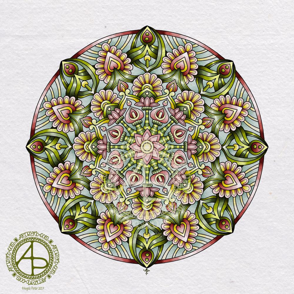
All done! It’s taken a couple of days work on this mandala, but I got there. For some reason the colours are darker and duller here on WordPress than they are in the file…still, the colours are rather rich and vibrant.
My usual tools of Microsoft Surface Pen, Microsoft Surface Studio and Autodesk Sketchbook Pro were used.