Yes, another mandala, but I enjoy creating them so much! I’m also exploring how to create them in a different way than I would usually; instead of drawing with black ink then colouring, I’m drawing in colour itself.
An unusual choice of colour for me too – a navy blue. I must admit, I’m enjoying working in monochrome for these mandalas. The colours are always harmonious and while I love a riot of colour, it’s much harder for me to incorporate that into mandalas like this. Well, at this time it is. Who knows how this is going to evolve.
Yesterday was a busy kind of day that had me away from my workspace from mid-morn. It was fierce chilly out with wintry showers of sleet and heavy-duty hail interspersed with bright, clear winter sunshine which did little to raise the temperature but did raise the spirits.
I was still feeling quite calm after my therapy session on Monday, still having that gentle, subtle inner smile, which I’m doing everything I can to hold on to, gently of course!
It’s always nice when I can find a sense of some kind of balance within me. I sense that these periods are getting longer and longer. However, that means that any downward blips in my mood and state of my mind feel more extreme in comparison. I do have to mention though that the downward blips, though sometimes scary and worrying, don’t seem to last as long as they used to.
Back to my mandala. I used my usual tools trifecta – Microsoft Surface Studio, Microsoft Surface Book and Autodesk Sketchbook Pro. I love that I’ve discovered that I love to carve basic colour shapes into these intricately patterned mandalas.
It’s been a weird kind of day today for me. I’m quite open about my mental health, and today has been one where it’s not been completely tickettyboo. I’m out of sorts. Unsettled. Nothing I’ve done seems good enough to me. I’m quite teary and that really set in during a loving kindness meditation this morning.
Loving kindness meditations are always difficult for me. It’s easy for me to send out love and good wishes to all people. It’s not easy for me to accept the same for myself. Today, it was more difficult than usual, including some physical pain along with it. Traumas from my past kept rising up. Things I didn’t think were traumas, just stupid decisions made by myself. Seems I have work to do on those too in EMDR therapy.
I did colour some mixed media paper with distress inks and quite small pieces at that. I drew on two of them, as above. I’m really not happy with either of them. I really don’t know why I put the words on the left hand one. Growth is a funny word there.
I’ll just put it all down to me being out of sorts. Perhaps tomorrow will be a better day for me to focus on art.
This is odd for me as drawing or creating usually helps me to feel better. Today it hasn’t.
I received a book in the post today – “The Wild Remedy’ by Emma Mitchell. It’s a diary she’s written over a year of how she finds being in nature and drawing and painting helps her with her low moods. She’s subtitled the book ‘How Nature Mends Us – A Diary’. I’ve read the introduction and the first month in the diary, which is October. Both interesting reads.
I almost was inspired to go out for a walk, but I just couldn’t pull myself together to do this during the daylight hours. The Sun has just set here in South Wales in the UK. Perhaps tomorrow I’ll manage to get out for a walk at some point.
I know my moods don’t linger for long. I do have low days which can linger for a couple or few days. Nowhere near as bad as they used to be, but enough to result in me being unsettled and out of sorts and hypercritical of myself and anything I do. I’ve become aware enough that it’s best to do other things that draw for publishers on days like today as I’ll just get more and more frustrated with myself and my efforts.
On other days, whatever I draw I may consider good enough. But on days like today …
Still, the sun will rise again in the morning and it’ll be a new day. My mood may be better then and I’ll accomplish work I consider to be good enough. Now all I need to do is try to find something that I can settle down to do today. I’ve been back and forth all day between drawing, reading, knitting, fussing around. The only creative thing I’ve enjoyed today has been colouring paper with distress inks. Not sure I want to spend the evening doing that though.
Maybe I need to go out for a drive. Sometimes driving with upbeat music on can shift my mood, especially when I feel anxious and restless as I do now, for no reason either.
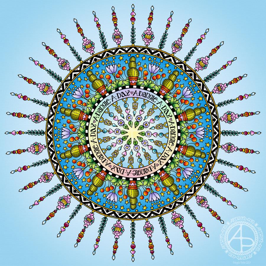
Dangles can be turned into mandalas! And ‘dangle-dalas’ satisfy my love of symmetry in an unusual way.
In this one, I have two rings to which dangles are attached. In the centre ring, they point towards the centre of the mandala. On the outer ring, they point out into space.
Then, there’s two central rings. One, I coloured in a pastel rainbow and added ‘A Dangle A Day’ in my weird take on hand-lettered uncials. The lettering isn’t perfect, but then neither am I, and neither were celtic/anglo-saxon/medieval manuscripts.
Ok, the manuscripts are more perfect than my hand lettering, but it’ll do. It’s perfectly imperfect. That is an idea I’m becoming to embrace more and more easily as time goes on, and an idea that I encourage you to adopt in my book ‘A Dangle A Day’.
I used rather graphic black and white geometric designs to separate the three main rings of the design. This contrasts nicely with the brightly colourful design elements.
I felt the need to draw cacti, flowers and some weird seeds today, so that’s what I did. Of course it goes without saying that I’d have to include stars and hearts in my design! There’s some beads in there too, particularly those teardrop shaped ones that remind me so much of medieval jewellery.
Mind you, medieval in character this design is not. It is rather cute and whimsical, which is one of my signature styles – the other is intricacy.
For this design, I hand drew and coloured it digitally using a Microsoft Surface Pen on the screen of my Microsoft Surface Studio. As always, my chosen art software was Autodesk Sketchbook Pro.
Yes, I really do draw on my Surface Studio with the Surface Pen as if I’m drawing with, say, a fountain pen on paper. Colouring I often do as if I’m colouring with traditional media, though sometimes I do use gradient fills. It just depends on the feel I want in the final artwork.
Being able to work in layers means I can do things that would be very difficult or time-consuming working traditionally. It also means that I can play with colour combinations – I love colour, but I don’t always make good choices of colour palettes, see yesterday’s Q monograms for evidence of that!
Of course, there’s so much more to digital art than this, and I’ve not discovered everything yet. But over time my experience is that I discover, workout or learn how to do what I need to do at that time when I’m ready to do that.
Originally, I drew the original version of this design with pen and ink on paper. I wanted to edit the design and add a dangle to it, so decided to work digitally (Microsoft Surface Pen, Microsoft Surface Studio and Autodesk Sketchbook Pro).
By working digitally, I could edit and amend the design easily, using the original sketch as a guide. You can see that I made quite a few changes. I’m much, much happier with the blue version. The pink one is pretty and a good start, a way to experiment, but the blue one is the more polished, finished version, and not just because it’s been drawn digitally!
For the original sketch, I used a copic marker to draw out the basic letter shape and then used Unipin and Pigma Sensei pens to add the lie details. The copic is patchy, but that’s because it was a quick sketch.
I like the increased amount of white space in the new version – it does add a bit of a stained glass look to the design. I also like the stylised roses inside the ‘B’ in the revised version; adding the patterns inside the rose rather than on the edge helps the rose to stand out from the coloured section by giving a mostly white border.
Once I’d thickened the main beams of the letter, I added dots to carry the lines on. Then, I decided it could be fun to echo these dots by carving out dots in the flared ends of these lines. These dots have lightened those lines up, adding some airiness as well as interest.
Oddly, as I look at them I am minded of a very Old Bridge here in my home town. The bridge was built by William Edwards in 1756. When it was built it was the longest single span bridge in the world. The addition of 3 holes at each end of the bridge allowed it to bear the weight of the stone and not collapse. It is these holes, the lightness they gave to the design that I recalled when I was thinking about those ‘holes’ in my blue B.
I really wanted to add a simple dangle to this monogram – the letter is ornate enough that it could be too fussy if I’d added more than one dangle, or made the dangle ornate. Of course one of the charms had to be a heart! Simple beads and a diamond charm complete the dangle. My dangles often remind me of jewellery!
It’s not very often I show any kind of editing or reworking of my artwork, that’s because I do tend to work very intuitively and don’t really draft my work. Sometimes, I may do a pencil or pen sketch for an illustration for one of my colouring books, especially if it’s a kind of ‘scene’.
Since I’ve been working digitally, however, I do seem to be doing a lot more of the sketching out or working more roughly and using this as the sketch for the digital art.
An added advantage is that this satisfies my need to work with traditional media. Also, by working on paper I get a better idea of the scale of the finished artwork.
I think I’ve said it before that I do struggle with a sense of scale when working on a screen due to the ease of zooming in and out. Paper is a fixed size so I can appreciate the scale far more, and it seems easier for my brain to get a better idea of the whole design.
It’s all part and parcel of my artsy journey, figuring out what is best for me and not trying to work like others or being worried about how others judge me and my process. More than anything though, it’s about me learning not to be such a harsh judge and critic of myself. One negative review, and my inner critic gives itself a rocket boost and any belief in myself is kicked to the outer edges of the known universe. That’s why I don’t read reviews – I struggle enough with my own inner critic without battling others’ opinions.
I’m learning it’s far more important that I appreciate my own work rather than looking to others for approval. It’s always wonderful when people tell me they love my work. It’s always valuable when people, particularly my editors, give me honest feedback on what needs to be changed to improve things – they see things I miss by working all too close to the artwork.
I’m learning that it’s more important for me recognise that what I create is mostly good enough, sometimes I’m really pleased with what I’ve done, sometimes I can see something is truly awful or that there is room for improvement.
Reflection on my work is important as it helps me to learn, grow and develop, and helpful input is always welcome.
When I look at this blue B monogram dangle design, I can honestly say I smile. It’s an example of a design I am pleased with. It’s intricate, but not overly so. There’s empty space within the design
Yesterday, I just felt the need to do a bit of an entangled drawing. So, I started with the lower case b and added designs around it.
Not at all sure this works. The letter just looks ‘plonked’ on top of the design rather than part of it.
I do like the entangled stuff though.
Always something to learn – that’s my piece of Wednesday Wisdom. If you don’t try something, you never know if you can either do it or if it’ll work out. This one isn’t one of my better lettering adventures, but, I can reflect on what I like and what I don’t like and then try again another time.
I’m not at all sure I can ‘fix’ this one, but I can try again.
For this one I used Daler Rowney Bristol Board along with 08 Unipin Uniball and 04 Sakura Pigma Sensei pens.
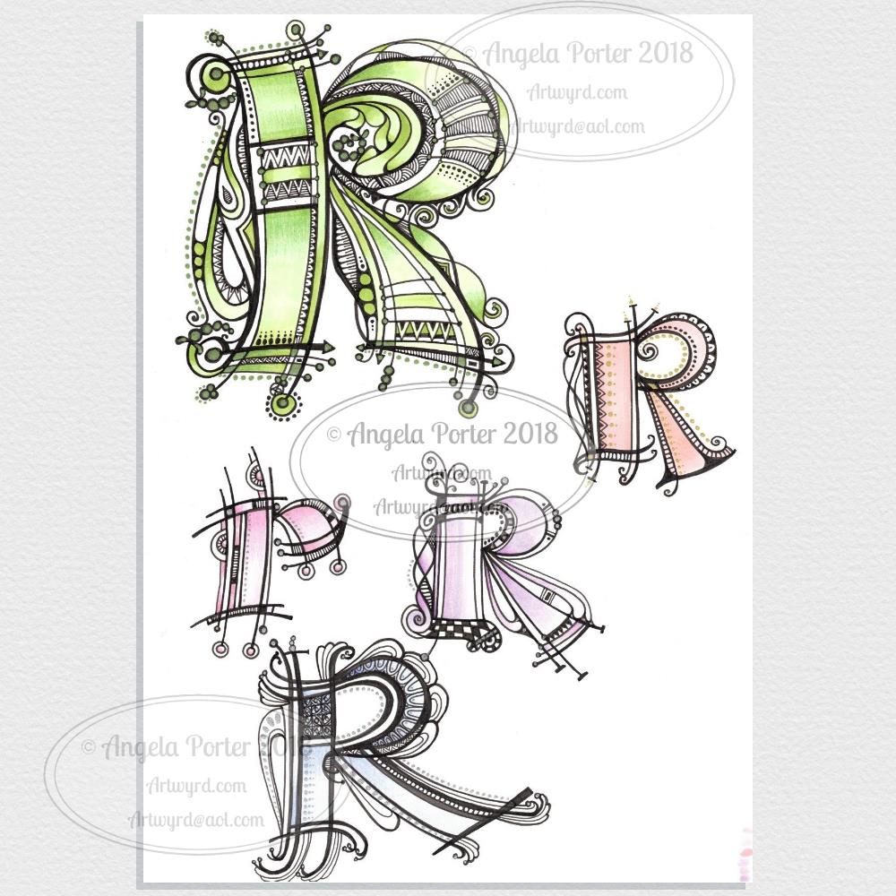
Yesterday’s black and white, graphic monograms of the letter R now coloured, with added lines and metallic highlights.
For all of the letters I used a combination of Copic markers and Chameleon Color Tones colored pencils to add the colours.
I chose Copics over Chameleon Markers as I really wanted soft, gentle, almost pastel colours for these letters. The only way to get these with the Chameleon markers is through gradients with the colourless blending chambers. I wasn’t at all confident I could get the soft, gentle colours with slight blending. So, I went with something I knew that would work for me – Copic Markers with Chameleon Color Blends pencils .
I think I got way too fancy with the added lines on the lower letter R, but it’s all a learning process.
I am really pleased with the others. The colours I chose or, rather, the pastel nature of the the colours, isn’t characteristic of me, but I think they work really well here.
Of course I had to add some metallic highlights. For the smaller Rs I used Uniball Signo metallic gold and silver gel pens.
I started work on these early this morning – around 7am. And I’ve finished for now – it’s around 9am. I’ll return to them later today or tomorrow as I have a lil trip out for lunch with a friend.
Some different kinds of styles appearing in this little bunch!
The big R at the top is mostly done – it just needs some colour I think. It’s also similar in style to the previous monograms, starting with the yellow K did a couple of days ago. It’s been drawn with 08 Unipin and 04 Sakura Pigma Sensei pens. Green metallic embellishments have been added with a metallic Sakura Gelly Roll pen.
The R at the bottom, with the thick lines, was drawn using a Tombow Fude brush pen. Not easy to control the thickness of lines, so I used a Uniball Unipin pen to tidy up the lines and add the bits on the end. Not sure how I’m going to progress with this one.
The two in the middle row have been drawn with the Unipin and Sensei pens.
The R to the right was drawn with a Uniball Unipin brush pen, which is a bit easier to control the line thickness than the Tombow Fude pen. I did neaten up the lines and ad more using the Unipin and Sensei pens.
The bigger the letter, the more space for embellishments – the paper size is A4 (approx 8″ x 10.5″) in size and it’s white and very smooth Daler-Rowney Bristol Board. The smoothness of the paper makes it so easy to draw smooth, even lines on it. It won’t take water colours or watercolour washes, but markers and coloured pencils work fine on it. Tombow Dual Brush pens and similar tend to cause the paper to pill. Of course, I can always use a scanned image to colour them digitally.
Yes, I could also add dangles to each monogram. However the purpose of this exercise is to practice my hand lettering, particularly in this rather ornate and embellished style. Dangles can be added in the future.
I cover drawing monogram dangle designs in my book ‘A Dangle A Day’, which is due to be published in just over a week! Exciting!
Three variations on a theme! All hand lettered and hand drawn on Daler-Rowney Bristol board (A4 in size).
For each I used black 08 Uniball Unipin and 04 Sakura Pigma Sensei pens. Here’s the other media I used for each monogram:
Top – Copic markers, Herbin Copper ink with a glass pen.
Bottom left – Copic Markers for the base colour, Chameleon color tone pencils for added depth of colour, gold metallic Sakura Gelly Roll pen.
Bottom right – Chameleon color tone pencils for the colour and a silver Uniball Signo pen for the metallic highlights.
It’s taken me around 5 hours or so to complete the set of three. I’m still feeling my way with this style of hand lettering.
For the monograms coloured with Copic markers I started by drawing the letter with the Copic markers and then added the black line work before adding the metallic highlights and Chameleon pencil shadows. I love having a solid shape to embellish with line, pattern and metallics. However, white space is only possible by adding lines outside of the main shape. Which is fine. I could add white space inside the letters either by leaving some in the design before coloring, or using white ink to cover up the copic colours. These two letters look a lot more solid and heavy.
For the L coloured with the Chameleon pencils I drew the black line work first. The advantage of this is that I can leave white space within the letter. this gives a bit of a lighter, airier feel to the letter, which is helped with the less dense colour of the Chameleon coloured pencils.
I’m not sure if I like the metallic petals in the top monogram; the ink spilled over the black lines and I tried to add them back in to define the petals but it just seemed to sink beneath the metallic pigments.
Also, the glass pen with copper ink that I used to add the metallic highlights to the top monogram was a lot finer than the Sakura gelly roll so it was easy for me to add tiny patterns and shapes. The Uniball Signo silver pen gave a much finer line than the Sakura Gelly Roll so it was easier to add highlights to the bottom left monogram, but I knew I’d not be able to get as much fine details or patterning with it as with the glass pen.
Overall, I’m fairly pleased with the finished results. I’ve learned that I’d like to leave white space in my monograms when I’m hand lettering them in this way. Maybe if I want to use Copics in future I should use a pale colour to draw the shape of the letter and then use darker tones to add dimension and depth to the design, allowing the lighter colour to act a bit more like white space. Of course, I can always draw the design with black lines first and then add the colour. Each has it’s advantages and disadvantages.
I’m not sure which is my favourite. I rather like the one on the bottom right. As it’s smaller in size I’ve not quite managed to go over the top with the embellishment. I like the white space within the letter. I also like the more subtle colours I’ve used.
I think I’ll take my attention to a different letter now, another I’ve not done a monogram for before, well not outside of my soon to be released book ‘A Dangle A Day‘. Of course, the monograms in the book are all dangle designs too. It would be easy enough to add dangles to these designs for sure, well it would be if I’d left enough space for them!
However, my reason for doing these monograms is to add to my repertoire of hand lettering styles. These may not be entirely unique in the realms of hand lettering, but I do want to work with them and find my own way through this to something that people can look at and say ‘that’s Angela Porter’s work that is’ in the same way they do when they’re familiar with my coloring books and my style of drawing there.
This is what I’ve spent the last 2 or 3 hours doing – I lose track of time when engrossed in an artsy project.
After the K monogram yesterday I wanted to try my hand at another letter and I just chose my own initial. I really do need to do some different letters though!
For this one I started by drawing the letter in colour using Copic markers on Daler-Rowney Bristol board. I did do a vague sketch of the letter with pencil very lightly which I then erased.
Black lines to define the letter were next, followed by the lines outside of the letter and the sectioning of the spaces inside the letter.
I wanted to finish some of the lines with some interesting shapes, so naturally I defaulted to hearts and beads!
I used some of my favourite geometric and abstract patterns to fill some of the spaces, along with dots and lines.
The penultimate step was to colour in some of the blank spaces, the hearts and beads using Copic markers.
Finally, I used a glass pen and metallic gold ink from Herbin.
I worked with traditional media to do this one, so I could use gold ink, which is something I’ve not quite worked out how to do digitally.
Having said that, my process for creating this monogram is the same whether I work with traditional media or digitally. The only difference is that some of my ‘overspills’ with the lines in the tiny patterns I have to leave here and accept as it being ‘perfectly imperfect. Also, the colours aren’t as bright and vibrant as they would be digitally, but they’ll do!
Yes, I could add a dangle or three to this design, but, again, I’m happy with how it is…for now! I’m just happy exploring hand lettering in a different way to what I’ve been doing.
If anything, this hand lettering is more about shapes and patterns than it is about letters themselves. I know this is a step forward for me in finding my hand lettering style (or one of my styles at least), and I also know that as I become more comfortable with it and don’t have to work quite so hard at it (working hard is thinking about the lines and working out how to add the embellishments so they feel part of the design and not just plonked there for the sake of plonking them there) I’ll work out how to add to them in a sympathetic way.
What letter will I do next? You’ll have to wait and see!
This is what I end up doing when I’ve fallen asleep earlier in the evening and end up being alert far later than I’d like to! All thanks to that one small glass of port after my lunch. I very, very rarely drink alcohol, so it always floors me either in terms of needing to sleep or in terms of my mood. At least this time it was the nap, so I’ve still got my calm, content mood intact at the end of this day – the first time I’ve felt this way on a Christmas Day for many, many, many years. In fact, I don’t think I’ve ever felt this way. Therapy is working! Yay!
Anyways, after I woke, had a huge mug of tea, I picked up a dot grid pad and a 0.4 Sakura Pigma Sensei pen and started to draw variations on the theme of letter ‘k’ as I listened/watched the second part of the Fellowship of the Ring.
I then remembered that I wanted to try something digitally like I did yesterday, so this is the result. I’ve been working on it for over 2 hours (it’s now around 1:30am, so if some words don’t make sense it’s because I’m just about ready for my bed).
I started by sketching out the shape of the letter in Autodesk Sketchbook Pro, using a Microsoft Surface Pen on the screen of my Microsoft Surface Studio.
The next step was to finalise the shape and redraw it and colour it in. After this, I added the black lines round the K, then the curvy lines on the outside edges. The final step was to add the patterns and colour in small sections of the outside embellishments. Oh, and I created a thin drop shadow and plonked the monogram on top of a paper texture background.
What I want to do tomorrow is to add a dangle to the design. I started trying to do that this night, but my concentration is now going. I also want to try to add some shading to the patterns within the K too. I think they could do with a bit more illusion of dimension.
Oh, the knitted stegosaurus is now complete. I may photo and show. Not sure if I’ll be doing any more knitted dinosaurs. I much prefer amigurumi! I have started an amigurumi monster, but I need to remember to limit my time spent crocheting as it does make my finger joints ache in a way knitting and drawing don’t.