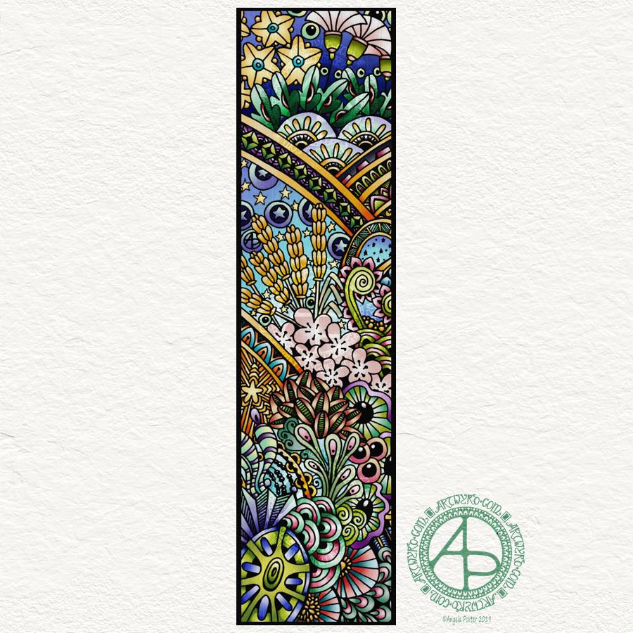
This morning I decided to take a narrow strip from yesterday’s drawing and colour it digitally. This is the result.
I think WordPress converts RGB images to CMYK or something; the colours aren’t as vibrant on this image as they are on my ‘puter. However, I’m sure you get the idea.
I added a background texture to add interest to the artwork.
I really enjoyed doing this. The unusual dimensions of the artwork have worked well too. It would make a rather lovely bookmark, don’t you think?
I drew the original image with a mixture of Uniball Unipin and Sakura Pigma Sensei pens on Winsor and Newton Bristol paper. I then used Autodesk Sketchbook Pro, along with Microsoft’s Surface Pen and Surface Studio, to choose the section of the image I’d like to use and then add colour and texture.
Unusually, I made use of the Copic color palette in Autodesk Sketchbook Pro to help me choose colours to use.
I will go back soon and add some increased contrast and some glowing highlights. I think I need some tea first!
It took me nearly three hours to complete the colouring simply because I chose to use the fill tools available in Autodesk Sketchbook Pro. I’ll spend another hour or two increasing contrast and adding those glowing highlights to the design. I will add a post showing a comparison between the two versions for sure.
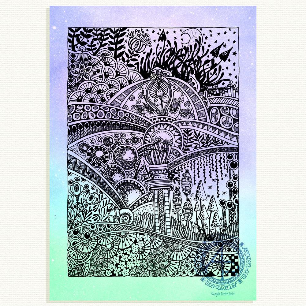
Yesterday I took a quiet day at home, apart from a quick trip out to do a little shopping for vittles. I lost myself in drawing and this image is the result.
It took me around 10 hours to complete, using a Sakura Pigma Sensei 0.4 pen along with a couple of 0.1 and 0.2 Uniball Unipin pens on Winsor and Newton Bristol Board.
The drawing harks back in time where my love of Romanesque and Gothic arches and architecture showed in amongst entangled, rambling organic motifs.
However, I think the passage of time, increase in skill and/or refining of technique shows through. Perhaps even a bit more polish to the design.
Although drawn in black and white, I’ve added a background colour gradient and texture digitally (along with the rather over the top watermarks).
Talking of watermarks…
I had a response from Teespring.com concerning my copyright infringement complaint against ‘Dragonfly Lovers’ on facebook.
The agreed with me and have removed the offending listing.
I am most grateful for their speed and professionalism in dealing with this.
It may be a drop in the ocean, but if we all took care of just one drop at a time we’d definitely reduce the number of copyright infringements out there.
My mental and emotional wellbeing
It’s been over a week since my last EMDR session. In the UK we’ve had a bank holiday weekend, so no therapy this week.
Last weeks session was really draining emotionally. I expected it’s effects to linger long beyond Monday. However, although I was still a bit tired on Tuesday I’ve mostly been quite content with that gentle smile both on my lips and in my heart.
That doesn’t mean to say I’ve not had my moments, ‘cos I have.
However, the drama of stolen artwork didn’t affect me as much as it would’ve in the past. I did what I could about it. I spoke up rather than letting it slide. It also has given me a little bit of a mission as I go forward – to raise awareness of how to spot an ethical company that supports artists by properly licencing work and properly crediting the artists they work with. Compare this with an unethical company that doesn’t support artists, doesn’t even mention who the artists are, and is only in it to make money for themselves.
Copyright infringement is rife. The myth that things on the internet are copyright free and in the public domain has to be dispelled.
Back to the point. I’m doing ok in terms of my mental and emotional wellbeing.
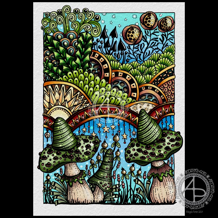
Yesterday, I took some time to finish colouring my ‘Entangled Fantastic Fungi’ drawing from the other day.
I’ve said it before and, no doubt, I’ll say it again: colour brings my drawings to life. It also takes me a lot, lot longer to colour the artwork than it does to draw it! I think it would’ve been quicker with traditional media, such as Chameleon marker pens. However, I like using digital tools for coloring and I use opportunities like this to explore the different settings and various brushes so that I can add to my range of techniques I like to use and the effects I can get.
It’s a slow process for me, and it can be both enjoyable, satisfying and rather frustrating! However, I think I’m making some progress in finding my way through the plethora of options available and gaining some understanding of what they do and how to make them work the way I’d like them to work for me.
I also am enjoying drawing on paper with these Tombow Fudenosuke pens. Using Autodesk Sketchbook Pro to add colour to my drawings is me having the best of both words for sure!
There’s also the addition of a background texture, which, I think, makes all the difference. The pale grey tone of the background helps to tone down the brighter colours in the image, enhancing that kind of vintage kind of vibe I was going for.
Of course, it goes without saying that I used my Microsoft Surface Pen and Surface Studio to colour the image. Being able to use the pen on the screen, just like pen or brush or pencil on paper, is fantastic! I’m finally getting to grips with making use of the pressure sensitivity of the pen and exploring ways in which I can use it, as well as setting up brushes to suit my needs.
When I think back to when I bought my Surface Book, my aim was to draw templates for coloring books digitally so I didn’t have to scan in paper. It was also to make it easier to clean up the images. I had no intention of colouring the images digitally.
I think I’ve come a fair distance since those early days. I’m still surprised at how the ability to create digital art by using a Surface Pen on the screen of the Surface Studio as if the screen was paper, has opened doors to creative expression for me.
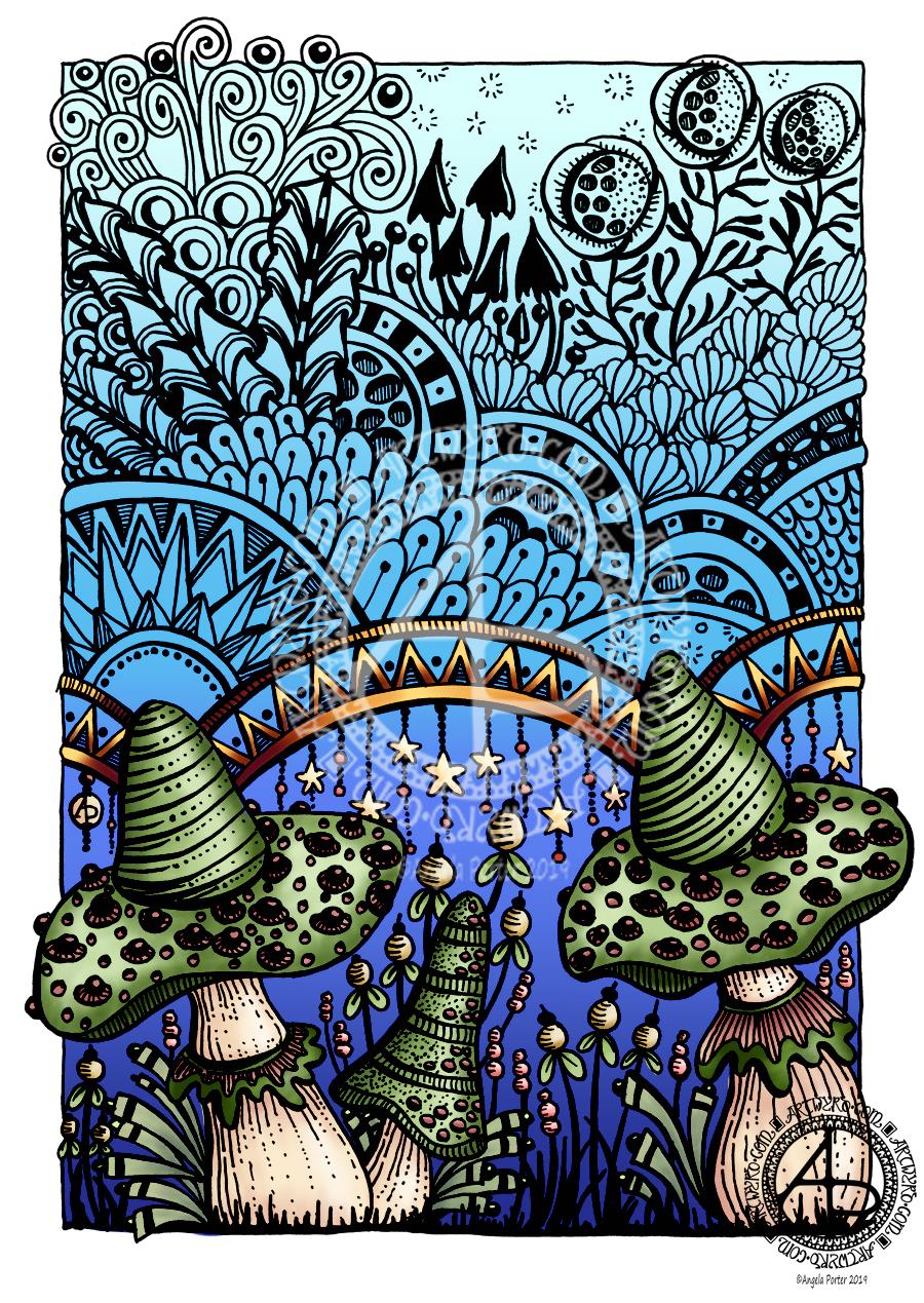
Drawn with a Tombow Fudenosuke (hard) pen on A4 11¾” x 8¼” Winsor and Newton Bristol Board.
I worked on this one over three days, both to get used to working with the Fudenosuke pen but also for some self-soothing self-care.
It does need some colour and I think I may try a more vintage/distressed/grungy color palette with it, once I get round to adding color.
At the moment, my focus is on colouring the sample colored templates for my latest book for Dover Publications Creative Haven Series –Entangled Christmas.
I’m feeling more content today and less exhausted too, which is a good thing after this weeks rather intense EMDR session.
Today’s been a tough day emotionally for me. Monday is, usually, EMDR day, and today’s was really emotionally upsetting. The memory I’m using led to quite a few insights that caused some distress, which was at a 7 out of 10 at the start and went up to 10 at the end of the session. This happens. I have a lot to think about and process before my next session in a fortnight.
I’m absolutely exhausted. I did have a sleep when I got home, but I’m still exhausted.
I’ve tried to sit and draw and I’m not able to work in a manner that is satisfactory to me. So, I thought I’d set up a colour palette in Autodesk Sketchbook Pro and colour the drawing from yesterday. Well, more like start to colour it.
Oddly, I’ve gone for rather muted, vintage colours in this one. Perhaps a reflection of how I feel. Or, maybe it goes with the lino cut ‘feel’ of this particular drawing with the strong, black lines.
Tomorrow, I hopefully start to colour in some of the templates for my next coloring book. My editor and her team at Dover Publications Inc have chosen their favourites. I do intend to give you some sneak peeks as the coloring progresses.
My tools for drawing this image were a Tombow Fudenosuke pen and a pencil. To colour it I’m using Autodesk Sketchbook Pro and Microsoft’s Surface Pen and Surface Studio.
I’ve had a lovely, quiet Sunday and I’m glad to say my emotional wellbeing is better than yesterday. Still a bit fragile, but there’s that hint of contentment that has been lacking over the past few days.
I’ve even had my oompf back to draw. This took the guise of adding patterns and outline drawings to my visual reference journal, and then using some of these ideas, plus some old favourites, in this drawing. I even added some dangles in places. Just little, delicate dangles, but still there’s dangles there.
For the drawing, I used a hard nib Tombow Fudenosuke pen. This has a flexible nib, not overly flexible, and so I could vary line weight while drawing.
I was inspired to try the Fudenosuke pen again after my experiments with digital brushes that vary line width with pressure and found that so much fun.
I found it much easier to use the Fudenosuke pen after my experience with digital brushes; it turns out working digitally does influence my work in traditional media and helps me gain new skills or confidence in new media.
I drew this design on an A5 piece of Winsor and Newton Bristol Board which is white and very smooth. Then, scanned it in and digitally added a background texture and some colour, along with my watermarks.
The drawing was mainly to try out the Fudenosuke pen, but also a bit of quiet self-care too. I’m quite happy with it, especially as it’s main purpose was to explore using the pen for drawing with.
I’ve relied on line weight to add some dimension to the drawing, though some colour and/or shading could help a lot. Maybe that’ll be my next task with this – to colour it either digitally or to use my Chameleon DuoTone and Color Tops marker pens after I print the image out.
I’ve really not been myself the past few days. With a couple of busy days this week, the emotional fallout from EMDR on Tuesday finally caught up with me as I slowed down Thursday afternoon. I’m so tired, and my mood isn’t the brightest to say the least.
It’s always a sign that even when I’m tired I can usually draw and create, but not much this week. I haven’t been able to find the inspiration to draw, nor have I found the interest or energy.
Today, around a meeting, I managed to draw this.
It’s a throwback to the more familiar art of earlier days. It has given me a chance to use some new motifs, as well as some favourite ones that crop up often.
The process of drawing was soothing, and I did my very best not to be too judgemental, though I did want to throw it out and restart several times as I wasn’t at all happy with what was coming out of the nib of my fountain pens or Uniball Unipins.
I switched to the Uniballs as the fountain pen ink was smudging lightly. I’ve fixed that, mostly, by digital wizardry. I also added the Distress Ink background digitally.
I know my inspiration and energy to draw will return, I’m just not feeling at all myself at the moment.
I do have a new self-care activity, which is sitting in/on the bed, crocheting shawls and listening to audiobooks – currently working my way through the Harry Potter series.
The rhythmic nature of crocheting is soothing. The familiarity of the Harry Potter story is also soothing. Being upstairs makes me feel safe, secure and it’s also comforting.
The memory being worked on in EMDR certainly has stirred some stuff up. I’ve had some very upsetting insights into how I’ve viewed myself. Releasing the trauma associated with this particular memory will be accompanied by a better view of myself. I may not fully believe it, but if I can believe a little of it then that is good enough for now.
I have to believe that with each memory and its associated traumatic experiences that are processed via EMDR I’ll believe the healthier, more positive statements about myself more and more.
These are some quotes I’ve found recently that are helpful to me in understanding me, helping me through this.
Trauma creates changes you don’t chose. Healing is about creating change that you do choose.
What happened to you was not your fault. The struggles you have today, like your cPTSD symptoms, are a normal response to abnormal events. So, please be kind to yourself.
The poison leaves bit by bit, not all at once. Be patient. You are healing.
This morning, I wanted to do a small drawing (the bristol board is approx. 10cm x 21cm) and try not to get overly fussy and trying to fill every space in. I used fountain pens to draw the line work, and I’m using Autodesk Sketchbook Pro, a Microsoft Surface Pen and a Microsoft Surface Studio to add colour to the design.
I’ve often said it on the Angela Porter’s Coloring Book Fans facebook group that the members work some fantastic magic in using colour to bring my drawings to life. And they do.
So, I’m working a little of my own magic here!
I don’t often colour my own art in – time constraints can limit me in this. Also, I love drawing so much and it takes me a lot less time to draw a design than it does to colour it. I can safely say I’m quite prolific when it comes to drawing, not so when it comes to colouring.
I’m also colouring this relatively small and less detailed design to fathom out the mysteries of the synthetic brush setting. I think I may be getting the hang of it and how I can make it work for me.
I actually like the less than perfect finish I’ve achieved, which has surprised me for sure. I actually really like the slightly battered feel to the orange pods in the artwork.
I’m usually obsessed with perfectly smooth colour gradients, whether achieved by digital tools or by more traditional methods of blending (whether working with traditional or digital media).
A good friend of mine (yes, you know who you are if you read this) did tell me when I bought my first Microsoft Surface a couple of years ago that it would open ways for me to create art and develop my artistic skills. It certainly has, and continues, to do that for sure.
I am aware that it’s quite a slow process where I’m concerned. Yes, I could go and watch and read tutorials on how to use the various brushes and settings.
I’ve tried that. The information given totally overwhelms me.
Being easily overwhelmed by information or sensations is something that is part of my cPTSD. If I get too overwhelmed, I tend to either walk away, end up in a panic or become fearful to face something again.
However, I do get a sense of satisfaction out of working out or discovering something for myself, when I actually need that something. Once I’ve become confident and comfortable with a particular skill, I’m then ready to discover more add more skills to my personal skill/tool box.
I never stop learning, discovering, and finding new ways to express myself creatively. I may no longer try to use a huge range of different media – my default these days is definitely digital. I don’t think there’s anything wrong in that. No doubt I will dabble with new kinds of media or creative skills from time to time (such as my toe-dipping into paper quilling; it’s not at all my kind of thing, but I had to try it to find out).
I still love drawing with pen on paper, but being able to scan that in and add colour digitally means I can make the best of both worlds. I can also keep all the little imperfections and smudges that result from drawing with pen and ink on paper, that add that more human touch to them, if I wish. Or I can draw digitally, keeping things clean and a bit more perfect. Either way works for me.
And so I finally overcome my own personal stigma concerning digital art vs traditional.
Therapy day!
It’s Monday so it’s EMDR day for me. I have no idea what the session will bring for me.
What I can say, though, is that though last week’s session was rather emotional and distressing, I seemed to recover quite quickly from it. By Wednesday I’d returned to a state of some contentment and that has mostly stayed with me since then.
I do know I have a busy week with anti-stigma talks for Time to Change Wales being given tomorrow, Wednesday and Thursday, and then a double talk next Monday. As well as working on templates for the newest coloring book for Dover Publications Inc, I need to make sure I have time to look after myself and not avoid the feelings I may have after EMDR today.
I also know I have a busy week with other commitments too…
At least there’s some sunshine today, even though there are some big, puffy, grey and white clouds mostly covering the sky. There’s plenty of breaks in the clouds.
This became yesterday’s self-care drawing. When I’m not feeling all that right my default setting is this kind of drawing. It really does help soothe my unbalanced mental and emotional health. Thank goodness that today I’m feeling a lot more myself, whatever that means. In this context I think it means more emotionally calm and kind of content and a less worrisome and fretting mind. My background anxiety levels are still a tad elevated, but not as bad as they were over the weekend and through to yesterday.
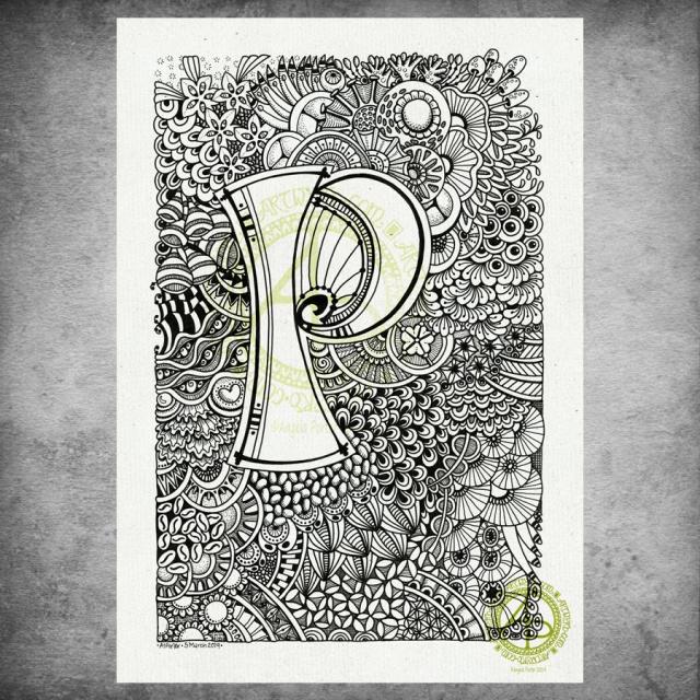
I hand lettered the monogram on an A4 sheet of Daler-Rowney Bristol Board using Uniball Unipin pens. I then just let my pens draw some new and old favourite motifs and patterns to create this abstract, entangled art.
Yes, the P is a bit off-centre, but I didn’t measure it out! I just drew it. I didn’t plan on doing the entangled drawing stuff. I was just going to spend sometime with hand lettering…just goes to show that instinctively I knew what I needed yesterday to help soothe me. I could lose myself in the flow and give my mind and emotions a bit of a break.
It took me several hours to complete, and this morning I scanned it in, added a background texture and the watermarks with digital wizardry.
My only consideration for it at the moment is whether to leave it as is (black and white), to add shading in greys, or whether to add colour. I’m also quite tempted to add some gold to the monogram, just in places. I could print it out and try that on a copy before I commit myself to altering the original.
Today I do need to settle to inking in some sketches for the next coloring book. Maybe do some more sketches as well.
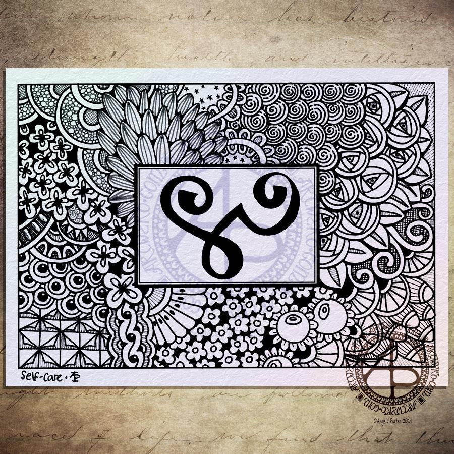
I drew this one with Uniball Unipin pens using both black and dark grey pens, though the difference betwixt them hasn’t shown up all that well in the scan and the digital wizardry that followed to add colour, texture and watermarks!
The glyph in the box is the Zibu symbol for ‘self-care’. Most appropriate for me today as I’m reeling more than a tad from yesterday’s EMDR session. I keep thinking I’m ok, then I get overwhelmed by a wave of sadness, despair and such like. The wave eventually passes and I feel ok, but a tad light headed. Then, the wave returns …
I had some appointments this morning and after a quick lunch I thought I’d draw something small and found this blank postcard template in my pile of stuff, with the symbol already drawn upon it.
I’m not entirely sure I’ve done a good job with this one. The overall design has a feeling that it is disjointed, that the parts of it don’t flow from one to another at all easily. It feels stilted and stiff.
Perhaps that is just how I’m feeling at the moment and I’m just projecting it onto my artwork.
As I said the EMDR yesterday had me reeling both yesterday and today. My therapist took up the role of ‘blind therapist’ where I chose a memory that is too difficult for me to speak about, and we just went with the emotions, feelings and thoughts about myself as the EMDR session progressed.
There were some observations made yesterday that were quite upsetting, okay very upsetting to me. They’re not something I can talk about at the moment.
Even though it’s upsetting, I still think progress is being made. That is all that really matters at the moment, I think.