Hand lettering – Tuesday Tips

tuesdaytips angela porter 2018 My #tuesdaytips are all to do with hand lettering this week, but taken generally, the advice applies to any skill, artistic, creative, practical or otherwise I’m sure.

Lots of people aren’t happy with their handwriting, for many reasons.

I actually am, when I don’t rush any ways.  I worked hard on my handwriting when I was in school; I didn’t like my writing (it was too much like my mother’s), so I worked to change and develop it. It did take time and conscious effort on my part, but I enjoyed writing, I always did. Doing all my homework and re-writing and re-organising my notes in school and in University gave me plenty of practice in honing my handwriting skills.

However, handwriting and hand lettering are not the same thing.

Handwriting is something we do without a lot of thought about how we form the letters, it is a practiced, automatic skill.

Hand lettering involves drawing the letter shapes; it’s more of an artistic skill.

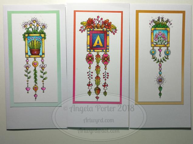
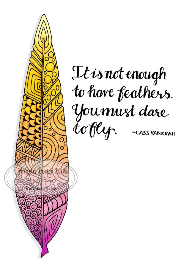
I’m working on my hand lettering skills.  I’m happy with my handwriting, generally, but my writing is naturally very small.  To write big, bold quotes and sentiments is a challenge for me, one that I had to face during my work on A Dangle A Day.

My first and most important tip about hand lettering is practice, practice and more practice.

dav

Here are some of the pages from my hand lettering collection in my BuJo. The pens are a Uniball UniPin, a Faber-Castell Pitt Artist Pen and a Lamy fountain pen with a fine nib.

The more you practice, the more you develop ‘muscle memory’ which makes it easier to be consistent in your lettering in terms of shape and so on.  It also helps it feel more natural and for you to speed up.

You can’t become an expert without first being a beginner.

My second tip is to start by practicing your natural writing style, your printing.  In these days of fonts by the million and perfect replication by computer and printing, I like to see the unique style that only your hand can bring to your hand lettering.

Practice your own printing until you are happy with the shape and style of your lettering, keeping it simple for now.  These letters will form the foundation of every other style you develop.

It’s easy to vary the style of your lettering by making simple changes to the letter height, width, line weight and so on. However, you need foundation letters you are happy with. So focus on this first and foremost.

My third tip is don’t compare your own writing to others’ or give up because you can’t seem to write as beautifully as you think they do.  Practice, practice, practice and work towards becoming the best you can be; it doesn’t happen overnight, it takes a lot of time.

“Daily learning of your craft makes you a master of your craft.” – Seema Brain Openers

“If people knew how hard I worked to get my mastery, it wouldn’t seem so wonderful at all.” – Michaelangelo

My fourth tip is to practice daily, or as often as you can.  In my BuJo (bullet journal) I have a section on my monthly tracker for hand lettering practice. Keeping a BuJo means I do get daily hand lettering practice, but it’s still not enough for me to keep developing the skill.

There’s plenty of advice out there and practice sheets and exercises for hand lettering, calligraphy, faux calligraphy, brush lettering.  What I like to do, however, is to write, using just my basic hand lettering ‘font’.

Writing out the alphabet again and again is productive, but not always enjoyable.  It doesn’t help you with putting the letters together in terms of words.

One of my happy memories is of English lessons when I was in primary school (aged 7 to 11) where we used a book called ‘A New First Aid in English’ to learn about nouns, similes, verbs, plurals and so on.  I enjoyed learning, but I enjoyed writing lists and answers down a lot too.  It so happens I have a copy of this book, one of the few remaining books from my days as a science teacher, and so I dip into this as a source of material to practice my writing.

Of course, you can use anything you like – quotes, names, lyrics, poems, anything that you enjoy but won’t distract from the focus of drawing the letters.

The last tip I will give is to use paper with guide lines on.  I printed paper out to suit my needs; I created it in Microsoft Publisher.  Dot grid or squared (graph) grid paper works well too.

My last words are – practice, practice, practice!

Monday motivation

Angela Porter 8 April 2018

#motivationmonday #mondaymotivation

Sunday funday

experiment 8april 2018 angela porter It’s Sunday, so that means it must be #fundaySunday #Sundayfunday.

This was my bit of fun for the day.  I created a background using Distress Inks, a mini-blending tool and a stencil.

After scanning it into my Microsoft Surface Book, I imported it into AutodeskSketchbook Pro and started to draw entangled patterns on the top of it.

It was just an experiment to see how it worked out, including the use of colour gradient fills for the entangled patterns.

I think it worked out ok.  I think there’s some more things I’d like to try out using this method; scanning backgrounds and then working on them digitally opens a new world of possibilities for me, as well as keeping me playing with more traditional media.  I do love the mix of the old with the new.

Of course, drawing on my Surface with the Surface pen is a lot like drawing with pen and ink on paper but with more possibilities…

It’s Dangle Day!

Angela Porter April Bujo 2018

This is my Dangle Day dangle design – for the cover of my April 2018 section in my disc-bound BuJo (bullet journal).

Yes, that’s right, a disc-bound BuJo.

I love my Leuchtturm 1917 journal, however I wanted my collections all in one place, and wanted memories together, more like a traditional journal, and my planning pages and trackers all in another place.

I also realised that a lot of my collections are references for art projects and I didn’t want to have to either hunt through a pile of BuJos to find the collection I wanted, or to have to redraw them every time I started a new BuJo.

So, the light came on and I realised a disc-bound (or ring bound) journal may be the way for me to go, as it doesn’t just offer the flexibility of design/layout/space that comes with bullet journalling, but it also allows me the flexibility to organise things as I need them, as well as to archive the planners and memories and so on as I need to.

I also get to use the paper that I need to use for different purposes as well…

I had some of the Arc by M journals lurking around my home, so I re-purposed one of them for this, along with some bigger discs so I can get more pages in the BuJo.

I am notorious for flipping back and forth between ways of journaling.  This could be the solution to that.

As to the April design, I drew it with Copic Multiliner SP pens and coloured it with Faber-Castell Polychromos and Caran D’Ache Luminance pencils, using a Derwent Blender pencil to smooth the transition between colours.

Don’t forget, you can pre-order my upcoming book, A Dangle A Day, which is all about drawing dangles, such as the ones dangling from the mandala.

Friday is Dangle Day!

Angela Porter Artwyrd 29 March 2018 Dangle Cards

Angela Porter Artwyrd 29 March 2018 Dangle Cards1

That’s right!  From henceforth Friday shall be known as Dangle Day.  Well, on my blog and the other places I can be found on the interwebs.

As you may know, I have a book coming out later this year that’s all about drawing dangle designs; it’s called A Dangle A Day and is available to preorder now.  In it, I’ll be leading you through, step by step, drawing dangle designs, amongst other things, so you too can create dangle designs like these!  Yes, you can do it!

So, I plan to post at least one completed dangle project each Friday, and this week there’s a bumper crop of five of them.

The cards I’ve made over the last day or two are dangle designs, but not ones to be found in the book. These are all drawn with pen on paper and coloured with either Tombow Dual Brush pens or Kuretake’s Zig Clean Colour Brush Pens.  I’ve also added dots and highlights using Sakura’s Metallic and Stardust Gelly roll pens, not that you can easily see them in the photos.

I will, in the near future, have an announcement to make about a giveaway.

Entangled zendoodle

Angela Porter Artwyrd 26 March 2018

I’ve just finished this drawing; the first zendoodle/zentagle type drawing I’ve done in a while.  I enjoyed drawing it – drawing always is an enjoyment.

I’ve temporarily coloured the background; I will be colouring it in ‘properly’ as time goes along.

Materials used :

  • Claire Fontaine Dot grid paper
  • Unipin pens
  • Pencil and eraser

I have scanned it in and cleaned the image up and created a transparent file I can work on digitally.

Derwent Procolour Pencils and some cute bugs

IMG_20180321_120333

Today, I wandered into my local stationers – Churchill’s – and found some items for my stationery stash.  Included were some coloured pencils from Derwent that are new to me.

They’re called Procolour and I picked up a tin of 24 of them. and you can see how much I paid on the tin, though they are available for less on Amazon.

cof

I tried them out in my Leuchtturm 1917 Dotted BuJo on some cute bugs I’d drawn earlier today (yes, another collection is being assembled in my BuJo).  You can see the colouring at the top of the page, though I adjusted the brightness and contrast a tad.

The blurb on the tin says

Derwent Procolour pencils are the perfect combination of a strong point and smooth lay-down, with a texture that has the covering power of wax yet glides like an oil.  The richly pigmented pencils maintain a sharp point for detailed drawing; while minimal chipping and dusting keeps your work clean and smudge free. Suitable for a wide range of drawing techniques, available in a carefully selected range of 72 rich and vibrant colours.

I didn’t choose the best paper to test them on, though they’re more like to be used in my BuJo than anywhere else, but the colours are vibrant, even on the creamy coloured Leuchtturm paper.

They do lay down well, with a gentle pressure, and they layer nicely.

What I do like is that they have quite a wide ‘barrel’, which makes it a lot more comfortable to hold than other coloured pencils; my old, slightly arthriticy fingers don’t like narrow barrels when I need to press hard.  That’s why I tend towards water-based media or digital media these days; they keep my fingers happy and working.

The colour palette of the 24 set is actually nicely chosen, with plenty of my favourite colours.

I am very tempted to get the full set of 72, but I think I’ll wait for a little while.


Mixed media 25 Feb 2018

Angela Porter mixed media 25Feb2018

I’ve been hard at work on my ‘A Dangle A Day’ book and felt I needed a break from the computer screen.  As much as I love working digitally, I believe it does the soul good to work in different ways from time to time.  A change is as good as a rest, it is said, and also a change can get the creative juices flowing!

A trip to Hobbycraft in Newport, Gwent, yesterday had me buying some A4 Daler-Rowney Mixed Media boards.

These are 1.4mm thick and sturdy board forms of their mixed media paper.  The board did warp when I added tissue paper with matt medium, and it’s still a little wobbly today.

The pictures shows how far I’ve got for now.  I’m letting the little drops of copper and golden glitter dry as I take a break from it to decide if I need to do any more to it.

The image I drew and then coloured using Distress Inks.

I’ve enjoyed getting a little inky, painty and messy for a change.

Doodleworlds 18 Feb 2018

AngelaPorter_Doodleworlds_Coloured_02

I’ve just finished colouring in this template from my book “Doodleworlds”.  I drew the template using pen and ink on paper, scanned it in for the book, but I chose to colour the template digitally using Autodesk Sketchbook Pro, my Microsoft Surface Book and Microsoft Surface Pen.

Doodleworlds is available on Amazon and in my Etsy shop – Artwyrd.

Brayered backgrounds with Distress Oxide Inks

Angela Porter Brayered Backgrounds 17Feb2018

The image shows some of the backgrounds I’ve made using a Speedball Brayer, a Gelli Arts Gelli Plate, white card and Tim Holtz’s Distress Oxide Inks.

I’ve been taking a little break from the work for the A Dangle a Day book, a change freshens up the creative part of my mind.

The process is quite simple.

  1. Press the oxide ink down onto the Gelli plate.
  2. Use the brayer to spread the ink over the Gelli plate. The Gelli plate acts as a blending mat.
  3. Use the brayer to add ink to the white card.  I find it helpful to have just printer paper under the card and to move the brayer from the paper onto the card.
  4. Build up layers of inks until you’re happy with the look.  Using one colour of ink you can quite easily build up an ombre background.
  5. Spray or dot water onto the paper and let the inks ‘oxidise’ if you wish.

I clean the brayer off on the copy paper between inks.  I also use the copy paper to lift off any residual ink from the Gelli plate between different ink colours.  Sometimes, I dab the Gelli plate with a baby wipe and then use copy paper to clean the plate, especially if the residual ink and the new ink will make a nasty brown sludgy colour.  In this instance, I wipe the brayer with a baby wipe and then clean and dry it on copy paper too.

Sometimes, the copy paper becomes a beautiful background paper too, so I store those away for future use, sometimes.

I’m going to scan some of these backgrounds in to use as backgrounds to my digital art, but then I’m going to draw on them.  I’m using quite a few in my Sketchbook Project sketchbook for 2018.