Monogram D entangled design (with some little dangles)

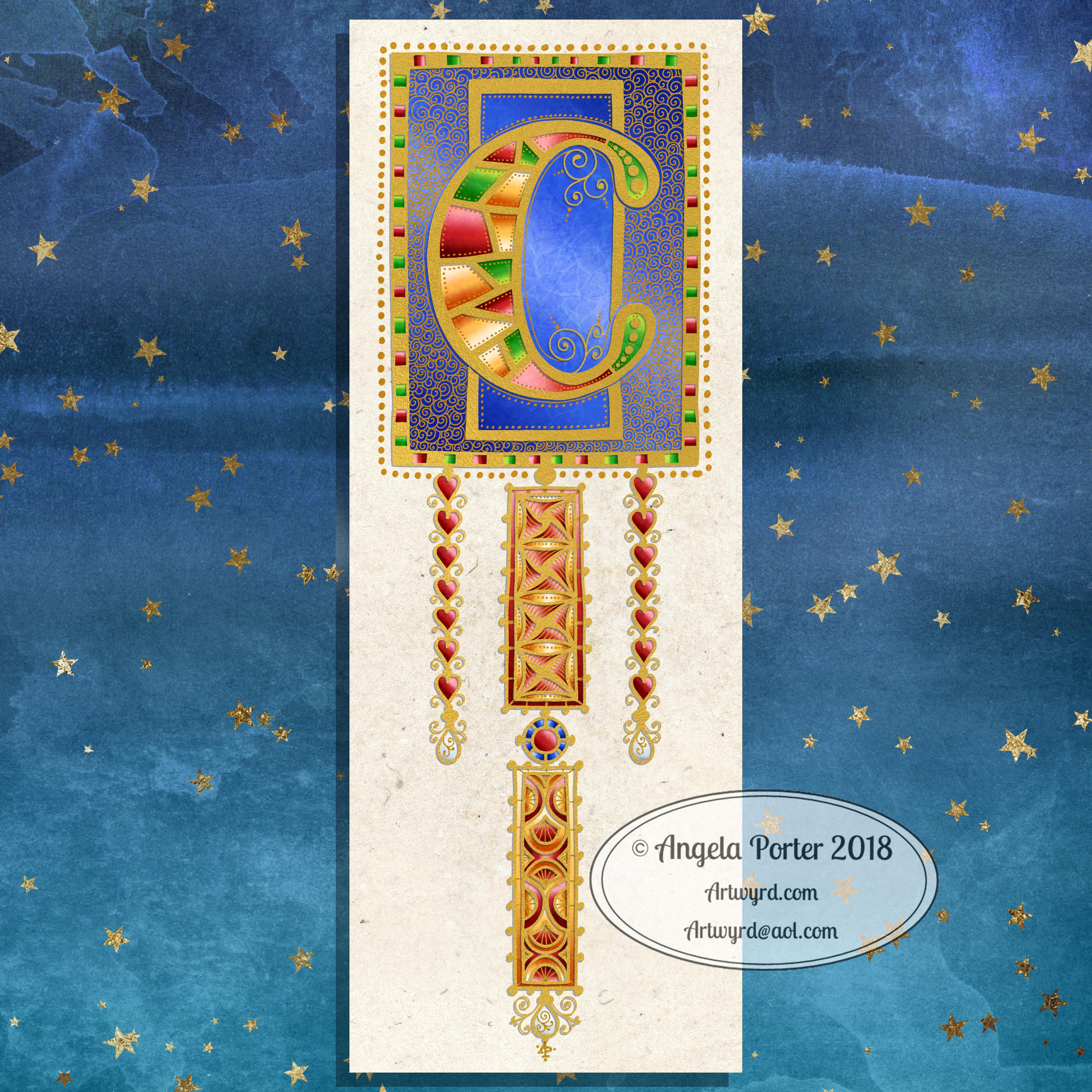
I had a day or two of subconscious reflection on how to pattern around a letter after not being all that happy with the lower case b design. So, I wanted to put my vague ideas into practice.

Yes, they were vague ideas, no clear idea of how I wanted things to look, but I just wanted to try them out and see where they led.

I started with a faint pencil outline of an uncial style letter d, and then used a fine nibbed Rotring Art Pen with black ink to draw the design with.

I used the pencil line as a guide to where the entangled designs would either butt up to the edge, spill over the edge or curl over it and I just let the designs flow and grow. I also left the design in an organic shape rather than working to a square or rectangular shape.

I did work on a piece of A4 paper, but the design is a little over a quarter of the size of the paper. I can’t believe I did such teeny-tiny drawings again! I really enjoyed it!

In some places I’ve made the edge too hard, too linear. In one place I tried to correct that (lower left of the d) by adding more bits to the pattern, but that linear line is still evident. However, it’s all learning.

After scanning in, I wanted to add some texture and a bit of colour to that letter to help it stand out more. I may try doing the reverse as in colouring the design in and leaving the letter plain later. I may even try using some watercolour brushes in Autodesk Sketchbook Pro, using my Microsoft Surface Pen and Microsoft Surface Studio.

I have designated friday as #dangleday, and I did add some tiny, fine danglesto the design. Dangles don’t always have to be big and fancy or a prominent feature of designs, like in my book ‘A Dangle A Day‘.

Medieval Monogram Dangle Design ‘C’ – 18 December 2018

©Angela Porter 2019

I’ve spent around two and a half hours on this monogram. I’m still playing with metallic/glitter textures rather than black line work.

I still haven’t ‘cracked’ how to achieve a more dimensional look to the gold lines/beads. No doubt I’ll have a bright idea to try sometime soon.

Medieval, Anglo-Saxon, Celtic and Romanesque art and architecture has long been an inspiration for me, though it’s not often I express it in such an obvious way. This definitely has a medieval ‘feel’ about it, but there’s also a more modern take with the rectangular dangle charms and the very  contrasting gradient colours that fill the patchwork pattern inside of the letter.

I was thinking of adding more complex patterns inside some of these patchwork sections. However, I decided that could be way too busy and went with the dots.

Dots are  a very common embellishment in Anglo-Saxon and Celtic manuscripts. After adding dots to those patchwork panels, I had to go and add them elsewhere. Such a simple thing, the humble dot, but how much it can add to a design.

I love the plain blue panel behind the C, so the letter doesn’t get entirely lost in the background pattern – my favourite little spirals. I like the thicker lines around the letter too, but they’re too ‘flat’ for my liking at the moment. The little square-ish gems in the main outline help to break that thick gold line up, adding a bit more opulence in the process.

I love the dimension in those rectangular panels, particularly the lower one. The high contrast gradations in colour really give it some dimension. I wasn’t at all sure about using the pale yellow to orange color gradations anywhere in the design, but once I’d completed this particular ‘charm’ I absolutely loved it!

Although I don’t show such complex monogram dangle designs in my book ‘A Dangle A Day‘, this design really isn’t all the complex to do. 

Talking of ‘A Dangle A Day’, Lydia at #quartocreates sent me a link to a nice review of the book by Funky Frugal Mommy.

This is a piece of digital art using my Microsoft Surface Pen and Surface Studio along with Autodesk Sketchbook Pro and some texture files purchased via Creative Market.  I did start with a pencil sketch of the monogram and dangle design which was then redrawn digitally.

Abstract Botanical 19 September 2018

Angela Porter 19 September 2018

It’s a lovely, sunny late summer morning here in the UK and it’s been a perfect time to finish this design off.

Yes, it’s another abstract, zentangly, entangled botanical design, which seems to be my signature style of art, though I do dabble in other styles, as you know, particularly my kind of dangle designs.

This one, like many of my previous ones, was completed in these stages:

  1. Draw the black and white line art on Rhodia dot grid paper using a black 08 Sakura Pigma Micron pen.
  2. Scan the drawing into GiMP. Use tools to remove the dot grid and remove the noise. Save with a transparent background.
  3. Import the image into Autodesk Sketchbook Pro. Any edits to lines can be made here using a pen ‘brush’ that mimics the texture of the Micron pen on the dot grid paper. Then layers are used to create the background, add colour to the design before adding texture and highlights.

It takes a day or more to create a piece of art like this. The drawing of the design alone can take anywhere from 2 to 10 hours, depending on the intricacy and size. This one was A4 in size and isn’t very detailed; I let the colour and texture add details to the design in this instance. I want the colours to shine. The colouring etc. has taken a few hours to do.

It takes me at least as long to create a piece of digital mixed media art as it does to draw and colour the design using traditional methods such as Chameleon markers or Inktense pencils.

What I love about working digitally is the ability to change the colours I use for the elements, and then being able to add texture and highlights/shadows. I can see where I need to go back to the image and add or deepen shadows to increase the sense of depth in the design. A drop shadow on the background isn’t really needed as I think the background is like a sunset sky or alien sea.

The other thing about digital work, is the ability to use the black and white outline to re-work the design using a different colour palette, different textures. I also have the option to print the design out and colour using other media, such as marker pens, perhaps changing the size of the image so that I can create, say, a greetings card or note card, or even a page for my BuJo.

I spent some time on Monday playing with Repper Pro and had some fun creating repeating patterns using the last couple of abstract botanical images. Just from a couple of artworks, I have more than a hundred seamless tiles for patterns; it’s just sorting through them and working out which are the best. I may post some of the best ones later today or tomorrow, and maybe create some based on today’s art above too.

I actually think some of the tiles would, with a border, make amazing patterns for square cushions/pillows worked in tapestry, canvaswork, cross-stitch or similar. You can decide for yourselves when I post them.

Abstract Botanical 16 September 2016

Angela Porter 16 September2018

Another abstract botanical. Here are the steps I took in creating it.

  1. Draw the black and white line art design on dot-grid paper from Rhodia using Sakura Micron pens.
  2. Scanned the drawing in, removed the dot-grid, removed noise and created a transparent background in GiMP opensource photo editing software.
  3. Imported the image with a transparent image into Autodesk Sketchbook Pro and added colour and texture.

It took a couple of hours to draw the design and several hours to colour and so on.

My digital tools are a Microsoft Surface Pen and Microsoft Surface Studio.

I love the way many of the elements seem to glow against the dark green-blue background.

Many of my latest works like this seem to have an ocean, watery background going on. So, in the one I have on the go at the moment I’ve done a kind of sunset background. I’ll see how that turns out. Working digitally means I can alter my backgrounds really easily for sure.

I’ve been creating backgrounds digitally, but I want to create some on paper with Distress Inks and scan them in to use instead of the digital backgrounds.

I also made use of a more limited colour palette in this work – going for a more cohesive look/feel. These aren’t colours I’d normally choose to go together, but they seem to work fine.

I now have a fair few of these images and so now really need to try to work out what to do with them. I may try to import them into Repper and create repeating patterns from parts of them; that could be an interesting exercise for sure, but a fun one!

If you have any ideas of how my artwork could be used, leave a comment – I’d love to hear!


Work in Progress Wednesday

Angela Porter 9 September 2019 02 coloured small1

This was drawn on paper with Sakura Pigma Micron pens, scanned in and is in the process of being digitally coloured in Autodesk Sketchbook Pro. I’m using my Surface Studio and a Surface Pen, both from Microsoft.

The background may go a little darker on this one, but I’ll decide on that when I’ve completed colouring the design elements in.

It’s also work in progress Wednesday over on the Angela Porter’s Coloring Book Fans facebook group. We’d love to see your colouring works in progress of pages from my coloring books. Why  not pop along and join in? You’d be very welcome there.

Abstract Botanical 27 August 2018

Angela Porter 27 August 2018 small

Started yesterday, finished this morning. Another intricate, abstract botanical

I coloured the paper first and worked with the patterns made, mostly. Intuitive drawing with detail and intricacy and black lines is my favourite to do. Botanical things, abstract motifs, from my imagination are also some of my favourite things to draw.

My colour choices are a bit different for me, the way I blended the colours resulted in some unusual, subdued, almost grungy tones. I think I like it.


Abstract Botanical 22 August 2018

Angela Porter 22 August 2018

Another day, another drawing/artwork/illustration/design. This one is only a little one; it’s approximately A5 in size.

I used some new watercolour paper from Canson – Moulin du Roy. It’s smooth, slightly off-white, pure cotton mould made and seems to work nicely with Intense pencils and a waterbrush.

I’m waiting for some metallic paints to arrive so I can add some highlights to this – there are places where a dot of gold will really work nicely, but not too many places methinks.

Also, I chose just seven colours to be my palette – sherbert lemon, apple green, iron green, lagoon, violet, red-violet and sienna gold. I thought that a smaller number of colours could result in a more cohesive feel to the design, and I think that it may have done so!

For this one, I drew the design first in pen then added colour.

When I draw first I do tend to fill the space with drawings. When I add colour shapes first I end up with more white space and a more random ‘edge’ to the design.

Why that is, I don’t know, other than it may have something to do with me filling spaces in with pen and ink habitually.

A habit I need to modify I think.

All the same, it’s nice to do little designs. I already have another drawn out waiting for colour!

Repeating patterns, my first experiment

Pattern 18 coloured v01 watermarked

Over the past few weeks, I’ve been thinking about and looking at how to make repeating patterns.

I’ve tried the old fashioned way of working on paper and cutting the paper and so on, and not found the results at all satisfactory.

I’ve had a bit of a go in Adobe Illustrator, but I find Illustrator so confusing and frustrating to use.  There seems to be a total disconnect between my brain and the software architecture of Illustrator, and other similar pieces of software.

A day or two ago I found a little app in the Microsoft Store called Amaziograph that lets me create repeating patterns in sheet form, which is great if I want a sheet of black and white repeating, entangled line art, but not what I want if I want a coloured repeating pattern.  Oh, the app is a lot of fun to mess around with for sure and no doubt I will use it to generate patterns.

Looking around at software today, a lot of it either works in Illustrator or is prohibitively expensive given that I just want to have a play, see what I can come up with and see if it’s something that I’d like to spend more time with.  Where they offer free trials, I know they’re not going to be a long enough trial for me to get to grips with Illustrator and the software/plugins, so I’d not be able to make my mind up.

So, on a wander around the corners of Google, I found a lovely little program called Repper. It had an online trial version that I could play with quite happily, and I decided to purchase it afterwards.

In Repper, you open your own artwork and use parts of it to create repeating patterns.  The pattern above is an example of that, kind of.

What I did was to take one of my coloured mandala patterns and use that to create a pattern that was pleasing to me.  Actually, I had many, many patterns that were pleasing to me, and I saved them as tiles that would form a repeating pattern.  With some, I saved them as a surface pattern, where the tiles were already repeated.

What is nice is that the program lets me set both the size and quality of the tile or surface image.

Next, I put the  tile I particularly liked into GiMP (GNU image Manipulation Program, open source software) to copy the black lines and create a new, uncoloured tile with a transparent background.

Autodesk Sketchbook Pro was my next destination so that I could colour the tile as I liked.  Not so easy where the edges of the tiles will meet  and to have no edges showing up.

The tile is partly finished in terms of colour, but I wanted to see how it would look tiled.  Go, back to GiMP I went and the above was the result!

My head now hurts a little after this, which means I need more tea, LOTS more tea and a bit of a break.

I absolutely love that I can take my artwork and use it to create more interesting designs and patterns with.  It’s absolutely fascinating, very easy to get lost in it all.

Definitely a very nice way to spend a few hours on a chilly and very rainy afternoon!  My Surface Book and Surface Pen have had a good workout in the process too!

WIP Wednesday

WIP 27 Dec 2017 Angela Porter

It’s WIP Wednesday once again over at the Angela Porter’s Coloring Book Fans facebook group. This is my current work in progress. I think I’m in touch with my inner bohemian/hippy once again in my colour choices, or maybe I just need a break from all the Christmassy/Winter colour schemes.  Perhaps I just need some bright colour in my life at the moment.  I do know using bright, vibrant colours always makes me smile.

#createdonsurface  #autodesksketchbook

Abstract and stylised flowers

Angela Porter Spring Flowers Watermarked SmallAngela Porter Bright Flowers Watermarked

I’ve had a couple of busy days, including a Time to Change Wales anti-stigma talk with the South Wales Police.  The talk wiped me out for a day or so, it always does as I get very anxious and emotional in telling my story.

So, I’ve been relatively quiet on the artsy front, but I did get these two abstract, stylised floral images done.

I rather like the bright colours, achieved using Kuretake’s Zig Clean Colour Real Brush Pens and a water pen.  I like both the white and black outlines, though I do prefer the black; they make the image look more like stained glass.

Both of these designs are available on products from both my Vida collection and my Zippi Portfolio.

A nice change of pace and way of creating from my more usual entangled drawings with tiny details done with fine pens and a whimsical quality.