Sketchbook / Art Journal

©Angela Porter | Artwyrd.com

I woke at around 4:30am again today and couldn’t get back to sleep. So, I got up, made tea, and did some work on my art journal / sketchbook.

Making Distressed Paper

I spent a good two or three hours making the papers you can see to the left. I used the following:

  • printer and layout paper, cut to A6 in size (UK size)
  • Distress Oxide Inks
  • 5″ x 7 ” Gelli plate
  • small Brayer roller
  • water in a spray bottle
  • heat tool
  • craft mat
  • pieces of cut and dry foam
  • metallic inks and paints

For some of the pieces, I brayered the Distress Oxides onto a Gelli plate and then pulled the print onto a piece of paper. For others, I used the Brayer to apply the ink to the paper. I also used the black side of a piece of cut and dry foam to apply ink to some of the papers.

I sprayed the papers with water to activiate the Distress Oxide, and used the heat tool to dry them. After doing this, I crumpled up a lot of the papers and then used the brayer to flatten them out. Both of these techniques resulted in textured paper. So, I used the cut and dry foam and some Distress Oxide ink to lightly brush the paper to help to accentuate that texture.

Finally I used cut and dry foam to brush metallic paint or ink over the paper to add some shimmer and shine. I used some textured cut and dry foam to add patterns too.

I now have quite a stash of very distressed papers to use in my art journal in the future.

Both the printer paper and the layout paper are much thinner than I would usually use for such a task. The light spritz of water on each, however, created a lovely, bumpy texture. They were also easy to crumple up, adding that kind of leathery texture.

The subtle shine that the gold metallic ink gave is rather lovely, though I do like the bright, shiny gold of some paint I found in my stash.

I can see me using these papers for collage, for making pockets/envelopes and other bits and bobs for a journal, and no doubt for other things I’ve not yet thought of.

Storing my custom papers.

I realised the papers I’ve made over the past couple of weeks have been piling up and I really needed to do something that would let me find them easily. So, the quickest and easiest solution was to use A4 poly-pockets and a ring binder, both of which I had to hand! That certainly has let me have a tidier desk, and I’ll be able to find the papers easily too.
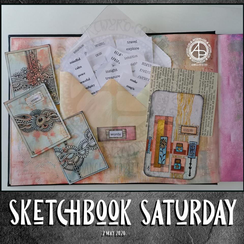
Art journal pages.

I also finished up the two pages shown to the right. I attached inchies, to fill in some gaps.

I used simple paper hinges to attach the ATC cards on page seen in the bottom image. If I ever wish to remove them to swap/share/gift, then I can remove them easily. That simple solution has relieved my anxiety about adhering them permanently into the sketchbook!

I’ve also folded some squared paper, used distress inks to colour the edges and folds, and put them in the vellum pockets I’d made earlier, all ready for me to journal on. Unusually for me, I made use of some washi tape to embellish the pockets.

I’ve also noticed that I’m very ‘regimented’ about how I put things in my art journal. I much prefer carefully cut paper to torn edges most of the time. Everything needs to be arranged ‘just so’ with me. Just as it is with my line-art – precise and neat. I suppose it’s another example of me expressing my personality through my art.

So, Angela, how are you today?

I’m exhausted. I’m practically falling asleep as I type this; that’s what happens when I wake up at stupid o’clock once again. I’m now officially overtired! I may try to get back to sleep soon; I do have work I need to do today!

As far as me being under the weather goes…

Well, I still have a sensitive digestive system and I feel nauseous from time to time. I did wake with a bit of a headache today, but that could just be lack of sleep, as is the tiredness I feel. I have eaten and my tummy doesn’t seem to be objecting as it has done. This all makes me hopeful that I’m almost over this bout illness. I was really quite grumpy about it yesterday, and I’m entirely sure I’m not grumpy today!

Other than that, emotionally I’m doing just fine. The sunshine helps with my mood for sure, as did being able to hear the bird song as the world was slowly waking up this morning.

Sketchbook Saturday

Sketchbook Saturday 2 May 2020 ©Angela Porter | Artwyrd.com

I am enjoying working a little either on my sketchbook-journal or preparing bits and bobs for it each day.

The main thing I wanted to do this morning was to get some little word tags prepared and in use.

I created a list of words I’d like to add to bits and bobs of art. I copied the list, using different fonts, then printed out an A4 sheet of the words. I made a second sheet using different words and different fonts. Then, I cut the sheets up into smaller pieces for storage.

Then, I realised I’d need to create a storage space for them in my sketchbook and thought an envelope would be the easiest way. I do have some commercially produced envelopes, but I thought it was time to use my We’R’Memory Keepers envelope punch board for a more custom size.

I cut an 8″ x 8″ piece of ordinary printer paper. I coloured the paper with distress oxide inks (old paper, tea dye and dried marigold) and then made an envelope that measures 3.5″ x 6″.

I then realised I needed a way to keep the envelope closed. I could tuck the flap inside the envelope, but as I used copy paper I didn’t know how durable it would be. So, I came up with the idea of having a little pocket to tuck the corner of the flap into. And that meant I could cut out “words” from one of the lists and add it to the little pocket.

Before I did that, I aged the edges of the label with Distress Ink. Next, I glued it to a an old book page and cut it out with a border of text. That layer was also edged with Distress Ink, then it was added to the pocket. I used a metallic Gelly Roll pen to draw around the label.

On the page, you can see some small drawings I’ve done over the past couple of days.

On the left of the page are three ATC cards (2.5″ x 3.5″) made from a piece of mixed media paper coloured with the same Distress Oxide Inks.

On the right, is a larger artwork, an experiment and exploration of what I could do. I collaged some Distress Oxide coloured pieces of paper on to the background. I added metallic gold and copper paint to some of the pieces, and also to create patterns behind them. I drew little designs too, including a Dangle Design from one.

I’m not all that happy with the ‘explore’ card. There are bits I like, and other bits where I think I messed up. I think if I’d left it with the gold patterning on the background and just some simple patterns on some of the collaged rectangles, maybe some gold paint on the smaller ones, then it would’ve worked out better.

I think I’m going to make a vellum envelope or pocket to store the ATC cards in. Vellum in translucent and so will provide a tantalising glimpse of the card(s) safely stored within.

The ‘explore’ card will be placed into the sketchbook, with notes and reflections about it. It’s one that will be a learning experience more than anything else.

Making a simple sketchbook or journal pocket.

Making a Simple Pocket © Angela Porter | Artwyrd.com

Yesterday, I said I’d like to make simple pockets for my sketchbook-journal to hold my artwork rather than gluing it to the pages. So, this morning, I started my day looking on YouTube for some ideas and this video by joie de fi was the top of the list.

While I was watching it, I thought I’d make an instruction sheet to go in my sketchbook (or my virtual one I’m making in One Note).

I picked up some quadrille paper and wrote and drew as I watched the method for the first pocket. I worked in ink without pencil sketches and I made quite a few mistakes. A Tipp-Ex mini pocket mouse was my friend.

When I’d finished the instruction sheet, I scanned it in and used Autodesk Sketchbook Pro to remove the square grid from the paper, clean up some smudges, and correct minor errors.

Then, I added some colour to help bring out the drawings, but also to help with the instructions.

I’ve yet to make this kind of pocket, but I’m sure I’ll be able to do so quite easily now.

Reflecting on the artwork/illustration

This was a lot of fun for me to do. It’s something I’ve not done much since my days as a science teacher, or a learner in school and university myself. I’d forgotten how much I enjoy creating instruction sheets with my own drawings on them.

Back in those days, I would’ve used a ruler to draw straight lines, pencil for the diagrams, pen for the words, and little or no colour. Here, I free-handed the drawings, wobbly lines and all. The colour also adds life and dimension to the diagrams/drawings/illustrations.

The layout of the instructions may not be the best and easiest to follow through. That’s because I did this as I was watching the first part of the video. I think that for the next one, I need to sketch out the steps and notes first, and then work on organising them more clearly.

Yes, I’m going to do some more instruction sheets like this!

I also really need to do more hand lettering! I’ve lapsed in my writing practice, that’s for sure.

Sketchbook Page

Sketchbook Page © Angela Porter | Artwyrd.com

I’ve been awake since stupid o’clock, which roughly translates to 3:30am BST. While I was trying to get back to sleep I watched a youtube video about making pockets and tuck-ins for an altered book journal.

I thought that could be something good for my sketchbook-journal. I have worried a little about gluing my little artworks into it, but pockets, tuck-ins, see-through envelopes could be a good way to both show the work and store it in a non-permanent way.

So, with my mind now working and sleep eluding me, I decided to have a go at making my own pockets. You can see the result at the top right, with a journalling card popped in one of them for now.

How I made the pockets

I used some ordinary white card, cut it into what I thought would be good sizes to make a set of stacked pockets for the ATC sized cards I’ve been working on.

I then coloured the cards with Distress Oxide Inks. For one of them, I used a brayer to add ink to a gelli plate. Before pulling a print, I spritzed the gelli plate with water that had some white perfect pearls added to it.

For another panel, I used the brayer to add ink directly to the paper. It did that unevenly. So, I used a ball-tool to carve some texture into the black side of a piece of cut and try foam and used that to add colour. That worked really well! Dabbing the foam added a lovely textured layer of colour. A spritz of water activated the dusty, chalky, soft nature of the Distress Oxides.

I enjoyed the look I achieved with the distressed foam that I coloured the remaining pair of paper panels in the same way.

I then tore the top edge of each panel, for added interest, then used a piece of foam and Rich Mahogany Distress Ink to add grunginess to the edges of each panel.

I wanted to add some embellishments to each panel, so I used a copper sparkle Gelli pen to draw patterns on them.

Finally, I used Tombow Mono adhesive to stick the panels together.

When I put the panels on the page in my sketchbook-journal, I thought a panel behind them. So, I coloured a panel of the same card with Distress Oxide inks and the distressed piece of foam and used the same gelly roll pen to add some sparkly patterns. Then, I adhered the back panel and pockets to my sketchbook.

When I tested some ATC cards in the pockets, I realised I need to work out a way for some more ‘give’ in the pockets as they’re too tightly put together to slip more than one ATC card in them. Also, I placed them just low enough down the page so the ATC card doesn’t stick out of the sides of my sketchbook.

I’m not well known for my fore-planning projects like this, though I do try to learn as I go along.

Inchies and Twinchies

My mind was working in weird ways this morning. As I was making the pockets, my mind strayed to inchies and twinchies. I’ve not made any of these for a long, long time. I thought it could be fun to do so and add them to my sketchbook-journal.

I cut two 1″ wide, and one 2″ wide strips of card. I used the distressed foam to apply Distress Oxide inks to them, spritzing with water to add to the distressed look. Then, after drying with a heat tool, I cut them into squares – 1″ x 1″ inches and 2″ x 2″ twinchies.

I decided to use metallic watercolours from Cosmic Shimmer to add a sparkly, shimmery border to each tile. I used rich gold, pale gold or copper on each tile.

Then, I got to draw on the tiles. Teeny, tiny zentangle-style drawings. That was fun to do!

After adding some dots using a white Sakura Soufflé pen, I adhered the inchies into my sketchbook-journal. I’ve left the twinchies for decoration later.

Journaling cards

I realised that I could stored journalling cards in the pockets. All I needed to do was to colour the back of one of the ATC cards I coloured a few days ago. I also just realised that I could have added a layer of squared, dot grid or lined paper to write on too. That’s an idea for another time, maybe.

After drying the ink, I used a rollerball pen to add what notes I wanted to about this mornings creative sessions.

In fact, I’ve just created another journaling card to jot down ideas and notes to self as a result of reflecting on my pre-dawn arty activities!

Sketchbook Sunday

Sketchbook Pages – 26 April 2020 ©Angela Porter | Artwyrd.com

Over the week I’ve been adding to my sketchbook- notes and images, ideas and reflections.

Each page has been coloured with combinations of Distress Inks, applied using the black side of a piece of Cut and Dry foam, followed with a spritz of water to bring out some water-staining grungy loveliness.

All the little drawings have been done on either Daler-Rowney Smooth watercolour paper (300gsm) or mixed media paper, either from Claire Fontaine or Daler-Rowney. The papers have been coloured with Distress Oxide Inks, Distress Inks, or a combination of them. Most of the pieces have had the inks applied with the foam, but some were made by brayering Distress Oxide inks onto a gelli plate and taking a print of them.

The reflection about what I like, what I don’t like, and ideas that arise is important to me in my sketchbook/journal. I do reflect on my art, a bit too much in my head. When I write it down, it forces my sometimes abstract and swirling thoughts into some kind of order. When I make these thoughts a material manifestation by writing them down, it helps me to recognise the thoughts, sift through that which is useful, and still record those that are not particularly useful at this moment but may be in the future.

I think I need to find a way to do this with my digital art. My mind goes to using One Note to do this. I shall think on this one, and make a note of it in my physical sketchbook/journal.

So Thankful

So thankful ©Angela Porter | Artwyrd.com

Today, I have a simple dangle design greeting card along with a coordinating envelope. If you’d like some more ideas, inspiration and step by step instructions for drawing dangle designs then my book, A Dangle A Day, is a good place to start.

Materials and dimensions

4″ x 4″ Strathmore Bristol paper with a vellum finish
5″ x 5″ acid-free white card blank
White envelope that card will fit in
Distress inks in Tea Dye and Rusty Hinge
Small piece of foam and a mini foam blending tool
A piece of card with a 1.5″ x 0.75″ window cut in it to use as a stencil.
Faber-Castell Pitt artist pens in F, S and XS
Ruler and pencil
Adhesive
Glass pen and coppper ink by J Herbin

Making the card.
  1. Use the card stencil and a small sponge dauber to apply a rectangle of Distress Ink in the top left of the 4″ x 4″ top layer. I used Tea Dye to colour the whole rectangle in, followed by a subtle gradient of Rusty Hinge from the bottom up.
  2. Use a mini foam blending tool to add Tea Dye Distress ink to the edge of the top layer.
  3. Use a pen to draw the rectangles around the colour block. I like to do this free-hand as it gives a more organic, human feel to the design.
  4. Draw the sprigs and add the lines to the border. Dots help to add some interest to the more empty parts of the design.
  5. Use a ruler and pencil to lightly draw a vertical line as a guide for the dangle. Also, draw pencil lines as guides for the position and size of the hand lettering. Sketch in the letters of the greeting.
  6. Draw round and diamond shaped beads to form the dangle. I like to finish my dangles with a ‘heavier’ or larger bead.
  7. Ink the letters in. I did some faux calligraphy where I made the down-strokes thicker. I added some lines and shading to the top line.
  8. Carefully erase the pencil lines.
  9. Attach the top layer to the card blank.
  10. I used a glass pen and copper ink to add copper dots to highlight the dangle design and the hand lettering. I also drew a box just inside the top layer and another just outside it on the card blank. Again, I free-handed the lines, embracing the wobbliness.
Making the envelope
  1. I used Tea Dye Distress Ink and a mini foam blending tool to edge both the front and back of the envelope.
  2. I then used a sponge dauber and the card stencil to add a rectangle of Tea Dye ink in the top left.
  3. I drew the design on the envelope as I had on the card, including adding a line border in copper ink.
  4. Finally, I drew similar sprigs on the envelope flap, using the glass pen and copper ink.
Before mailing…

Once I’ve addressed the envelope, I’d apply a thin layer of Distress MicroGlaze to the front and back of the envelope to protect the Distress Ink and drawing from the elements. I’ve done this to other cards and they have traversed the UK and US postal systems with no problems.

Ideas for using the design.

Although I’ve presented this dangle design as a greeting card, which is, I think, a lovely way to share a little bit of artistic loveliness with others, there are many other ways the design could be used, with or without any hand lettering.

In a BuJo, journal, planner or diary it would make a lovely little design to fill in a blank space.

This is a design that would work really well as a bookmark.

I’m sure it would look charming as part of a scrapbook spread.

I also think it would look lovely on a ‘with compliments’ slip or decorating the edge of a hand-written letter.

I’m sure there are many other ways and media that this design would be suited to.

Final thoughts…

I’m really enjoying drawing these kinds of dangle designs. They’re simple and elegant, to my mind anyway. They’re also quite easy to draw.

I do prefer to free-hand the lines and let the wobbliness be part of my signature style. It gives that human, hand-made, hand-crafted feel to the finished project, and a warmth to the finished project.

I work hard at finding a way of drawing digitally that lets me keep this uniquely ‘Angela’ way of expressing myself through line and pattern. I’m still working on it and sometimes get frustrated that, to my eye, my digital art seems too, well digitally perfect.

It’s all part of the process though – learning, developing, experimenting, trying out new ideas, techniques and methods. That’s what helps me grow as an artist.

Thank you card – a dangle design

Friday means it’s time for another dangle design, this time a ‘thank you’ card and coordinating envelope.

In previous weeks I’ve had some fun adding patterns to small blocks of colour. So, I thought I’d run with that idea and turn one into a simple dangle design. The steps I used were the same for the card and envelope.

Card size.

The card is an A6 card and I cut a piece of Winsor and Newton Bristol paper to 5″ x 3.5″ for the card topper. The envelope came with the card blank so is A6 in size too.

How to…

I started by drawing a square of colour using the BL3 (Sky Blue) Chameleon Color Tone pen – no gradient, just pure colour.

Then, I added a gradient of BL6 (Royal Blue) over the base colour. I added pure blender to the Royal blue bullet nib using the mixing chamber. I didn’t use the Color Tops to add Royal Blue to the tip of the Sky Blue pen as I wanted a more subtle colour gradient.

Next, I used a Tombow Fudenosuke pen to draw around the block twice. Then, I added a filler pattern of spirals to the colour block. On the card I used a gold Uniball Signo sparkle gel pen. On the envelope I used the fudenosuke pen.

Now the colour block was decorated I turned my attention to the dangle.I decided to draw one dangle as I thought the design would look too crowded if I ad more. Sometimes, less really is more!

After drawing a faint pencil guide-line, I used a combination of beads, daisy-like flowers and a heart for the dangle. I wanted to keep it nice and simple.

Then it was time to add colour to the outline and design elements. I used the Chameleon Colour tops to add very simple colours. I didn’t do any gradients as the designs were so small. Instead I coloured them in the lightest colour, added a touch of darker colour where I wanted shadow and blended that out with the lighter colour.

I decided to hand letter ‘Thank you’ on the card using a soft nib Fudenosuke pen. I also added some tiny daisies to some of the loops and swirls to tie the hand lettering in with the dangle design.

I then mounted the card ‘topper’ on the card blank and added some gold glitter gel dots around the designs. I also added a gold line around the card topper.

Before I post the card, I’ll use some Micro Glaze from Ranger on the envelope to protect the Tombow pen from water damage.

Reflecting on the project…

Overall, I’m quite pleased with this. In hindsight I wish I’d used the Tombow Fudenosuke pen to draw the spiral pattern on the card. I think it’s a cute, simple and versatile design.

It would make lovely stationery, such as note paper or note cards, along with coordinating envelopes. There are lots of ways the design could be used in BuJos, Planners, Journals, Scrapbooks, and Art Journals. The vertical nature of the design means it would make a lovely bookmark.

How would you use this design? I’d love to hear, so leave a comment!

If you have a go at drawing and using this design then please share your finished products with me – I’d love to see how people use dangle designs!

If you want to learn more about drawing dangle designs then my book ‘A Dangle A Day’ is a good place to start. There’s over 120 designs for you to use as they are or for inspiration for your own designs.

Nearly every Friday I publish a new dangle design on my blog for more inspiration.

A simple and elegant Autumn Dangle Design.

Autumn Dangle Design ©Angela Porter | Artwyrd.com

Hello to November, and farewell Inktober. My blog post today looks a bit bare compared to my Inktober creations. However, I have neglected my dangle designs during October, so now’s the time to get back on track with them

Today, I’ve created a simple and elegant dangle design with an autumn colour scheme that could be used in so many different ways. I’ve also put together a step by step set of instructions how you too can create this design (and hoping that it’s not so simple that I come across as patronising).

This is my first time posting a set of instructions – post a comment to let me know what you think of them and if you’d like to see more of them in the future.

I’ve put the dangle design on one side of a slip of paper that would make a perfect compliment slip or a note to slip in with a gift, or just as a short letter to a friend. It would also be perfect for a coordinating piece of envelope art!

This dangle design would be absolutely charming as an embellishment in a BuJo, planner, scrapbook or art journal. It would also make a darling bookmark.

It would be easy to turn this design into a greeting card as well.

So many possible uses for such a simple design.

I do hope that you will give drawing dangles a go – no matter whether you think you’re good at drawing or not! This design is made out of just simple shapes; it’s the colour that brings it to life and masks all kinds of imperfections.

If you’d like more ideas for dangle designs, then please take a look at my book ‘A Dangle A Day’ – it’s filled with examples of dangle designs with step by step instructions and helpful and encouraging words of advice.

One step at a time to a dangle design.

Step 1

Step 1
Draw a square in the top left corner of a piece of paper. I used a piece of paper measuring approx 8.25″ x 3.5″. I used a Tombow Fudenosuke brush pen to draw the box, and outline it. I deliberately made the squares less than perfect to give that human touch as well as a uniquely ‘me’ way of drawing boxes. The Fudenosuke pen allows me to draw lines of variable width quite easily, which adds to the charm of the box. The ink in the pen is also alcohol marker friendly.
Letting your drawings be less than perfect is what makes them uniquely yours.

Step 2

Step 2
I used Chameleon marker pens (BR3 “Cinnamon” and YO3 “Warm Sunset”) to colour the inner box. Autumn is definitely here in the UK, and the combination of these colours reminded me of the leaves. However, you could use any colour combination you like and any medium you prefer to use.
Chameleon pens make it so easy to create a colour gradient – I prefer them to other alcohol marker pens, even Copics.

Step 3

Step 3
I added a simple leaf pattern to the coloured box using a Sakura Pigma Sensei 04 pen.

Step 4

Step 4
Add the dangle! For this dangle I used the same kind of leaves as in the box for a consistent design. I added some round beads as ‘spacers’. Finally, I added my ‘symbol’ to the end of the dangle.
Also, I did draw a faint pencil line with a ruler to help me keep my dangle hanging straight, more or less!

Step 5

Step 5
I coloured the beads and leaves in using the same colours of Chameleon Markers. I then decided I needed to add some shimmer and shine; I used a Uniball Signo gold glitter gel pen to colour in the border of the box and to add some dot highlights here and there.
The Chameleons caused the Sakura Pigma Micron ink to smear a little – I always forget that happens! I should’ve used the Tombow pen again. Oh well, you live and learn, eventually!

Hello – A dangle design card with coordinating envelope.

Hell - A Dangle Design card with coordinating envelope © Angela Porter | Artwyrd.com
Hell – A Dangle Design card with coordinating envelope © Angela Porter | Artwyrd.com

Yesterday I decided to make a second card with a coordinating envelope. I wanted to try out using the Chameleon fine-liners to add colour in the form of lines and cross-hatching. Finally, I added some gold dots to the points of the petals on the flower design.

To draw the design and execute the hand-lettering, I used a Uniball Unipin pen. I then used various pairs of Chameleon fineliners to add the colour.

I prefer this way of adding colour with the Chameleon fine-liners, though I’m not entirely happy about it either. Looking at it now, in the clear light of dawn, I think I could have added a flat colour below the coloured lines. I may go and add that colour in a little while. After all, it’s just a card, an experiment, and if I mess it up, I can always make another one! A lesson learned, an experience gained is worth the few pennies worth of materials and the time it took just as long as I remember the lesson in the future.

I’m also not happy with my hand-lettering; I like the idea of the letter layout, but it’s not centred between the arcs.

I do like the ‘banner’ I’ve used to enclose the hand-lettering. However, there’s something about the rectangular ribbons and the patterns within that I don’t particularly like. I’ll work out what it is in time.

For now, I’ll try adding flat colour to the coloured sections to see how that works out and not worry about messing up the card. I’ll use it as a learning experience.

And that reminds me, I’ve still not set up my One Note journal for my private critiques and what kinds of methods and techniques I use in my art.

Materials

A piece of yellow card cut to 4″ x 11″, scored and folded in half to make a top-fold card measuring 4″ x 5½”.

A piece of white card approx. 4″ x 5″ for the top layer.

A We R Memory Keepers Envelope Punch board and an piece of paper measuring 7⅞” x 7⅞” or a blank envelope that will fit a 4″ x 5½” card.

A pencil and ruler for the guide-lines and a good eraser to remove them.

A black fineliner pen for drawing and hand-lettering; I used a Uniball Unipin pen.

Pens to colour the design; I used Chameleon fineliner pens.

A gold gel pen for the dot embellishments; I used a Uniball Signo gold gel pen.

If you’d like to learn more about dangle designs or are looking for some more inspiration for them and how they can be used in cards, BuJos, scrapbooks, bookmarks, journals, and more then my book ‘A Dangle A Day’ is a good place to start. It takes you through how to draw monograms and dangle designs for all kinds of occasions around the year in simple steps.

Golden memories – a dangle design

Golden memories dangle design ©Angela Porter 2019 Artwyrd.com

As it’s Friday it’s time for a dangle design, and here it is. All in monochrome, well nearly. I added some subtle colour to the photograph.

If you’d like some ideas and step by step instructions on drawing your own dangle designs then my book “A Dangle A Day” is a good place to start. Just saying like.

I decided to use one of the images from the ‘Photobooth’ collection in the Idea-ology range by Tim Holtz. I thought that around it it would be nice to create an entangled frame, and to add a simple dangle design to this frame.

With the vintage nature of the photo I thought that the hand lettered sentiment of ‘golden memories’ would be a good one to add.

In keeping with the vintage design I thought a monochrome colour scheme would be appropriate. Mind you, a color palette of subtle vintage colours would work quite nicely too. It would be nice if I’d changed the colours from greys and blacks to sepia tones.

I drew the design and did the hand lettering with Unipin pens on Winsor and Newton Bristol board. I then cleaned up the scanned image, and added the subtle colours to the photo, using Autodesk Sketchbook Pro, Microsoft Surface Pen and Microsoft Surface Studio. I also added some subtle grey shadows to the design.

This would look absolutely charming framed, a lovely way to display cherished photo-booth images. I drew this image on a sheet of A4 paper (approx. letter size).

However, this would work on a smaller scale for a scrapbook, journal or even a BuJo. It would also make a lovely greeting card or note card for someone too.

It’s also an idea that can easily be altered for a more masculine tone, perfect for father’s day or a male birthday.